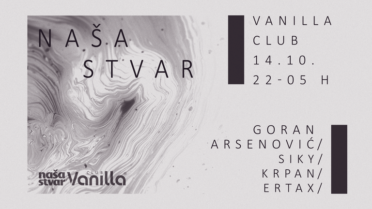
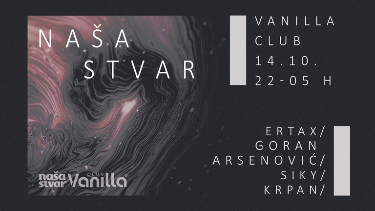
This is the last thing I did. It's a techno party ( Facebook Event ) in my hometown, Vinkovci in a Vanilla Club where I'm a resident DJ. This saturday I don't play since I wasn't in town but I was in charge of making a poster / cover design.
If you need a poster for your event please feel free to contact me. Here's a link of the post where you can see how to contact me and some examples of my design: STEEMGIGS: Do you need logo, cover photo or photo design...?


Leave a comment if you like it or dislike it, would love to hear your opinion.

I think Vanilla club text should be in bold.
img credz: pixabay.com
Nice, you got a 4.7% @minnowbooster upgoat, thanks to @antoniokarteli
Want a boost? Minnowbooster's got your back!
@originalworks
The @OriginalWorks bot has determined this post by @antoniokarteli to be original material and upvoted it!
To call @OriginalWorks, simply reply to any post with @originalworks or !originalworks in your message!
To enter this post into the daily RESTEEM contest, upvote this comment! The user with the most upvotes on their @OriginalWorks comment will win!
For more information, Click Here!
Special thanks to @reggaemuffin for being a supporter! Vote him as a witness to help make Steemit a better place!
I like it
Nice :)
I like! it has a sophisticated and dark feel about it! It makes me think that the music in the club is very atmospheric/experimental/soundscaping...
Great work. Its nice. :)
I like the graphic element and the atypical layout. I do think it could be improved with some information hierarchy. This is a concept I picked up in a typography course a few years ago.
It's pretty basic, make the least important information smallest. Make the most important information largest. Of course in practice this is harder than it sounds. When you are dealing with musical acts, you have some acts which draw more than others. As well as some information which seems important, like the date and address, but those are really minor details.
Also, if this was my flyer, I'd want to get the text out of the way of that great graphic element.