Well, I hope this is ok for @coloringiship's doodle contest!
I do like to doodle but I think my definition of doodling is different than some? While I see her samples were more of the "Adult Colouring Book" and Mandala style I prefer to doodle in the more kawaii style. They do have similarities ... like there are patterns and little details but Kawaii keeps it simple, and cute! I do have some more samples of more complex doodles I have done and if you'd like to see them let me know, I'd be happy to post!
I really love doing challenges, so I guess even if this doesn't fit into the contest rules I still had fun doing it, and it forced me to make something I don't always do. I will definitely be posting other art challenges and what not as well ... I can't get enough of them!
For now ... let's take a look at my contest entry ^_^
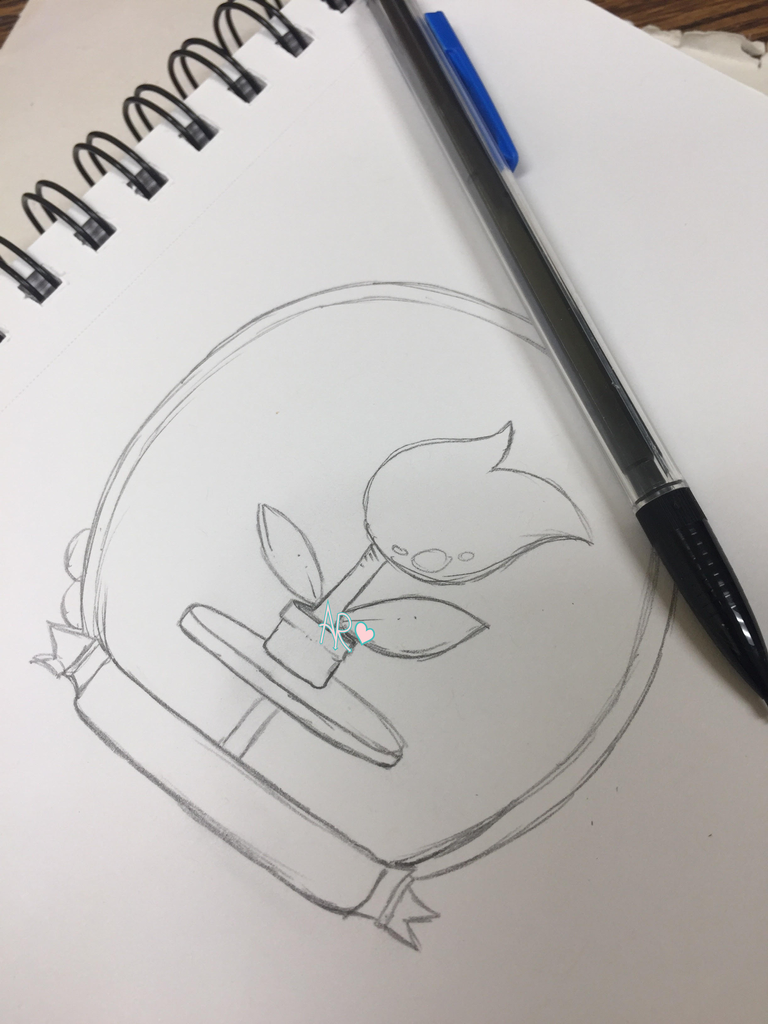
I decided to make a potted plant. I thought I may build off of it and thought maybe do like a cactus with a couple of it's "branches" becoming other plants but I made this sketch and really liked it so I decided to make it my focal point.

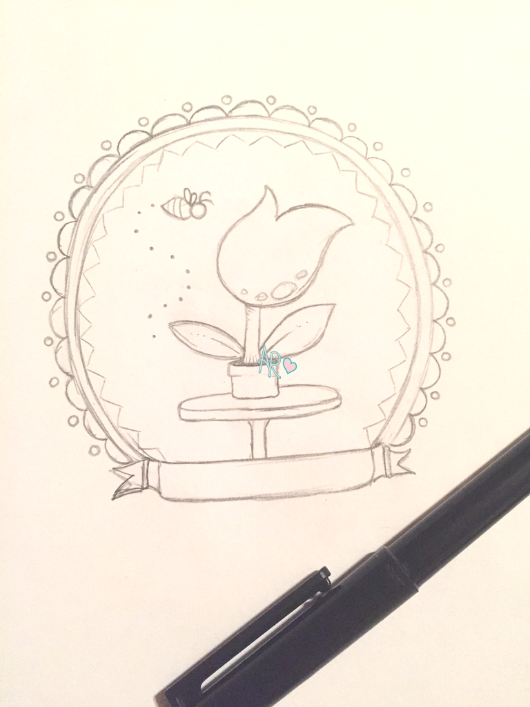
Once I did the plant I realized it needed to sit on something, hence the table and then I added the ribbon because I decided pretty early on that this would be a Mother's Day kind of doodle. Because doodles do tend to have patterns and what not I decided to really just incorporate that into the border and background of the image to really make the flower pop.

So above is my finished sketch, as you can see I added a little bee to fill in some of the open space, and I do love bees! I also really elaborated the frame and gave it some cute elements with the scalloping and the circles ... I think dots in general are just cute. I wanted to add dots to the background as well but decided instead to do this after colouring. Since everything was looking very round, I decided to contrast that by doing the zig zag pattern on the inside of the frame.
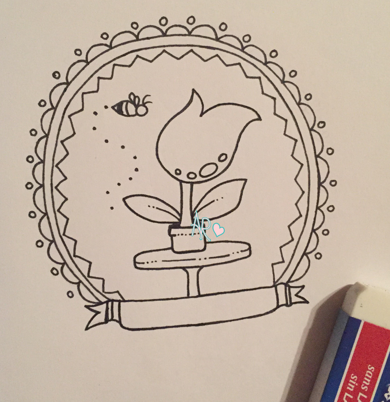
Then I inked it!

Since I wanted a simple design I didn't do a lot in the way of line thickness here. I wanted the lines to all be the same width to keep the kawaii/cute feel to it. Instead when I wanted to add some kind of texture you can see that I would break the line by stopping, adding a couple dots in a row then picking up the line. This keeps the lineart looking dynamic and interesting without losing the style I was going for.
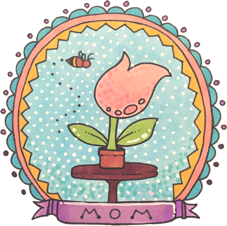
And finally, you can see the finished piece. I did a quick colour with copic markers, then used my gelly roll to finish the job. I think it turned out pretty cute!

There were a couple things I wanted to do but forgot, and I got lazy on the right side of the flower pot and put the little dots further apart :P but on the whole I think it's just a cute little graphic and since it made me think of my Momma I made sure to add a cute little "MOM" to the ribbon!
I will add this line art to my site in the future, probably closer to the end of April in honour of Mother's Day, if you like it you're welcome to snag it up on my site: http://www.scrapndipity.com
Cute! @bpinkie! :)
Thank you :)
This is very cute @bpinkie
Thank you for doing the contest I had fun :)
Thank you for dropping by and appreciating my entry @bpinkie.
Love your kawaii interpretation, all the details fit really well together.
Thank you :)
You did a fantastic job on this, very cute!
Thanks so much!
Most welcome!
Your art is great, I hope I can have copic too but it's quite expensive here lol! The color effect is blended well....
Thanks Tonie, yes they are quite expensive and I don't have a lot but I really do love working with them :)
My friend she's using copic too and she said it's nice to use... :)