I guess, working for so long as a graphic designer, it somehow became professional deformation analyzing logos, posters, typography or even the tiniest element of any graphic concept. You know, it is something like solving a puzzle and it engages your full attention. Just imagine yourself trying to solve every possible puzzle you see around!
I am very new to Crypto Currency market, and I saw there are so many coins out there, different designs, values... but me, like most among you - we build a trust to a product through its brand.
On a daily basis, I tend to keeps things very simple… simplicity in design is very important too. Simplicity is about subtracting the obvious and adding the meaningful. It’s about making something easier to understand. We have to know through thinking process when something is simple enough – but not more than that – not to obvious, therefore, simplicity is not quite easy to achieve.
So, what Branding is?
(I will try to be as short as possible)
When I started my own graphic design studio long time ago, people asked designing a logo, business card, letterhead etc, back then, a company’s logo was their image. Later, companies faced marketing growth, getting stronger rivalry, and there was a need for something more than just a logo, something that will distinguish them from others, but they wasn’t quite sure what’s that, and believe me, actually a lot of companies still don’t know!
While a logo is an image that identifies your business in an unforgettable and appealing way, it’s best to keep it simple, and it has to be unique. Brand is much broader. It tells your customers what you offer and how you’re different. Your brand is the public face of your business. You could also consider using slogans, which are an important part of branding as well. Typical definition for a slogan would be “A short and remarkable or memorable phrase used in advertising”. There are various types of slogans; they are used to convey true messages about any event, service or product. As far as I know – none of altcoins has a slogan, so be the first one to use it!
Some of the best advertising slogans: Nike – Just do it! Apple – Think Different!
KFC – Finger Lickin’ Good! Red Bull – It gives you Wiiiiiiiings! Etc.
What happened when I saw Steem logo for the first time?
The very first time I saw Steem logo, I thought: Have I seen this logo earlier or something, because it looks very similar to something I’ve seen before? What these triple S letters mean? If it’s not S letter – then it might be a symbol? Is it Steem or Steam? Is this logo something like Coffee, tea or food steam?
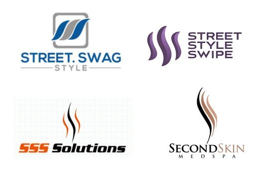
In order to get a close Idea of what I just saw, I needed to do some researches. First I checked if I can find similar logos. After some google search I found some quite similar logos.
Concerning this point, it was obvious that Steem logo is simple but not unique; there are several companies with almost the same logo.
Then, I’ve checked dictionary:
Steem - (obsolete) A gleam of light; a flame.
I couldn’t find a connection between the Steem definition and Steem logo, for me, the steem logo was something more like Vector symbol of STEAM, therefore I was thinking, what would look like, if we ask a kid draw a Steaming Cup of Coffee?

You know, I was very happy finding this because from the very beginning the only thing relating to the Steem logo was a steam.
Then, I next goggled for Steam Vector to take further my supposition, and I’ve found these results:
If this is the case, then I can firmly say that, Steem logo:
- Is simple, and it is good to be simple, but it’s too obvious
- Not unique
These two indicators are quite good facts that you need to go rebranding.
Can you guess what Rebranding is?
While above we mentioned shortly what Branding is, you can guess what Rebranding is. It is not simply changing your corporate logo, color palette, or your graphics. It is a change in the way you communicate with your customers, the way you do business etc. Sometimes, a true rebranding is changing your company name, as we evidence something what Antshares (ANS) is going through – The ANS asset symbol will become NEO in the 3rd quarter of 2017. The NEO team is working on new clients and a UI for the new NEO brand. So this is a big fact for me that they are going to be very serious in this business and as I mentioned in the beginning “we build a trust to a product through its brand”.
But, Steem doesn’t need to change its name in my opinion, I like it, and I like the way they are trying to find their place in this market, but in order to achieve it easier and faster, without any doubt they need rebranding, and it is not something they can do it fast!
I have strong confidence that Steem is going to be BIG, therefore, in my opinion they should consider rebranding as a first priority.


Great post @mikullovci! I agree that Steemit could benefit from a rebrand. Their user interface (I know it's still in beta) is pretty outdated as well, and doesn't offer much in terms of flexibility for typography.
In terms of the logo, I think it's so important, just because the crypto vertical has so many very well designed brands. When crypto is all about trust, the logos need to communicate that.
Yes, especially user interface, very well said.
Flexibility.. hmm I've just spend enough long time trying to transfer some STEEM to STEED DOLLARS inside my account and I gave up at the end. I wanted to promote this article and bought some STEEM and then I saw that I can promote it only using STEEM DOLLARS. I never understood why! It kinda reminded me when in 90's I had to shut down windows 3.0 in order to run another application in DOS. Shouldn't things be more easily nowadays?