Hello Steemians! Markets are crashing everywhere 😔. While everything is looking all doom and gloom, allow me to lighten up the mood a little 😂. Yesterday, I made a post on a new Steem web interface, Steeve. There are many who commented and to my surprise, it seems that there are still a good number of Steemians who are not aware of alternatives to Steemit.com.
In my attempt to educate the public a little, I am writing this post to showcase the 4 Steem web interfaces that I know of and get you to tell me which one you like the most. The top 3 comments (entirely ranked and determined by me 😎) will get 3 SBI shares from me. Feel free to also share any other Steem web interfaces which is not listed here. Without further ado, here is the summary of the 4 Steem web interfaces that I know of.
Steempeak.com
Steempeak is an interface which is being developed at a rapid pace and is quickly gaining traction. It offers a grid layout for your feed which is something not found on other interfaces. On top of that, it has a "Tools" section with some in-depth data analytics on your profile. It also has a Witness section for you to vote for witnesses easily and a feature to help you calculate what is the "Guaranteed Steemit Minimum Income / Voters" based on past voting activities. Overall, it is an awesome interface with loads of neat features that can really help with your blogging.

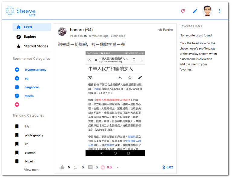
Steeve.app
Steeve is a relatively new interface. Its focus is on helping fellow Steemians discover good contents through the use of AI. It has a nice user interface. However, having just launched its public beta less than a month ago, it is still lacking some features the other interfaces have already built in. For instance, notifications system and the funds transfer system are not available yet. That being said, the whole idea of using AI to customize your feed is a great and I am looking forward to future developments from the team.

Busy.org
Busy has been around for sometime and it is probably the second most popular interface other than the default Steemit.com. Being around for a while, Busy.org is a rather well-polished interface with most basic features that you need on your Steem journey. One unique feature on Busy is the "Interesting People" section. The section will generate some Steemians who you might be interested to follow which aids you in discovering more content which you may like.

Steemit.com
Last but not least, the first Steem interface ever built. I think there is not much introduction needed. It has all the basic functions you need to interact with the Steem platform and nothing more. These days, I do not post on Steemit.com anymore, however, I am still using their currency market to convert SBD to STEEM.

So, tell me which is your favorite interface and why. Try to restrict only to pure web interfaces, so mobile apps like eSteem and Partiko are not counted. Thanks for reading and shill me your favorite Steem web interface now to win some SBI shares!
Projects/Services I am working on:
You can find me in these communities:


Steem web my favorite today is Steeve, even though there are still obstacles to the transfer process, but I'm sure it's not a big problem, if in view of the ability which is owned by @void @mor and @hr1
so I dare say STEEVE is the best project in the future
Posted using Steeve
Hi, thanks for the comment! Steeve is really promising, if Steeve can partner with Steempeak, I think they will be able to creare the best interface. :)
Posted using Partiko Android
I think so too, but for now the surfing experience that has been given Steeve to steemian & steevian is already very good..
Keep smile
I will try to break down my answer into two parts: one that I use for posting and one than I use for browsing and/or commenting.
Probably the best Steem web interface for publishing blog posts is Busy.org, as unlike other Steem platforms (ESteem, DTube, etc.) Busy does not take any cut or beneficiary rewards. As a matter of fact, just by using the "busy" tag as one of your tag/category will "guarantee" you an upvote from their busy bots provided you have enough followers_mvest.
There literally is no downside to using Busy and one might even get a decent upvote from them.
One problem I see though is that they don't have the "Night-Mode" feature. As someone who has a somewhat sensitive eyes, I honestly can't stand browsing in Busy with those too bright white plain background. It will trigger my migraine XD
So what I use for browsing and commenting is Steemit.com (when I'm on desktop/laptop). I have used Steempeak before which also has a night-mode feature but I still prefer Steemit.com's simplicity. For some reason, I just don't like Steempeak's UI. Sometimes the image is too large or a whole post is just occupying too much space? Idk XD
So yeah! Busy.org for posting and Steemit.com for browsing/commenting.
Just dropping by to mention that Steeve now has a night mode ;-) You can turn it on by clicking an button to the right from your avatar.
Posted using Steeve
Niceeeeeee!
Test! This is my first comment via Steeve! XD
I think it would be better to clear the text field once the user has already typed something instead of still displaying "Leave a comment" :)
Posted using Steeve
Yeah, you are right that it looks better. The change is being deployed as I am writing this comment ;-)
Posted using Steeve
Great to see continuous improvements on the interface. Even better to see the team listening for feedbacks from users!
Posted using Partiko Android
@steeveapp is also not taking any beneficiaries, unless you configure it to do so. And you are not the first one to complain about interfaces not having a night more, so I guess that I will implement that as the next major feature ;-)
Posted using Steeve
Interesting.. I thought Busy is taking beneficiary rewards. At least that was my impression. Haha.. anyway, thanks for the in-depth review!
Posted using Partiko Android
I completely switched to steempeak.com, it´s design and number of features are awesome, especially the management of draft posts I like.
No night mode would be a clear no-go for me.
Not to forget, sometimes I use dclick.io to post, this puts an ad at the end of the post and creates - in theory - an additional way of monetization. I think this has huge potential, but it is not that frequently used yet.
Yup! I also like all the small little features that they have. Overall it is just a much better user experience for authors
Posted using Partiko Android
Very interesting post cause i have numerous times mentioned the interface issue and how big it is. I haven't use any of these interfaces primarily cause i am used to that one but i know a thing or two about the others. First of all, busy is the first interface so it had more time than the other 2 to grow bigger. The main reason most people using it isn't how good the interface is but because of the community and votes they get. I have to mentioned though that i keeps a % of your post payout if you write through the app something that i don't like.
Steempeak on the other hand is quite new so it has room to grow. It seems cool but needs a stronger community. Also, as far as i know if you write through it you don't pay something, which is +++ for me!
About steeve i don't have an opinion yet
Overall i think that a new interface is needed and i believe that destiny will play this part. Although all of the above (except steemit) have a community and are better than the original the people that will search for steem will see steemit as their first option. So either we need to change steemit interface and by that i mean steemit inc or by making an app so huge that google will show that one in advance!
Hi @filotasriza3, thanks for the comment. I have read that busy.org takes beneficiary rewards, but I am unable to find out exactly how much. Do you know what's the exact percentage they take from each post?
Posted using Partiko Android
sadly i don't remember i think 20-25% 1-2 months ago i had calculated if it's worth the upvote you get from them. At that time the answer was no it was definitely not worth it. I don't know if that changed though or recall the exact % they take
@Culgin, your contests are always amazing and encouraging. Thank you for this one.
I have used about 10 web-based Steem interfaces including Steemit.com, Busy.org, Ulogs.org, Steemgigs.org, Fundition.io, steemhunt.com, Oracle-d.com, Dtube, the defunct Dlive and Steeve.com
All these interfaces do have their uniqueness and I must salute the initiators for that. Steemit.com is the most used by me, followed by Busy and Ulogs in that order.
My love for Busy has been amazing especially during my early days when I wasn't familiar with "Markup language". Busy makes it simple by having the language formating embedded in tabs. Steemgigs and Ulogs tried functioning in that regard too.
However, the most recently used interface - Steeve.com seems promising as I can see features such as not present in other interfaces. Uniquely, the Resteem count button which shows the number of resteems a post has is quite amazing. Moreover, the star rating and "blue-coloured" quotes are wonderful features.
Busy is currently my best, but Steeve.com has great prospects to become my favourite.
Thanks for the reply @uyobong! I won't regard steemgigs, fundition, steemhunt, oracle-d and dtube as web interfaces though. I think they are apps with very specific purpose and not meant just to browse all Steem content
Posted using Partiko Android
Thank you for theinformation
Hi @culgin!
Your post was upvoted by @steem-ua, new Steem dApp, using UserAuthority for algorithmic post curation!
Your UA account score is currently 3.309 which ranks you at #7662 across all Steem accounts.
Your rank has improved 1642 places in the last three days (old rank 9304).
In our last Algorithmic Curation Round, consisting of 404 contributions, your post is ranked at #154.
Evaluation of your UA score:
Feel free to join our @steem-ua Discord server
I literally just discovered Steempeak.com through a comment on MSP/PAL Discord made by my friend and partner in crime as station manager on MSP-Waves @r0nd0n.
I have to say, I never warmed up to Busy.org much, nothing wrong with it - it's just not me.
But Steempeak gives an entirely different experience of Steem based blogging, and I think it brings the fun back into browsing, commenting, posting. I even pay more attention to my feed, which, in all honesty, I have dreadfully neglected using Steemit.com.
There we go. Let's see how this works out on a daily basis. Steeempeak.com is bookmarked for now.