Cool, you'll have to let me know if they match up to what you are thinking with regards to curie.


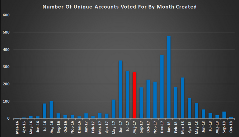
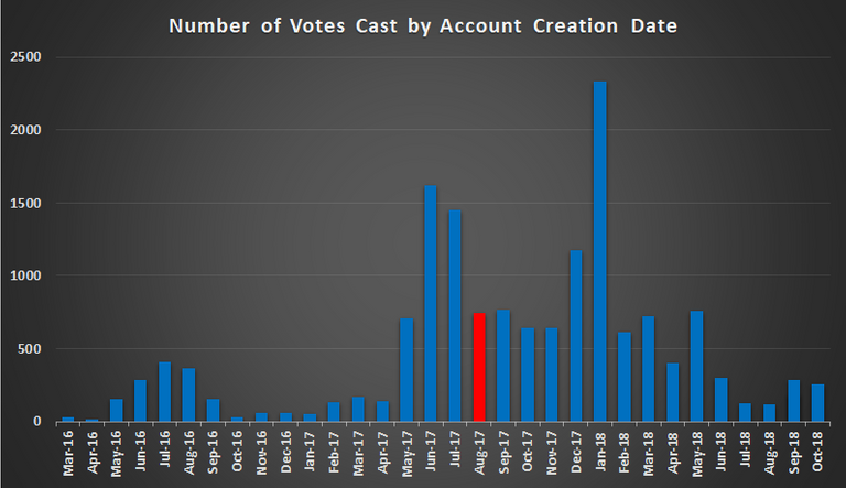
I'd say your charts generally follow the overall account creation numbers, which I think is a good sign relating to spreading vote around. And following on from that, I think it would be quite tough to guess your join month.
Total SP by Account creation month - Nope, I don't think I've checked that one before. It shouldn't be too hard to pull and I may have a look today. I'm guessing the chart will look a bit farcical, with the March 2016 'speck' holding massively more than the January 2018 boom. Probably slightly better if the Steemit Inc accounts were removed, but I still think the early accounts hold the vast majority of SP. You would hope that in time there would be some distribution, that's the goal apparently, although owned stake = more stake incoming, sooo... :)
Oh and Mike, what happened to the last 3 months? :D :D :D
Yup.. you get a general bell curve from when I started with Curie until I had to put on the brakes due to my changed job position in early 2018. That all looks very much like expected.
Once I took my promotion in January of 2018 I didn't have time to goof off on STEEM during the work day anymore. More responsibilities, less time to curate.
As my travel schedule has ramped up, I have barely had time to go through my feed, let alone curate any new users.
Eventually I hope to find some time to curate again, but probably not to the level of being a Curie Curator. Not unless I win the lottery, or STEEM hits $1000 and makes me enough to quit my job.
For now it is just hanging on and trying to interact where I can.
Thanks for the effort Asher!!