
Hello steemians! Today, I'll be explaining in details the steps I used in making my design idea for the "State of SNDBOX" thumbnail.
First off, my graphics design software for this design is exclusively CorelDraw X7 and I am working on a Windows 10 OS.
Next, the steps.
1. Text/Typography
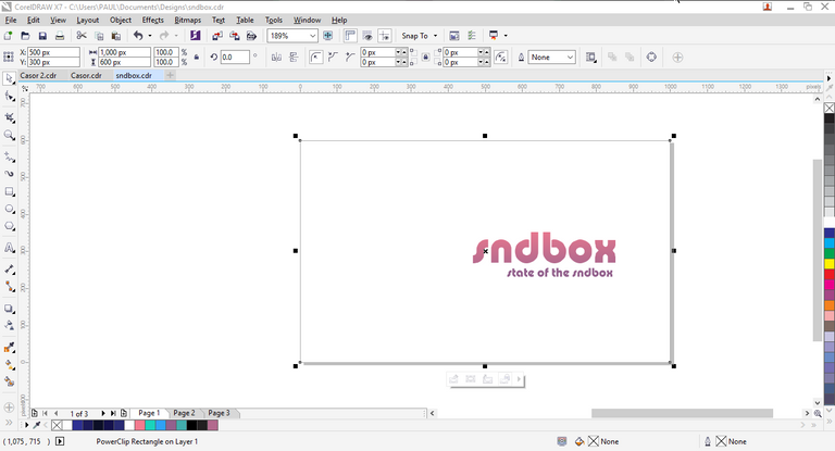
This is one key part of graphics design in that it passively registers the concept of the design to the viewer. Bold texts, like 'rockwell' or 'impact' will look too serious in a thumbnail to me as a viewer. So in this light, I chose 'Pump Demi Bold LET', this font style feels like something in between fun and seriousness.
2. The Fancy Strokes
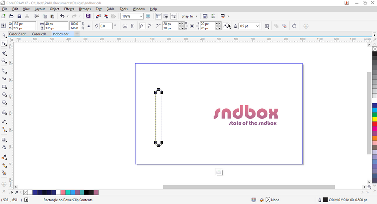
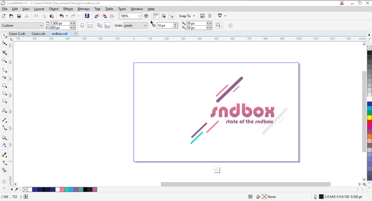
Still in the vain of making a semi-formal design, I decided to add some shapes, shapes which reformed into simple fancy strokes. Some images below further illustrates this.
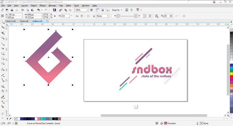
3. The SNDBOX logo
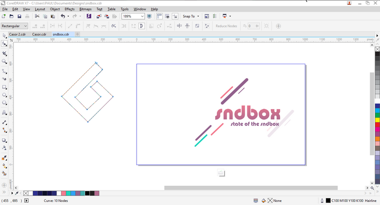
I got a little more fancier here, I hope it doesn't count against me though. I did a little switch from the conventional diamond schema to some other shape (🙊I don't know what shape that is). See illustration below
4. The Watermarks
Life shouldn't be complex rather, it should be
simple and sweet
-Jon Bellion
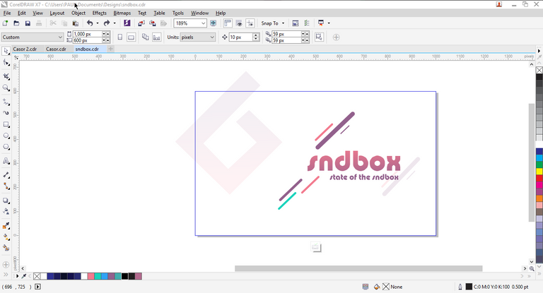
So, as usual, I made this simple too. I took the modified logo, duplicate it then made it very opaque- almost a see through! This is my new watermark.
5. The Colour Scheme
As is a part of the rules and requirement of this contest, the colour scheme is shown in the picture below.
As regard how I managed to pull the colour arrangement off, that was just emotion-driven inspiration, there's no pattern it!
6. The Finishing
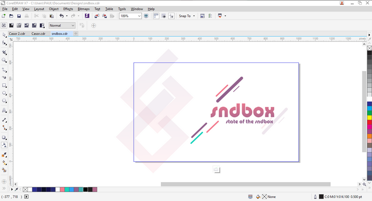
To make work the beauty that it is, another array of arrangement is made and_ power clipped_ into the design sheet giving it the beautiful outlay shown below.

I hope you enjoyed this session. Thanks for staying tuned and have a nice day!
This is so beautiful, I hope you win. I'll work on mine too.
Thanks man, I hope I win too. I'll love to see what you'll come up with.