Back in the day, SEO was completely separate from UI and UX, you would make your website, throw some keywords in and call it good, but – oh boy! – how times have changed. Not only is Google placing less and less focus on keywords but search engines even have algorithms that analyse the usability of your site and this too will now affect your ranking online.
And don’t think that this is only for desktop sites – having an interesting and usable mobile site is paramount as this too plays into your online rank! Click here for tips on mobile web design.
Over the years, Google has been moving its algorithm around to better suit searcher needs and to favour sites that give something back to the internet i.e. blog posts, posting photos, videos etc.; these tendencies have only been getting stronger and stronger. Now with more complex algorithms looking into the usability of a site, including the existence and quality of the mobile site, we can be pretty sure that this tendency from Google will also get stronger over the years to come.
How to optimise your site for UX and UI
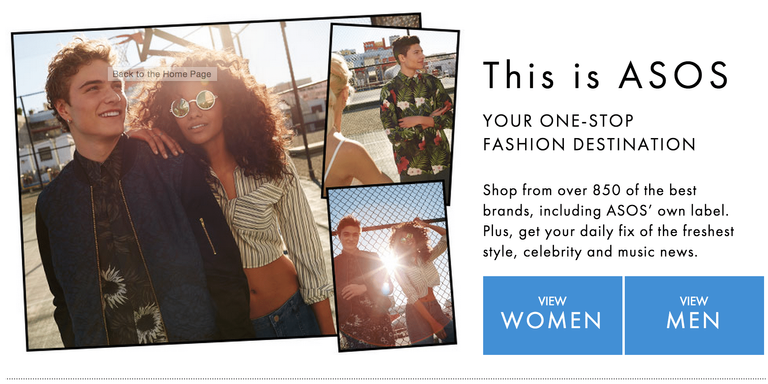
This is no easy feat – many people spend years at universities around the world learning how to design and optimise websites – but there are a few elements that you can apply to your site that will dramatically change the look and feel of the site. First up, image navigation: head over to ASOS and have a look at their homepage. Right from the get-go, ASOS divides the users into two categories: men and women. With one simple click on two large image-based navigation buttons, ASOS has moved everyone to where they need to be. This is simple with no menus: just big pictures and text – beautiful!

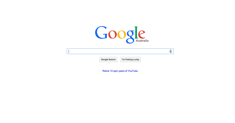
Second up, negative space. Filling your pages with content can be a good thing – having lots of text, pictures and links works very well; indeed, just look at Youtube, the third-most visited website of all time. But by having lots of negative space, like the Google homepage, you can create a fantastic sense of importance to your content that emphasises the elements you already have on your site. Remember the designers of Bauhaus in the early 20th century – less is more. Often, it is advantageous to place lots of content deeper into your site so people can click through and explore the site even more; this can also lead to better chances of conversion. However, on the homepage, simplicity reigns supreme.

Implement these basics into your site and see your rankings soar. If combined with other SEO tips and tricks like dynamic content, Proper Content and Hierarchy optimisation and other marketing tactics such as remarketing, there will be a good chance that your website will rank first!
Hi! I am a robot. I just upvoted you! I found similar content that readers might be interested in:
https://seomelbourne.com/seo-optimisation/seo-user-experience-and-user-interface-design/