In the last tutorial you have seen how to set up a research environment and acquire cryptocurrency OHLCV price data for a single asset. In this tutorial we will extend this skill to automating data collection process to multiple crypto-assets. We will proceed to perform exploratory data analysis and visualisations on these data.
Bulk Data
In order to conduct useful analysis on multiple price-series, we first need a way to acquire and meaningfully combine the data together for analysis. To do that, we will modify our data acquisition function to not only load the data into a dataframe, but also save it as Comma Separated Value (.csv) file:
def CryptoDataCSV(symbol, frequency):
#Params: String symbol, int frequency = 300,900,1800,7200,14400,86400
#Returns: df from first available date
url ='https://poloniex.com/public?command=returnChartData¤cyPair='+symbol+'&end=9999999999&period='+str(frequency)+'&start=0'
df = pd.read_json(url)
df.set_index('date',inplace=True)
df.to_csv(symbol + '.csv')
print('Processed: ' + symbol)
To make use of it, we need to make sure that all the needed modules are imported and that we can plot our graphs inline:
import pandas as pd
import matplotlib.pyplot as plt
%matplotlib inline
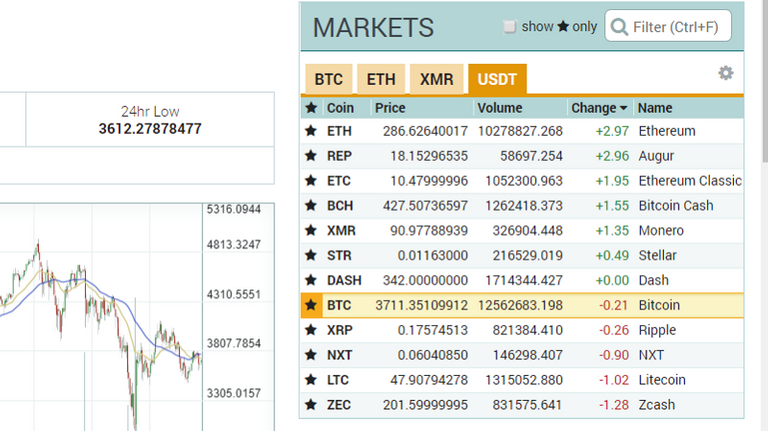
Further, we need to define a list of tickers that we will loop over, thereby performing the data-fetching function on each of them. We are interested in tickers denominated in USDT. On Poloniex, they would be located under USDT tab in the Markets window:
Enter the full list:
tickers =
['USDT_BTC','USDT_BCH','USDT_ETC','USDT_XMR','USDT_ETH','USDT_DASH',
 'USDT_XRP','USDT_LTC','USDT_NXT','USDT_STR','USDT_REP','USDT_ZEC']
To download the daily data for all of these, we will use a for-loop whereby we apply CryptoDataCSV() with daily granularity to each ticker:
for ticker in tickers:
    CryptoDataCSV(ticker, 86400)
You should see the following output:
Processed: USDT_BTC
Processed: USDT_BCH
Processed: USDT_ETC
Processed: USDT_XMR
Processed: USDT_ETH
Processed: USDT_DASH
Processed: USDT_XRP
Processed: USDT_LTC
Processed: USDT_NXT
Processed: USDT_STR
Processed: USDT_REP
Processed: USDT_ZEC
Also check that the directory from which you are running the notebook/script now contains the CSV files:
Pandas provides a nice way to then load CSV file into a data frame via pd.read_csv() function.
Combining Currencies into a Single DataFrame
Now that we have the data locally, we want to combine closing prices into a single dataframe. Note that we will not be including Bitcoin Cash (BCH) into the dataframe as that would mean dropping days for which there was no BCH data. Hence, we need to redefine our list of tickers to reflect that:
tickers =
['USDT_BTC','USDT_ETC','USDT_XMR','USDT_ETH','USDT_DASH',
 'USDT_XRP','USDT_LTC','USDT_NXT','USDT_STR','USDT_REP','USDT_ZEC']
Let us now initialise and populate a dataframe of closing prices:
crypto_df = pd.DataFrame()
for ticker in tickers:
    crypto_df[ticker] = pd.read_csv(ticker+'.csv', index_col = 'date')['close']
crypto_df.dropna(inplace=True)
Inspect it by running crypto_df.head().
Manipulating and Visualising Multiple Price Series
Now that we have all the cryptos in one dataframe, let’s visualise the relative performance of the currencies. To do that, we will divide the whole dataframe by the first row, normalising it such that the first entry will be 1 for all currencies and subsequent cells within columns will represent respective percentage gains:
crypto_df_norm = crypto_df.divide(crypto_df.ix[0])
Pandas almost seems to know what you want to do when you call various methods. In order to visualise multiple price series at once, call crypto_df_norm.plot() and that will plot and label all the series on the same chart:
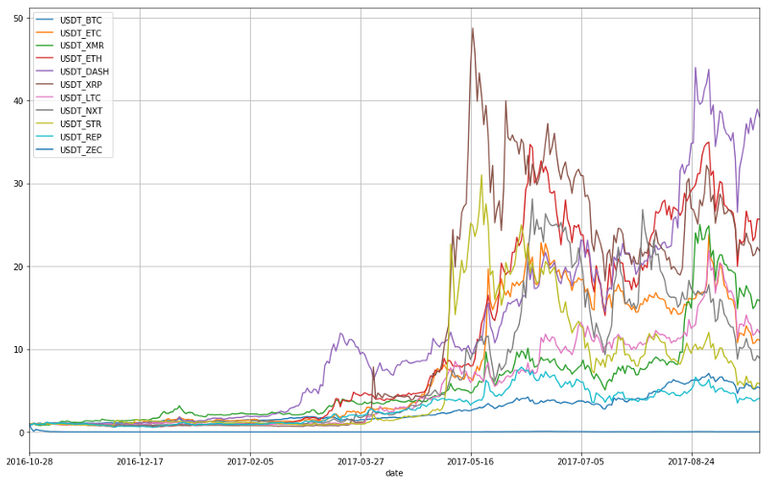
Last half year has indeed been very volatile and active period as we saw inflows of “new money” into the markets. In order to do truly meaningful analysis, however, we need to work with percentage returns, which we can easily achieve by running:
crypto_df_pct = crypto_df.pct_change().dropna()
A lot of the time we want to inspect the correlations of the assets’ returns. In pandas we can obtain the correlation matrix by calling:
corr = crypto_df_pct.corr()
To visualise the correlation matrix, we will use seaborn library — an awesome Python visualisation module.
import seaborn as sns
sns.heatmap(corr,
            xticklabels=corr.columns.values,
            yticklabels=corr.columns.values)
This should produce a neat plot of the correlation matrix:
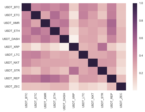
From the matrix, we can see that the cryptocurrencies tend to mainly move together, at least against the dollar, as confirmed by all correlation values being over 0. We need to bare in mind that our data starts from October, 2016, which marked the start of the period of exponential growth in many cryptocurrencies simultaneously.
Drilling Further
From here, we may wish to analyse a relationship between two highly correlated currencies. From the correlation matrix it looks like Monero (XMR) and Dash (DASH) are highly correlated. We can double check the correlation by running:
corr['USDT_XMR']['USDT_DASH']
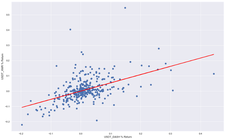
Which should yield a correlation coefficient of 0.493886. A scatter plot of respective returns can now be plotted as follows:
plt.scatter(crypto_df_pct['USDT_DASH'],crypto_df_pct['USDT_XMR'])
plt.xlabel('USDT_DASH % Return')
plt.ylabel('USDT_XMR % Return')
Which should give a us a visual representation of currencies’ respective returns plotted against the counterpart:

The relationship looks linear for most data points, but seems to be chaotic for extremely positive returns, exhibiting a "fan-like" relationship. We have given one quantification of the two series of returns already, however correlation coefficient gives us a value normalised by standard deviation to be between -1 and 1. Further breakdown of the relationship between Monero and Dash can be obtained by conducting one of the most popular statistical techniques performed on returns series — Linear Regression. Many economic theories and pricing models are built upon linear regression. Anaconda includes statsmodels package, ideal for statistical analysis and machine learning of varying degrees of complexity. It provides a great interface for performing linear regression and is very intuitive to use, especially with pandas dataframes. To make use of it, we need to import and initialise a linear regression object, which we will have to fit to data that we are interested in.
import statsmodels.api as sm
model = sm.OLS(crypto_df_pct['USDT_XMR'],
               crypto_df_pct['USDT_DASH']).fit()
model.summary()
We first create and fit linear regression object to our data by passing dependent and independent variable to the constructor (yes, in that order!). Since we are examining a contemporaneous relationship and are not testing a particular hypothesis, we do not have a preference for one currency being dependent or independent of another. The code above produces a summary output, giving us essential metrics of linear regression that we just performed.
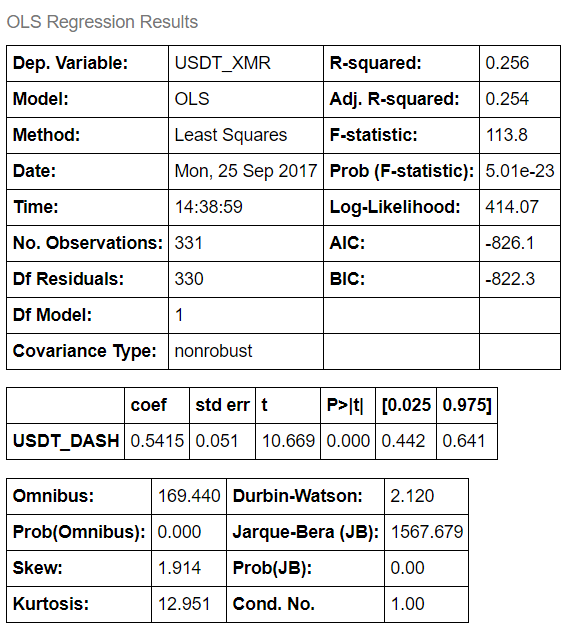
For now, we are interested in the regression coefficient, which is 0.5415 , which can be interpreted as XMR return on any given day is modelled to be 0.5415 of DASH return. i.e. XMR % ret = DASH % ret * 0.5415 . Another value that we are interested in is R-squared, which tells us how much dependent variable variance is explained by the independent variable. It is bounded by 0 and 1. Our R-squared is 0.256 , which means that daily return of DASH explains 25.6% of XMR’s variability of returns. If that sounded like a mouthful, take your time to get familiar with these terms.
We can now visualise the line of best fit on our original returns scatter plot by accessing .params[0] attribute of our model.
To do that, we simply need to create a line out of parameters, which we obtained from linear model and pass them to matplotlib, while keeping the original code that produced our first scatter plot:
line=[model.params[0]*i for i in crypto_df_pct['USDT_DASH'].values]
plt.plot(crypto_df_pct['USDT_DASH'], line, c = 'r')
plt.scatter(crypto_df_pct['USDT_DASH'],crypto_df_pct['USDT_XMR'])
plt.xlabel('USDT_DASH % Return')
plt.ylabel('USDT_XMR % Return')
If you are confused by the first line, don’t be! We are taking advantage of Python’s neat way of creating lists — list comprehensions. Basically, we are asking the Python interpreter to multiply each value of DASH returns by the slope coefficient we obtained from regression and put them into a single list. Result:
Conclusion
In this tutorial we have gone from bulk data scraping to full-fledged data analysis. You can already start to appreciate the ease with which different Python modules allow you to approach you data analysis problems. Linear regression is a powerful technique with many variations and must be understood in detail. It is extremely helpful in analysis of continuous variables, which is mostly the case in finance and trading.
In future tutorials we will be cutting deeper into analysis of digital assets. We will use cutting edge machine learning algorithms to uncover insightful information about these young assets. By the same token (no pun intended), we will be testing strategies that flow out of that analysis. Should you have any issues, questions or suggestions, be sure to leave a comment below.
To stay on top of latest algo-trading developments in realm of cryptocurriences, follow me on twitter!
Once again, please leave your feedback and happy coding!
Congratulations @eliquinox! You have received a personal award!
Click on the badge to view your Board of Honor.
Do not miss the last post from @steemitboard!
Participate in the SteemitBoard World Cup Contest!
Collect World Cup badges and win free SBD
Support the Gold Sponsors of the contest: @good-karma and @lukestokes
Congratulations @eliquinox! You received a personal award!
You can view your badges on your Steem Board and compare to others on the Steem Ranking
Do not miss the last post from @steemitboard:
Vote for @Steemitboard as a witness to get one more award and increased upvotes!