If you think about it, it would be impossible to live in black and white. Everything would be boring and tiring. Colors play a very important role in our daily lives and affect our activities. Did you know that colors can affect your mental and physical well-being? In this article we will investigate the psychology of dangers closer.
The influence of the colors on our lives
Each color has one or more unique features. Learn more about the effects of each of the rainbow colors and how to use them to improve your daily life and achieve the goals you set for yourself.
Red

Red is the most vibrant and sensational color in the spectrum. It's the ability to stimulate adrenal glands and neurons. Because the red color is so intense, it's a great color to go or work out, because it gives energy and increases stamina so you can stay for a little longer. Be careful, however, because too much red can lead to stress, frustration and even anger.
In addition to being stimulating, the color red is also a symbol of love and passion. Studies show that a man will be more attracted to a woman wearing red colors. If you are not a big fan of color, you can always use a small hint of red, for example on the lips or in the hair.
Yellow

When you think of the color yellow, you often associate it with the light and the heat from the sun, and this is the reason why yellow is a powerful antidepressant. When surrounded by the color yellow, the body releases a neurotransmitter called serotonin that is related to feelings of happiness and well-being. Studies have shown that this color improves the concentration and activates the nervous system. It's perfect for offices or other rooms where you need to be able to free up their creative talents.
On the other hand, it has been shown that babies often cry in yellow spaces and some people find it hard to be patient or fall asleep so it is not a good idea to paint the bedroom walls yellow. Last but not least, yellow is a good color to increase metabolism and is a common color in foods.
Blue

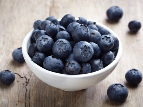
Research shows that blue can cause an explosion of creativity in the mind. In addition, it has been shown that the color has a calming effect. But prolonged exposure to the color blue can cause depression and the feeling of being sad. Blue is also associated with cold as well as seriousness and formality, which explains its use in many company logos.
Our mind perceives blue objects as being easier, so the lightweight weights in the fitness center are often color-coded blue. It is a color that is not usually found in foods as it is associated with toxins and can actually make us lose the appetite (which may be a good thing for people who are on a diet).
Black
Black is a symbol of authority, power, intelligence and knowledge. It is the most popular color in the fashion industry, as it has long been associated with style and has a slimming effect. It is also a bold, aggressive color and is a favorite of sports teams (such as New Zealand's national rugby team, All Blacks) who want to scare or intimidate their opponents.
White

White is the most neutral color that exists, and it is synonymous with purity and somewhat untouched. It is the color of both wedding dresses and baby clothes; Doctors and nurses wear white uniforms. White gives a sense of cleanliness and elegance at the same time. White also has the added effect that it can make the rooms brighter and more soothing.
Green
Green is the color of nature, and is the most used color in interior and decoration due to its calming effect and appealing appearance, which both reduces stress and captures attention. For the same reason, many schools choose boards in this particular color. Customers often spend more time (and more money) in stores with a lot of green in the decor.
Pink
Pink is considered a feminine color, and at the same time is the most romantic color available. It is associated with a sense of calm and parents use it for their children; It is known to calm the monsters and reduce anxiety. Some prisons paint the walls in their common areas pink to keep the prisoners more calm. Even if you wanted, you could not get angry in a pink room simply because the heart's muscles react more slowly than usual.
Purple or Violet
Purple has long been associated with nobility, luxury and sophistication, and anyone who carries this color will embrace riches and elegance. It calls for deep thoughts and spirituality. Little has also been shown to intensify and improve sexuality, so this is a good color choice for the couple's bedroom.
Orange

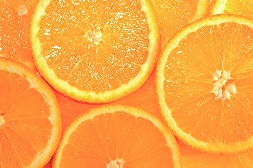
This eye-catching color effect is yellow, and is the best choice in the closet if you want to improve your mood and be more aware and energetic. Combined with red, this color will keep you awake and alert throughout the day. Orange stimulates the mental activity and is good for studying, as it also stimulates the appetite.

Great post!😊
Your interpretation of the colours is very interesting. I was surprised to read that "pink" is supposed to be a calm colour and is even used in prisons.
Thank you for sharing. 😊
Interesting post.
I once read that some places in east Europe where they have these depressing grey buildings that they are trying to use different colors on the building in order to make people happier.
Colors really count on how we feel!
Exactly, also in Copenhagen they do it.
Very interesting.
I also read some articles about how colors make up our sense of sight. Especially in the case of blind people. I read an article before that says blindness corresponds to the lack of colors their brain perceive. Or something around that thought.
This one's really interesting.
Thank you very much, appreciate it!
The below video shows a man's reaction when he sees colours for the first time in his life. https://m.youtube.com/watch?feature=youtu.be&v=hqHlIRZnF38
Haha.. Good one!
Thanks for this post! I have been trying to make rhyme and reason of the new logo.
I will use your post to help me decipher things…sorta’…
Okay, the black in the logo may represent intelligence and knowledge.
The white is supposed to be soothing to the thought processes.
And lastly, the green is appealing in appearance, reduces stress and captures attention.
(Exhale) (RME)
I wish I could say things are much clearer now in explaining the logo…but back to the drawing board.
Again, thanks for sharing.
Peace.
Nice post @tradewonk. It is really interesting.
your skin is the biggest organ we have, for me it is totally logical, that the color sends of a vibrant, that resonance with your feelings. so sometimes when you are in a very blue mood, intelligent, focus, use your mental ability, and you will add Yellow in the surrounding the atmosphere will be less formal, also orange wil help feeling people more comfortable cause it is red and yellow, love passion anger mixed with hope. I love your blog, right up my street ! thank you i will resteem.