Hello people! Aldateacher here again ✌️ and sometimes the life could be a little hard ☠️ it hasn't nothing to do with this but, today i have some new content that could help you in your posts, business, or to make your dreams come true idk the graphic desing is a large world and read this will give you a knowledge that could help you in some part of your life so, let's do it ma friend . This is how to make great desings by aldateacher
First it would be great to know that there are things in life could seem to be quite simple but at the same time are sooooo complex, some of them could be designing a post, flyer, logo or just taking a photo 🤔. Anything that has to do with graphic design is not just creativity, it is knowing how it works and that is why today I am very excited to share with you through my humble experience how professional design is done without the need to be a fucking pro on it, let's go ma Bros

1.- The less you put the better it will look
This is fucking key my compas, and I'll explain why ... Our brain is mechanized to be very lazy, It means that if it is easy to process information it will be faster and effective the message received. Many colors can be difficult to digest, many typefaces are equally exhaustive, the easier it is to perceive, the more accurate and functional it will be.
Check this logotype that everyone has seen before
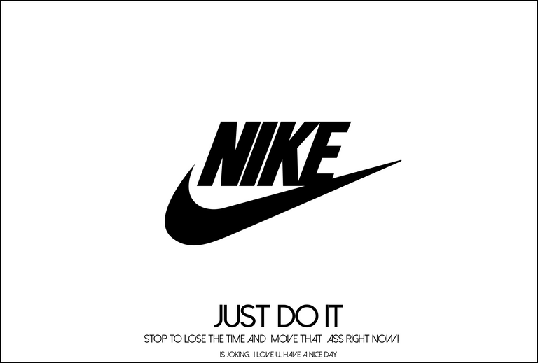
In this logotype we can see only two elements, it’s a kind of cursive line that seems that we use in an approved or confirmed checkpoint, also they added the “nike” that curiously it is in a cursive writing too, to represent that it is something in constant movement like sports.
These kind of things we can take it if we want to create some kind of logo or an advertising. Let's make an example with a design.
Let's suppose that we want to make a sentence placed in a type image like "hello i am the greatest master"
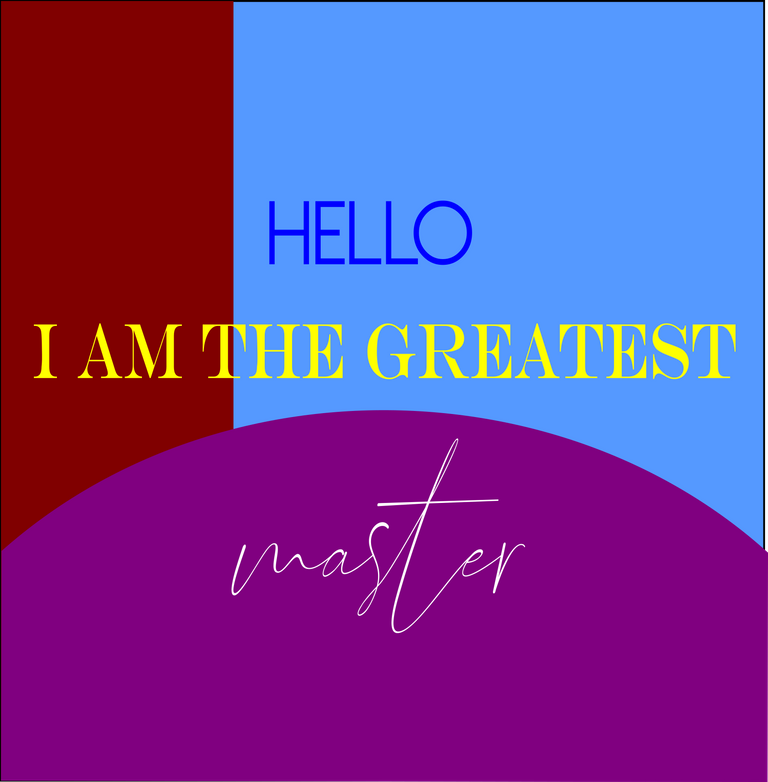
it looks awful doesn't it? In this first example we can see many fonts, colors that are not in harmony or anything, very similar to a PowerPoint slide.
Now let's try following the rules
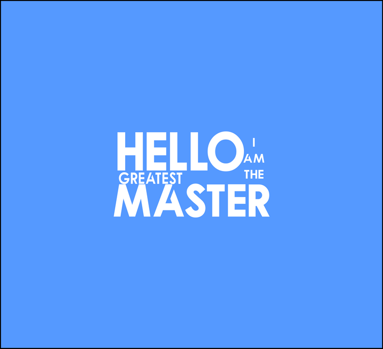
So much better, now you can see it with just a typeface in different sizes and placed in a well-ordered way I which we have a great result like that, simple, but successful.

2- Organization
You may be like me and could be difficult for you to even organize your bed when you just woke up. But in this case those kind of things are not valid, in graphic design it is very important to know where to put things and how. It would be impossible in a single post to tell you how everything should be organized in each design and structure, however, here are some tips from your favorite teacher.
Organize symmetrically
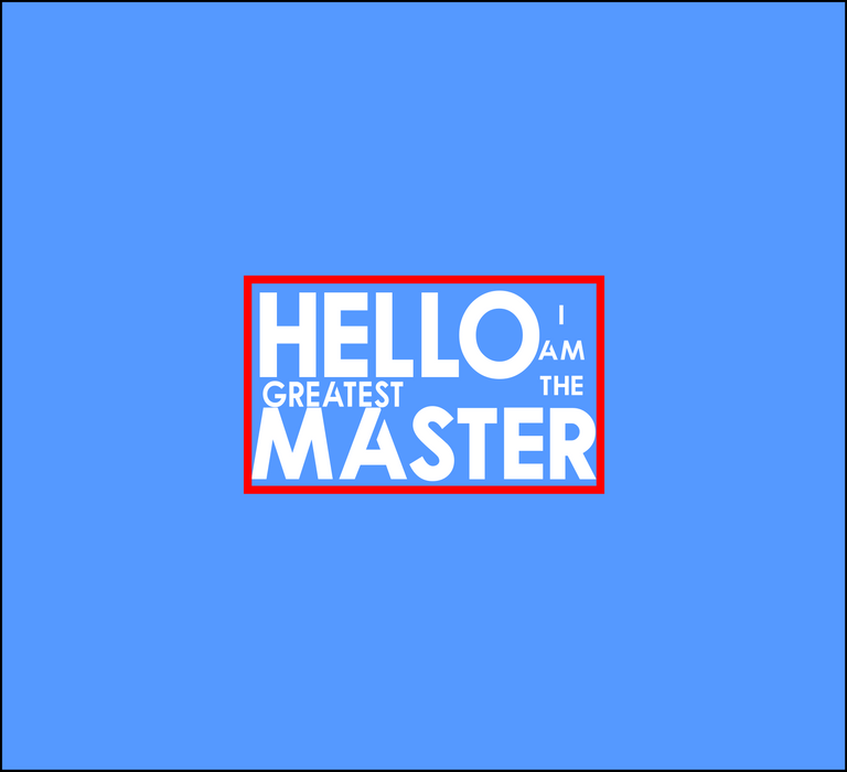
As you can see in the last sentence, all the letters are organized in a geometric figure, this type of symmetry makes the phrase's representation visually more attractive and easier to perceive because, who doesn't see rectangles every day? Well, here is the key ma bros...
At the same time, try to do it with pictures like this
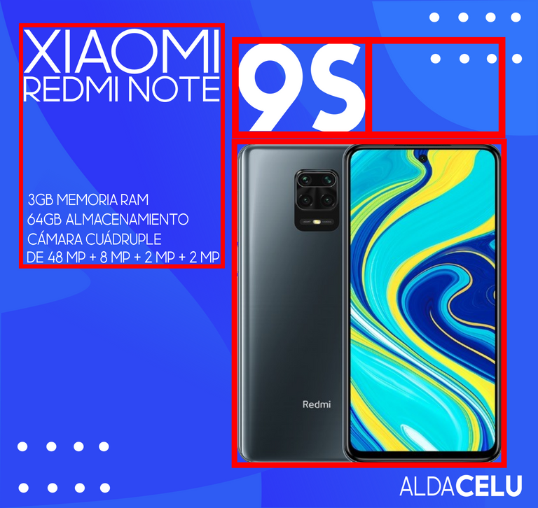
Place the font in different sizes
To make this, just place the word that has the greatest impact in the largest size and then the secondary ones in a smaller size, it will help to capture the person's attention, therefore, they will read the small ones to know the end of the message, example:
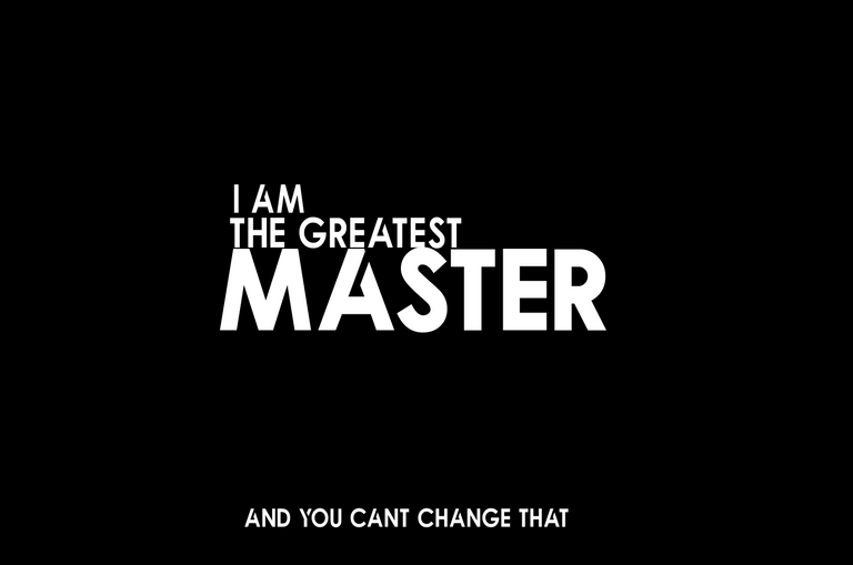
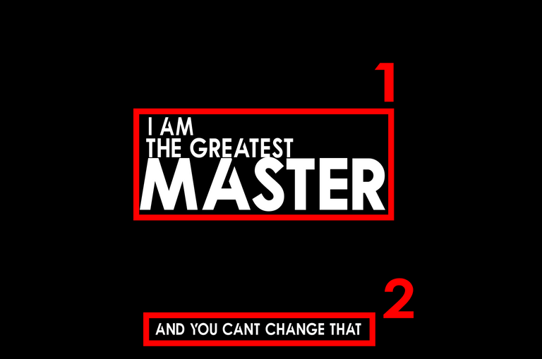
Number one is the most important writing with more impact, number 2 with less impact but well organized at the bottom

3 - Representation
Sometimes we’re crazy and we don’t take the most important thing, representation. With this we mean that if you are going to make an advertisement for fast food, for example, which is being represented by some striking colors of the brand and the type of merch in question, some certain details must be included showing what the brand is. For example, check out a Flyer I made months ago:
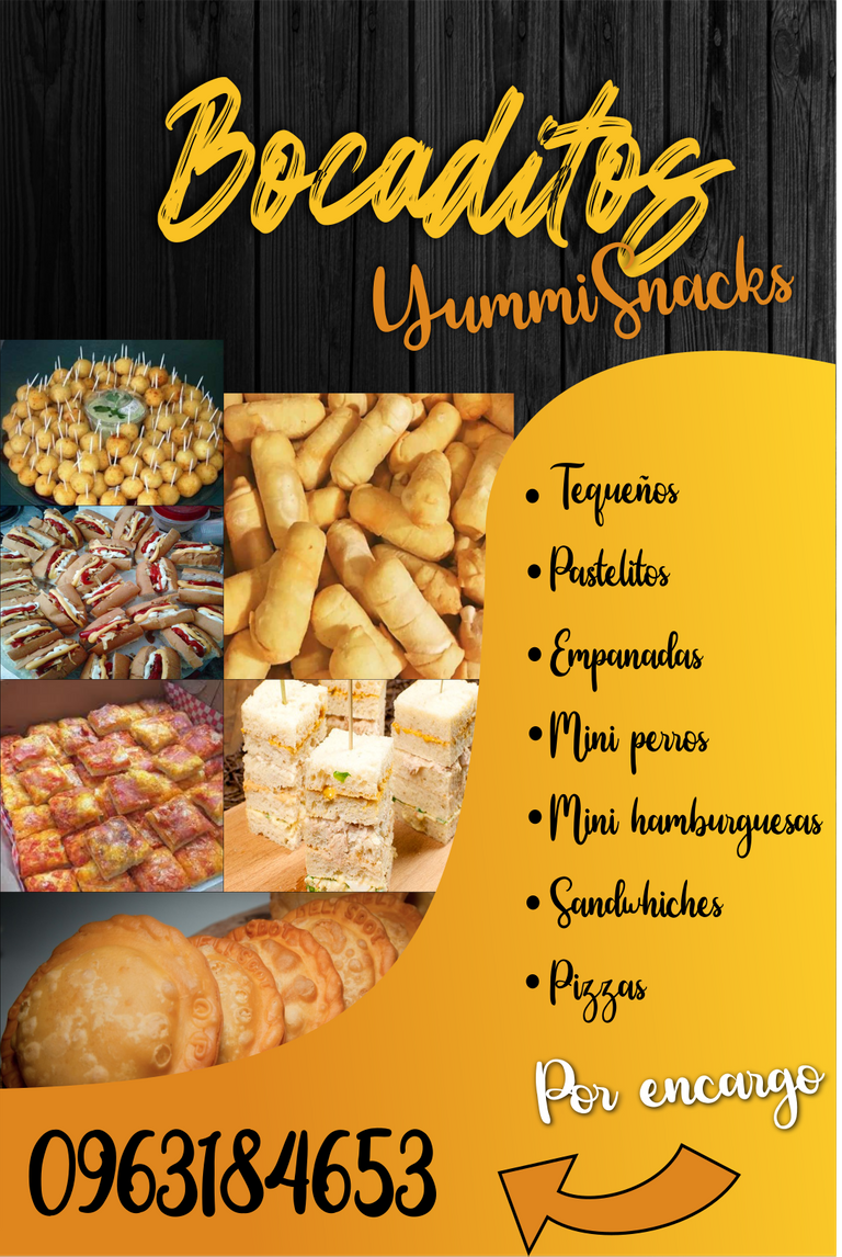
To begin with, the image is super simple (i know), but it is represented with a wooden background that can be related to a table (place in which we serve), the gradient orange color represents the color of the fry which is the product here and the fonts are cursive and childish representing the word “yummi”, a word related to the expression of a child when trying a delicious meal, and also, the commercial name of the company.

4 - The 3F
F#1 Form:
The form is something that is a key when we design, this is what we mean that it must be visually attractive with its colors well-chosen and in harmony and in addition to it, having fonts well-chosen too and following the aforementioned rules, check this post from my marketing services page @Marketeamve on Instagram.

Simple, easy to perceive and with only three colors.
F#2 Feeling:
The message should be delivered in a good way, and what better way than to convey feelings? It means that the message must change the mood of the person when they see your design, you generate an effect of empathy, look at this logo that I made for a kinder garden:
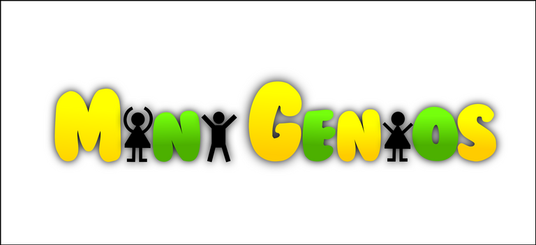
The colors are lively, but at the same time calm, and the pivots (little stick figures) generate a lively atmosphere that transmits joy for those who see it and also you can perceive tranquility that, if you leave your children with them, they will stay in good hands.
F#3: Function
It could be very beautiful and everything, but if it is not for what it is going to be used for, the design would not be nothing. Hard but true hehe, the most important thing about this is that, it must have a purpose, it must be executable, I mean that if it is going to be printed or placed on a page, it must have correct measurements and also be very easy to read and understand. Check out what this Instagram post looks like for a Mother's Day promotion:

With exact measurements for any ig post and totally functional, it is simple, but successful and the purpose is taken, very easy to read and perceive.

I hope all this information has been helpful for you my dear virtual friend, before you go I recommend to download inkscape software, it’s one of the best programs that I use to design, the simplest and above all the best, also it’s free :D
And if you don’t know absolutely nothing about desing you could take these tips and apply them designing in Canva app, it is even easier than inkscape and it is on the phone so, is Great. that's all for today ma friend
I hope you have a nice life and see you in a next post, I am your favorite teacher @aldateacher and i‘ll see you soon
