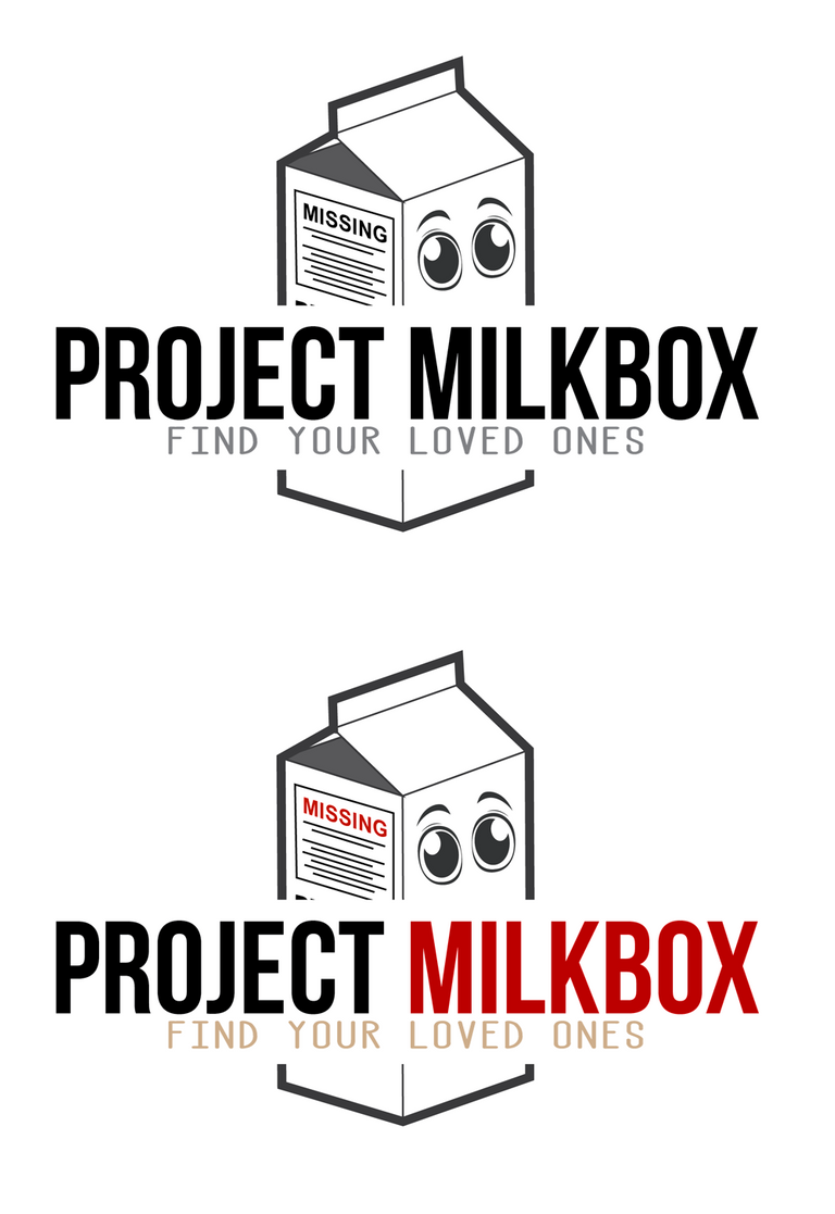
Nice, Thank you for submitting your ideas for this. This is an interesting design concept, very clean and stylized interpretation with the character being "there" but low-key. I like that.
I made some additions to one of your designs (lower left) to play with another variation of it. I added in "MISSING" to the carton, widen the tagline, and add in the bottom of the carton. Also a quick play on adding in color options.
Nice, thanks for your opinion, and I like the "missing" word on it, the colors was the other thing I was about to try now, and see how it works with a couple of combinations, thanks for helping improve it mate, well done.
Nice, Thank you for submitting your ideas for this. This is an interesting design concept, very clean and stylized interpretation with the character being "there" but low-key. I like that.
I made some additions to one of your designs (lower left) to play with another variation of it. I added in "MISSING" to the carton, widen the tagline, and add in the bottom of the carton. Also a quick play on adding in color options.

Nice, thanks for your opinion, and I like the "missing" word on it, the colors was the other thing I was about to try now, and see how it works with a couple of combinations, thanks for helping improve it mate, well done.
I owe this account 8 beyondbits. please give your bts addy so I can send them and sorry for late upvote
No worry man, its ok. My account is fivefive-eleven and thanks for the prize, awesome contest.