Good afternoon Steemit!
It has been a wonderful day so far consisting of many interactions with beautiful people. People who are into this for the same reason as I am: trying to help where possible and in the meantime learning a whole lot.
The responses I'm getting are heartwarming and they get me pumped to start writing my third #photofeedback!
Just a quick reminder: If you want to have your photo reviewed by me, post it on your feed with the hashtag #photofeedback. I will check for new posts with this hashtag all the time!
Well, let's get down to business..
Today I would like to review a photo shot by @tanversaadakash. He has been to the national monument of Bangladesh, of which he wrote an extensive post on his feed. Please check it out at https://steemit.com/nationalmonuments/@tanversaadakash/at-national-martyrs-memorial and leave him some upvotes!
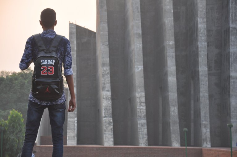
In his article, he posted a very interesting picture of a person (I think it's himself) looking at the monument.

Some first impressions:
- I really like the composition in this picture. The person is standing in 'free space', with the monument on his right. If he would have been standing more to the right, this picture would have lost a lot of its power. The vertical lines of the monument make this picture powerful.
I think that his right arm hanging down as one of the vertical lines, makes this picture better. Because of this, he and the monument flow into eachother. - The colors somehow have a lot of vintageness, I quite like this. They are a bit faded, which is nice, but I think the main subject (him) could use a little more 'pop'. Changing this picture to black and white would put more focus on the lines and structures, which may be nice too (I will try this further in this article).
- In some pictures, cut off feet are very very displeasing to the eye. In this case I don't bother too much. If he was standing on a little wall or something, it may have been interesting to capture his feet too.
- The powerful lines of the monument are nice, but I think they could be a bit more prominent.
- The person walking by next to his left leg is a bit distracting, but luckily it's a very small piece of the picture.
- I like his overall pose and in my opinion the backpack adds to the picture, allthough I don't even know exactly why..
- I think there is a little bit too less space above his head.
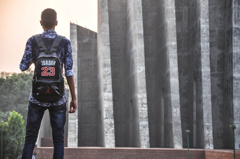
After looking at the picture and noting these points, I made two edits in Lightroom. The first one is in color:

What did I do and why?
- I wanted to accentuate the lines in this picture more and that's why I added quite a bit of contrast. This makes the transition between the dark and bright parts more prominent. The vertical lines immediately look more powerful.
- I wanted to keep the vintage colors, but add a bit of vibrance. This makes the colors come to life, without oversaturating them. To enhance these colors, especially in him, I added some clarity. It makes the picture look sharper and the colors pop out more.
- I dropped the highlights a little bit, to compensate for the sky that was a bit too bright in my opinion.
- I made the whites in the picture a bit whiter. This gives a little punch.
In my opinion, the photo has a little more pop now, which increases its overall quality. Of course this is all personal opinion and perhaps very far from your truth. That's the beauty in photography and art in general :).
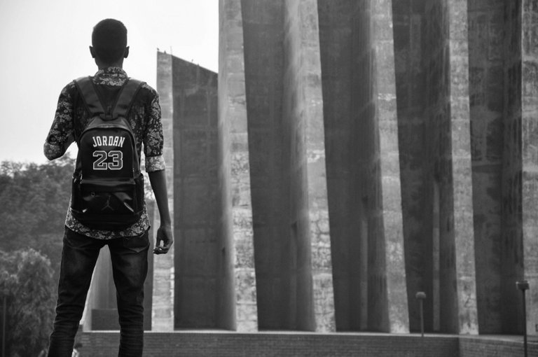
In my second edit, I converted it to black and white:

What did I do and why?
- I converted it to B&W in Lightroom (pretty obvious isn't it?).
- I added loads of contrast, which in many cases makes a black and white photo look better.
- I upped the whites and lowered the blacks. This gives some extra contrast, which I think is very nice.
- I reduces the highlights because the sky looked way too bright now.
- A little of extra clarity to make him stand out more.
@tanversaadakash did a good job shooting this picture! The composition is great and overall the photo is pelasing to my eye.
What would I do differently?
- I would also shoot this picture with his feet included, maybe this would make it better, maybe not..
- I would leave some more space above his head by pointing my camera up just a little bit.
- I would try and shoot this with my camera down on the floor. This would make him look very big and may have added some mood to the picture
- I don't know the equipment and settings he shot this with, but if it was me with my camera, I would try to increase my aperture a little bit, to add some background blur while leaving the vertical lines intact.
Conclusion:
I really like this picture. Of my two edits, I prefer the colored one. Normally in a picture with this many lines and structure I like it more to convert it to B&W, but somehow the colors enhance this picture a lot for me. The soft orange in the sky and the light gray of the monument make it pleasing.
You did a great job, please keep up the good work!@tanversaadakash: thanks for letting me review your picture, it was an honor and a whole lot of fun!
I hope you guys liked my newest post. If you did, please feel free to upvote, comment or follow.
I would love to hear what you think. Both about my writing, my editing and the structure of these feedbacks.
Love
Laurens
#photofeedback
I'm very glad you getting good feedback @photofeedback! I was certain your content would do well on Steemit.
Keep it going strong! And as Gary V would do, keep jabbing but don't forget to work on a right hook ;)
God Speed Brethren
In the meantime I'll keep jabbing and eventually come with a smashing right hook haha.Thanks for your reply @ansonoxy, you truly are an amazing person.
Enjoy your weekend!
Cheers
img credz: pixabay.com
Nice, you got a 92.0% @gogogadgetupvote upgoat, thanks to @photofeedback
Want a boost? Minnowbooster's got your back!
To call @OriginalWorks, simply reply to any post with @originalworks or !originalworks in your message!
img credz: pixabay.com
Nice, you got a 33.0% @glitterbooster upgoat, thanks to @ansonoxy
Want a boost? Minnowbooster's got your back!
upgoats are the best goats aren't they.
Thank you so much again @ansonoxy!!
No worries! I just posted a in-depth article on Satoshi Nakamoto, the founder of Bitcoin, if you're interested please do give it a read!
The Chronicles of The Father of Blockchain : Satoshi Nakamoto [Deep Dive]
Will do buddy! Blockchain has interested me from the beginning. In the meantime, you can read my fourth photofeedback haha ;)
Cheers!
Already replied to your post! If that's the case, my post should be right up your alley, it's the inception of this whole crazy blockchain revolution, no where better to start then at the beginning!
img credz: pixabay.com
Nice, you got a 16.0% @alao upgoat, thanks to @photofeedback
Want a boost? Minnowbooster's got your back!
Very nice my dear friend
Laurens, you gave some very detailed information about why the photograph worked for you, and you gave some suggestions for changes - very important when you are critiquing work. Good job, and very encouraging!
Thank you @dmcamera fo your response! I will keep working on improving my feedback. I noticed that I didn't spend much time on the story of the picture this time, I think this is a point of improvement :). If you have some suggestions on how to improve my content, please contact me. Would appreciate it a lot!
i really enjoy reading your conclutions and your resoning, well done :D 💗💗💗
Thanks again @swedishdragon! I will be posting another one very soon :).
Enjoy your weekend!
woohoo I am waiting 💗
Congratulations @photofeedback! You have completed some achievement on Steemit and have been rewarded with new badge(s) :
Click on any badge to view your own Board of Honor on SteemitBoard.
For more information about SteemitBoard, click here
If you no longer want to receive notifications, reply to this comment with the word
STOPVery impressive explanations. It's interesting to hear your level of articulation while describing your perception of this image. Thanks for sharing. Thanks for visiting my post today too. ✌️
Thank you for your reply @steemseph! Great to hear that you like it :)