Since @kellyjanderson asked me about a more detailed tutorial of how I color toned my latest pic "E U N E I R O P H R E N I A", I decided to share it with you all and try to explain it as good as possible.
To see the full edited pic you can click here.

The first thing I want you to know is that I ALWAYS shoot my images in RAW, thanks to this, I lose less details when I try to correct things in my pic like when the white balance or lightning isn't as it should be and other small details that help ALOT for the finishing result!
RAW is a file format that captures all image data recorded by the sensor when you take a photo. When shooting in a format like JPEG image information is compressed and lost. Because no information is compressed with RAW you’re able to produce higher quality images, as well as correct problem images that would be unrecoverable if shot in the JPEG format. (photographyconcentrate.com)
For any more info why you should be taking photo's in RAW instead of JPEG, go to the link I added of photography concentrate above!
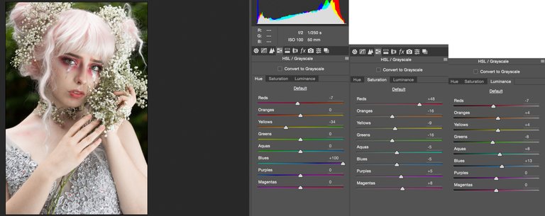
1. Next to the lightning and white balance editing, I always 'play' a little with Hue and Saturation in the Adobe Raw program. I don't really have a rule for this, mostly I do what fits the best with the pic. In this one, I was more looking to let the "reds" pop out and to reduce the other colors a bit, but as I said, I just try and see what looks good on the photo.
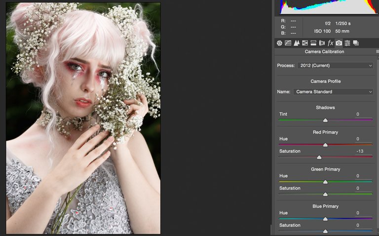
2. The part I NEVER skip in my raw processing is the Camera Calibration!! As before, I don't really have a rule while I'm playing with colors. But I always love the "effect" that certain options in Camera Calibration gives, as I chose here to use the Camera standard option; it doesn't affect the pic as much as al the other options do, but it gives a bit more "life" to the photo. There is more contrast and the colors pop out better.
3. Finally the Raw processing is done. Because this tutorial is only about color editing, I'm skipping the skin retouching part.
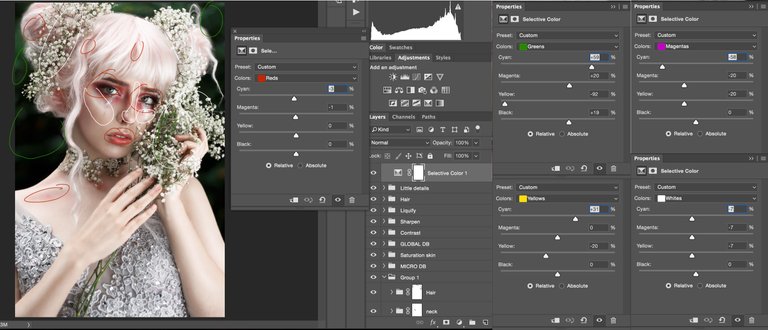
The first thing I start with is the "selective color" adjustment (as long as I don't mention any other program, I'm editing with Photoshop CC). The main thing I want to achieve with this adjustment is that the green will become more blue-ish because I personally thought it would fit better with the other colors. I also enhance the white to get a more glow effect in her face and to let the gypsophila pop out.
As always, I play a little with all the other options and see what looks good. I know there are some color theories like the color harmonies etc. I sometime do this, I check the color wheel of Adobe and add the color that will be the main color in the pic, like in this one the red/pink color. There are options like complementary or monochromatic colors, aside from which option you choose, the color wheel will give you the right colors that will fit the best with your main color.
I didn't use this with Euneirophrenia, but for the color addicts here, it's a handy tool to get the right colors. I prefer to follow my own feelings and do what feels good in the pic, but I thought it would be nice to share with you guys.
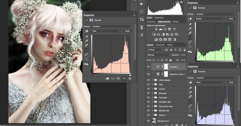
4. In the following step I'm going to work with "Curves". I added more green in the highlights and blue in the shadows.
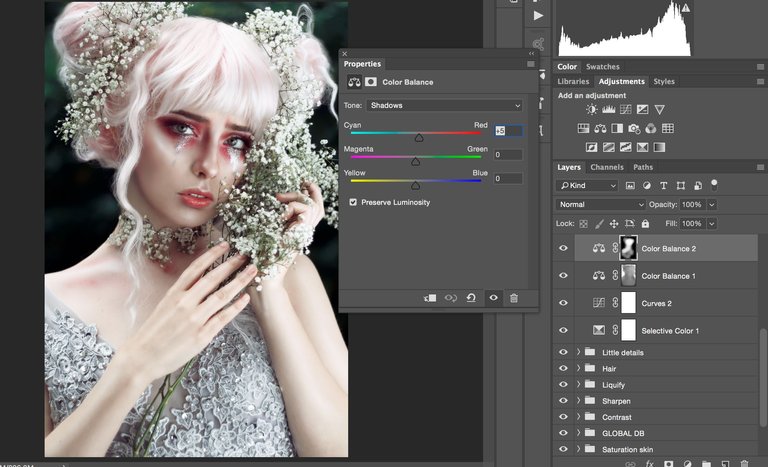
5. With the "Color balance" adjustment I added more blue in the shadows and highlights. With the mask layer I reduced the blue color on the model as you can see on the screenshot.
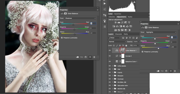
6. I had the feeling there wasn't enough redness in the skin, I really wanted it to pop out so I added another "Color balance" layer and added more red in the shadows. I masked the background because I only wanted the model to have more redness.
The following steps are done with Nik Collection which is free to download here. If you don't have Nik collection or don't want to download it, these steps are also doable with a bit of knowledge and creativity on photoshop! I just liked certain adjustments on these programs which are fast and easy to add.
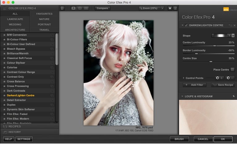
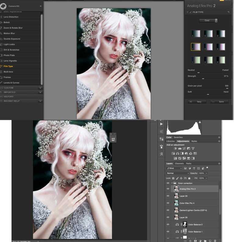
7. I opened Color Efex Pro from the Nik collection and added the "Darken/Lighten Centre". This is actually easy to do on photoshop: adding vignette en make the centre of your pic lighter.
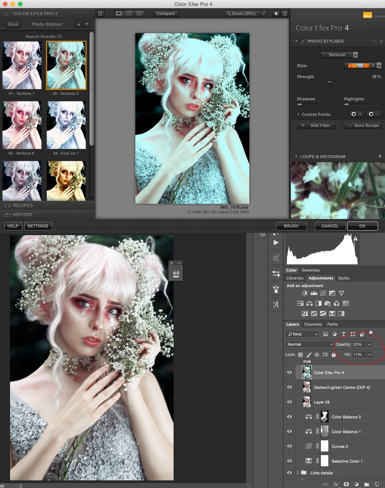
8. One of my favorite filters on Color Efex is the "Photo Styliser - Varitone 3". In this photo it was handy because it gives a blue/green-ish effect but also makes the saturation of the reds stronger! I decreased the opacity and fill of this layer in Photoshop because I only wanted a minor effect of it.
9. The final step; I merged all layers to a new layer so I could add 1 final adjustment. I opened the "Analog Efex Pro" of the Nik collection -> went to Camera Kit where I only added "Film type". I selected the 2nd filter (pink-ish) on the left of the "Cool" film types. I wanted the film type to be more neutral than faded and decreased the strength to 37%. And that's it!
I really hope you guys enjoyed this tutorial and hopefully learned something out of it! If you like this kind of tutorials and want more of it. Please let me know in the comments or upvote this blog so I can see that you really thought it was helpful. You're also welcome to resteem this to let fellow artistic steemians find this tutorial. :)
You can also find me on other social media as;
Instagram: https://www.instagram.com/gaellespaas_photography/
Facebook: https://www.facebook.com/gaellespaas.photography/
Thank you for posting this! I do already have the Nik collection so I will have to checkout the filters you mentioned. This is the second tutorial that I have read that mentions using curves to adjust the colors of the highlights and the shadows, so that seems pretty key. I have never thought to use color balance to be more artistic with color.
Thanks again for the tutorial and please keep them coming.
Cheers,
@kellyjanderson
Thank you so much! Looking forward to see your work based on these tips ;) Good luck!
Nice tutorial. Keep it up! Big fan of your work.. @gaelle.spaas
Thank you so much!
Never heard of RAW before so I learnt something very useful in the first paragraph... Can see I have a steep learning curve to climb...
Ah great to know! ;D Once you get used to shooting in RAW, you'll never want to change again ;)
Thanks for sharing. That's really an interesting read. I work as an illustrator and not that familiar with photo manipulation. It's very cool to see how you adjust your pictures step by step....educational to see the workflow of other creatives.