A few days ago, the peak of the flowering of dandelions began in our region. All the fields look like yellow carpets. In the city, too, there are a lot of them and while the weather was sunny, I managed to photograph them. I hastened to photograph them not because dandelions quickly fade, but because the communal services quickly mow down them.
I want to show you how to use the dandelion foreground and how different shooting points differ from each other.
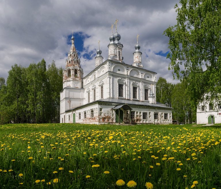
I'll start with pictures of Komsomolsky Square. Panorama of 3 vertical frames. The usual point of shooting, slightly crouched.
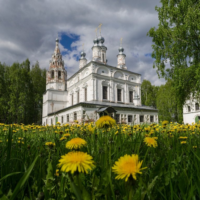
And here I lay down on the grass and also shot a panorama of 3 vertical frames.
The angle changed radically. For a perfect photo, you could use a combined focus, for dandelions and for the church separately. But this requires a tripod.
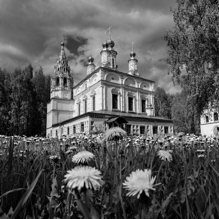
The same photo, only b&w.
The second example: the Soviet avenue in Veliky Ustyug. Ordinary flower bed and usual foreshortening.
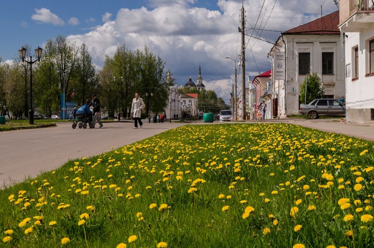
If you sit down harder, it turns out much more voluminous.
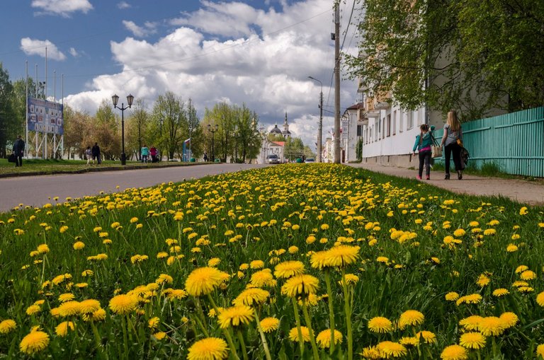
And if you lie down again?
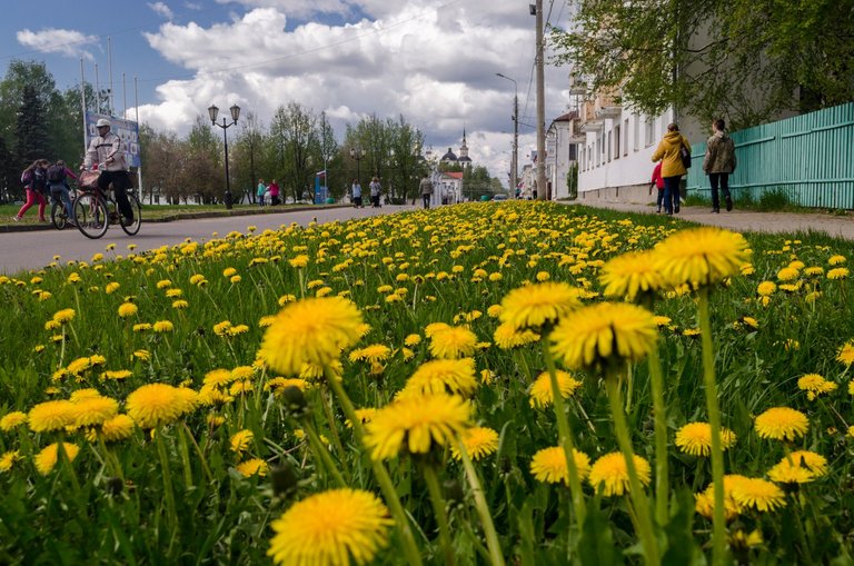
I think you understood the essence of this. A simple change of the survey point can give us an interesting view, more voluminous and not so boring.
All successful perspectives! Improvise and experiment!
"If your photos are not good enough, then you're not close enough" (c) Robert Capa.
nice photo, beautiful flowers
This is good point @evildeathcore. Wider the lens is, better perspective shift and deeper the DoF you get. It is probably doable with a smarthones of wide angle and small sensors with the very large DoF, but what lens did you use here?
I used 18 mm (18-55) on crop camera Nikon D5100
Thank you!
Russian beauty ! Great photos, I hope I will have the opportunity to do their photos at this level.
great photos, the more voluminous photos get the more it seems like dandelions are looking back at you :)
Awesome photographs love hoe the dandelions pop so brightly.
Thanks for that quick lesson! For the cathedral, I like the 1st image the best because it gives the most information about the overall context. For the avenue, I prefer the 2nd one because it emphasizes the length of the greenway with the least distraction from the background or the foreground.