Lol, I see @scottshots and I had more or less the same idea about this one!
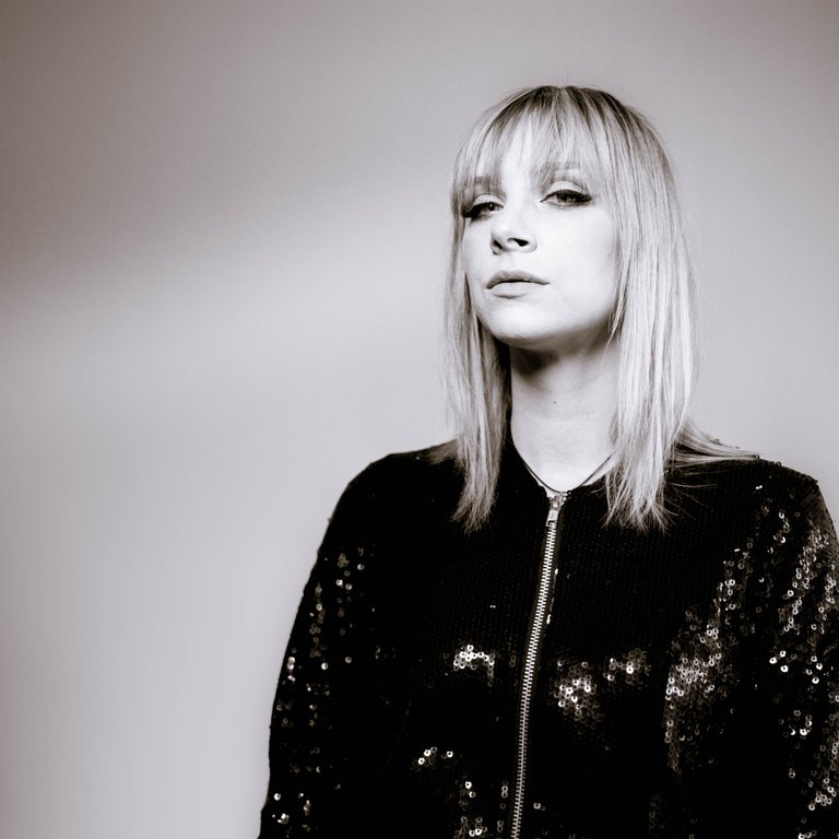
I felt like the rockstarry nature of this model could be amphasized by creating a album cover look: square, and purposely put out of the middle. (Just because following the rules is not rock star like or because a designer needs to put the name of the band left of her ;-))
I blackened her jacket because it just needs to speak and without all that black the picture would have been too soft for my taste. Then added some colour toning to it so it's not a full black and white :-)
Thank you for sharing your picture!

Rad! Very album cover for sure! Love the tone.