Winning edit from @snaptravel.
My @photogames Fix It Friday winners!
On Friday I shared the photo below and asked you guys to process it any way you liked.
I knew that this photo would be a challenge for you to edit - in fact, I had posted my own edit just a couple of days before and talked about how I was never happy with it - something just didn't feel right. I love the location but it's an awkward composition, and the worst part is that big rock in the bottom, which draws the eye way too much because of how much darker it is compared to the rest of the scene. Foreground elements are great, but they should lead into the rest of the scene, not steal the show.
I wanted to challenge you guys, and with purpose - editing photos that don't feel quite right is an everyday reality for photographers of many genres. From a landscape perspective, sometimes you only have one chance to visit a location, and the weather is often poor, and you don't always have time to scout it out for the best composition. You make the best of it, but you get home and look at the photos and think "that's not terrible, but it's not good enough to go into my portfolio - is there anything that can be done in post processing to make this better?"
In submitting this photo for #FixItFriday I hoped you would answer that question for yourselves and for me as well.
The response was overwhelming. Not be a broken record, but it really was hard to choose a winner.
Here is my original photo (don't judge the exposure - I was trying not to blow out the highlights):
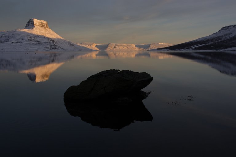
Photo Star @caseygrimley did this:
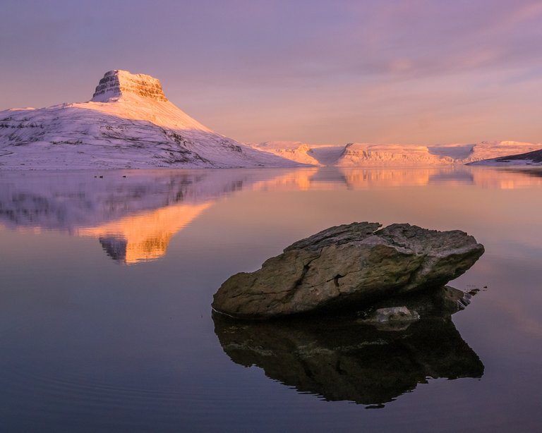
Casey's edit was my favourite among the Photo Stars - he did an excellent job with the colours - there is colour, but it's not overblown, it's pastel-soft. The colours and tones helped to minimize the overwhelming impact of the large rock in the foreground, and the square crop came to the rescue of the composition by balancing out the elements in the frame. Very well done!
1st place: @snaptravel
I picked this edit from @snaptravel as my favourite for similar reasons to Casey's image above. Both of them chose a square-ish crop, which worked well to balance the main subjects in the foreground and background. Both used colour effectively, though differently: I liked the blues here - they're peaceful and calming. Also, the contrast has been minimized, which helps with the "rock management." A solid, comprehensive edit of this photo, it earned the first place and the 2 SBD prize!

Honourable Mentions:
@galione
I love the addition of clouds - clever way to add interest to the scene! Anything goes in the #FixItFriday challenge, and finding unique ways of editing my photos are always appreciated! I just wish that darn rock wasn't there. ;)
@christianunger
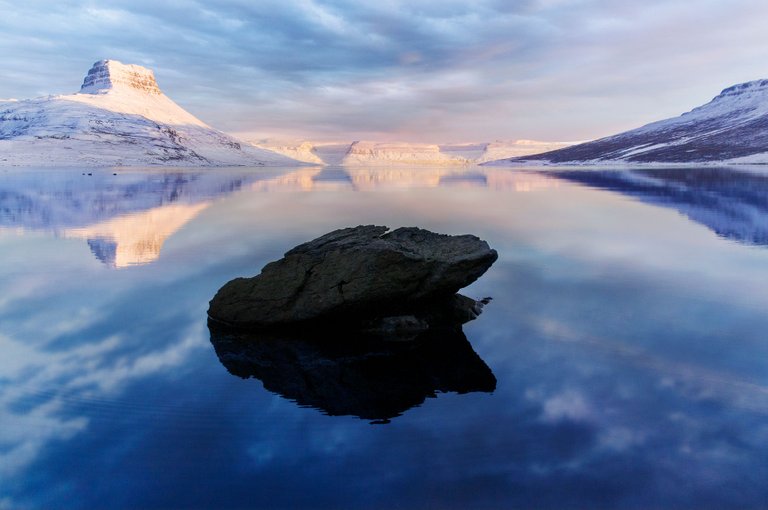
Great crop! I know I picked a couple of square crops as winners, but this works well too, and I like those colours.

@dmytokorol
Dmytro didn't like where the rock was, so he moved it! Love the creativity. In this fun contest there's no need to get into an ethical debate about how much Photoshopping is too much - this is art, and it's also a game, and I appreciate his effort!

Best Unicorn Prize goes to @vmoldo
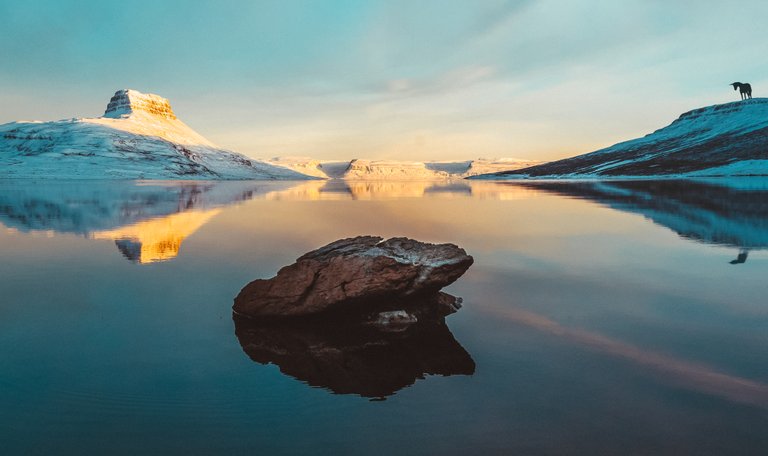
A good, sensible, unicorn standing on the hill, reflected in the water. Very nice!
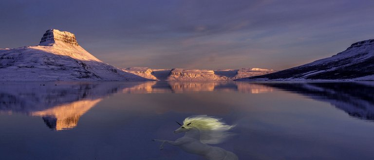
Best Failed Unicorn Attempt Prize goes to @bill.prag
You can lead a unicorn to water, but don't assume it can swim. Don't worry, this unicorn was rescued, but it wasn't happy and didn't stick around for any more photos.
Cool Idea. If you do this again, I'll try it to.
Can you link the pictures, that it is possible to view it in full screen?
Blessings @ml3000
Good idea Derek, I like the blues as well, with a touch of afternoon warmth.
Thanks, it wasn't my idea but we've had a fun time doing #fixitfriday for @photogames! :)
You rly should make a unicorn category. Unicorns are awesome 🦄 🌈
are you a starwars fan too?
As it happens, I am!
Good post,
Always success.
no unicorns were harmed in the making of this :D
Fantastic idea to have them fix a photo. Amazing what you can do in the edit. Keep up the good work :)