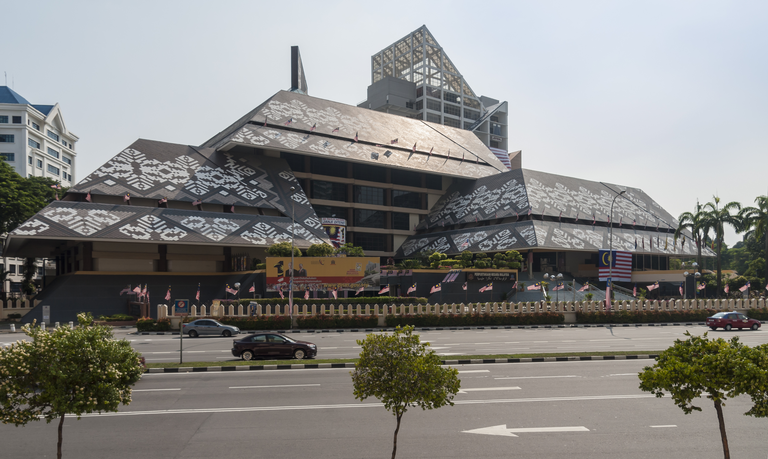
This design is pretty awesome! The geometric shapes works well to give what could be a flat surface a lot more depth and colour. It reminds me a lot of the traditional motifs on the roofs of the National Library here in Kuala Lumpur :-D

This design is pretty awesome! The geometric shapes works well to give what could be a flat surface a lot more depth and colour. It reminds me a lot of the traditional motifs on the roofs of the National Library here in Kuala Lumpur :-D

Similar yes - interesting to see shots like this with patterns repeated around the world.