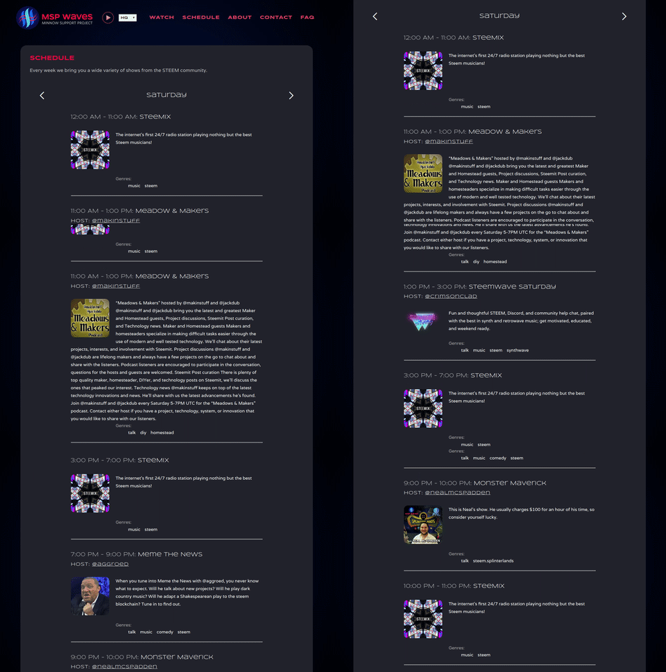
We've heard your feedback, and we made it happen! The old mspwaves.com with its bad theming, confusing schedule, and clunky interface is a thing of the past. Thanks to the expertise of @ura-soul and @crucialweb, MSPWaves.com got a facelift, and we're pretty excited to show you.
Features
We've packed a lot into this initial release, with a lot more to come, so stay tuned for future updates. Here is just some of what we've done so far:
- Complete rewrite from the ground up; no more WordPress
- Schedule now displays shows in local time, no more converting from UTC
- Home page shows current show info or SteeMix artist/song depending on what is live
- Both Low Quality and High Quality audio streams are playable at the top of any page you're viewing
- Streamlined to only include relevant info for ease of use
- SEO optimization so users can find it easier
- Complete theming based off @ankapolo's amazing logo

What's to come?
As with anything else, there's always improvements to make. At some point we'll be adding a chat (either vimm, steem.chat, or discord) next to the video stream on the Watch page so you can interact with the audience right from the website, improve on the SEO, add a method of contacting us direct from the website, and more minor styling/formatting to make it the best experience for all the loyal fans our there.
We would like to again thank @ura-soul and @crucialweb for their amazing work on this project. They had no problem handling our niche needs in a timely and professional manner, and we would highly recommend checking out their services if you need website/branding/tech solutions for your blockchain project. This is not a paid endorsement of their services, we just really had a pleasant experience all around working with them, and we're thrilled with both the price and the results.
Tell us what YOU think
We think the site is pretty great, but we want to know what you think. Go to mspwaves.com and check it out, and let us know your experience in the comments below.
that's flashy color scheme :-) NICE AND BRIGHT
If the moving animation is anything to go by in the post then it's looking pretty sharp! Will have a look tomorrow morning when that DNS thing sorts itself out!
huzzah! Localized schedules!!
Wow.. Looks really good!! I love the new layout, and it way more smooth and slikc.. Good job guys! Will be sharing momentarily with my friends!