In my opinion the entire front page needs to be revised to industry standard. The theme you see on the front page of Rabbit for example there isn't a huge "Learn More" button but instead a "Chat Now" button or a "Go to My Room" button. The point with UX is you want people to feel invited in, it has to be simple, not something people have to learn. Yes it's Alpha but you might be better off removing the big Alpha signal. These sorts of sites are continuously improved so having Alpha will encourage people to be more cautious and maybe not try it at all. Make Alpha in small text if you keep it and put it in the About section where you list the version of the site.
If you choose to copy the layout of Rabbit then there is no need for people to browse. If there is a need to browse then you want to put the active rooms on the front page for people immediately to see without having to click browse. It should be as simple as go to streemit.online and we see all the most active rooms and broadcasts on the front page just as Blab.im used to do it, or just like other chat sites do it because that is the level of quality people are accustomed to.
The current layout looks designed for crypto nerds and that quality of UX will not get 3 million users the first year. My criticism is based on the fact that I have used Blab and Rabbit and I understand why they got millions of users in a year. UX is the key to the success of Blab and sites like it.
Reference examples
- http://www.myfreecams.com/
- Blab example 1

- Blab example 2
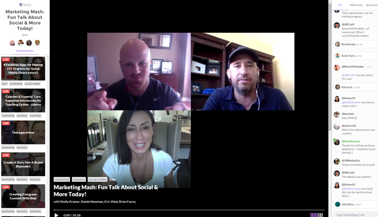
- Blab front page example

Note: As you see from the front page example, the first thing people would see when they would enter Blab.im was an active room. This allowed the active rooms to advertise themselves on the front page real estate. It also encouraged people to join in discussions.
Front page with recommended rooms

Note: In this example you see that a recommender can suggest rooms to join to a particular user profile based on their particular interests. In the beginning these rooms could just be whatever active rooms are available on the site until there are so many that you can pull off a recommender. Rabbit has the same slider interface too..
Thanks for this well thought out and descriptive insight in to why you think the site design suck. Appreciated. :)
I guess one thing that one has to realize when going through the site is that it was heavily styled off of steemit.com. Currently we've got something like just over 100K accounts and if even 1/10th of the users are active on the site and the infrastructure can be set up to accommodate them I'll be happy.
This isn't a site that's being made to maximize profits. It's a site for STEEM users to go and stream their thoughts, lives and world and get SBD tips. Not everyone is a good writer, this site hopes to help them folks.
Also I'm just 1 man, that admittedly has other things on the go in his life other than developing stuff for STEEM.
Thanks again for your feedback. I'll check out those sites you mentioned or record of them. Cheers.
Good luck, I support your efforts to bring streaming to Steem. I'm only so critical because I want it to be successful very badly. I apologize for any hurt feelings.
No Problem Mr. Edwards.
I appologize for initially being "stand-offish" or defensive. :)
This project is one of my babies. I do appreciate you helping out with it though! Even though I initially perceived the worst! Thanks man.