So you're creating content on HIVE. The biggest positive step you can take and the greatest obstacle you can overcome is simply to do the work. Good job, you deserve a lot of credit. But I'm here today to talk about one of the most important aspects of your work, which is often neglected by new creators: The thumbnail.
There are many reasons that creators decide to not pay enough attention to thumbnails. I'll list a few, but I'm not going into great detail about why. My intention with this article is to show you not only that thumbnails are worth your time, but also that they are easier than you think to understand and master.
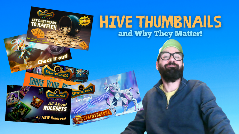
Reasons Not to Try
These are some of the reasons that people give up early on thumbnail creation, often to the detriment of their hard work. You must resist these impulses, which every creator feels.
Not Enough Time - It is easy to think that there simply isn't enough time to spend on something as seemingly trivial as creating thumbnails. But where does this stop? Is it trivial and unimportant to learn a new skill, to pay attention when a friend is talking, to practice something in order to get better at it? If you're always telling yourself that you're short on time, you'll eventually find your time vanishing rapidly. The fact is that we have time. No matter how busy we may think we are, we have the time to take care in our work, especially with something as important as thumbnails.
Not Caring What People Think - This is a lie that people tell themselves, one of the worst. If you truly did not care what people thought, you would never be creating content to post on the internet. For those of you thinking "but I'm just doing it for the rewards," if you could only grasp how much making decent thumbnails could increase your potential for rewards, you would think differently.
Avoiding "Click Bait" - This is not a reasonable concern. Your goal in creating content should be to make people want to see it. Aside from employing shady or creepy methods to do so, anything goes. My best advice is to create a thumbnail that shows them how professional and trustworthy you are. You can do this by practicing a few simple techniques that I will describe in the remainder of the article.
Reasons to Try
1. People will come into your content with greater expectations - The reader or viewer's initial estimation of you is everything. Sure, you can win them over with your amazing words or your awesome video quality, but it's a stretch for them to think that either of those things are even possible without a good thumbnail. The thumbnail is the first exposure they will have to your content, and it is the most likely piece to turn them off completely before clicking on your content. I'm not saying it's fair, but it's true. Everyone judges books by their covers. How else do you propose to judge the book? With millions of pieces of content to choose from, they need more reasons to want to view yours. A single reason not to will be enough to lose them as a potential reader or viewer.
2. You will Seem Professional - We are all pretending to be professional. Isn't that the gig? We sit here (in our pajamas most of the time) trying to convince everyone that were are credible, trustworthy, smart and relevant to the things they want to think about. Honestly, your ability to get views is entirely unaffected by the degree to which you actually possess those qualities. It's like politics. The winners are not the ones who are best at winning. Instead, they are the ones who can do the best job of convincing people that they know how to win. 100% of the time, this starts with your thumbnail, and if you're not careful, 99.99% of the time it will end there as well.
3. Cropping Looks Sloppy - This is very similar to the above, but think about it a bit more. Here I am scrolling through a feed with hundreds of pieces of content. Every one of them wants the same thing from me: A fragment of my attention for a few minutes. I'm simply not going to be lured to a second location by someone who has not even taken the time to figure out a decent thumbnail cropping. My mind will draw all sorts of unnecessary conclusions. One of the worst extensions of these conclusions is the idea that the creator was too dumb to get it right. The fact that it's a little complicated is no excuse; there is simply too much competition. In fact, no one cares about any of your excuses. Not ever. Avoid having to make them by taking the time to do it right, or at least find a version of right that works for you.
All Thumbs are not Equal
The most important thing to remember in thumbnail creation is that most platforms have different ideas of what a thumbnail is. You may be wondering, "Why can't they just agree on a universal thumbnail size?" The answer is because people suck at communicating. You can't fix the internet, but there are some relatively simple ways that you can live within its stupid rules.
Why do Dimensions Matter?
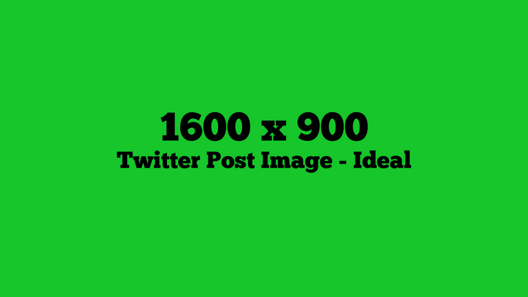
To get your content out into the world, regardless of the publisher you are using, you must typically share it on multiple platforms. With Splinterlands-related content, Twitter is the platform that we use most often for this type of sharing, but there are many others. Each of them does their own thing to your work, usually turning it into some kind of social card to fit the format of that platform's feed.
SOCIAL CARDS - It is important to understand the details of the social card that will be created when you share your post on a given platform.
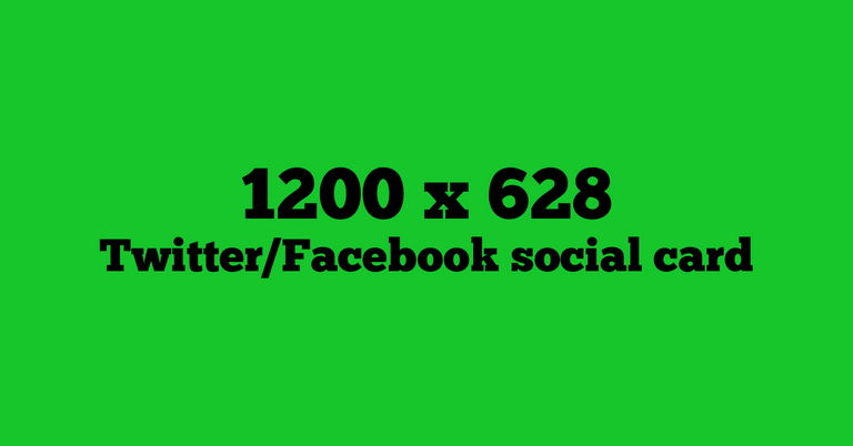
A lot of people can't even agree on the best thumbnail dimensions for the same platform. For example, with the HIVE blockchain it's difficult to find an answer for this question with a simple Google search.
Even for Twitter, there are variations and exceptions. When linked posts or images are Retweeted as a "Quote Tweet" for example, a social card is created, applying a new cropping to the image, with which the original poster was given freedom to make wider than the above recommended dimensions. Luckily, with the creation of social cards, the dimensions are the same on both mobile and desktop, as well as across most platforms.
Check this out. I've created an extra-wide version of one of the above images and shared it to Twitter as an image.

Here's what it looks like when shared as a Tweet...
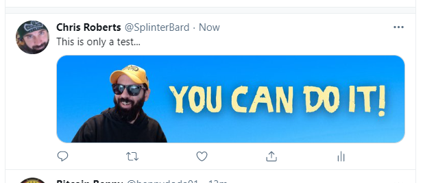
Look at that handsome fellow, presented in the originally-intended wide shot! But watch out! As soon as this is Retweeted by another account as a QUOTE TWEET...
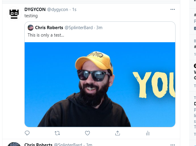
It's autocropped, and suddenly it's just my goofy face with no positive message of encouragement. That will not do!
Twitter Confusion
Twitter allows posts wider than the recommended dimensions to show uncropped in the feed... sometimes. Beware of varying too much from the above recommendations however, especially if you are expecting any Retweets on your post. While your original tweet may show up perfectly in its full wide glory, every single retweet will create social cards that put it into the box of predetermined confinements, and you may not like the way their algorithms choose to do it.
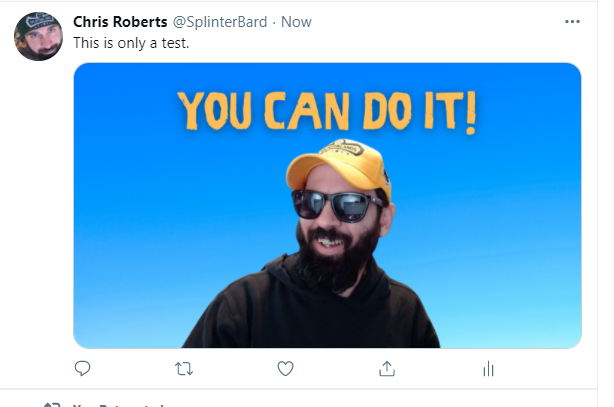
When I RT the above image as a quote Tweet, this is the result...
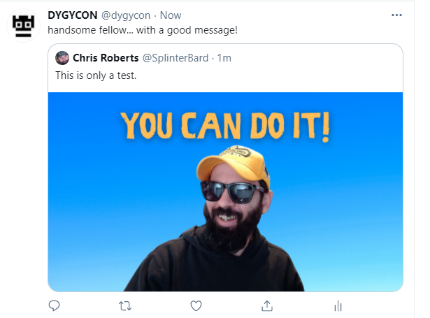
Better, right? Image and message are both fully intact!
It's best to always retain control of your thumbnails by being aware of the dimensions for every part of the process. This does not mean that you must create a bunch of different versions of the thumbnail you're using. The effort would actually prove not only unnecessary, but futile.
How I Do It
The simple method I have devised for myself is easy to repeat, and as long as you keep a few things in mind, your thumbnails will always look professional, no matter the different subtle dimensions and alterations that occur.
Create the Image in 16:9
16:9 is the most common aspect ratio for computers and monitors. It is a well-accepted ratio that you will find in many places. It is the ideal and preferred image size for Twitter, Youtube, OBS, etc.
I create all my thumbnails in this size, no matter the platform I intend to use. When I post on HIVE (where the ideal dimensions are 1600 x 960), I'm 100% satisfied with the way 16:9 thumbnails are displayed. There may be a tiny bit of cropping, but it's not a concern to me because I take precautions (see below).
When I post on Publish0x (where the ideal dimensions are 1300 x 730) the 16 x 9 ratio works just fine, with minimal cropping. Again, this is fine as long as I adhere to some simple precautions to ensure that the edges do not matter (see below).
When I post directly to Twitter, the 16:9 image is already in the correct size for my original uncropped share and for any retweets. Additionally, the same image can be used as a video thumbnail, intro or outro without changing a thing. After I've worked hard creating the content itself, the less work I can do on the thumbnail, the happier I am.
How to Ensure it Works
In the creation of your thumbnail, make sure of a few things and it will look great everywhere. You can use measuring and templates if you like, but it is also fairly easy to estimate with nothing more than your eyeballs.
The goal when making a thumbnail of set dimensions (1600 x 900) universal is to give yourself wiggle room around the top and bottom edges. As I have explained above, each different site and type of share will crop your image differently. If you create an image for which the edges do not matter, you cannot go wrong.
This simply means you should allow a buffer zone around the outside of your image. I'll illustrate with an example below.
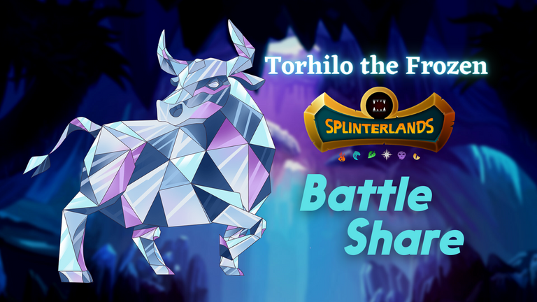
Notice how the meat of the 16:9 thumbnail is centered, with plenty of space left around the outside edges. This is not an especially awesome image that I created (it took about 45 seconds), but it should illustrate the points that I'm trying to make about thumbs.
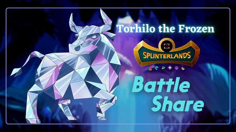
In the above image, I have added a thin rectangle that shows the cropping of the resulting social card from this image. If your HIVE post has the first image as a thumbnail, the social card will come out with a cropping of 1200 x 628. More specifically, it will take the centermost 1200 x 628 chunk from your image. As you can see, I have successfully eyeballed the borders to make sure that even the social card will contain the whole uncropped image.
An Example
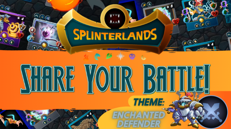
Here is an example, using the 16:9 thumbnail from the Splinterlands Share Your Battle Challenge on HIVE. First, the thumbnail in its entirety...
Here it is on Peakd.com as it appears in feeds...
Notice how the entire image is displayed with its original 16:9 dimensions. This means that you can count on 16:9 thumbnails to be shown correctly on the HIVE blockchain. That's one less thing you need to worry about.
Here's where the trouble can begin. When this post is shared to Twitter, the following card is created...
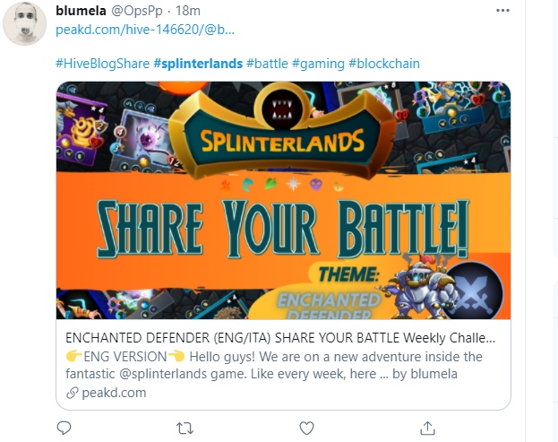
As you can see, Twitter has created an auto-cropping. The width of the image stayed the same, but a vertically centered cropping was taken. In this case, that cropping actually cut off some of the words at the bottom and took away the space above the logo. With this example, the important stuff is all still there, but even this thumbnail could have been created more effectively. I know... it's the Splinterlands official one. We're learning as well, and we'll create one that lends itself better to social shares. Thanks for being my experimental subject @blumela! ;)
Extreme Examples
In the worst possible examples, instead of showcasing the awesome Splinterlands art as intended, many HIVE creators simply give the Twitterverse close-up crotch shots of monsters. Allow me to illustrate that with another example.
Let's take a look at THIS POST from @shrazi - an awesome art process blog for entry in the Splinterlands Art Contest. Nice job with the drawing @shrazi! :).
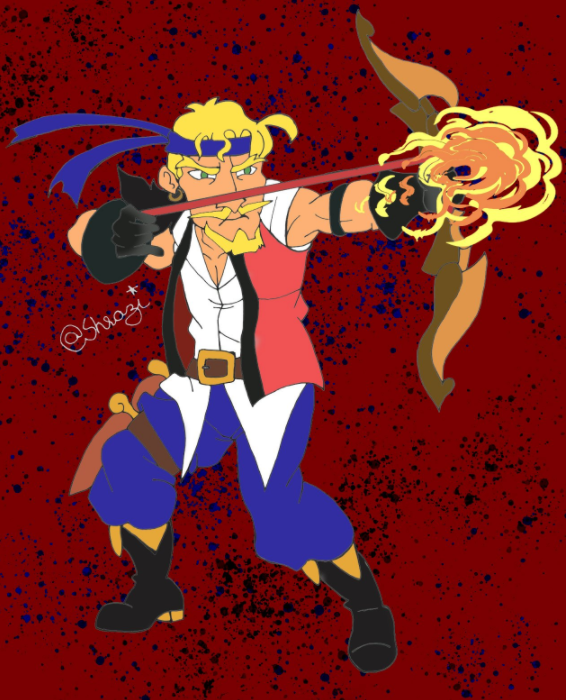
While the post goes into great detail about the various steps of creating this art, the time was not unfortunately taken to create a 16:9 thumbnail for the post. Below is the full image of the portrait-oriented drawing, which was also the first image in the post, making it the default thumbnail image. The HIVE cropping was nice to Shrazi in this case, producing the following image in HIVE feeds...

As is apparent from this example, HIVE thumbs are cropped by taking not the center of the too-tall image, but the top. This is different than Twitter. Below you'll see the same post when shared to Twitter.
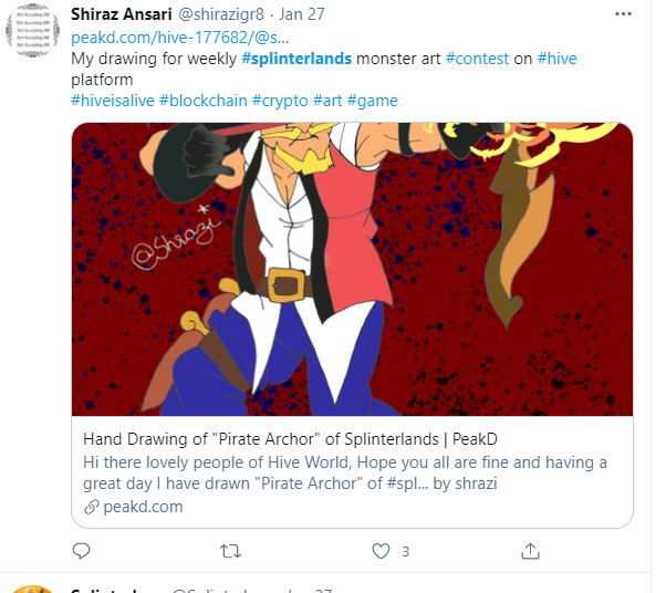
As expected, Twitter took the centermost vertical cropping that fit into the predetermined dimensions for their social cards. It was unfortunate in this case because it cut off a fair amnount of the drawing from both the top and the bottom.
Thanks again for being my example @shwazi. I appreciate your help in illustrating the importance of thumbnails, and I really appreciate your participation in the art contest! I apologies for sharing your image in a somewhat negative light in this way. Hopefully you understand my reasoning for doing this. -Chris
This could have been avoided by creating a simple thumbnail in 16:9. Such a thumbnail would prepare the image to be shared (without corruption) to a number of different platforms with a professional look and feel. I would have done something like this:
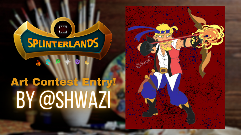
By leaving space at the top and the bottom of the image, I'm able to ensure that nothing important will be cut off by the card that is created on Twitter. Plus, I'm able to incorporate a background and tell something about the post in the thumbnail, giving it a professional feel. Finally, this image only took me about a minute to create using Canva, which I will describe briefly in the next section.
Canva.com
If you don't have a clue where to begin, go to Canva. If you have another site or program that you prefer for making images, that's absolutely fine, but I have used Canva to create thousands of thumbnails. It saves me time, and gives a professional look and feel to my images without me ever having to spend professional amounts of time.
I pay a little bit to have access to their Pro features, but creating thumbnails is simple even without these extra elements. The free version has tons of stuff that anyone can use, and I rarely even take advantage of the Pro elements in my work.
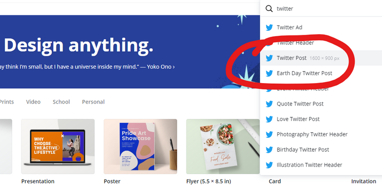
Above you'll see my go-to dimensions when creating thumbnails: 1600 x 900. You can always scale the image size down if the publishing site you're using requires a slightly smaller image, but for Twitter posts I would always stick to the full 1600 x 900.
You are able to create images here using custom dimensions of any size, and there are tons of elements to use to create thumbnails that will pass the scroll test. The scroll test simply means that some people may stop scrolling and look at it. If you can accomplish that, you're doing a good job.
Images from Canva can be downloaded in multiple formats, and it's a very quick and easy interface to learn. I highly recommend it, and I have tried lots of different sites and programs to accomplish these same things. Canva is the easiest and the quickest.
Final Words
I hope this article has helped you realize the importance of thumbnails in your own work and content creation. As the one who runs the Splinterlands social media accounts, I can tell you first hand that I will not Retweet thumbnails that are wrong.
Through incentivized sharing and the brilliant work of @CarrieAllen, Splinterlands has turned our users into a powerhouse army of marketers for the game. I take sharing of this content seriously, and I advise you to do the same. This means not always taking the easy way, but making an effort to continually improve and grow. After all, we're not only doing it for rewards. We believe in this game, and we always want to present it in the most beautiful light so that others will learn how great we all are.
For those of you who have not been using thumbs as effectively as you could have, don't worry. Rejoice in that you read this article in the interest of self improvement. For everyone who is willing to help themselves, there are perhaps a dozen more who are not, so please do your part in helping to educate others about the importance of thumbnails when sharing on outside social media. It will be good for all of us in the long run. As some of my favorite crypto people like to say, we're all going to the same moon!
Thanks for reading! See you out there!
Super Fantastic Links
Play SPLINTERLANDS
Play Townstar by Gala Games
Earn BTC with Lolli
Buy Awesome Custom Shades from Knockaround
Buy Awesome Custom Embroidered Merch
Create and Earn with Publish0x
Get NFT Fortune Cookies Daily on WAX
Learn Why I Love Referral Marketing and You Should Too
Thanks for the detail discussion about the point I am not taking serious.
I will take care of that on my future publications.
I will put 16:9 framed image as my First/cover image (I think I get the point??)
Have a nice day!
Thanks for understanding - I didn't want to single anybody out, but I could think of no better way to increase awareness! :D
Keep up the good work!
We gave you a nice Splinterlands upvote for being such a good sport!
Thanks to you for pointing my (and many other's) mistake with a solution :D
And you are right it takes not more then few minutes to put our cover image into 16:9 frame.
Thanks again
To maximize your earnings even more, I'd recommend making yourself an attractive female version of your species in said graphics.
I totally screwed up my thumbnail for my art submission this week... This post is fully on point. It's a shame we can't set the open graph and twitter card images manually. Oh well. Playing it safe by going with these best practices is a must. Also what works good with thumbnails. Not getting too repetitive. Unique photos of the content creator and easy to read bold text.
Thanks for this! I stumbled here from the telegram group so I'm new to this Hive stuff. I guess this is good article to start from if come up with some good content ideas. Been working as a video tech for the last 10 years so I totally get the importance of your point. 😊
Also never heard of Canva.com so thanks for sharing that too.
Hahaha but please !! I read fast because I'm at work but as soon as I get light I am happy to have been of help in some way 😂
very good, I'm learning to leave my posts all with standard images from now on.
Thanks for the useful information. I could never find a good answer from Google.
I sooo needed this content. And wow, holy thorough. Much appreciated.
I learned the hard way how important thumbnails are for a post, even if a thumbnail is mostly text with minimal to no graphics. Here a consistent look and feel are a must.
Once I started using thumbnails, I noticed it wasn't enough: they needed to be the right dimensions. Not knowing what you had explained in this post, I aped into 600x340 dimensions after measuring the thumbnail as shown in feeds. In the feeds they measure 150x85, so I just multiplied each dimension by 4.
It turns out that the dimensions I used are in proportion to the 16:9 you not only recommend but urge everyone to use.
I don't have a Twitter account, so I never considered image sizes used there. I'll need to account for that going forward.
New for me would be the importance of a buffer zone around the image core to account for image cropping done by various platforms. That's good to know.
It's too late for me to upvote this post, so please accept this slice of !PIZZA instead.
PIZZA Holders sent $PIZZA tips in this post's comments:
@magnacarta(2/5) tipped @chrisroberts (x1)
Learn more at https://hive.pizza.