A professional logo can elevate your company to your product. On the other hand, a non-professional logo product can ruin your company. Many non-professional logos used can tell you how amateur or start-up a company is. Everyone thinks they can make a perfect logo, but knowing just photoshop is not enough in this regard. Here are some insights on an effective and modern logo design process and workflow. With these tips and a bit of creativity you can reveal a beautiful and so professional logos.
1. Design: Drawing and Brainstorming
Many early designers start designing directly on the computer to create logos.But often, designers spend wasted time with special effects and filters. This may work at some time, but you will find it difficult to design something from where you are sitting with your back.
The best way to get started is to get a paper pen and get a clean page. Think about the meaning and emotion you want to give to the people you prepare. Are you doing it for a government agency or a toy company? Can the complex yada be simple? These thoughts will lead you to drawing and many alternatives. Everything does not have to be perfect. You can think of alternatives in this way without worrying too much about it comfortably. Without a computer you can draw on paper with natural creativity.


When you create different options, your designs that reflect your thoughts and the meaning you want to give will emerge spontaneously and you will be able to practice them comfortably. When you are satisfied with some of your designs, it's time to move these designs to the computer.
If you are preparing a logo for a customer, you might think that is not a good idea for your customer.Yan, I would like to point out that you do not spend much time on a design and do not concentrate on it. Separate your time and ability for each alternative. At this point, you will save a lot of time and give your customers many ideas and find out the degree and direction of your customers.
2. Production: Vector Graphics

Vector graphics are considered a topic that many newcomers (and some professionals) find confusing. Recently there has been a blur between vector graphics and bitmap graphics made in some graphic design programs such as Photshop, Paint Shop Pro and Fireworks.
Common image formats such as GIF, JPEG, BMP and TIFF are bitmap graphic formats. Digital photographs are excellent examples of bitmap graphics because digital photographs consist of points we call pixels. Bitmap graphics have certain resolutions. If you zoom in on a digital photo, you can see the individual pixels comfortably. If you reduce the size of a bitmap graphic, you can get good results, but on the other hand, if you enlarge a bitmap graphic, you get mixed results depending on the amount of pixel enlargement. Programs such as Photoshop, Pixelmator, Paint Shop Pro and Painter are the best software you can design bitmap graphics. And these programs are not suitable for designing a logo.

On the other hand, vector graphics do not consist of pixels at the edges. Instead, they have mathematical expressions. Vectors can be enlarged and reduced as desired without loss of detail and clarity. For example, you can use a vector image for printing on a business card, or you can use the same vector image in large billboards. Professional logos must be vector graphics that can be used for commercial prints, web sites, television and all other media formats. File formats with vector capabilities: EPS (encapsulated PostScript), PDF (portable document format) and AI (Adobe Illustrator).
If you learn to use vector assisted software to create logos, you can quickly and simply create smooth lines, smooth curves and shapes. If you want to make perfect vector drawings, you can use software such as Adobe Illustrator, Lineform, FreeHand and Corel Draw. In addition, it is available in many free software including Inkscape software.
3. Decoration: Color schemes

When you are thinking about the colors of strokes and lines, you can try the combination of colors you want and try out the combination you want to reflect the meaning of logon. For example, you should not use pink or orange color for a serious logo like an investment bank. If you have a problem with color combinations, you can find and use combinations of color combinations created by "Adobe's Free Kuller Service" and shared by other users.
4. Versions: Black and White
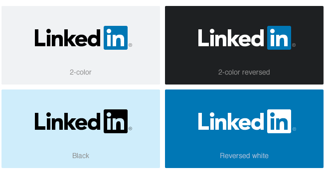
Once you are done with the logo colors you have prepared, you have to consider how you will look at the logon in a fax machine. If your logon is inconsistent and bad, then my computer is back and we are starting to make a black and white version of our logon. Logonun black-white version needs to be prepared to protect the general appearance of the logos may be different. This can make you feel like you are forming a shape shadow.

5. Planning: Media
When organizing a logo you should always keep your goal at moderate level. For example, if the logo is only displayed on your website, you can use many colors and even develop with many special effects. But if the logo is to be used in other circles, you should think about the cost of printing the log, the color of the print, and the cost of the effects. For some logos other than the logon web version, you may need to develop a different version that is less detailed for printing. In the printing world, the more color the image you will print, the more costly it will be.
6. Collapse: Typography
The words on the log are just as important as the graphics that make up the log. Beginners will generally use old writing styles. However, the effect on the logo can be high, even if the writing style, type of writing, and even writing is small, large or mixed. For this reason, never take advantage of the influence of typography. Also, if you are using a logon font, you should translate the letters into vector graphics. It is not important for you to have your font on the other computer when you want to send one or more files in this way.
Image Source
Text Source
http://www.spaksu.com/nasil-bir-profesyonel-logo-olusturulur/
http://www.webdesignerdepot.com/2009/02/how-to-create-a-professional-logo/

Follow me on Twitter for Real Time Alerts!!
--
Thanks for recommendations :) This is an important topic. I think, Linkedin is best :D
@lovejuice