This is not a tutorial "Hot to not screw up your photo", so there isn't basic stuff here.
1. Mind Your Contrast
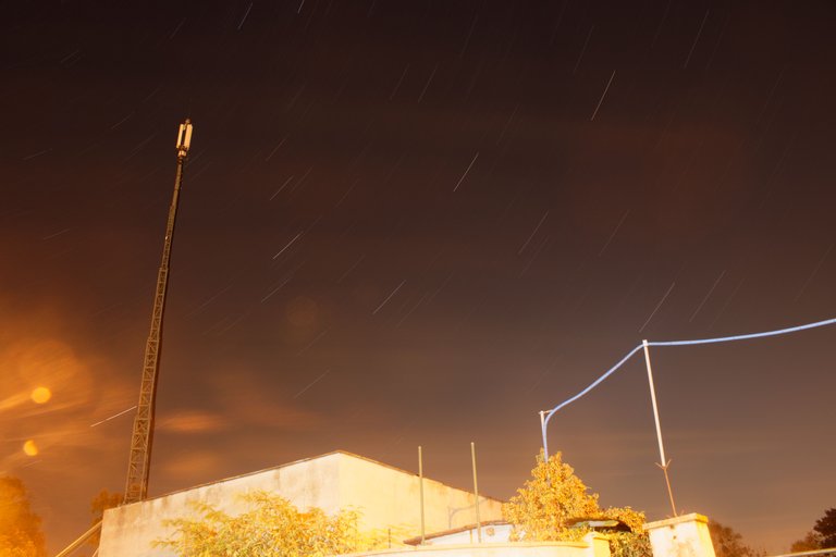
Out of all parameters, I find contrast the most important (right after exposure). You have to keep it the highest, you can before photo looks bad.
Example:
- Low Contrast
2.High Contrast
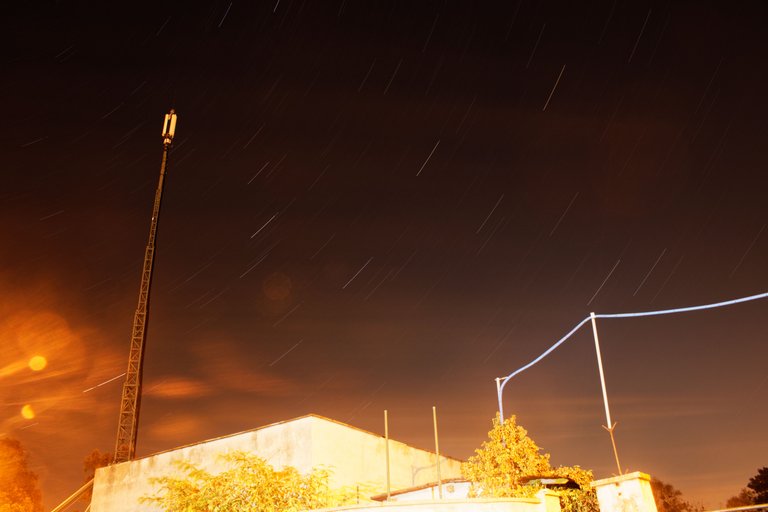
You can see, that when I increased the contrast, very clear difference appeared between the foreground and the background. Bright parts became even brighter and dark parts darker. That's the look, that proffesional photographers are going for. Just look at any magazine's cover photo and you'll see my point.
You can achieve interesting effect by adding microcontrast
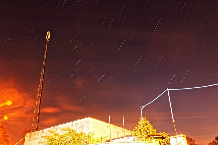
It adds this super sharp look, which is not quite common, but I've seen a lot of this on Instagram.
2. Use rather long focal lenghts (especially for portraits)
Long focal lenght of the lens makes everything flat on the picture and allows you to get very blurry background even with higher f-stop
Example:
- 18mm f/3.5 ISO 400 1/50

- 50mm f/3.5 ISO 400 1/50

As you can see, there is a huge difference between these two. It works that way with every kind of photography. Most of the times, longer focal lenght will look much more proffesional, unless we're talking about landscapes.
3. Use low f-stop
If you wanna have pro look, you have to get that blurry background, sorry if you don't like it, but people get crazy, when they see the bokeh behind the subject. It's probably because not everyone has a camera capable of doing such thing.
Example:
- 50mm f/22 ISO100 1.3 sec.
- 50mm f/1.8 ISO 100 1/80
4. Color Psychology
We're not gonna go deep into it, because it's a very complex topic, if you wanna read more, click on the title, there is whole webstie about it. I'm just gonna cover a very basic distinction on warm and cold colors.
Warm color palette of the photo means general joy, optimism and can also mean litterally, that it was warm in the place, where the photo was taken. Too warm though means insecurity and caution, it's used often in horror film to build a suspense.
Example: 
Cold color palette means negativity, sadness and also that it's cold in place, where the photo was taken. Too cold palette means calm, security and a peaceful state of mind.
Example:
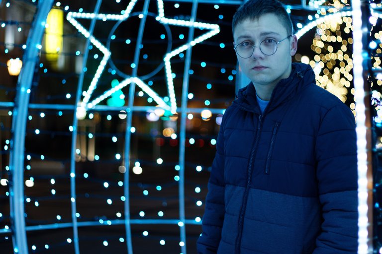
As you can see, playing with color palette is a great way to improve storytelling of your photos
5. Last but not least : Perspective
It's also kinda psychological thing. Depending on perspective, that we're photographing our subcject from, our vievers are gonna percieve it differently.
Examples:
1 Shot from below
It shows the subject as someone important, a leader, someone, that much depends on.
2 Shot from eye level
It shows the subject as someone equal to the viewer, a normal person, someone like you and I
3 Shot from above
It shows the subcject as someone unimportant, miserable or overwhelmed
Share your opinion in the comments, I'm open to discussion.If you liked this post, please upvote and resteem. I try to upload 2 posts everyday, so if you're interested please follow me at @michaelfilmmaker.