Hey Hivers,
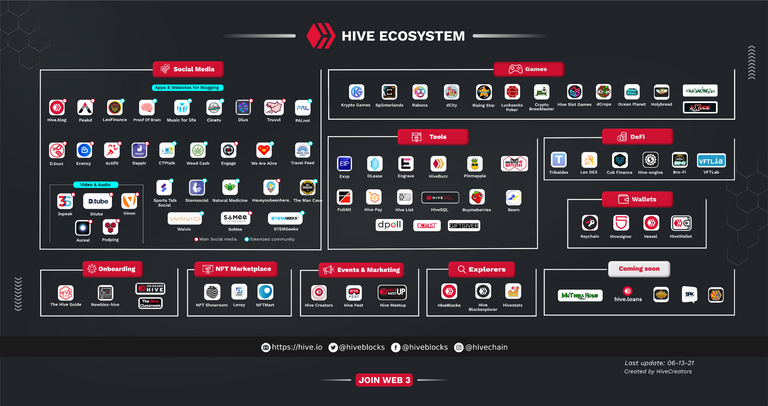
We thank everyone for the great feedback on the Hive Ecosystem Infographic. @Enrique89 has been working hard, and he has made many changes and upgrades to the infographic. You check out the first version of the infographic here.
This is the new version:

It's a little blurry. If you want to see the image with more details and better quality, you can view it or download it from here.
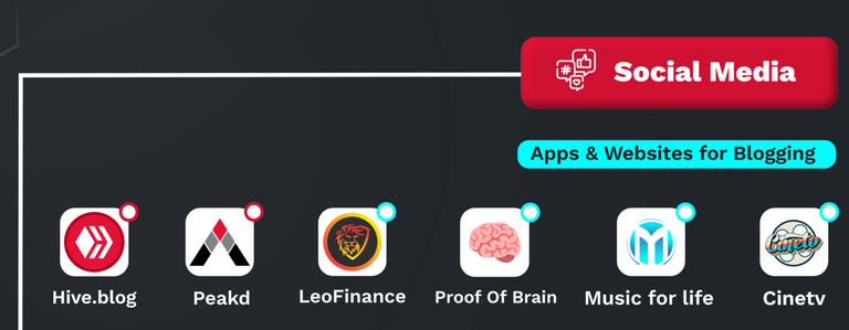
Zooming in:

Please, share your feedback:
- Which active Hive apps are still missing?
- What would you add, and what would you remove?
- Would you change some of the categories?
- Which apps would you add to the "Coming soon" category?
Best comments with helpful feedback will be eligible for small upvotes from my account.
Awesome graphic @Enrique89. An insane amount of work must have been done for this!
You might want to add the following in the social media category:
Tools:
Great feedback! Thank you! Check this out, @enrique89.
Cheers mate. First make a note of these changes from all the comments on the post and do them together.
Ultimately it should look something like this. 😂
Daaammn lol! That will be Hive in a few months, hahaha. Thank you for sharing this image. Btw I'm not designing it, but I'm helping Enrique with the info and with feedback and ideas.
With smart contracts, easy.
You guys have done a mind-blowing job! I didn't know there were so many DApps and tools we have.
Do you think we should add 'exchanges' too?
Posted Using LeoFinance Beta
Thank you! 99.99% of the work is Enrique, though.
And talking about the exchanges, I think we should add at least the main ones: Binance, Bittrex, Upbit, Huobi, Blocktrades maybe. Because adding all, it would take too much space, in my opinion.
Makes sense!
Posted Using LeoFinance Beta
I believe that in the coming months, it will look like this.
Also, infographics will be created by segment or area.
Alright. That's going to be so cool. A web of applications and projects built on or associated with HIVE.
Posted Using LeoFinance Beta
This looks great! We need to add the latest tribe @dunksocial.
Also The Man Cave text is cut off by the white line slightly.
Thanks for the correction my friend, ok, I'll check that project.
I also think that changing the little circles that signify Main social media/red & Tokenized community/blue may be easier to read if it was a solid colored circle rather than just outlined. I have to look closet to see the difference, that may just be me though.
You are right.
Excellent work you did @Enrique89, you can see the dedication put into this infographic. No doubt Hive will continue to grow and more work will come, I would bet on a channel where the administrators of some part of this ecosystem can register their projects and these in turn are public and easily visible, in order to reach more precisely what is sought.
For new users, encountering such a large ecosystem that will continue to grow, it becomes overwhelming and difficult to understand something that I would add to this infographic and for the simple fact that I use it daily to collect my tokens is Hive Engine, I am still discovering the diversity of the platform and what a joy to see that different spaces are being created for all tastes.
I would also like to leave this comment in Spanish.
Yeah. pero hay que tratar de ver las cosas simples.
I like the presentation, however I make two observations:
1.- In Tools and for aesthetic and visual purposes, I think the HiveWatchers icon, should be moved to the third line next to GiftGiver. Where it is currently located, it seems that the designer forgot to identify the icon (it was the first impression I had). In the last line of that category it would look more homogeneous with the rest, or, failing that, it could be named like the others.
2.- I would like in the next categories Discord and Orinoco.io (I didn't see this one). I do not know if they would enter in some.
Please, do not change the identifiers by color of the communities: tokenized and main social media.
It is quite simple to understand and that is excellent. Congratulations @Enrique89
Thanks for your observations, it's already noted, it has several details that can be seen when my eyes are already rested lol.
Orinoco.io already enters the categories of Exchange and Discord could be placed in an infographic of communities.
Hahahaha...It was worth the effort. Excellent job for all of us to see it in a simple but detailed way.
Thank you.
Is there a place/file for all icons? :)
Edit: I think exchanges should be there too :)
Edit: I think exchanges should be there to
Yes, after finishing this one, I can publish the link of the file in SVG, AI and PSP so that someone else can contribute.
oh, perfect that's really good :)
A new tribe recently launched called DunkSocial (dunksocial.Io). It should be added to the social section. Tagging @rob23 for visibility.
Ok, if you are kind enough to label the creators or the web site
I believe @rob23 is the creator. The website address is https://dunksocial.io
Much appreciated! This is correct
Posted Using LeoFinance Beta
I gave a substantial amount of feedback on the previous post, so I won't say much more than that, just wanted to swing by and show some love.
Huge props to you, @Enrique89 , and anyone else involved for all the work here. As someone fairly well versed in graphic design, I know how much effort and energy goes into making something like this. It's really coming along, well done. 🙏
I am always willing to listen and thank you for your suggestions. But if you can propose another design other than this one, I would gladly take it.
Yes, a lot of work and a lot of computer resources are used, luckily I have a pretty good one.
Thanks very much! I have many design ideas & tweaks, but you seem to be doing just fine with this current design. Keep up the great work! :)
And yes, I imagine it would need a good CPU, Ram, GPU, etc. Blessed to have a good PC. 🙏
Awesome stuff, fantastic work @Enrique89
I'll get this out to my tribe and help them discover our eco system even more!
I really like the approach of your projects, then I contact you to see what we can build or see how I can help with marketing
For sure man, let me know!
Nice one with the infographics. Truly fantastic. Dunksocial should be added. It's a new tribe on the blockchain
Love this graphics
Great work @enrique89
The truth is that I had not realized the whole universe of Hiveblog, more than can be said as a project, there is already a great utility.
Actually, Hive.blog is only a frontend, just like PeakD or Ecency. The Blockchain or "platform" is Hive. So there is a bit of confusion there. And Hive is much more than a Blog, as we can see in the image.
Of course that's what I'm referring to the Hive blockchain.
Oh ok. I said it because you wrote Hiveblog, but it's a common confusion. Back in Steem, many users (even me at the beginning) referred to it as the Steemit Blockchain, which was not accurate. Steemit INC was the company, and steemit.com the frontend. And I see that for many, it's the same confussion with Hive and Hive Blog.
If I understand that, maybe it was more of a mistake in my language, but well I have been learning more about this ecosystem and its usefulness, which is what I meant in my first comment. Anyway thanks for the information.
Oh, it's ok. Sorry if my comment sounded rude. It's just that it's something that I want to left clear because there is still a lot of confusion even after actively speaking about it.
And I understand your first comment, there are many apps and development that we still don't know, and in the upcoming months/years, we might as well triple the number of dapps and tools we have in Hive. But for that, we also need to increase the userbase and use case.
No problem, I understand your point.
Congratulations @theycallmedan! You have completed the following achievement on the Hive blockchain and have been rewarded with new badge(s) :
Your next payout target is 410000 HP.
The unit is Hive Power equivalent because your rewards can be split into HP and HBD
You can view your badges on your board and compare yourself to others in the Ranking
If you no longer want to receive notifications, reply to this comment with the word
STOPAwesome post @theycallmedan👌. And these graphics works are awesome, @enrique89.
This is amazing ! I love it.
Yay! @hivelist made it!
Farmfarmer is mia.
Saludos. Se ve que se han trabajado bastante a seguir creciendo en el ecosistema de Hive. ¿Está todo, verdad?
Y va a seguir creciendo, este diseño es como lo principal. Muchos trabajos y proyectos se están desarrollando.
Looks awesome, great work.
Fantastic work @enrique89! Glad you removed the exchanges and consolidated the two groups from V1 "Social media" and "Community Interface Apps" into one category.
I haven't seen a block explorer for Hive-Engine.
Here's hive-engine.rocks.
There are also gaming tools available.
Here are the two well-known ones for Splinterlands:
PeakMonsters (created by the PeakD team)
MonsterMarket
Posted Using LeoFinance Beta
Thanks
Love the new version! Looks very neat and well arranged. Good job!
I'm still new to hive. Was surprised to see the entire ecosystem. Never knew it is this vast and there's a lot of app & tools revolving around Hive
Wow! Great job you are doing @enrique89, I honestly had no idea there were so many apps for blogging, I definitely have to check them all out. Good job my friend! 👍
Gracias amiga.
Great @Enrique89, Hive ecosystem is clearer for me now.
I'm not sure if every item in social media is a frontend in its own, or a community can go too? If this is positive then I would add @hiveopenmic because its growing exponentialy!
Cheers to everybody!
TOGETHER WE THRIVE
Great look at the parts!
I've shared it to our discord where we are training many of the newbies we're onboarding from Uptrennd.
Looks good to me, the layout does a decent job of organizing all that info. It's a lot to take in but I do think this is a good basic overview
very good job I would add for a future some representative exchange houses for some countries with more flow, as well as a tutorial documentary where much of the content is already shown for beginners so that those who arrive on their own will not find it so difficult to join the platform.
Honestly, from what I see in this INFOGRAM I conclude that I know very little about the system, I had no idea that these applications existed and I know less about their use, I need HELP to know more! LOL! If you explain it to me, I could make a bigger contribution. Of the rest, at the ESTHETIC level, the images and the general design of the same, it looks quite organized, it is self-explanatory, it goes to the point in each of the levels, and it is visually GLOBAL, you only need to make use of it. Nice work, it was worth the effort.
Thank you for voting me on my posts.
Commented by @hojaraskita