How do we read online?
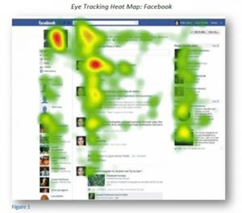
Today, almost every website contains a logo in the upper left corner of the screen. No wonder, since that's where our eye wanders most often. You'll notice that categories in online stores are also on the left. And the further down and to the right, the less relevant the content is.
And no wonder, since web designers work based on the principles of eyetracking.
A simple study from Facebook:

businessinsider.com
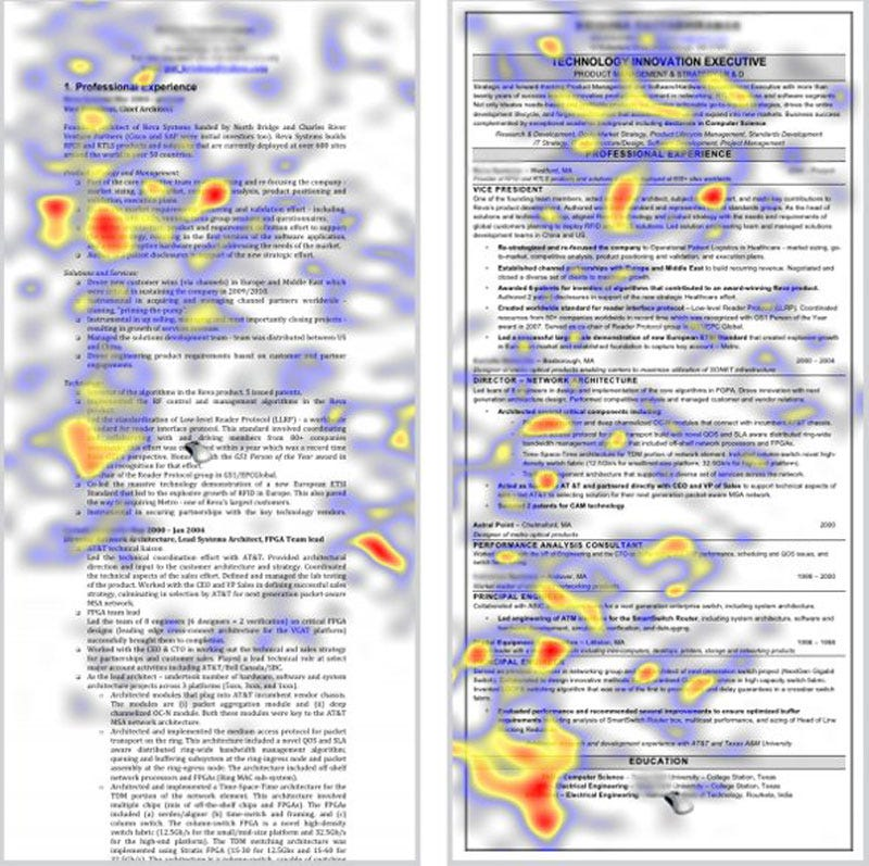
Breaking down content into lines is equally important. The above study (and more) proves that we most often read the shape of the letter "F". In longer texts, it is particularly important that the Internet user, unlike a book reader, most often only filters the text rather than reading it in its entirety.
The first words are also very important. You will notice that on Empik's or Amazon's website it is the most popular categories that come first, although it would seem that they should be arranged alphabetically.
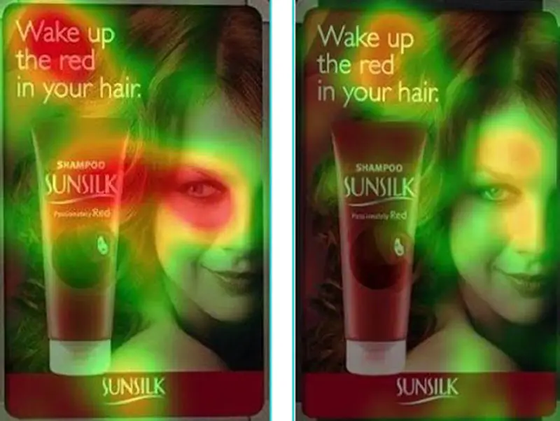
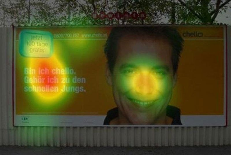
Ads are also created based on e-tracking maps.

businessinsider.com

businessinsider.com
As you can see, the left side rules. And below is a proof of how we filter long and boring texts

businessinsider.com
Very often, the golden mean to attract a reader or customer can be the less is more principle.
Congratulations @kreatywnie! You have completed the following achievement on the Hive blockchain and have been rewarded with new badge(s):
Your next target is to reach 900 upvotes.
You can view your badges on your board and compare yourself to others in the Ranking
If you no longer want to receive notifications, reply to this comment with the word
STOPCheck out the last post from @hivebuzz:
Support the HiveBuzz project. Vote for our proposal!