I saw acidyo’s post a few days ago and I neither commented nor engaged with it. Even though I loved the concept of the initiative he was starting, I simply read the post, voted and reblogged it. I didn’t put much thought into participating myself because I’m no designer. I knew there was no way I was going to win this one. But I saw my friend @zzzinnn’s entry this evening and I could help but throw in a participation myself. So if we’re talking inspiration on why I decided to jump on the design, there it is.

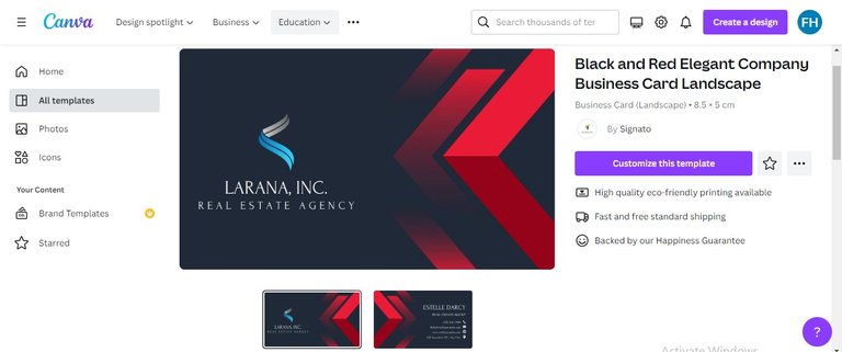
For the inspiration on the design I came out with, there’s really nothing special about it. I’m a visual person, but my vision needs to be sparked or ignited. My ignition for covers and designs mostly comes from Canva. So first thing I did was jump on canva, and find some templates. Luckily for me, this nice hive-looking template was staring me in the face after a few scrolls. And bam! I knew that was the one.

Immediately I saw it, everything just came to me on which way to take the design from there. So I got to work. To be honest, I didn’t do much work myself on the front. I simply replaced their logo and name with what you see on my design- A QR code generated on QR.io that links to hiveonboard.com and a slogan I thought was fitting as a description of Hive: Your content, your keys, your crypto. This basically summarizes what Hive is about in short (imo of course).

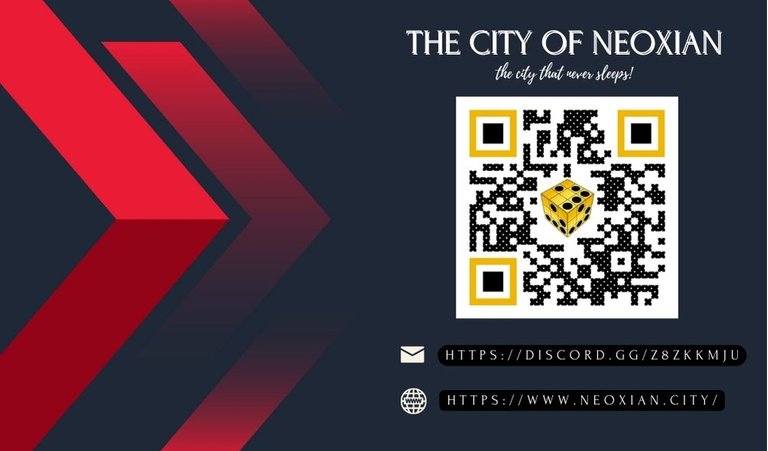
After this, what was left was the back. Business card templates come with a front and back templates, so I basically did the same for the back. This time however, I put in a bit more work than I did for the front.

The Neoxian City is known to citizens of the city as the city that never sleeps. We call it that because it literally always has people chatting in the discord. 24/7. You can hop in the city discord anytime to verify this. Scan the discord. Hehe. This is simply the inspiration behind the back side of the card. I decided to also add a link to the Neoxian.city front end for people who don’t know how to use qr. This is my way of increasing the inclusion group of the card.
I changed the color of the rectangular edges of the qr code to match the black-dotted yellow cube of the neoxian city logo. I also changed the style of the qr dots from the classic design to this dot pattern that looks like a minetest world or brick world. In the neoxian city, we explore a lot of web 3 based improvements of web 2 apps.
Minetest is an improvement of Minecraft and we've been exploring it for quite a while thanks to Mr Dragon. I just had the feeling adding this detail could in some way onboard more minetest-playing citizens. So this was a bit of detail, but only to the informed eye. Others who see this different dot pattern might not even pick up on what I'm saying. W're heavy minetesters and would love to have more minetesters join. The community is open to all though, minetesters and non-minetesters alike.
So yeah. This is not going to be the winner for this initiative, but is simply my humble contribution to marketing Hive to more people outside. May the best design win. Haha.
This post has been manually curated by @bhattg from Indiaunited community. Join us on our Discord Server.
Do you know that you can earn a passive income by delegating to @indiaunited. We share more than 100 % of the curation rewards with the delegators in the form of IUC tokens. HP delegators and IUC token holders also get upto 20% additional vote weight.
Here are some handy links for delegations: 100HP, 250HP, 500HP, 1000HP.
100% of the rewards from this comment goes to the curator for their manual curation efforts. Please encourage the curator @bhattg by upvoting this comment and support the community by voting the posts made by @indiaunited.
Haha why would you conclude that this isn't going to be the winner of this initiative... Anything is possible 🙂
You designed a good business card, now I'm inspired to join in this contest 😂 I'm not good designer at all.
But if Hive has taught me one thing, is doing you and get encouraged so I'm hoping in on this one.
Well done and yeah, may the best design win!!!
Lol I was going to participate either so I guess we both should thank @zzzinnn for the inspiration chain reaction. Lol
Haha sure!
Thanks to him
You did great, atleast for a starter. It’s not bad. You took up a challenge and did it to the best of your ability. That’s all that hive is about. With time you’ll be perfect.
Thanks for the encouragement, man:) I’m sure you’ll want to drop a design of your own. I’ll be on the lookout for it :D
I’m still gathering my inspirations😂
So you already give up that you can't win the contest right?
This is incredible, believe in yourself and anything is possible man.
Nice design and I love it,well done
Haha I think I forget to write this reply to merit.
I didn’t give up. Lol I merely was just iterating that my design is mid. I’m an amateur in a contest of pro designers. I believe in my design of course. I wouldn’t have dared to bring it forth if I didn’t. Lol
Then next time you don't need to put it there that it might not be the winner.
I even love the design, just a reminder that you are doing well and it wasn't an amateur design.
Thanks, man:)
You welcome ,this your name is always funny.
I hope you will write an article on it soon😃
My intro post is the article on it. Lol check it out.
Okay ,I will check it out.
Depressedfuckup, this name is heavy 😃
Oh @actordontee, by the way, this weekend’s game night is tonight. I mentioned you in my announcement post 2 days ago but I’m just reminding you in case you missed it. It’s in 30 minutes time.
Thank you so much, bro,I won't be able to join tonight.
I'm in transit , but I will participate next week
So much for you are just a starter in this types of things.😂
Even though you claim you are a starter I still think it looks really good. Whenever I see someone combine colours so easily I feel good cause I don’t know how to combine colours very well.
The design of the neoxian discord looks pretty cool man :)
Haha thanks man. Let me see your entry soon.
I will do that real soon. Am looking for the inspiration to create :)
This is inspiration to create. Now get to it!
Chale, make no one lie you. Your design is nice. I see simple and straightforward
Thanks for the encouragement, bro. Haha simple and straight forward was the idea:)
I will have to come from some canva tutorials. You nailed it, boss. Good luck with the contest.
Are you teasing me? Lol I saw your design. Let’s not do this😂
😆😅
Sharp🚀😇
Lol seeing this, I can now rightfully conclude that the total number of things this boy can not do is equal to the product of the first positive integer. This is dope. I hope you win
You and these your expressions. Lol thanks for the nice words anyways.
I learned all from you ! You’re welcome 😉
I like the design dude, dont kid yourself! It’s simple and to the point which is good. Look at the hive logo, it’s pretty easy to see and doesn’t have a lot of flash and bullshit to it. These cards here look pretty sweet I’m glad you entered!
Posted Using LeoFinance Beta
Thanks, man. I’m glad I entered now too. Didn’t think it was a great idea entering at first but you guys spoke confidence into me now. Hehe
I also designed mine in Canva, it takes a little time to do it but in the end they look great, this one is great, I like it.