Hello everybody!
I hope you’re all doing great.
Today I’ve got something special for you…
@ximmathiii and I tried to get a few other nice flashlighted images of plants.
How we did it:
We went in a dark room and placed the plant in front of either a dark background or another beautiful wall.
Then we set up the camera on a tripod.
Afterwards we dialed in the settings 30 Sek to get that blurred light and round about f8 to get the whole plant in focus and of course ISO 100 or sometimes even 64 to get a clean image and then we started lighting it with the screens of our phones and tablets.
To archive the stripes in the background we took my IPad and slowly went through the frame.
Talked around long enough: Let‘s start with the images:

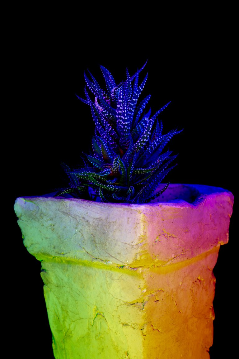
(Sony a7RIII, Sony 24-70 f/2.8 GM, 58mm, 20 Sek., f13, ISO 100)
This time we even had to go to f/13 to cut back on the incoming light.

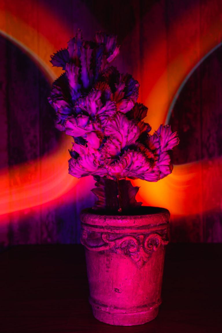
(Sony a7RIII, Sony 24-70 f/2.8 GM, 40mm, 30 Sek., f7.1, ISO 64)
This time we changed the shutter speed to 30 Sek. And the aperture to f7.1 that we got that nice lightstripe but also a little bit of background separation but not to much that everything is in focus.

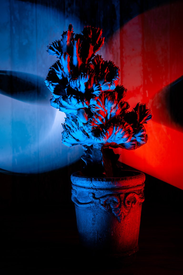
(Sony a7RIII, Sony 24-70 f/2.8 GM, 40mm, 30 Sek., f7.1, ISO 64)

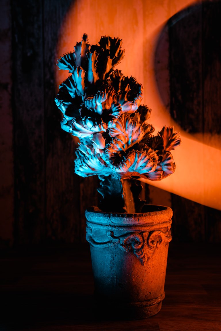
(Sony a7RIII, Sony 24-70 f/2.8 GM, 40mm, 30 Sek., f7.1, ISO 64)
The settings on these are the same but we experimented a little bit with the color…
Anyways that‘s it again: Thanks for reading and I hope you liked our pictures.
Maybe leave some feedback in the comments below and tell me which is your favorite (personally I prefer the first one)
See you soon!
I think i like the third image best. I love the color contrast but it seems to be the one in best focus as well. For shots like this, the focus on the plant is the most important aspect. Lighting and background don't impact as much as having the focus in proper order! Very creative shoot! =)
Thanks…Glad you like it
You're welcome! =)
Nice execution. You can also try to give a highlight in one color and for shadows just add a little bit of light in a contrast color. Brings out structures even more.
Thanks a lot...next time I'm trying to do that😊