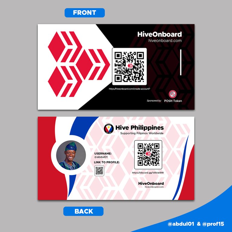
Hello, wonderful people of this community. I am here to participate in this great contest with my partner @prof15. Thanks to the sponsor @poshtoken and other sponsors. Thanks to @acidyo for the contest.
This design will entail a lot and I will give all of us here the breakdown of how it was done. It’s not going to be in a video form but we will do our best to make you follow the process from where started to where we ended it. we will be glad to see many people going through this journey of our design with us. Let’s start the process.
Exploration stage
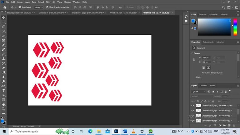

Explorative designs
We all know design isn’t something you just start and do. you have to explore your space and see how well your imagination fits in. so we started with some works. We explore made our choices and got the idea to use and modify it to the way we wanted. So these are the ones we explored and made our choice at the end of the day.
Design Start
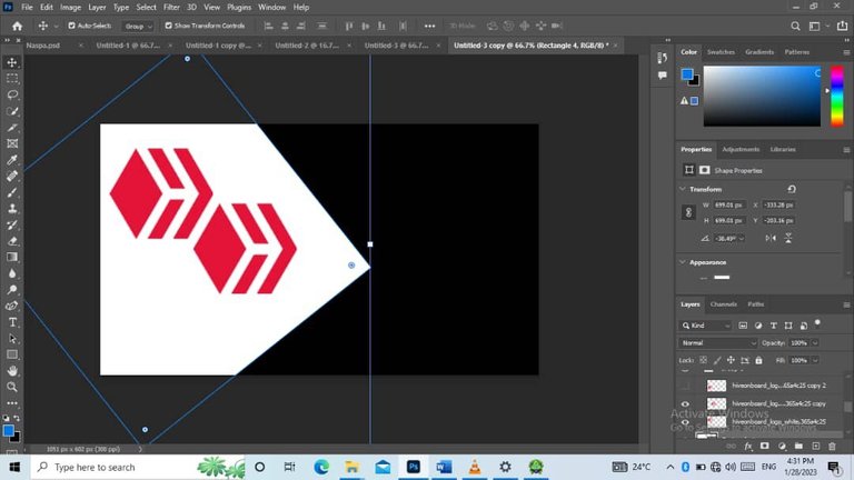
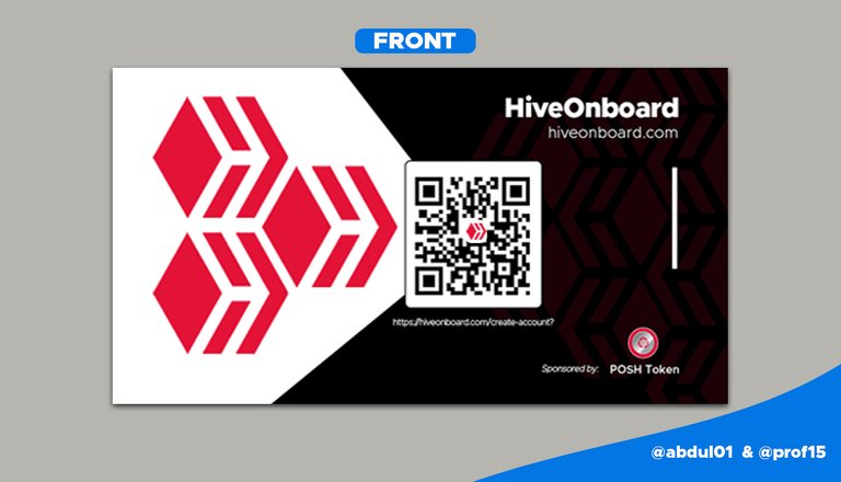
After we did our exploration, we started the main work. the work where we wanted to use represented colors and logos of the desired design which is black and white plus the hiveonBoard logo. The size was made to fit the normal size to present how the cards are.
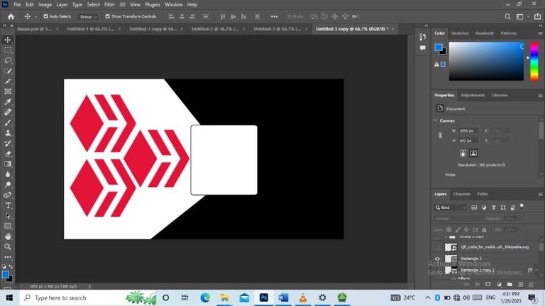
From there we moved to create meaning in our design. We brought in the hive logos such that it will represent an arrow. Let’s all take a look at the design we will see the arrow design of the three hive logos.
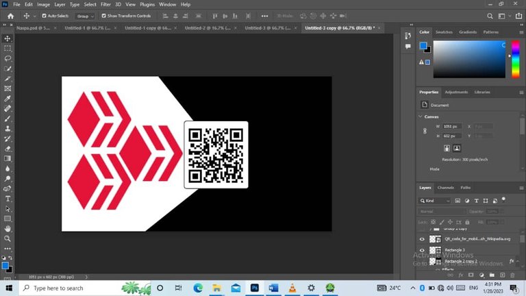
From there we added the QR code for the HiveonBoard sign-up. So now let’s observe what I was saying above. The logos now points to the hiveonBoard sign-up QR code. This was where we used the design to do the talking rather, we opening our mouths. So that’s what the design here means.
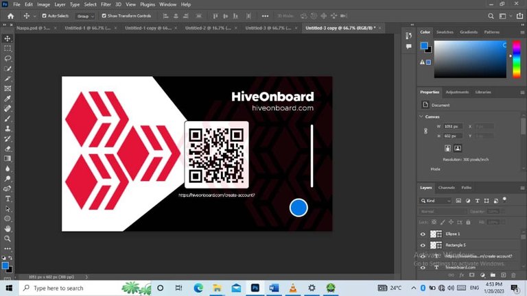
From then we then made them know what the QR code there was for. We showed that it is for the hive on-Board sign-up link which is written under it. Let’s look at the design here, we will see the name “HiveonBoard” and under it, we have its homepage URL there. They own the business card and there should be a way we can see what they are about. That’s why we kept it there.
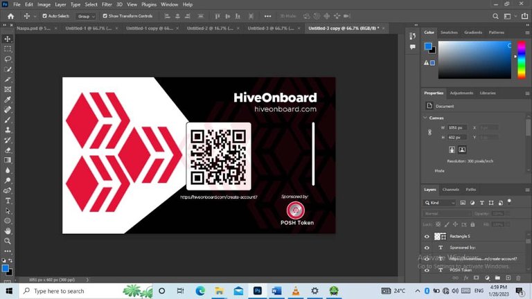
The next design was bringing on our sponsor. It is great to have someone giving his or her best for something we acknowledge them by bringing them on the business card.
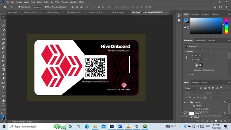
This was when we were done with the front face of the card. The front face used the color black the onboard color. So, this is what the front face of our business card looks like.
This is what our front business card design looks like.
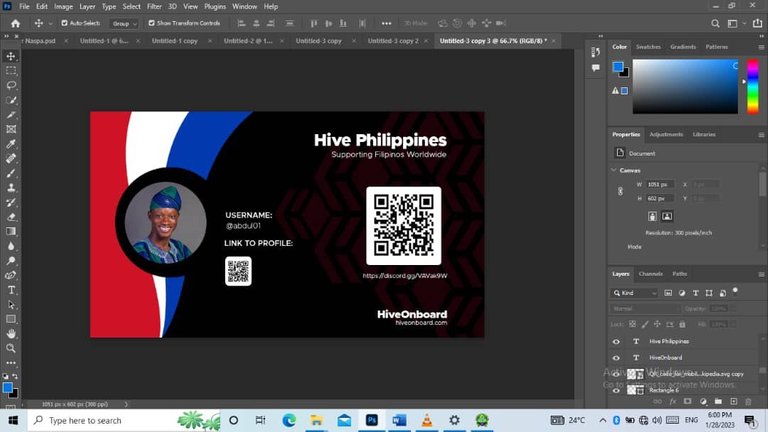
Now to the back where we were being told to sue Hive PH for the case study. Then the back will be made up of things that we can use to locate that community or see what the community is about. We didn’t get the details for this because of the first one. But will show some things that we did there too.
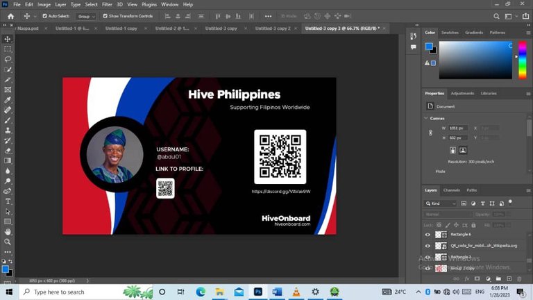
To the design. So, the most important ones that were to be covered were the back should be about the community it is being sent to, and also there should be a QR code that scans to the discord community of that particular community.
 1
1
 2
2
 3
3
 4
4
 5
5
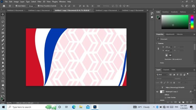
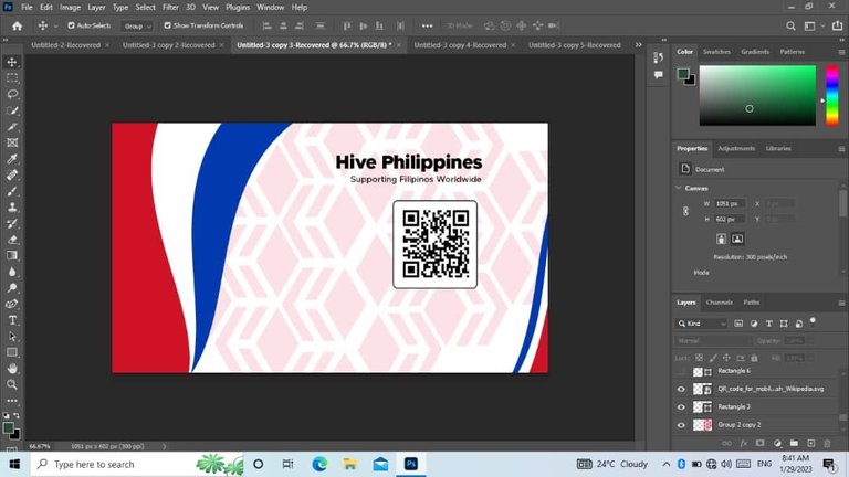
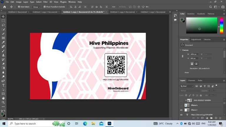
Analyzing for design, we brought forth what we were expected to show. That’s the community where we used the community colors. The QR code which we included and wrote down the link to the discord channel of the Hive PH community. Now for this design, this was what we had.
We then moved further to think about our design. The color came to mine. The front is made of the first hiveonBoard color so this should be of the second which is white. Before the color, we had to show the community what the back of the business card was for. We did that by bringing the name and the slogan of the community we will be using. Here is this case Hive PH as a case study. HiveonBoard should still be there because they own the card completely. This was what was meant to be on the card.
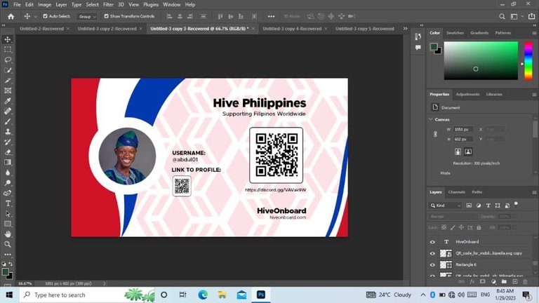
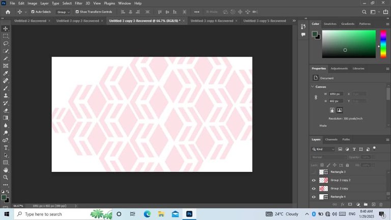
Here we changed it to white background and changed the colors to the other color of the hive which is black. We should have what we had to show and this was how it will be. From the contest, it was said we can add what we think the kit will be necessary and this was what we added.
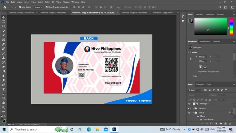
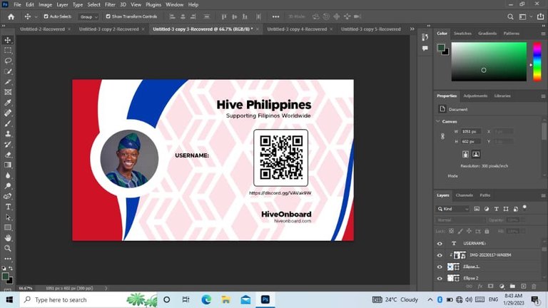
This will be awarded to each community. So, let’s say Hive Ph has a community, and each member there will have a business card of Hive Ph. It should come from them and there should be the username, the profile, and the link to the profile of the person who owns the card. That was what informed our decision to add the username and the profile picture of the user on the hive and then use a QR code if scanned to take that individual to the profile of the person. That was what we added as our idea and I hope it’s welcome.
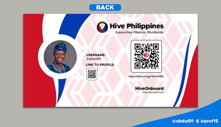
So here is the final design of the back of our business card to have onboard for the Hive PH community.
We still have the black side so is either the black front and black back or black front and white back. What are the designs available here in our presentation of our contest?
For a clearer view of how we made our business cards, we brought them unto one screen for each analysis. We will appreciate it if we look through and see what we need to change or what has to be done to any of the designs to make it better. Ideas are welcome and we will be glad to hear them.

This work is from @prof15 and @abdul01. We say a big thank you to the organizers of this contest and we hope we get the best one at the end of the day.
Congratulations @abdul01! You have completed the following achievement on the Hive blockchain And have been rewarded with New badge(s)
Your next target is to reach 400 comments.
You can view your badges on your board and compare yourself to others in the Ranking
If you no longer want to receive notifications, reply to this comment with the word
STOPTo support your work, I also upvoted your post!
Check out our last posts:
Support the HiveBuzz project. Vote for our proposal!
Absolutely stunning, great work guys. I wish you the best.
Thanks my boss😇✌️
This is nice. I like the designs and I must say you guys did a great job using photo shop.
I think you guys spent more time trying to make the back look nicer than the front, you have to remember that it’s the front that should catch attention on a business card not the back.
The back looks more like the front and the front looks more like the back.
What am trying to say is that, the back catches more attention.
I get the vibe. Thanks for the analysis. We will take that into consideration next time.
Thanks very much😇✌️
Ok bro. So what will it cost me( in hive) if I want you to make me a business card like that?🤔
Let’s talk about it on discord boss
@pandev is my discord handle✌️🤩
This is amazing. I’m actually jealous of how you really took your time to do all this. I’m a fan. All the best bro.
Thanks boss. We have to do what we do best. Thanks by the way😇
This is some really cool design. I bet it will take me ages to come up with something like this.
Thanks for the complement 😇
I’m humbled✌️
Thanks for the complement 😇
I’m humbled✌️
You really did a great job guys 💫🔥. I will have to come for some PhotoShop tutorials. Lol
Sharp ✌️💥🚀
The rewards earned on this comment will go directly to the people( @abdul01 ) sharing the post on Twitter as long as they are registered with @poshtoken. Sign up at https://hiveposh.com.