You are viewing a single comment's thread from:RE: HIVE Hustlers: Announcing Our Logo/Branding Design Contest - 40 HIVE to The Winner!View the full contextthemanualbot (71)in HiveHustlers • 6 years ago my 2nd design. can have complementing colors to choose from.

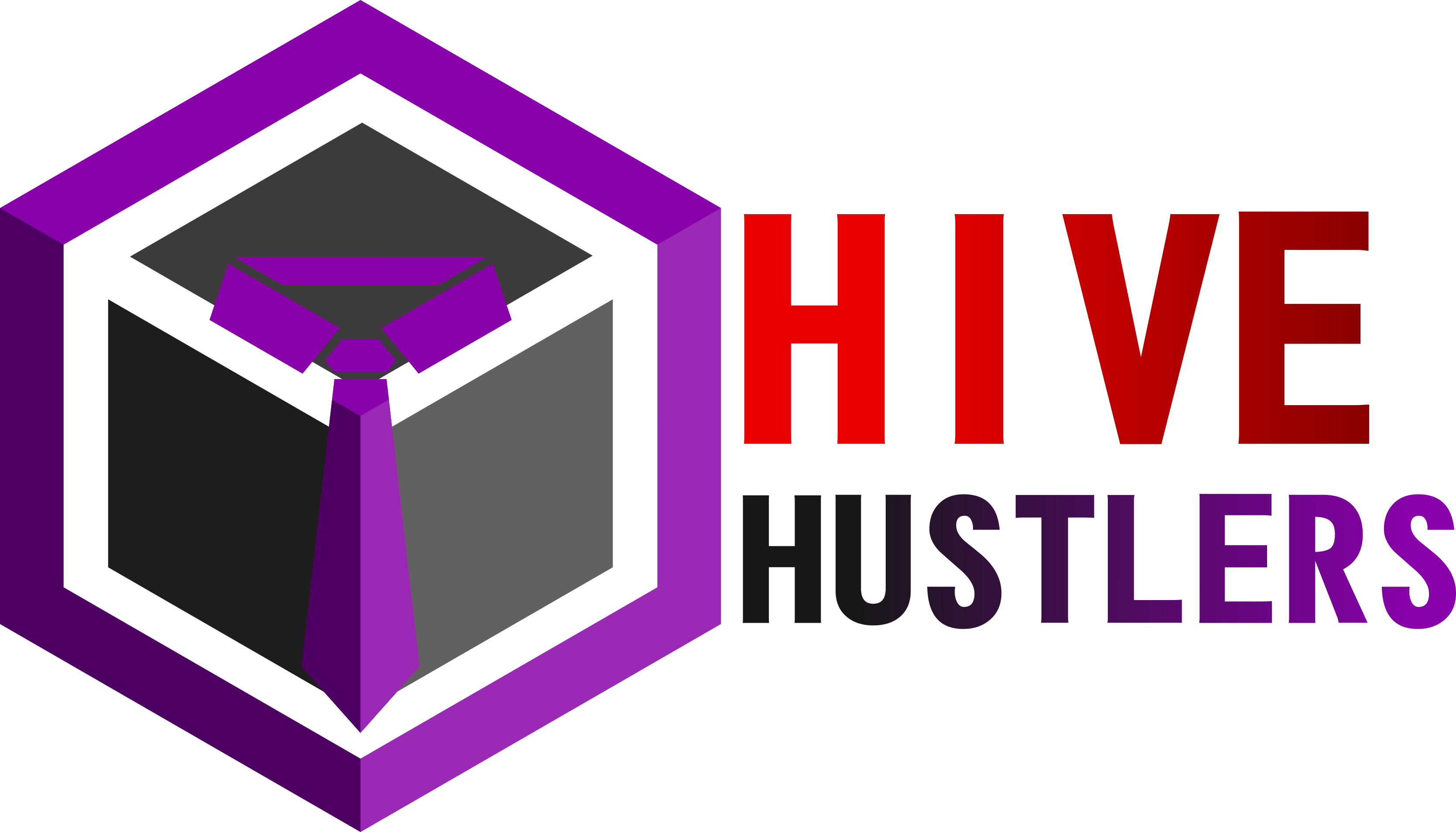
I like #1 (without wording/gradient lettering)!
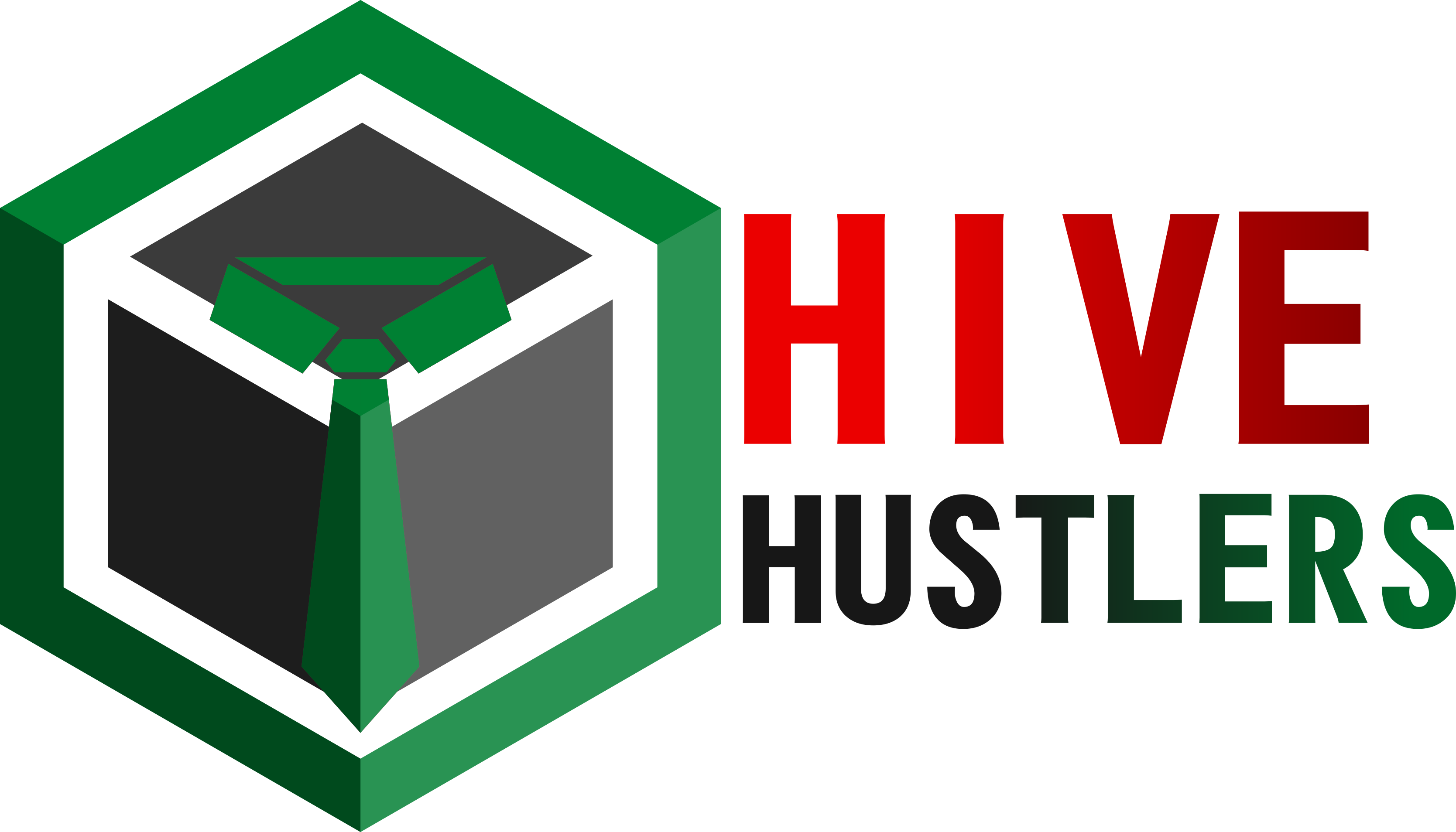
Perhaps, in the cube sides, you could do "H" and "H" for Hive Hustlers ;)
Like this? :D thanks for the feedback...
My personal opinion, the lettering feels a bit too "blocky" for me - of course it's still up for community members / voters to decide, so, that's just my personal feedback :
Yep, we'll let them decide. :D