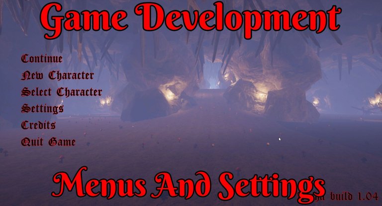
The time has come I have an actual exit game button and a lot of other standard menu and game settings options. I had early on a basic menu system it was so bad that I disabled it and never looked backed for the nightmares it would induce till now.
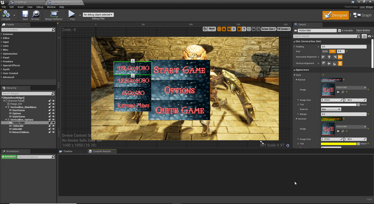
I give you the old system. It was mostly there so I could “quite” the game if you would. I’m sure it was something I worked on at some insane hour without sleep and it was supposed to be good enough to last me for a while.
I hated it so much and did not need a quit game button while playtesting from Unreal Engine 4 (UE4) itself that I ended up disabling it. I’m slowly walking towards such functionally needing to be in-game that it was time to revisit it.
Game Intro Title Screen
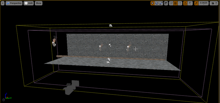
The first order of business was to get a little intro screen up and running. Nothing fancy and in fact while I do have a few things on my wish list for it I’ve remained good at not overextending and just working on the basics only.
It’s quite basic. I created a small zone with just a couple of tiles for the background. A little bit of lighting and added in the background sound of fire from the torches. Other than that for now nothing special.
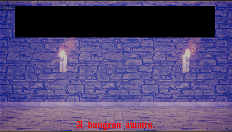
The player sits at this screen just for a couple of flashes of “a dungeon awaits” before being taken to the next screen. One of the possible names for the game, for now, has been removed in the screenshot.
I gave this little zone a bit of a colder blue look and feel. While I may do more in the future it's just a few seconds spent here for the player.
Main Menu
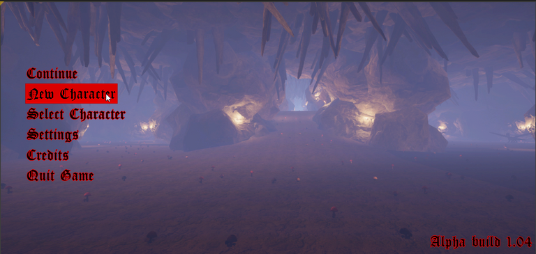
It was about time I had an actual main menu in this game. From here the player can do quite a few different things. They can continue on their last game. Make a new character. They can also adjust the game's graphics and sound settings. Along with a couple of other things in this zone.
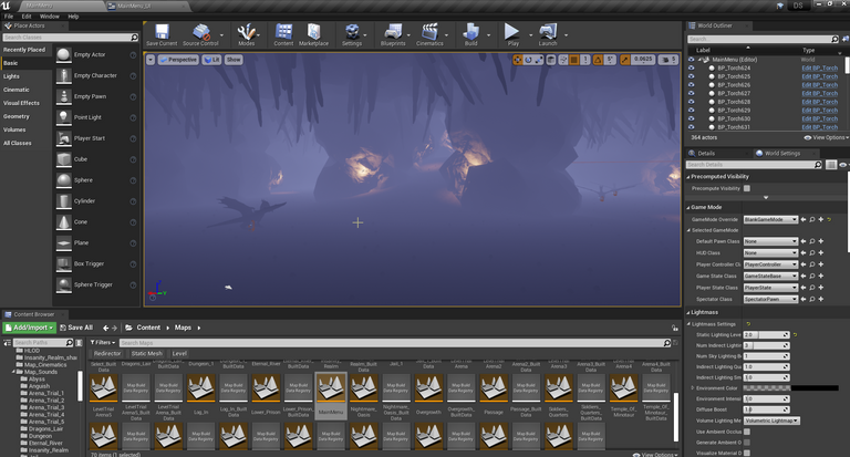
It’s always interesting how many things reside within their zone in a game. The main menu is no expectation. Here things will be a bit busier with some end-game monsters walking in and out of the scene while the player sits here before clicking on an option. I still need work on the animation of the monster for that last part as I ran into a bit of a bug.
Class Select Screen
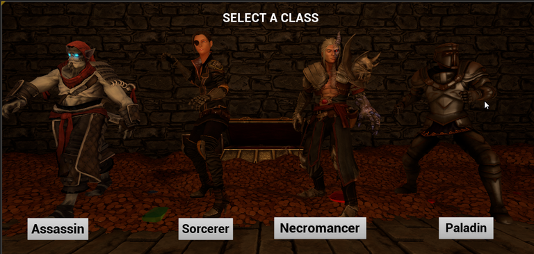
For the longest time, the class section screen for the player was sitting in the first dungeon zone. That was great in the early days when I was playing testing a lot and wanting to use the different classes. I also spent far more time than someone ever should in my first dungeon zone. It was time however for that to change as well.
Thankfully there was not much work getting this setup. I just copied the meshes from the old setup into the new zone. Add some gold to the gold pile that they are in front of to make it a little more full. Along with moving some gems around.
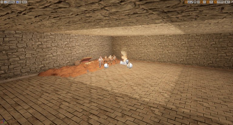
I played with the lighting a little bit in here. I wanted it dark but not as dark as it has been in the past. Thankfully with how small this zone is it only takes a couple of minutes for a full lighting rebuild. This is also a temptation to keep wanting to play with the lighting and making small adjustments.
There is a little bit of change in the code since it's now in its zone. That however took less time than playing around with the gold did. All in all, I’m happy to have it in its place now. I might even extend on this place a tad in the future if I find the time for it.
Settings Menu
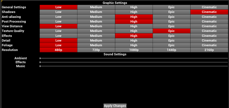
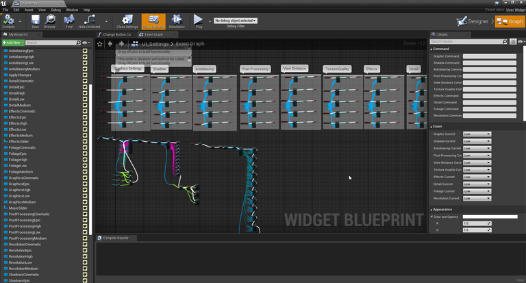
I was a bit torn in how I wanted to have this overall set up. I ended up not having so many options that I needed to split the graphic and sound settings into their widgets. I have given the player quite a few options here and this was the biggest time spent on what I’ve been working on as of recent days.
Every single option for the player to select is its variable. The option the player selects also changes to a red background to indicate they have selected it. This I feel gives the game a bit of an older vibe with how it’s set up. Nothing fancy.
There are five different options for the player to select for each graphics settings. While I could have done it a bit more fancy with some of them having drop-down menus, other having sliders, and some being set up the way they are. I just wanted something simple and not over-complex.
It was also interesting reading through the documentation Unreal provides for quite a lot of different things you can implement for the player to change. Some things have quite a wide range you can select while others might just have something as simple as turning a feature on or off. While others you could have a dozen options.
Cinematic will always have the highest option to select for graphics quality and low with the lowest. Some of the options in the middle space however might change very little or nothing at all if there were not at least 5 different settings to use for it.
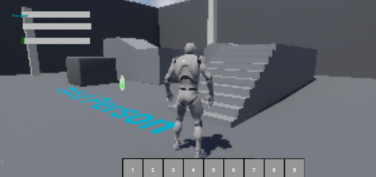
Thinking back to all the games I’ve played. I now do not doubt in my mind when I clicked on graphics settings and swore nothing changed that nothing did! I wanted to give lots of options for the player to have so a wide range of machines could play this. I just don’t wish the lowest settings on anyone. I hope a toaster could run that it’s so bad looking in one of my testing areas on the default pawn!
As far as the sound options are concerned there are a couple of things that were easy to implement for the player to be able to control the volume with a slider. While there are other things I don’t know much about sound and they require a decent amount of time modifying how I have the sound set up to work. It didn’t seem worthwhile so three options it is.
In Game Menu
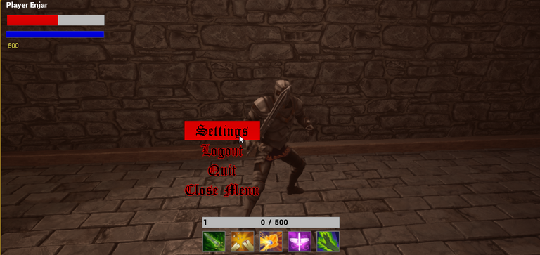
Finally, we end up where this journey started with the in-game menu. I knew wanting to change that would lead down quite the rabbit hole of other things I wanted to get done. For this, I kept it quite simple.
You can access the settings for graphics and sound from in-game. I have always found it annoying when games don’t provide that option and since I already had it set up it was nothing to just have a button for it.
You can also logout which takes you back to the main menu. With how simple it was to add, I now question why every game does not have that option. It’s much quicker if you want to switch to a different character. Making the player having to fully exit and restart the game to do so is just odd and I would not do that to them.
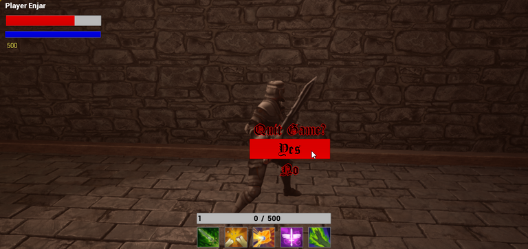
There is also the whole reason for doing all of this the legendary and super important ruler of all options in any menu in a game. The quit button. It even makes sure you want to exit the game before doing so. How fancy.
Final Thoughts
Yet another long-overdue thing I needed to get around to doing. It is starting to feel like a game now. Still, much polishing, fixing, and endless things to get around to. At least this is now up and running. All be it a couple of changes I’m sure will be in its feature along with a fix or two.
Other Posts:
Information
Screenshots were taken and content was written by @Enjar. Screenshots are from Unreal Engine 4.
Game roadmap.


Nice, nothing annoys me more when a game has a bunch of different menus/buttons in all different sections/screens of the game, cellphone games especially have this problem where there are buttons splattered around all over the place...
Cellphone games are like more buttons = more microtransaction opportunities 😂.
yep, so annoying
Super cool! Can you invest in the game development?
Not looking for any investors at this time. Also not set up legally to accept investors either and the costs to do so are not worth it for now with the yearly cost to main at this time.
This is a very high-risk project that is not expected to generate much revue unless some later stage goals are accomplished in 2023. Those goals are far beyond my current skillset and will be the biggest finical cost to the project to run.
I am ahead of schedule and hopefully by the end of this year I’ll be running a single player alpha version for people to check out and test. Once that is achieved than I’ll be revisiting my options and the path forward.
Twitter.
Congratulations @enjar! You have completed the following achievement on the Hive blockchain and have been rewarded with new badge(s) :
Your next target is to reach 12000 comments.
You can view your badges on your board and compare yourself to others in the Ranking
If you no longer want to receive notifications, reply to this comment with the word
STOPSupport the HiveBuzz project. Vote for our proposal!