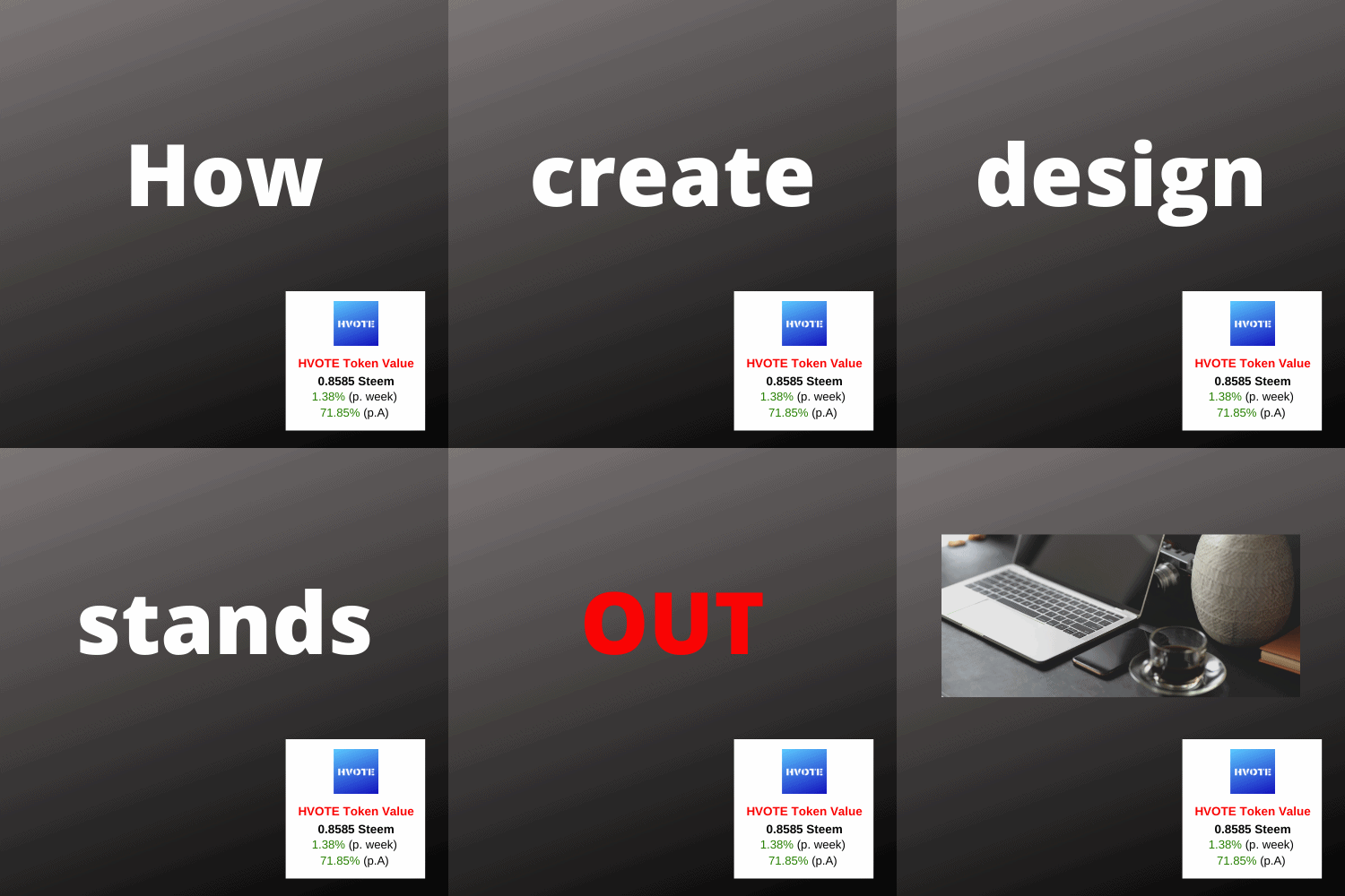
When you want to create a post and get some visibility, it is important to choose a nice image that illustrates the content of your post. On steem it is possible to use images in png or jpg format but many don't know that it is also possible to put imanges in gif format. Gif means graphic interchange format and allows to put several images into one and to create an animation.
Why a gif image can be more interesting than jpg or png
If you want to transmit a message with your image, you can lack space and alternatives. If you create a gif image, you can include more content into your picture. Another important aspect is that with a gif image, you can present something animated in a static surrounding and thus attract the eyes of the visitors.
How to create a gif image
I'm using two free programs to create gif images. The first is canva.com which is an online platform that allows you to design almost anything.
The second is a software that can be downloaded for free and it is called photoscape.
Step 1: creating your slides in canva
In canva you can create an image of any size. The important fact for the creation of the gif at a later stage is that all the images that you produce have the same size. As an example let's see how I did it for the image of this post.
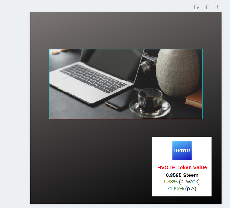
source: canva.com
I started by creating a basis image and I saved it as a png file. Then I simply erased the computer picture and instead put text.
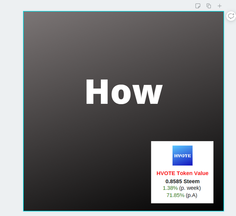
source: canva.com
I downloaded this as a png image as well and then went on to create an image for every slide that would compose my gif. On each slide there would be just one word. For the last word "OUT" I would create a litte effect by making the text once once in red.
I made a total of 11 slides and saved them all as png files.
Step 2: Creating the gif with Photoscape
When you open the software you will get a screen with the different components of the program.
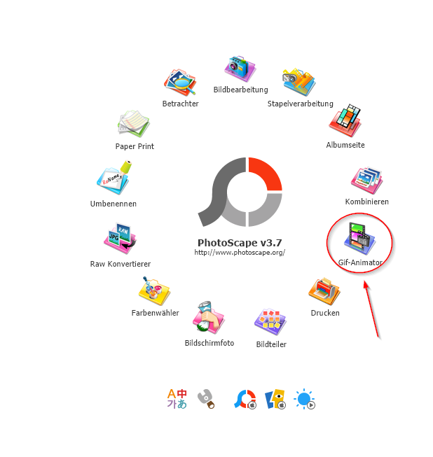
source: photoscape
You need to click on the gif-animator.
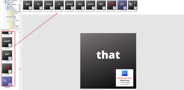
When open you have to search the slides that you have created with canva and pull them into the window at the top
source: photoscape
Put your slides into the correct order by drag and drop and define for each slide how long it should appear. You can even set what kind of transitions you want between the slides.
To finish simply save your file as gif.
Gif can be quite successfull in attracting the attention of the visitors
I've used animated gif for banners but also for bigger images and they have proven to be quite successfull. Especially on landing pages big gif animations can be quite successfull where videos are often ignored and simple images can't convey enough information.
HVOTE Explained (Video)
HVOTE Whitepaper - Adaptation after HF21
HVOTE Explorer
HVOTE Market on Steem-Engine
Great tutorial, @achim03! Thanks for sharing!
Made in Canva
@thisisawesome Moderator
This post is AWESOME!
It will therefore get a manual 100% upvote from @thisisawesome (will be done today), for the Awesome Daily Highlights in category CTPtalk, we give out 1 such vote in that category per day, plus 4 more in other categories, and your post will also be featured in today's Awesome Daily Curation report for more visibility.
The goal of this project is to "highlight Awesome Content, and growing the Hive ecosystem and the CTPtalk tribe by rewarding it".
Source
Thank you very much for the feed-back!
👋 Hi @happyvoter, I was flipping through the blockchain and stumbled on your work! You've been upvoted by Sketchbook / a community for design and creativity. Looking forward to crossing paths again soon.
✅ Join the Sketchbook Community
Thanks a lot for the upvote
Thanks for sharing this tutorial. I will check the apps you mention.
Thank you for your comment!
@tipu curate
Upvoted 👌 (Mana: 21/28)
Thanks a lot for the curation!