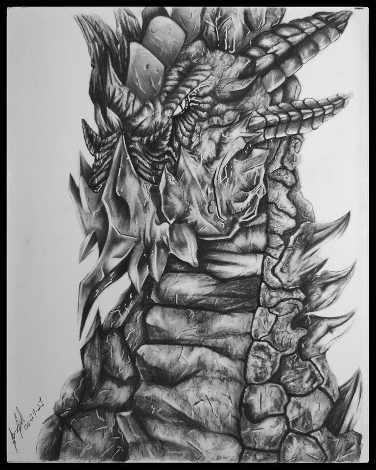
Reptiles are creatures that I love to draw because they have so many textures and dragons are my favorite mythological creatures.
that is why I will show you step by step how I did it and you can differentiate all its parts.


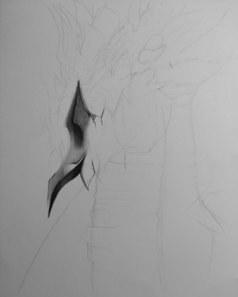
The sketch was a bit simple, just take the position of a dragon as a reference and then add elements to it.
I started by illustrating the jaw, it has a very strong coating due to the blows it gives with it.
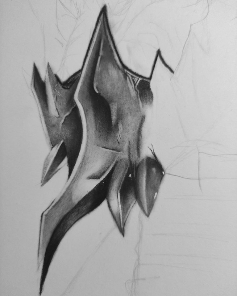
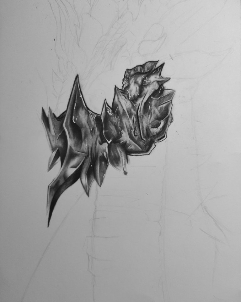
I painted the jaw with the charcoal pencil and used the brush to blur and create lighter tones.
The second image is the covering of his jaw, it is the characteristic part of this dragon.
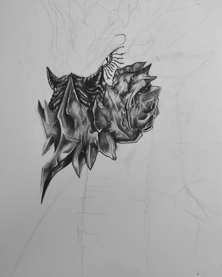
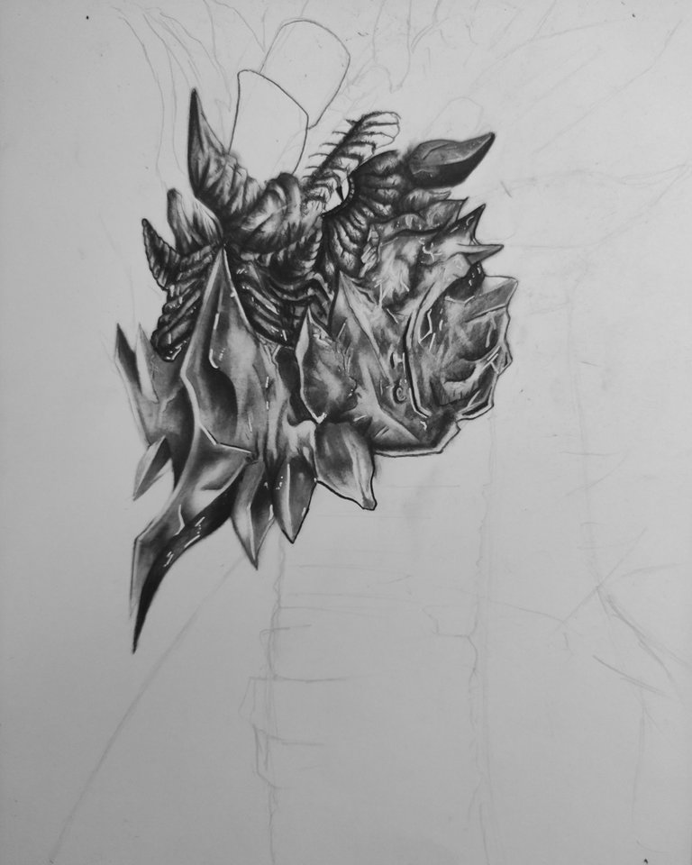
Now I will paint the face, I made her eyes very small, perhaps that is why it is not distinguished very well, however in the image you can see where it is.
Then I made details on the face, like adding horns and rustic elements.
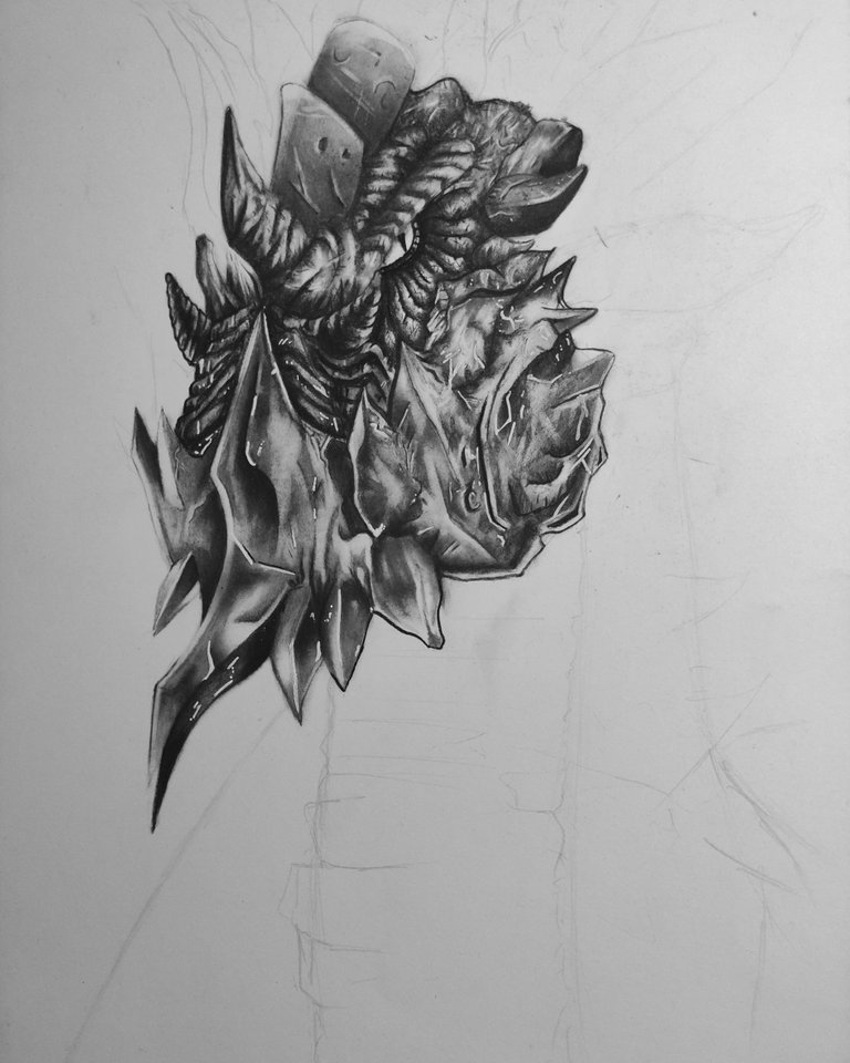
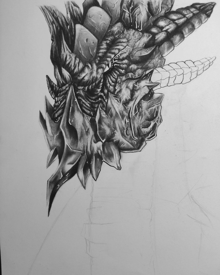
- I added a lot of details so that the skin looks quite rustic, I highlighted the details with the moldable rubber and the gel pen, this gives a little light.
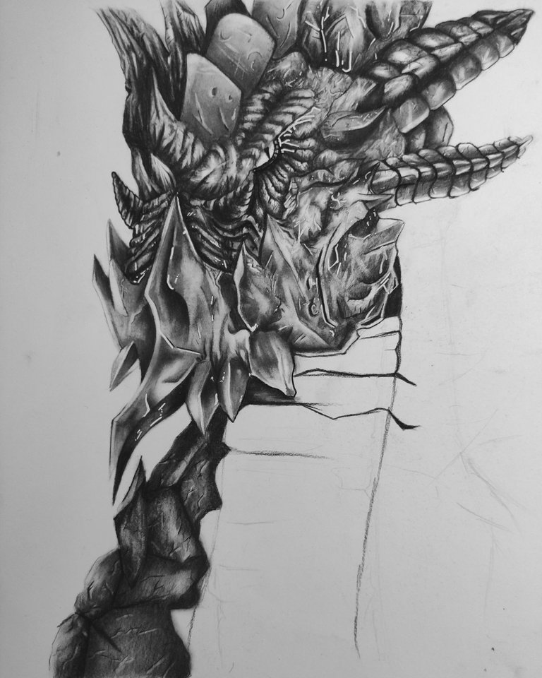
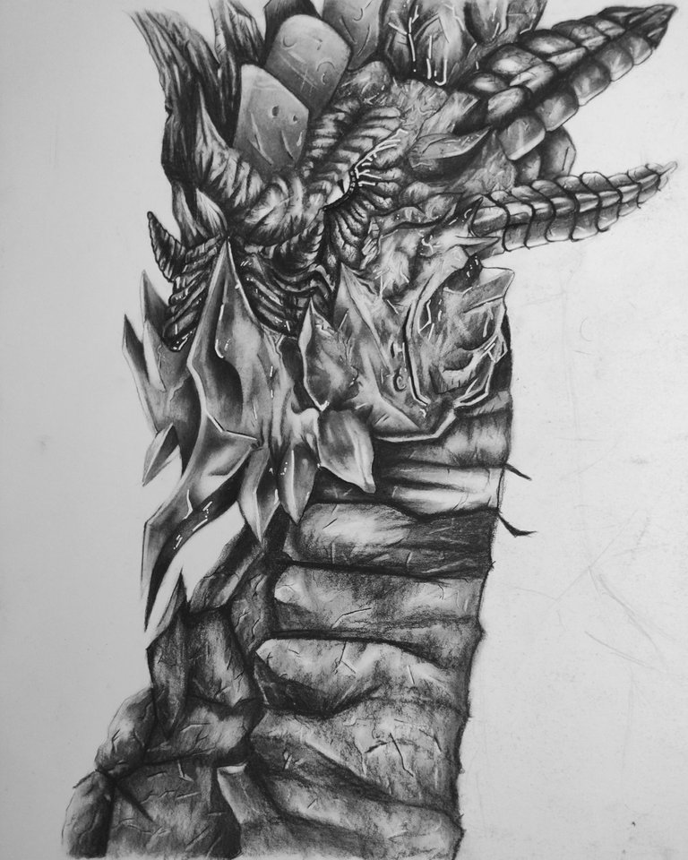
- The first image shows the right side of the dragon, a little hidden, in the second image I already added part of its neck, it is not that long, it is like its chest.

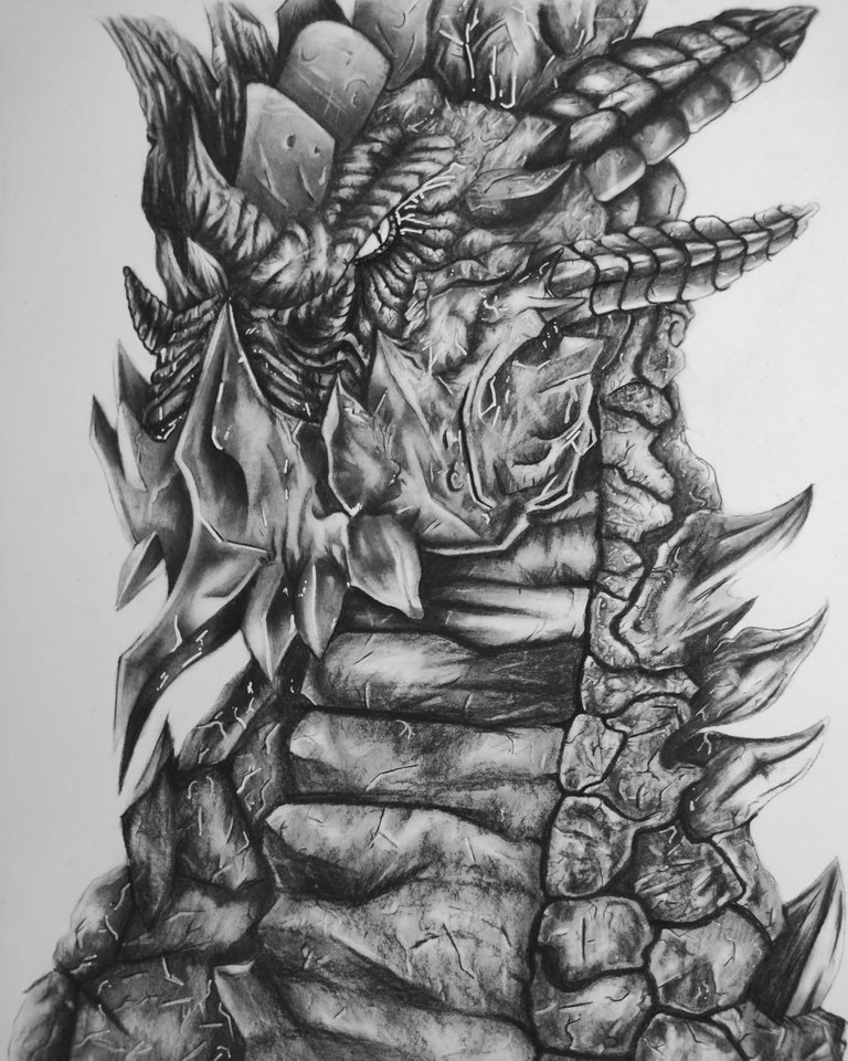
In this part I drew the left side of the dragon, I wanted to make better shaped scales and some horns to make it look more aggressive.


This job was a lot of fun because, I really enjoy drawing textures, although I had to use other materials to detail it better.
I will be drawing different dragons since I would like to create a collection on this, so I will use more than just charcoal to make my next illustrations.
I hope you like it and I want to thank you for coming!
see you to the next post.
Roll out!
Fantastic work. Is Strong Jaw a character from a novel?
!LUV
Hi Sidekick!! I think I was inspired by a Munste Hunter´s Creature, it is quite similar because it also attacks with the jaw. i dont remember the name :/
good application of the technique my friend but I think the problem is more graphic than for the colors, to differentiate it better you must make a better composition...
Yes, maybe the position, I also think that using the same tones in all the illustration causes the problem, the next one I will do it from the side and I will use graphite too! Thank you!
@realisticdraw, you were given LUV from @sidekickmatt. About LUV: https://peakd.com/@luvshares http://ipfs.io/ipfs/QmUptF5k64xBvsQ9B6MjZo1dc2JwvXTWjWJAnyMCtWZxqM
great bro! meticulous work, it would take me days to do something like this XD. Good luck!