Greetings to all! I hope you are feeling very, very well. Today I'm back with a new post and this time I bring you the first part of this new section where little by little I will show you how you can make basic, intermediate and advanced compositions in Photoshop.
¡Un saludo a todos! Espero se encuentren muy pero que muy bien. Hoy estoy devuelta con una nueva publicación y esta vez les traigo la primera parte de esta nueva sección donde poco a poco les iré enseñando como pueden hacer composiciones básicas, intermedias y avanzadas en Photoshop.
I won't spend too much time explaining how to use Photoshop itself and how the Photoshop tools work, since the internet is full of free and paid courses where you can learn more effectively. My intention will be to show you the application of Photoshop tools to create from basic to advanced compositions.
No me detendré mucho explicandoles cómo se usa Photoshop en sí y cómo funcionan las herramientas de este, puesto que internet está inundado de cursos tanto pagos como gratuitos donde pueden aprender con mayor efectividad. Mi intención será entonces enseñarles la aplicación de las herramientas de Photoshop para crear desde composiciones básicas hasta las mas avanzadas.
I hope you like my post and can give me your support. Having said all
this, let's get started!
Espero les guste mi post y puedan brindarme de su apoyo. Dicho todo esto ¡Comencemos!
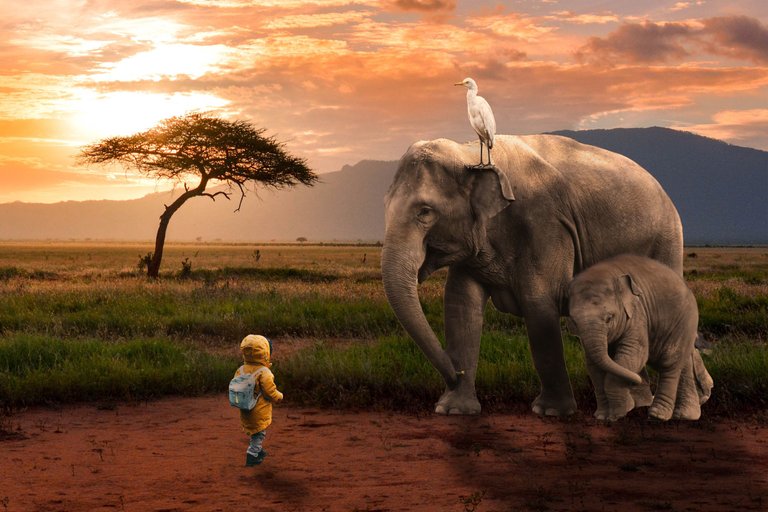
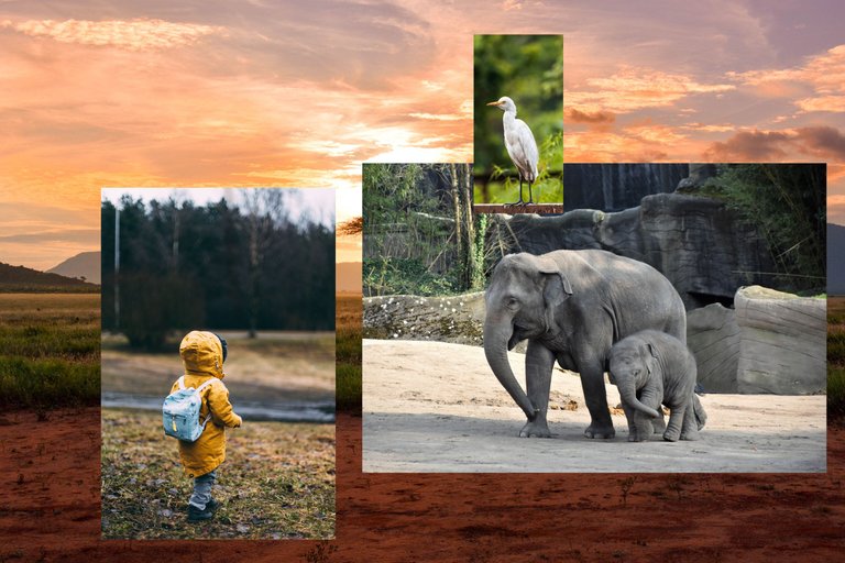
¿Como podemos entonces pasar de esto a esto?
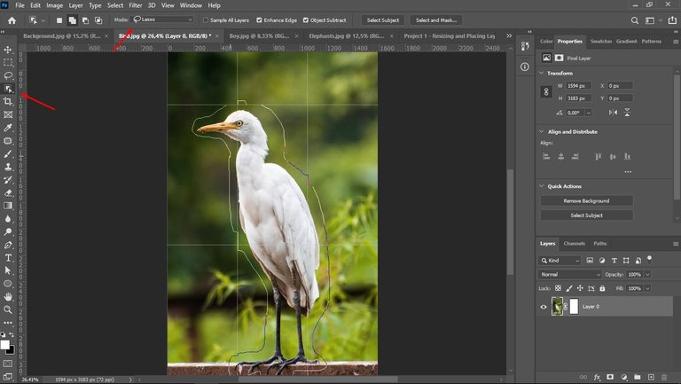
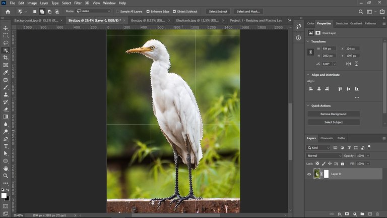
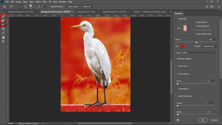
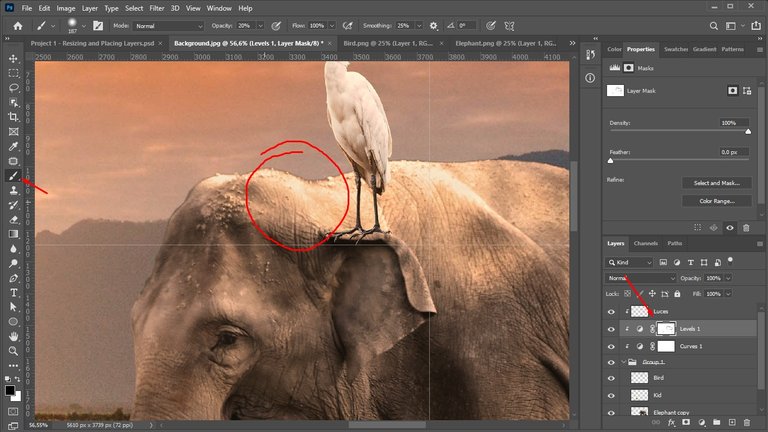
Well, the bread and butter in Photoshop will be image selection or image clipping. For this case, use the object selection tool in lasso mode to make a quick selection first. That done, I went to "make a mask", this is where we polish the selections to make them look really nice. Remember, no matter how creative you are in making compositions, if the selection of the photos you use is bad, the composition will be bad too.
Bueno, el pan de cada día en Photoshop será la selección de imágenes o recortes de imágenes. Para este caso, utilice la herramienta de selección de objetos en modo lazo para hacer primero una selección rápida. Hecho esto, me dirigí a “make a mask”, aquí es donde pulimos las selecciones para que se vean realmente bien. Recuerda que, no importa que tan creativo seas haciendo composiciones, si la selección de las fotografías que uses es mala, la composición también lo será.
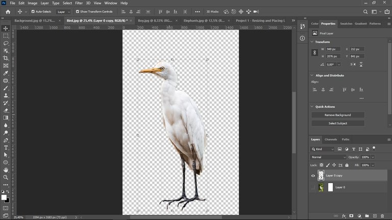
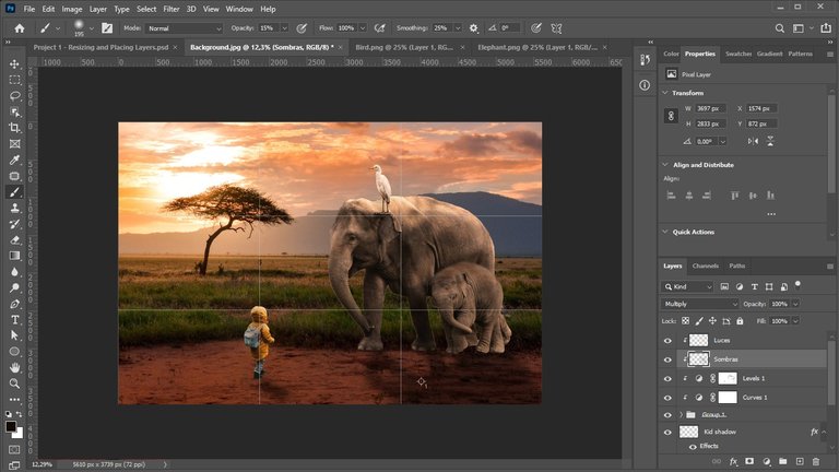
I did exactly the same with the rest of the images to be used. I then converted them into a smart object, and resized and positioned them where I thought they looked good using the rule of thirds as a guide.
Hice exactamente lo mismo con el resto de imágenes a utilizar. Luego las convertí en un objeto inteligente, las redimensione y las posicione donde creía que se veían bien teniendo como guía la regla de tercios.
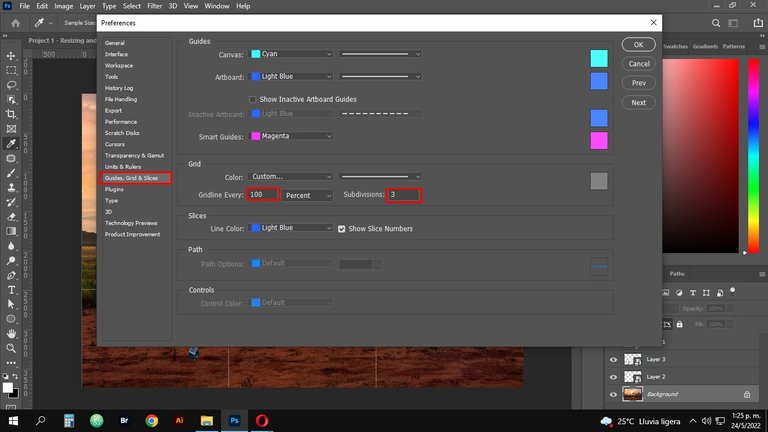
In order to see the rule of thirds, press Ctrl/Cmd + k to bring up the preferences panel. Then go to the Guides, Grid and Slice section and change the values to the ones I have highlighted in the red boxes. This way, every time you activate the rulers it will appear in the rule of thirds format.
Para poder ver la regla de tercios, pulsa Ctrl/Cmd + k para que se despliegue el panel de preferencias. Luego ve a la sección de Guides, Grid and Slice y cambia los valores por los que yo tengo señalados en los recuadros rojos. De esta forma, cada que actives las reglas te aparecerá en formato de la regla de tercios.
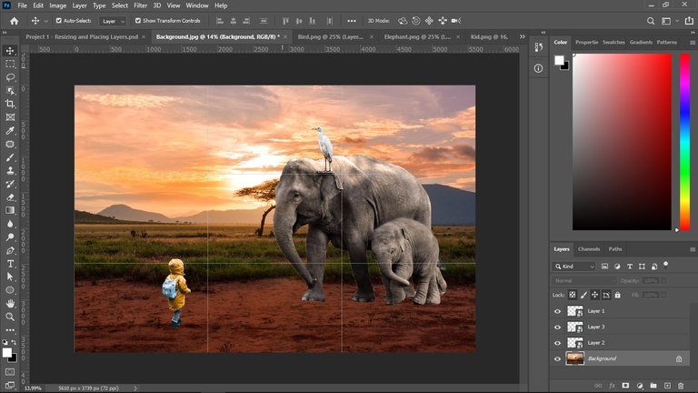
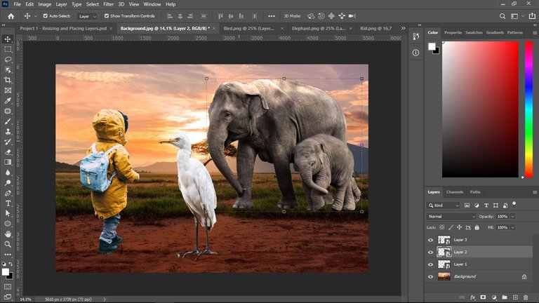
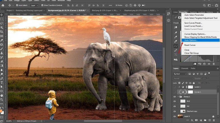
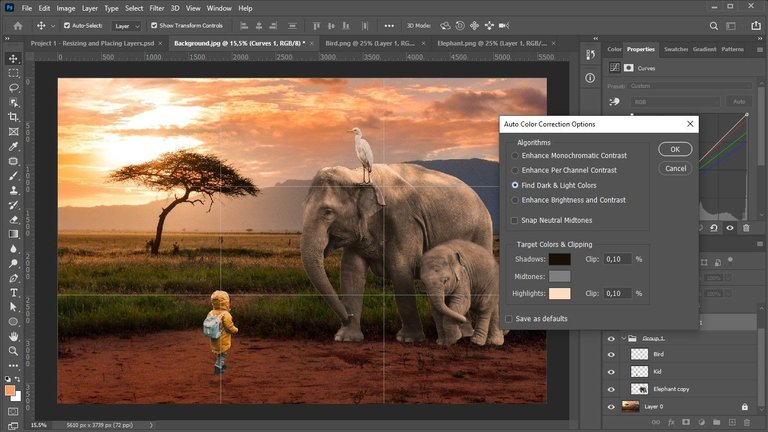
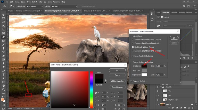
The next thing I did was to move the images of the boy, the elephant and the bird to a group, this so that the effects are applied only to those images, since what I want to do is to adapt the colors of the images to the background. To do this, I went to the settings layer, then I clicked on the top right corner (where there are some dashes) and then clicked on auto options. And then in the find dark and light color section, we change the shadows and lights according to what we have in the background.
Lo siguiente que hice fue mover las imágenes del niño, el elefante y el ave a un grupo, esto para que los efectos se apliquen solamente a esas imágenes, ya que lo que quiero hacer es adaptar los colores de las imágenes al fondo. Para hacer esto, me fui a capa de ajustes, luego di clic en la esquina superior derecha (donde hay unas rayitas) y luego clic en auto options. Y luego en la sección de find dark and light color, cambiamos las sombras y las luces según las que tengamos en el fondo.
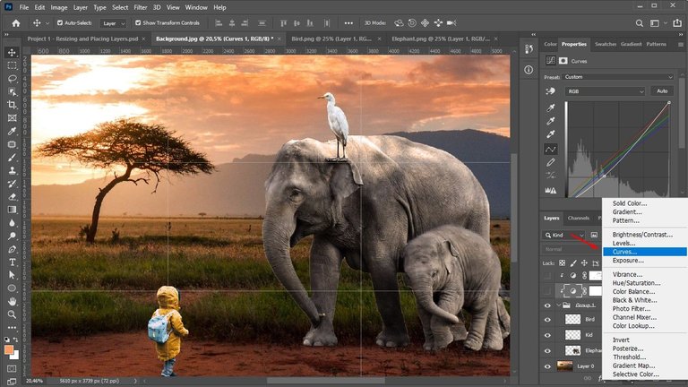
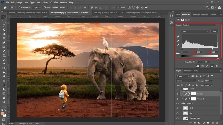
Then, create a levels adjustment layer to give more contrast to the effect.
Luego, cree una capa de ajuste de niveles para darle mas contraste al efecto.
I created another glass and linked it to the levels layer and then, using the brush tool at 20% opacity, I passed it over the illuminated areas to rescue them and get closer to the desired effect.
Cree otra copa y la enlace con la capa de niveles y luego, utilizando la herramienta de pincel a una opacidad del 20%, lo pase por las zonas iluminadas para rescatarlas y acercarme mas al efecto deseado.
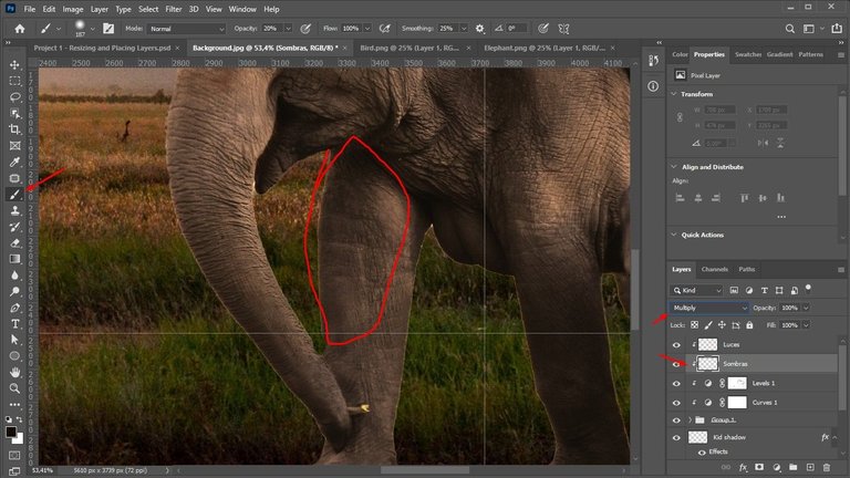
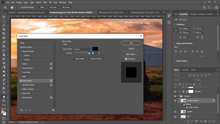
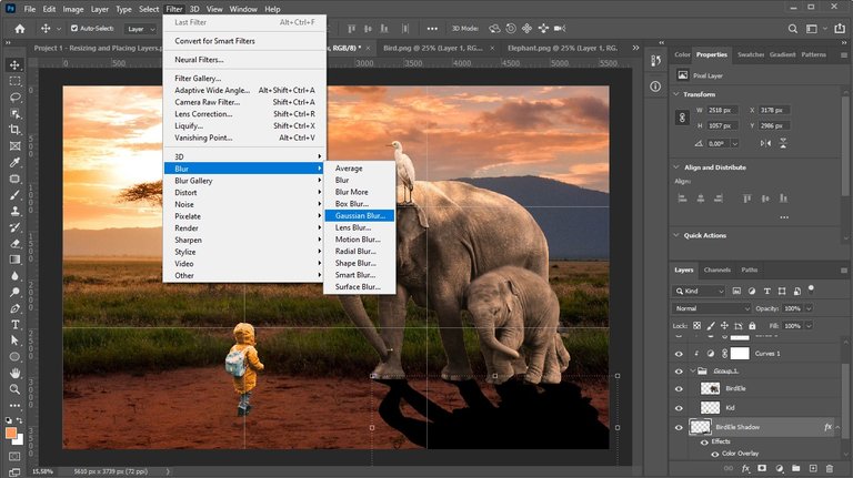
A good trick to make the images not look flat and match the environment is to create a shadow on them. To do that, first merge the elephant image with the bird image into one and then double click on that layer to bring up the layer styles panel and turn it into a solid color (black). Then, holding down ctrl I warped it to the ground taking into account the background lighting.
Un buen truco para hacer que las imágenes no se vean planas y cuadren con el ambiente es creándoles una sombra. Para hacer eso, primero fusione la imagen del elefante con la del ave en una sola y luego di doble clic en esa capa para que se desplegara el panel de estilos de capa y convertirla en un color solido (negro). Luego, manteniendo pulsado ctrl la deforme hasta el suelo teniendo en cuenta la iluminación del fondo.
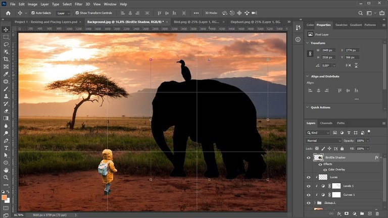
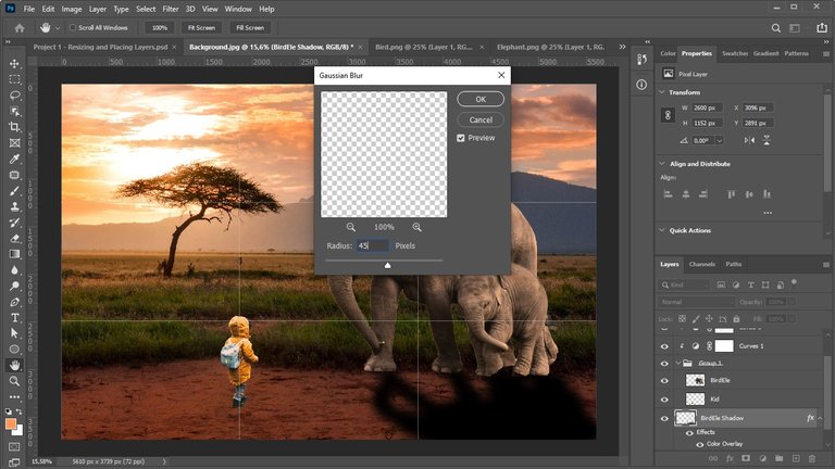
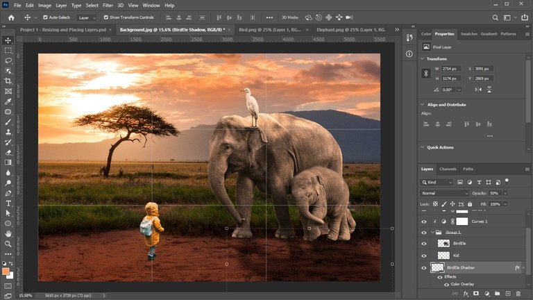
Then I blurred it with the help of Gaussian blur and reduced its opacity to 50% to make it really look like a shadow and did exactly the same with the boy.
Luego la difuminé con ayuda del desenfoque gaussiano y reduje su opacidad a un 50% para que se viera realmente como una sombra e hice exactamente lo mismo con el niño.
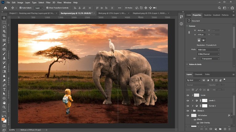
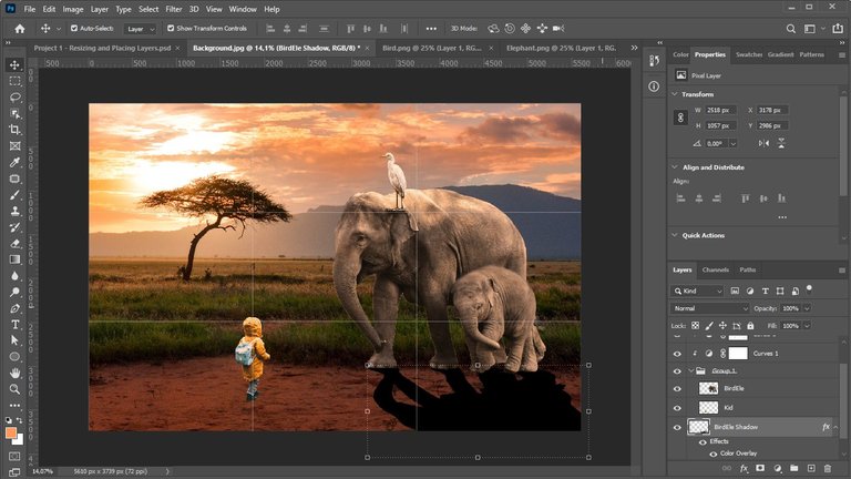
Finally, create a new layer and with the brush tool at an opacity of 15% or so and using the same color I used for the shadows when adapting the colors of the images, pass it through the shadows of the images to generate even more contrast and better match them to the environment.
Por último, cree una nueva capa y con la herramienta pincel a una opacidad de 15% mas o menos y utilizando el mismo color que use para las sombras al adaptar los colores de las imágenes, lo pase por las sombras de las imágenes para generar aún más contraste y acoplarlas mejor al ambiente.