Wlcm to another Post here in #Sketchbook Community, today I'm gonna showcase the third and final logo design variant from a collection of three, that i created about 3 months ago.
So, this is the third post following two different logo variants(of the same brand), which I revealed in Post 1 & Post 2.
So Artists, you can follow from the start with the posts above!.
Now, Let's get this started,
For this post, like I mentioned above, I'll reveal the final logo design (from 3 designs) to you guys, of the three designs, this was by far my favorite because I thought the design matched the concept alot, it was very attractive and looked most professional, IMO.
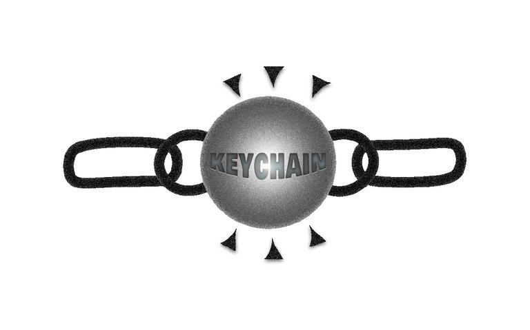
Logo Design

Full Banner Image

Creation Process
This Logo(Variant 3) is a bit more complex than the last two, and in fact, online references were handy here, for instance, Variant 2, didn't have a lot of complexity so I skipped a deep dive into the details of how it was created.
Variant 3 Comps:
- The Chain-Links
- The Triangular "
Sparks" - The Stretched Keychain Typography
- The Intense Gradient Contrast (Almost forming a Light)

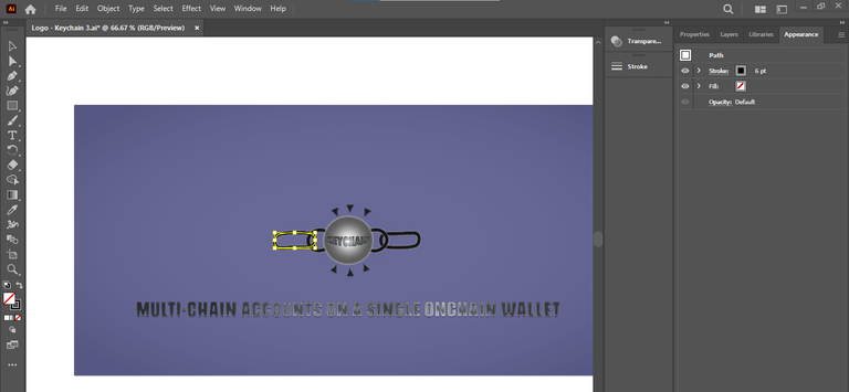
For the First Process - I Created the ChainLinks with pen tool, then modified the curves using the curvature tool. Doing this for only two different paths, I now Duplicate for the Opposing Side.
For the Second Process - The Middle Round Shape itself is a Circle Path with Drop Shadow for a Realistic 3d look. The Gradient used here is Radial Gradient, with just two points, originally the Circle is color black

For the Third Process:
The Keychain Typo, has Text Wrap on the Lower Arc Applied to it, with Inner Glow, No Stroke and a Fill Color
The Fourth Process involves applying the Diffuse Glow Effect as in the other two Variants to achieve this Metallic Look
Summary
So Basically, that's how this moderately complex Logo Design can be Simplified and recreated if you wish!.
In Rating the three Logos,
- Variant 3 Comes First
- Variant 1 Comes Second
- Variant 2 Comes Third
What are your thoughts, Do you agree? Feel free to leave your comments below and catch you in my next post.✈