Lemme know 😘
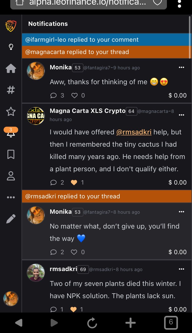
This is what it looks on my phone. Yours come in blue and I can’t open them, while replies to my threads are easy to open

Lemme know 😘
This is what it looks on my phone. Yours come in blue and I can’t open them, while replies to my threads are easy to open

Oh it's the same with me and I think to everyone as well. Replies to threads are already opened on the new UI, but replies and even mentions to long form contents show but are not clickable. I wish they are so we can just click on them and they'll lead us to it. I hope it is one of those features that will roll out soon.
Posted Using LeoFinance Beta