
This article is an automatic translation of my original article written in russian. I apologize for some inaccuracies in machine translation. I hope the value of the article from this will not become less. You can read the original article here - https://telegra.ph/Bazovaya-rabota-s-grafikom--gorizontalnye-urovni-i-linii-trenda-Fundamental-tehanaliza-lyubogo-grafika-07-04
Everything will be extremely simple, but useful. This is basic knowledge for working with a chart, I will try to describe in very simple words where to start analyzing a chart. After mastering this material, you will be able to identify trends, navigate horizontal levels and identify possible reversal points. These are extremely simple things, but basic, fundamental.
It is necessary to trade exclusively with the trend, trading against the trend is like driving into the oncoming highway on the freeway and hoping for a lucky break. And if you do not know how to determine the trend, how do you trade?! Luck in the market is limited to 1 phase.
Large market participants work for a long time, they physically do not have the ability to quickly collect a position. For them, the average position acquisition price and the average distribution (dumping) price are important, and not just one purchase. I recommend that you start thinking and acting like a major market participant, regardless of the size of your deposit.
How do hamsters think - to have time to buy at the very bottom and have time to sell at the very top. At the very top, they do not sell, they buy there, but sell at the very bottom, in anticipation of a downtrend reversal. Don't be a hamster, think like a big player, so you are more likely to become one.
Chart timeframes
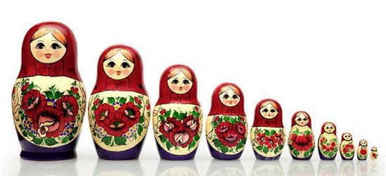
Timeframes hide a lot of matryoshkas
You can work on any timeframe you like, even for a few minutes (if only it worked out), it’s up to you, but you can understand the big picture only after you analyze the entire history (in cryptocurrencies, these are relatively short periods) or at least the last few years of the chart.
It is impossible to determine the phase of the market at 15 minutes, this is a nesting doll inside another nesting doll. There are 96 15-minute candles in 1 daily candle. The last bull run on BTC lasted about 600 days, that’s 57,600 candles in fifteen minutes, this amount will not fit on any screen, and the hand will get tired of scrolling the history and you still won’t understand the price in the moment. At the same time, on the monthly timeframe, the entire history of BTC is 130 candles, it fits perfectly on the laptop screen and clearly illustrates a completely harmonious trend. At the same time, there is its own world in one monthly candle - 2880 candles of the 15-minute timeframe.

Move away, become an observer of the market situation
For ease of understanding, I will give an example of the analogy of the micro and macro worlds. It is a well-known fact that the universe is divided into galaxies, galaxies are divided into star systems, star systems into planets (their full-fledged world, their own ecosystem), the human environment, the kingdom of animals, insects, then atoms, atoms are divided into nuclei, electrons, neutrons and protons and etc. Answer the question - you, as a person, are very worried about what is happening in the kingdom of ants, or the ecosystem inside the atom, how many worlds are in your cup of coffee?
And if you were the universe (scale), you would be very interested in what happens inside a certain galaxy (there are countless of them), not to mention a single planet, maybe the fate of a single person!? This is very similar to what is happening in the crypto market, large participants do not care about what happens on small timeframes, inside each monthly candle they have their own world that harmoniously fits into the trend, and if something does not go according to plan 1-2 candles on the days of the week they will quickly return the harmony to the schedule.
To understand the holistic picture of what is happening, you need a holistic picture of the chart, this can only be seen on higher timeframes - 1 day/week/month. Chart analysis always starts with large timeframes and ends with those you plan to work on.
It is very important to look at the history on a logarithmic, and not on a linear chart. Find out why below.
Logarithmic scale
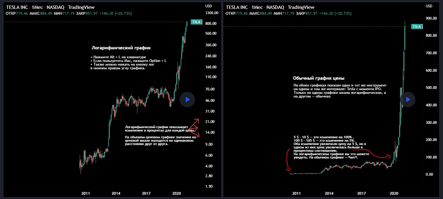
On the left is a logarithmic graph, on the right is a linear graph.
On the vast majority of exchanges, it is possible to switch charts between arithmetic and logarithmic scales using one button, usually it is on the bottom right of the chart - “Log”, sometimes you need to go to the chart settings and click on “logarithmic chart”. If this is not possible on the exchange, use third-party charting services, such as TradingView. If there is no specific chart there, do not work with this tool at all, because you will not have a complete picture and you will analyze a puzzle, a separate piece of data, without having an idea of the situation as a whole.
I noticed several times that the chart from individual exchanges in the logarithmic projection and the same chart on TradingView are different! It can differ only because it is necessary for someone. For qualitative analysis, it is necessary to use qualitative tools, it is desirable that the owner of the resource be a disinterested person. The conclusions from this paragraph, everyone can draw on their own.
By default, all exchanges have a line chart with an arithmetic scale enabled. On such a scale, the price movement is displayed according to a linear model, that is, there is an X-axis (time) and a Y-axis (price) on the chart, so prices are displayed linearly on the Y-axis, the numbers are written as on a ruler at equal intervals, hence the name . The line chart focuses on the sharp movements of the quote, regardless of the percentage of growth or fall. In the media, you can see only linear graphs, this causes more emotions, fear and greed. A line chart does not provide a visual picture of the quote's progress interval, taking into account the resulting percentage profit or loss.
On the line chart, the growth of the quote from 10 to 15 and from 100 to 105 is displayed in the same way, the interval here is the number 5, the line chart misses the fact that in the first case, the quote made +50% to the price, and in the second, only 5%. The logarithmic chart works on a different principle, the price move is displayed taking into account exactly the percentage. The quote move from 10 to 15 will be displayed as a significant movement, but the move from 100 to 105 is less pronounced. The logarithmic plot gives a more harmonic picture over a long period of time.
On a logarithmic chart, with an increase in the price of an asset, the movements become less pronounced. That is, it is one thing to buy bitcoin at $1,000 and sell it at $5,000 - this is a 400% profit, but to get the same 400% when buying bitcoin at $20,000, you need to sell it for $100,000 in this case, the interval will be displayed proportionally 400% in both cases. If these two situations are displayed on a line chart, then the first case will be turned into a thin horizontal thread, on which there were supposedly no movements, and the second one will be displayed as a huge bubble.
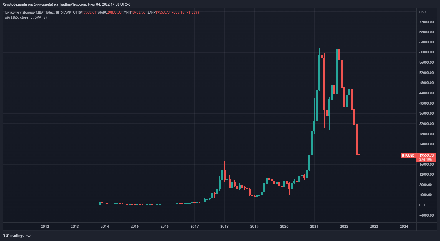
Line chart BTC timeframe 1 month (full history).
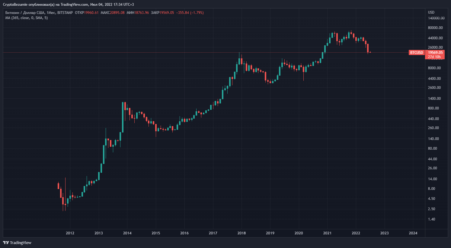
Log chart BTC timeframe 1 month (full history).
The global trend contains many local trends, the line chart is not able to display all price movements, the quote move at the minimum price turns into a horizontal line, and to display a line chart for example on BTC for the entire period, you will need a 10 meter high monitor). That is why the lines of long-term trends are laid on the logarithmic chart. The logarithmic chart shows the percentage price movement and therefore trend lines work here.
Stump graph - another diagram for a hamster mower
A separate topic for conversation, the scheme of how to mow hamsters, is very common.
Especially used on top exchanges! So, the chart on the exchange starts to be displayed from the moment of listing! Before a coin is listed on the top exchange, it is traded on smaller ones, and is traded at completely different prices, at the very bottom, naturally with its pumps and dumps, where the coin accumulates.
After that, a listing occurs on the TOP exchange and the quote flies into the “heaven”, followed by a dump - a classic. The hamster looks at the chart and sees that the price has already dipped by 50-70-80%, in, the hamster thinks, I’ll buy on the bottom right now and make money ... If the hamster knew that the current “bottom” is several thousand percent of pumping compared to the price of trading on a small exchange, the hamster would not have climbed here, but alas, the hamster does not know this and does not want to know ...
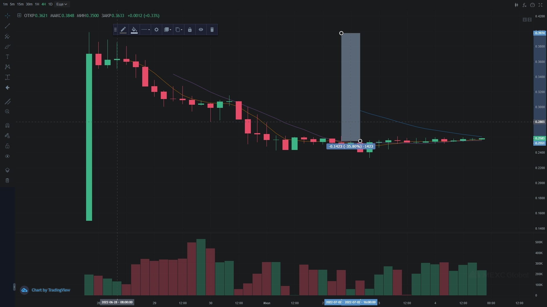
Exchange MEXC. Tidex Token. After listing correction 35% "bottom". The price tag is $0.25.
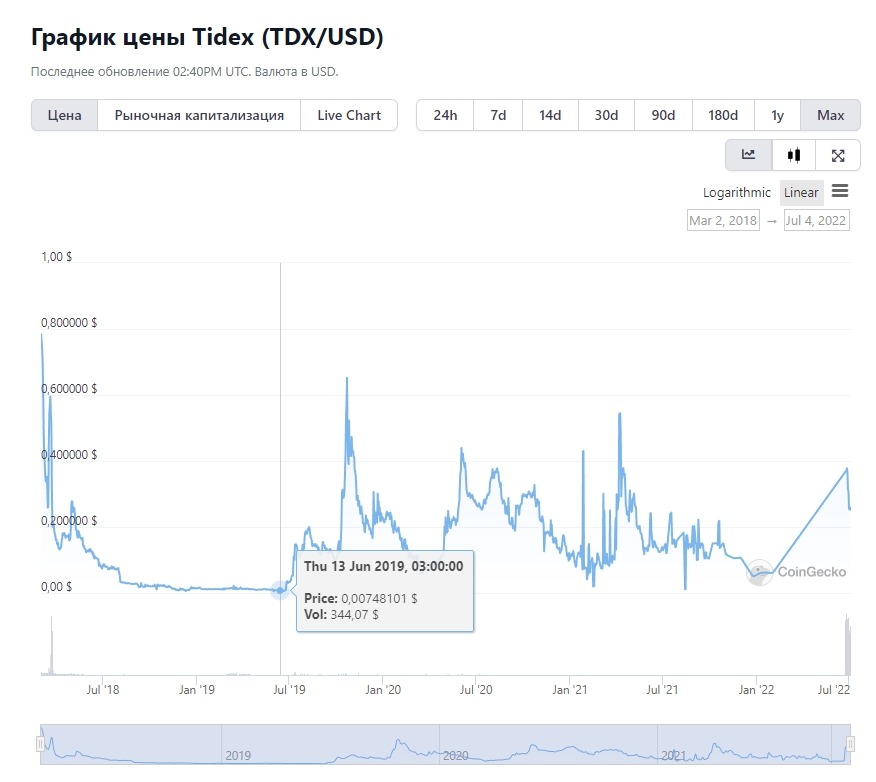
Data from coingeco. Trading 2018-2019 average price $0.01, dumps up to $0.003, currently the coin is at 25x since then.
So, when you analyze a chart on any top exchange, and not only a top one, always go to cryptocurrency aggregators:
and watch the entire history of the chart, calculate the price of a position set and compare it with the current price, with an alleged bottom.
It is ideal to work on a chart with a complete trading history in order to be able to set horizontal levels and trend lines, such an opportunity is available on TradingView and other specialized services.
Horizontal levels
Horizontal levels are price zones from which the quote bounces, rebounds and changes direction. The older the timeframe, the more reliable the horizontal level. The more often the quote rebounded from the horizontal level, the more reliable it is.
Often horizontal levels are round numbers - 1000, 10,000, 15,000, 20,000, this happens because the crowd believes in the magic of round numbers, this is used against the crowd. At the end of 2020, the price of BTC broke through 20k and only stopped around 40k. The situation is completely similar with ETH, recoilless growth from 2000 to 4000. The crowd was waiting for a rollback after breaking through the high of bitcoin and after breaking through the high on the air, but they didn’t give a rollback, the crowd went on highs, after the correction.
If the horizontal level is below the quote, then it is considered support, there is a chance that when the price goes down to it it will bounce up, but if the level breaks from top to bottom and it is on top of the quote, then it is already considered resistance and there is also every chance for growth to rebound from it or break through .
At horizontal levels, traders buy or sell, and bots also trade from levels. Limit orders in the order book stop the price movement at important levels. As a rule, round prices have high liquidity, which makes the price bounce. In turn, breaking through the level up or down can provoke an impulsive movement due to reduced liquidity and increased interest of traders in further developments.
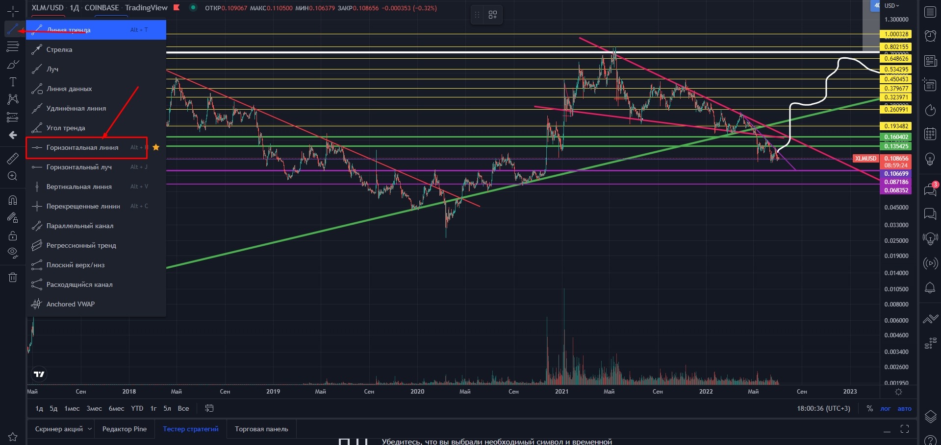
Horizontal lines are set on any chart using the appropriate tools, according to local levels and highs.
It is worth remembering that the horizontal level is not a line on the chart, but a zone. Important horizontal "levels" can be marked with rectangles. The main thing is that you understand the markup on the chart.
Determining trends when working with charts
A trend is the main tendency of the price movement of an instrument in a certain direction. There are 3 trends in total
- Ascending.
- descending.
- Lateral movement, consolidation or flat.
As part of the trend, there may be corrections in the price movement, this is normal. It is important to understand and accept the fact that the trend has changed in time. Trading with the trend means going with the flow, spending a minimum of energy and getting the maximum efficiency; trading against the trend is a very thankless, nervous and unprofitable business.
To determine any trend, I recommend using a logarithmic chart.
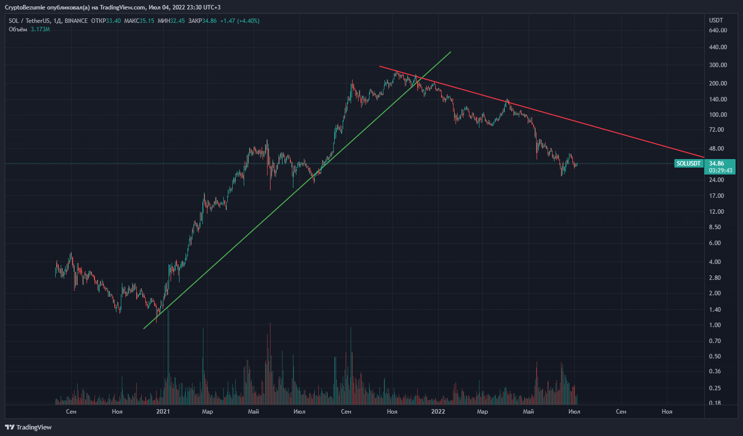
SOL/USDT. Timeframe 1 day. An uptrend is green, a downtrend is red. At the peak of the bull market, an uptrend was broken and changed to a downtrend.
An uptrend is characterized by an increase in the highs and lows of the price of the instrument. The main direction is growth. An uptrend line is drawn along the lows, it is also called support, it is always directed upwards (an uptrend). If the trend support is broken and the price fixes under the rising trend line, the trend changes to a downtrend.
A downtrend is characterized by lower lows and lower highs. The main direction is the reduction of the quote. A downtrend line is drawn along the highs of the instrument price, it is always directed downwards and serves as a resistance to the trend (downtrend line).
Sideways - a horizontal channel or flat. The quote does not have a pronounced uptrend or downtrend, but locally has an alternation of trends within the sideways movement. The lows and highs are about the same level. Having drawn support and resistance lines along the lows and highs, a parallel horizontal channel should be obtained.
Global
On strong instruments, as a rule, on large timeframes, a global, uptrend is clearly visible. The global trend is characterized by growth throughout history or a large part of it.
The trend line can break from top to bottom, the trend can change to a downtrend, the slope of the uptrend can change, but speculative markets and, in a sense, the economy are arranged in such a way that on the charts of strong instruments, you can almost always draw a line of global growth. Global uptrend.
This is how the global uptrend of BTC was built until 2019, in November 2018 it was broken down, technically this trend was broken down and a downtrend began, but...
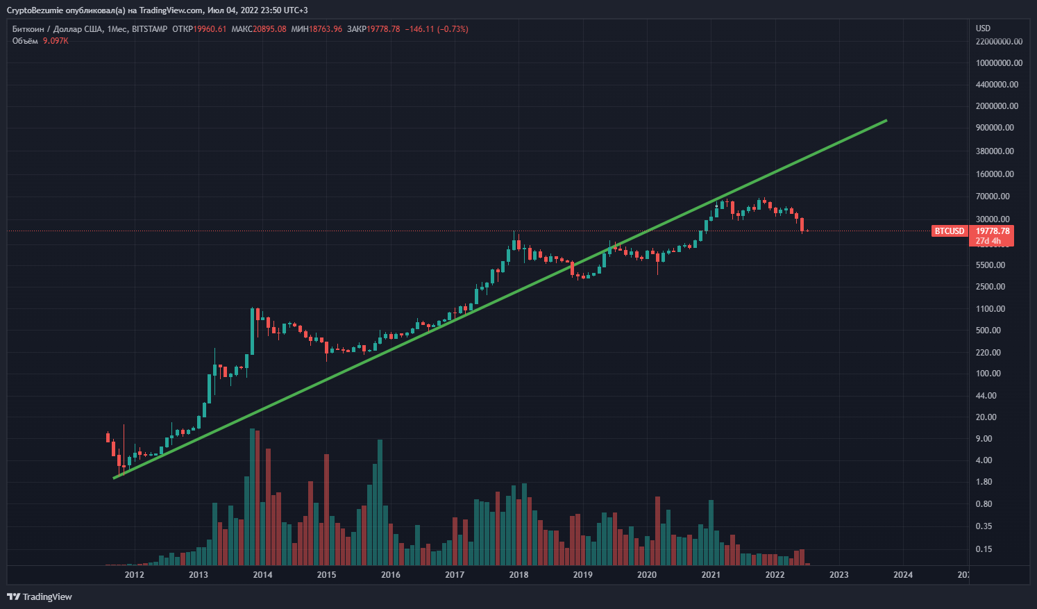
Drawing a new global uptrend on new lows. As you can see in this chart, the uptrend lasted until 2022.
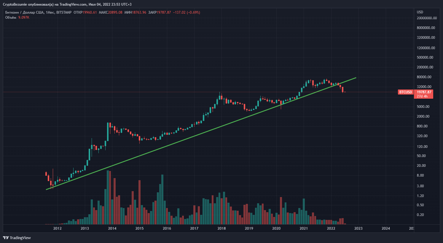
We did some charting and voila, we are still in an uptrend. I changed the slope of the uptrend 3 times, but the conditions for building trends are still met - rising highs and rising lows. The trend line is drawn along the loys, everything is legal.
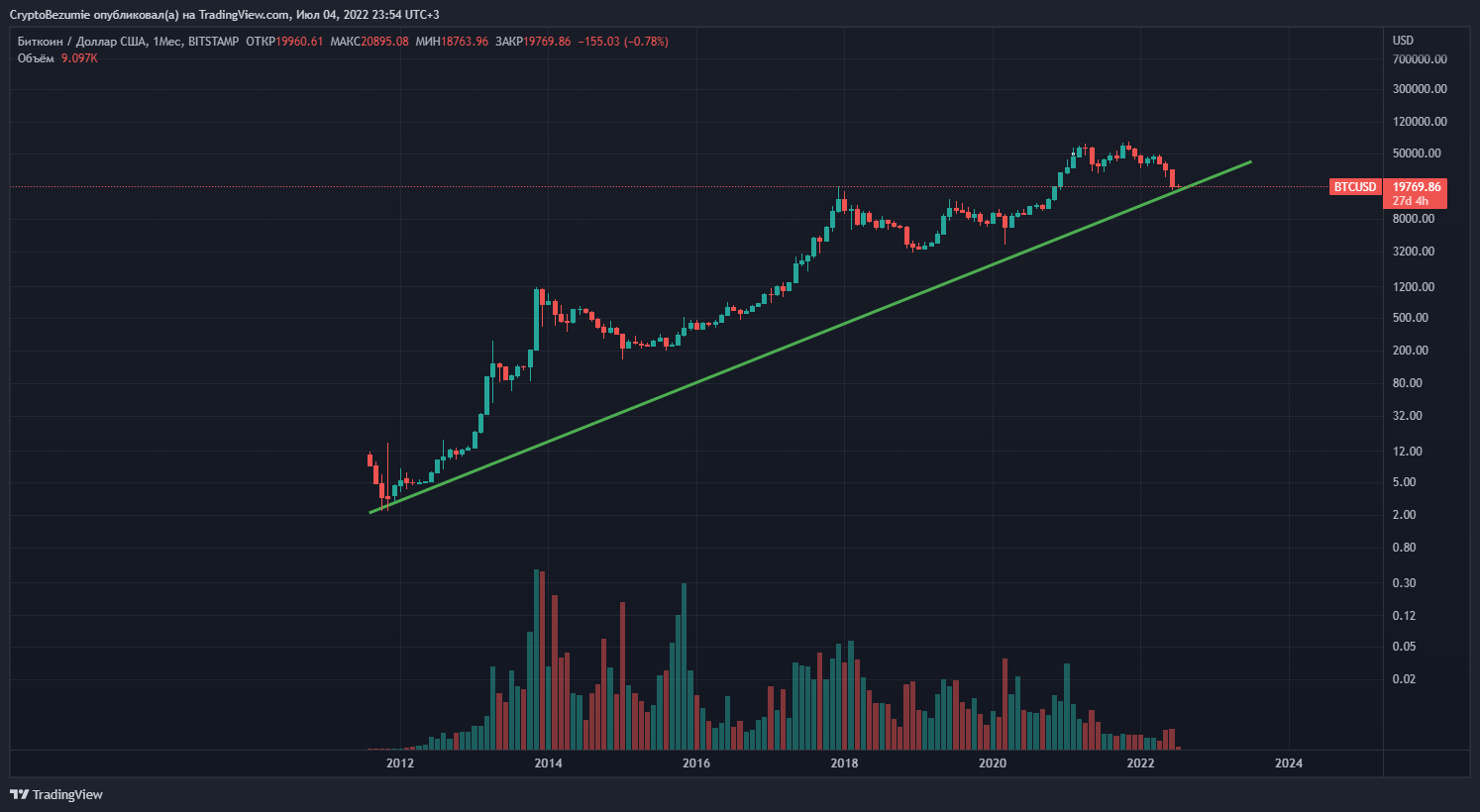
As the value of the instrument grows, the slope of the ascending trend line will invariably change, which is logical. Value cannot rise exponentially throughout history, over time volatility decreases and growth slows down. At the same time, the uptrend line in the future will serve as a very powerful support for corrective movements, or the angle of inclination will have to be adjusted once again.
It is also important to understand and accept the reality that when a global uptrend line breaks from top to bottom, this is a powerful signal that an uptrend has changed to a downtrend within this particular market phase.
Local
Local trend lines do not need to be corrected. On the contrary, they serve as a hint about what is the dominant trend in the market at the moment, and when the trend line is broken, this is a signal that you should probably change your shoes.
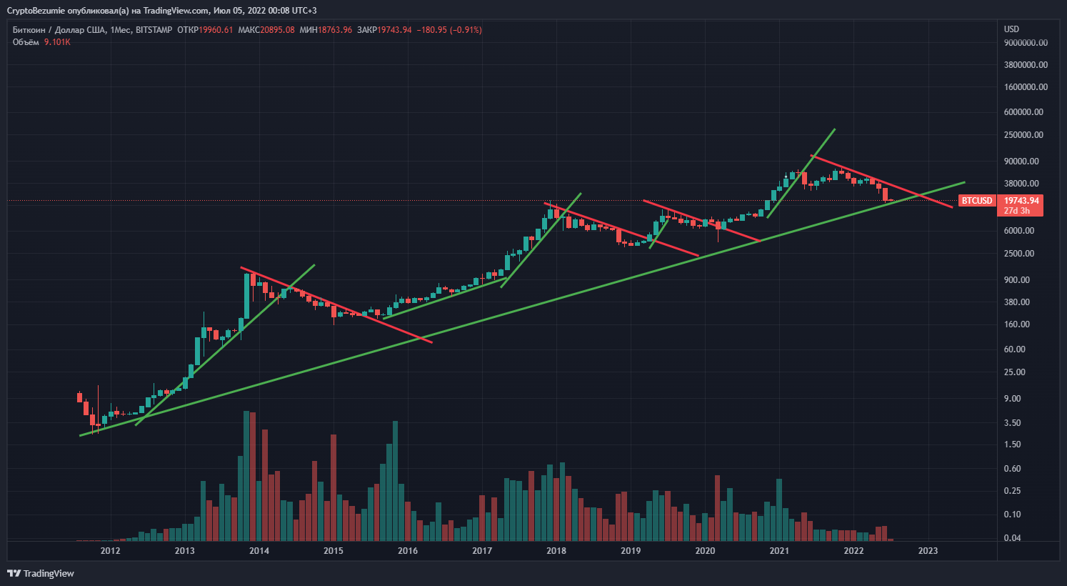
BTC timeframe 1 month
The smaller the timeframe, the more trend lines can be drawn there. It's not a panacea, it's just the prevailing sentiment in the market.
Below in the screenshot is the local situation that has developed at the moment in the BTC market.
The green uptrend is a global uptrend, a return above it would mean the resumption of the bull market, if we get there soon, without the need to change the angle of the global trendline, then this will be preceded by big positive news and the growth of most assets.
The red downtrend is a large local downtrend from the last all-time high - November 2021. Its breakout is a strong signal for the beginning of an uptrend, if it breaks through, a new local uptrend will be confirmed - the blue line, the quote rebounded from it at local lows.
With all of the above, there is a yellow downtrend, this is another local downtrend, a breakout will also serve as a positive signal, but not as powerful as a breakout of the red downtrend.
In terms of conditional strength, the trends go in the following order (in ascending order) - blue is ascending but not yet confirmed, yellow is local descending (situational), red is descending, a strong trend that lasts more than six months, green ascending is a global trend and the strongest.
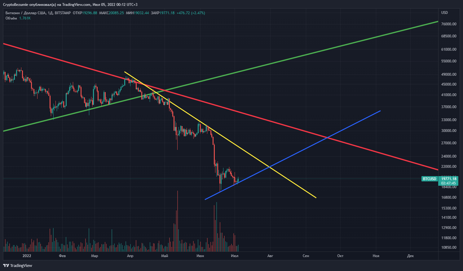
BTC timeframe 1 day
As you understand, trends are a convention, but due to the fact that almost all experienced market participants use them, various models have been compiled, books have been written, traders and bloggers talk about it, they evoke emotions, these lines really have weight in the market.
You don’t need to consider trend lines as something magical, and even more so impenetrable or trouble-free, but to be aware of their existence, hierarchy, be able to impose on the chart you work with and simply take into account in trading in order to understand what trend is at the moment on your instrument is a must -have.
Do not trade against the trend, at least you will lose time, at the most time, money and peace of mind. Understanding the principles in this article will give you an advantage over those who are not familiar with the information presented here.
PS... Technical analysis of an instrument (chart) cannot be the only reason for entering a trade, it is only a part of the strategy. It is necessary to view the glass, the history of transactions, the project itself (official sources), the general situation on the market, related factors. But this is the beginning.
Successful transactions.
Posted Using LeoFinance Beta
Congratulations @crypto-madness! You have completed the following achievement on the Hive blockchain and have been rewarded with new badge(s):
Your next target is to reach 100 upvotes.
You can view your badges on your board and compare yourself to others in the Ranking
If you no longer want to receive notifications, reply to this comment with the word
STOPCheck out the last post from @hivebuzz:
Support the HiveBuzz project. Vote for our proposal!