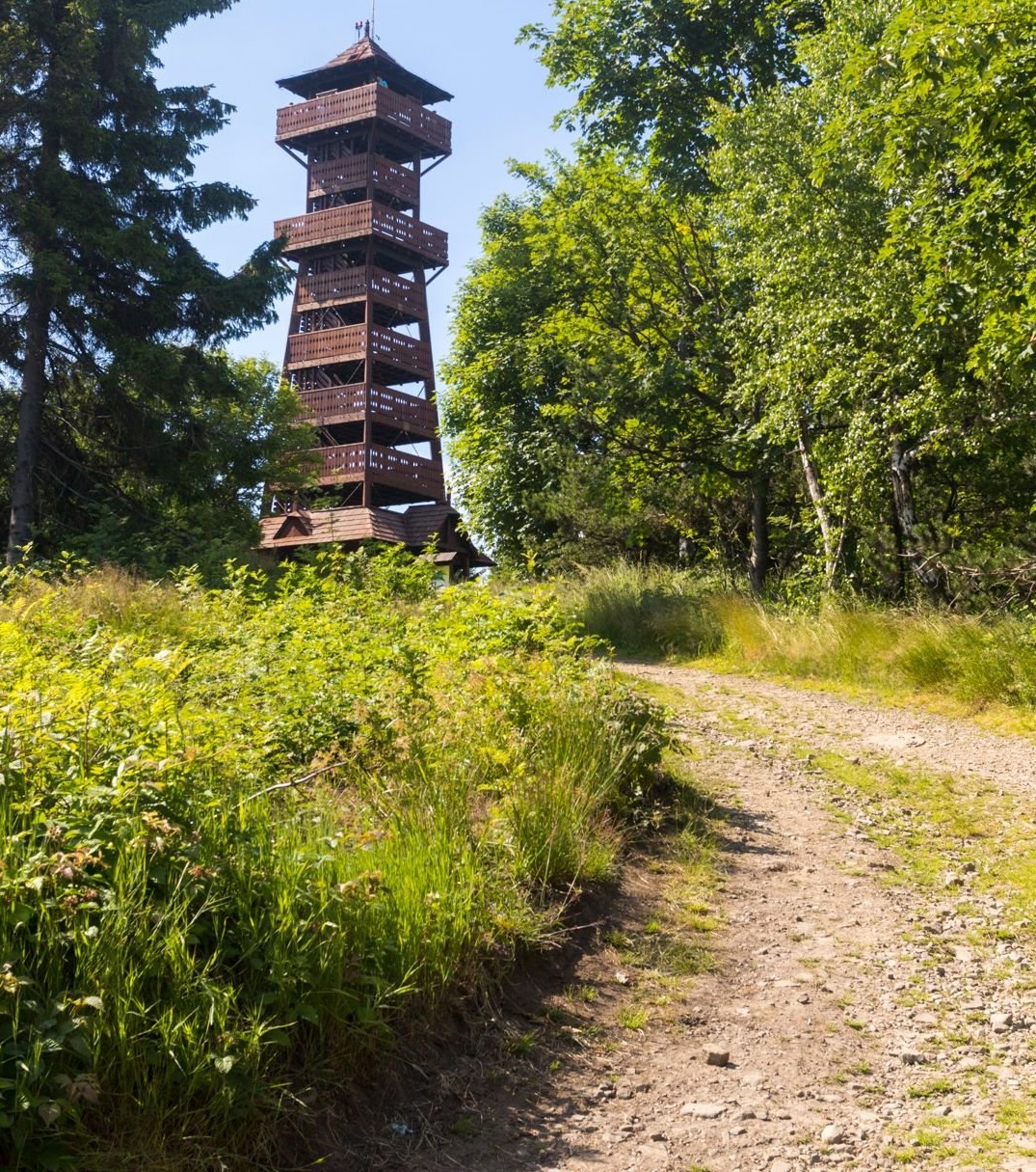
I like the first shot of the tower, but personally would have cropped it like this :

You lose the tops of the trees, but the composition is more in line with the "rule of thirds", and more balanced ). Just my two cents.
I like the first shot of the tower, but personally would have cropped it like this :

You lose the tops of the trees, but the composition is more in line with the "rule of thirds", and more balanced ). Just my two cents.
Thanks for the suggestion, but in your crop it seems to me that the top of the observation tower is too close to the edge of the photo.