I wrote an article post about Five Reasons Why I Like PeakD and promised to write something about the limitations of PeakD that I have faced during using it.
Today I will discuss about 05 major limitations of PeakD that should be overcomed and updated by the developers to make it more easy and convenient for the users.
Don't be confused about this post. This is not a bold criticism rather than some effective suggestions. I have mentioned earlier and repeating again that still now PeakD is seemed to me as the most user-friendly and potential interfaces of Hive Blockchain among all I experienced. But there is no horizon of perfection.
So today I want to draw the developers attention about some features that I experienced not to be convenient ultimately. That's why the title is Five Issues of PeakD, Should be Fixed.
Issue 01: Photo Upload
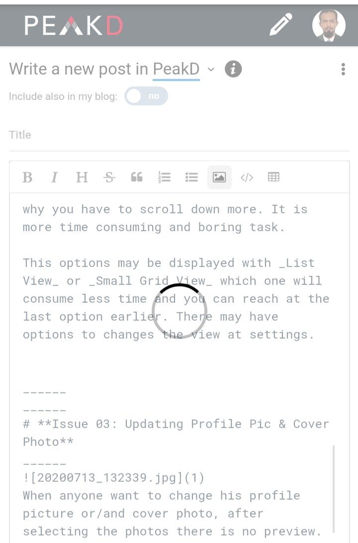
view while uploading photos
When we want to add the photos by seleting them on the text box, it takes some times to be uploaded. In the mean time we have to wait as the screen is buffering. We can't write the post or do anything during that time until the photo is being uploaded.
It's a time-consuming process. When anyone have to add more photos, he requires more times. But if he tried same thing at Hive blog or other interfaces, he may write, edit post or add another photo in the mean time while the previous photo is uploading.
I think, this issue should be fixed to save time consumption of the users.
Issue 02: Grid View
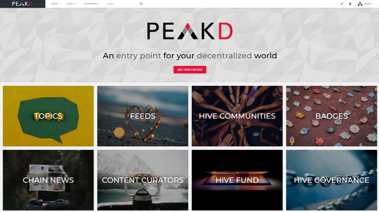
options after clicking at PeakD Logo
By clicking at PeakD logo, you will get some useful options as:
- PeakD, Add your content
- TOPICS
- FEED
- HIVE COMMUNITIES
- BADGES
- CHAIN NEWS
- CONTENT CURATORS
- HIVE FUND
- HIVE GOVERNANCE
- YOUR ANALYTICS
- SERVICES
- FAQ
- SEARCH
These all are useful options for an user. But I have an objection about the grid view of these options. Each option contains a huge background photo, that's why you have to scroll down more. It is more time consuming and boring task.
This options may be displayed with List View or Small Grid View which one will consume less time and you can reach at the last option earlier. There may have options to changes the view at settings.
Issue 03: Updating Profile Pic & Cover Photo
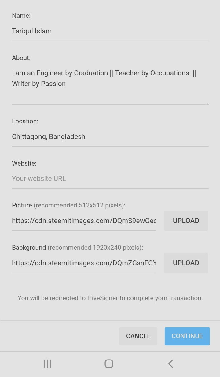
upolading profile pic & cover photo
When anyone want to change his profile picture or/and cover photo, after selecting the photos there is no preview.
It should have a preview system so that the users can get an idea about how the profile will be looked like after updating the photos.
Sometimes new users don't have the idea about the suitable photo sizes. So they select wrong size photo and it looks something different as he wished.
Issue 04: Preview of Short Description
Reveal spoiler
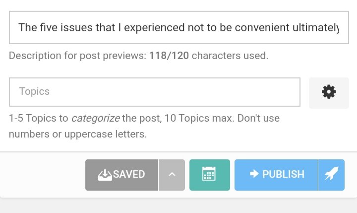
short description writing bar
I have mentioned on my previous post about the unic feature Short Description of the posts.
Here you have to write (optional) a short description about the post that will give the preview of your writing. This short description attracts the reader to go through your post. It's a filtering system that when you read others post, you can get filtered your choice in very short time by reading short descriptions.
We only get the preview of the post, but we don't know how it will be represented on tge community/blog before anyone enter on the body.
I think, it also may have a preview about how your post will be looked like at a glance to the other users with this short description.
Issue 05: Shortcut Menu
There is no shortcut manu that can be customised as like ESTEEM, Facebook etc. That's why we can't go through many options at a single click.
There are some options which are frequently required. If there was an such arrangement that allow you to go through that option at a single click, then many times would be saved and it was becoming more user-friendly.
So I think, it should have a customized shortcut bar for the users.

About Me:

I am Tariqul Islam
Like Blog, Vlog, Writing, Photography & Art
3speak: tariqul.bibm
Twitter: Tariqul Islam
Hive: @tariqul.bibm
I am an Engineer by Graduation,
Teacher by occupation
& Writer by passion.
I believe, Life is beautiful!
I have picked your post for my daily hive voting initiative, Keep it up and Hive On!!
It's my pleasure that you appreciate me picking from a lot of posts on hive blog. Thanks.
You can visit PeakD's discord and ask under #peakd-support
This post was only for suggesting the developers some issues that may be developed. I posted it here to draw the attention of peakd and I hope it will help them for the further development of this interface. That's why I posted it here. Thank you very much for you suggestion.
Understand your desire to have it upload in the background while still able to work on the post. That is a very understandable request.
There's a couple ways to look at this menu. We could make the graphics thinner allowing more to show up. However to some extent the further down options aren't for everyday quick access but are almost there to introduce users to all of what PeakD does and what perhaps Hive is abbout. So i'm conflicted It makes sense to go both ways. Would love to hear other user opionions. Or perhaps what option is missing from the first two lines users would like to see.
Yes showing a preview of the Cover and Profile pictures would be great.
"we don't know how it will be represented on tge community/blog before anyone enter on the body." I do not understand the issue... sorry. Can you explain what the feature you're requesting is.
Any screenshot examples you can share with us?
cc. @asgarth
It's my pleasure that you have considered my recommendation and agreed with some issues.
The 4th issue was about, there may have a preview of the title and short description, while we write the Post.
And the 5th issue was about, it may have any shortcut bar either up or down of the interface, that will be customised.