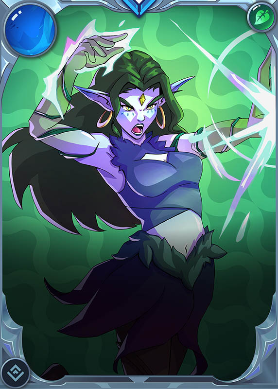
Hello! I want to share my post and entry for the Splinterlands Social Media Challenge. This week, Fan Art of Rebellion. I have two folders with the Rebellion characters, one has the card design, name, and other stuff, which makes it hard to fully appreciate the details and the other one, which has complete PNG images, this particular character is missing, and I don't understand why.
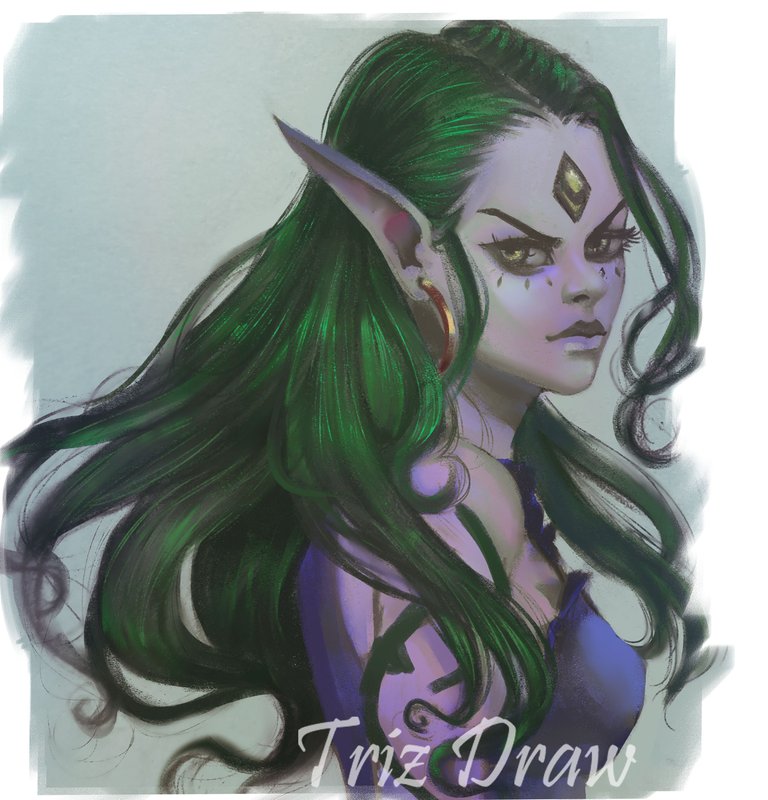
But, well, since I was going to do a portrait, it worked for me for the future if I want to make a complete drawing, so I'll have to look for the complete image .
I made this drawing while I didn't have electricity - how strange, right? I actually started it in my sketchbook, and it's not that big of a drawing, to be honest. I usually work in a smaller format, so it's not a large piece. I worked on it there until I was quite far along, then I switched to the PC to finish adding the final details and filling everything in completely with gray, which I hadn't done before. I also fixed some things and then added color - that part was done on the computer; everything before that was in pencil.

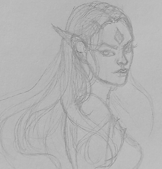 The sketch was just to get started, not much detail but it was the position I wanted, although it had some lines that shouldn't have been there but I erased them later. I did this with a pencil, like an H or HB type, not too dark so I wouldn't have much trouble erasing it later. The sketch was just to get started, not much detail but it was the position I wanted, although it had some lines that shouldn't have been there but I erased them later. I did this with a pencil, like an H or HB type, not too dark so I wouldn't have much trouble erasing it later. | 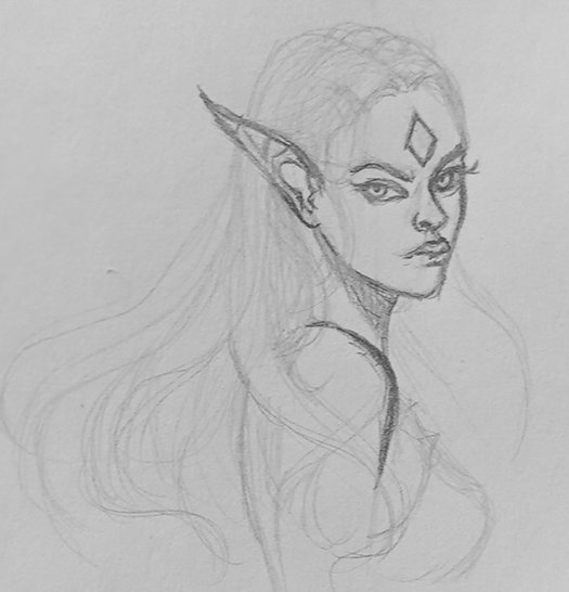 By the time I had the position and a clear sketch, it worked as a base with a slightly darker pencil, like a B3, which worked better for making more precise lines and fixing any errors as I went along because that's what would stand out more. So it was a bit more defined. By the time I had the position and a clear sketch, it worked as a base with a slightly darker pencil, like a B3, which worked better for making more precise lines and fixing any errors as I went along because that's what would stand out more. So it was a bit more defined. |
|---|
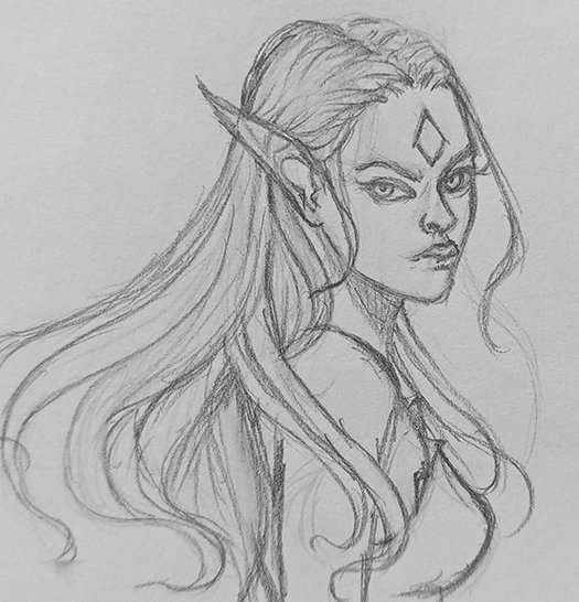 As I progressed, I cleaned up and fixed the lines a bit more, making the sketch look better than it was at the beginning because it was more for the base and not meant to stay exactly the same, so I corrected those errors a bit in this part. As I progressed, I cleaned up and fixed the lines a bit more, making the sketch look better than it was at the beginning because it was more for the base and not meant to stay exactly the same, so I corrected those errors a bit in this part. | 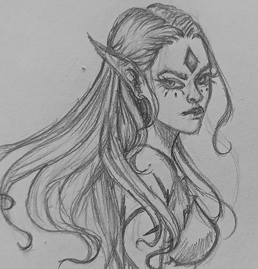 To add a bit more depth and darkness, I used an 8B pencil with a fine tip, which didn't work for making those small dark spots that make everything a bit more defined and give some deep to the portrait. To add a bit more depth and darkness, I used an 8B pencil with a fine tip, which didn't work for making those small dark spots that make everything a bit more defined and give some deep to the portrait. |
|---|
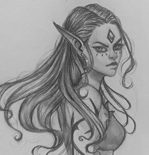 I think in the end, everything looked kind of gray. It seems like I was detailing and fixing and adjusting some things, and by the end, well, I realized, I don't know, I don't know if I left it like that, to be honest. It didn't seem right to me if I left it like that, without the color, but up to that point, it wasn't so bad. Sooo yes! I decided later on, well, it needed some color. I think in the end, everything looked kind of gray. It seems like I was detailing and fixing and adjusting some things, and by the end, well, I realized, I don't know, I don't know if I left it like that, to be honest. It didn't seem right to me if I left it like that, without the color, but up to that point, it wasn't so bad. Sooo yes! I decided later on, well, it needed some color. | 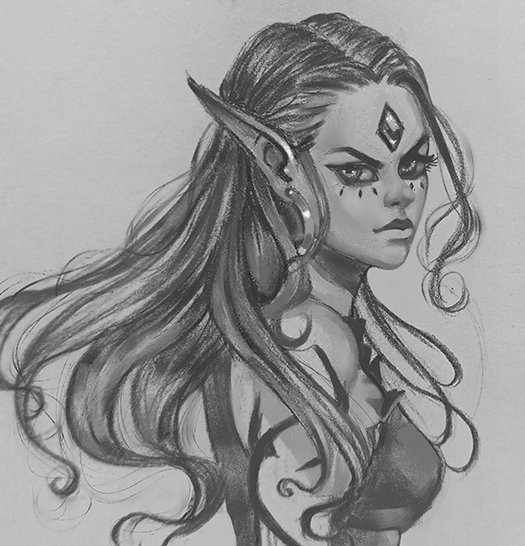 I already had everything ready, just needed to explain the color because I had already detailed some things. What I was going to detail was basically the base, but it had to be good, so after adding the gray everywhere and detailing things a bit, because I wouldn't detail them later, so that worked for me. so at this point, I was ready to add the color I was thinking of using. I already had everything ready, just needed to explain the color because I had already detailed some things. What I was going to detail was basically the base, but it had to be good, so after adding the gray everywhere and detailing things a bit, because I wouldn't detail them later, so that worked for me. so at this point, I was ready to add the color I was thinking of using. |
|---|


To finish, I don't usually use, I think it's the second time this year that I've done a piece with just overlaying like that. Actually, I just put the layer on top and placed another layer on it in overlay mode, although it wasn't I mean, I didn't use a filter or It wasn't exactly that, but I found another method that seemed better than overlay, and that's what I used. I added some small details afterward, some highlights and those kinds of things, made some adjustment tweaks, and it was done
Thank you very much for taking the time to view my work.




What a character! He has an expression of anger on his face, and you can see his strength. I liked the technique and the development!😃
Haha yes, a bit, unfriendly face 😆.
Thank you
🤗❤️
That looks really awesome, love the hair part, I think it looks so realistic 🤩, very detailed too 🤩
Thank you so much!
Checkout our BDVoter Daily Hive Showcase & Participate into our Daily giveaway to win various prize.
It's beautiful work as always!
Thank you
Thanks for sharing! - @mango-juice
