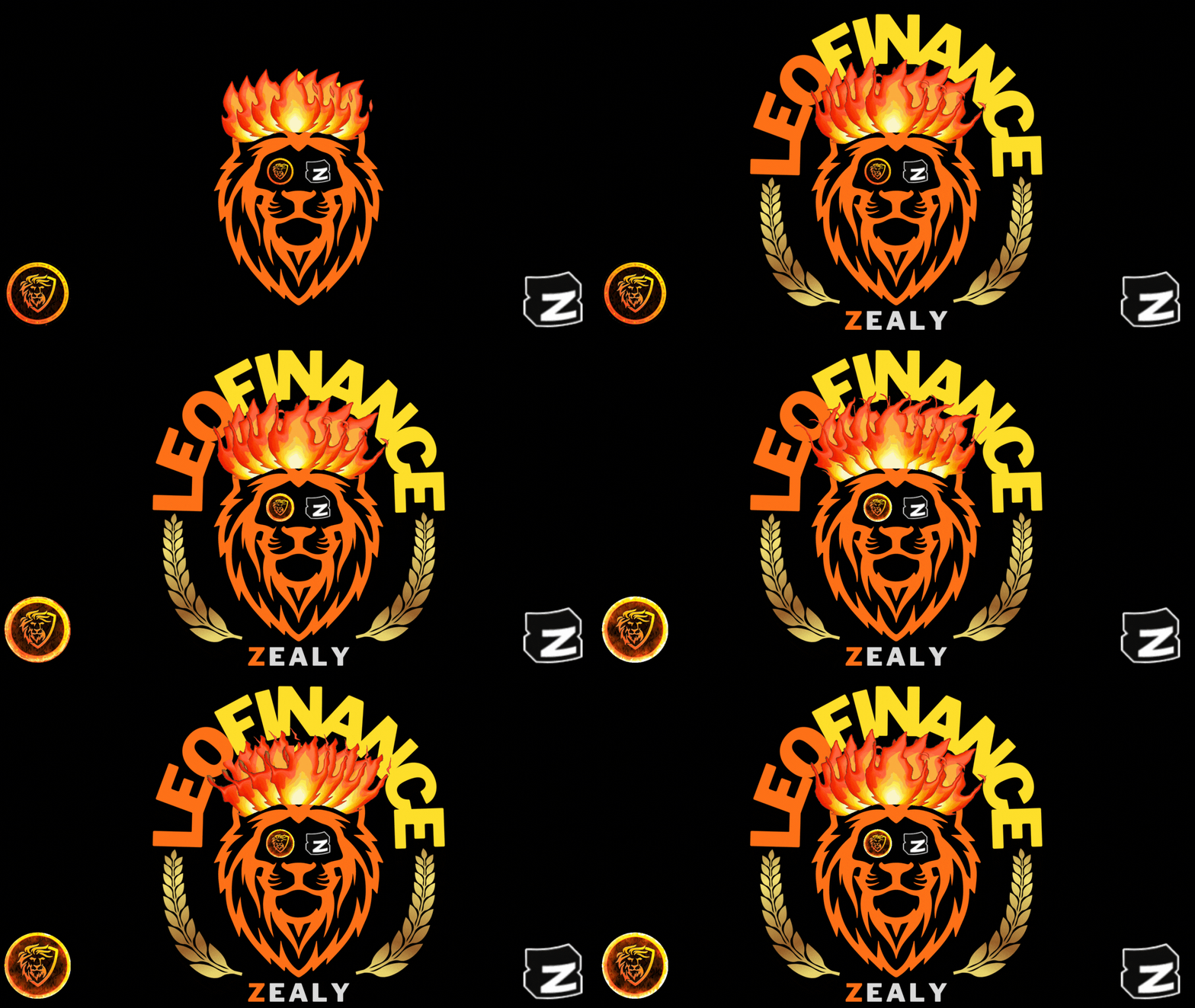
HI fellow Lions, I have merged myself with the ongoing mega campaign by LeoFinance X Zealy and on last day, I gathered some courage to participate in the art quest series and made my first collage image as an art of a Lion fighting and slaying a dragon for the first mission. Gladly, as it was a rookie level quest, I luckily got passed. But as I ladder up, I will find next quest missions with more and more difficulty so I decided to try harder and come out with a better art piece for my next mission.
Today when I got started with the second art mission, I begin to think with the theme which stats - 'Draw/Design/Create an image of a Lion interacting with the Leo Finance and the Zealy Logos' and after some time, I decided to make a poster time image this time while respecting using and interacting with the logo part. Then with a secret idea and a blurry blueprint of the outcome, I started making it on canva.
Step 1
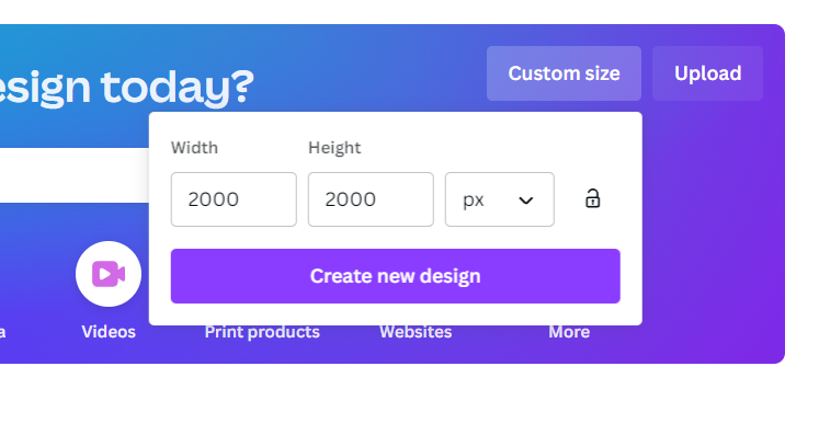
I went to canva and made a custom image size of 2000 X 2000 pixels to shape it as a Square.
Step 2
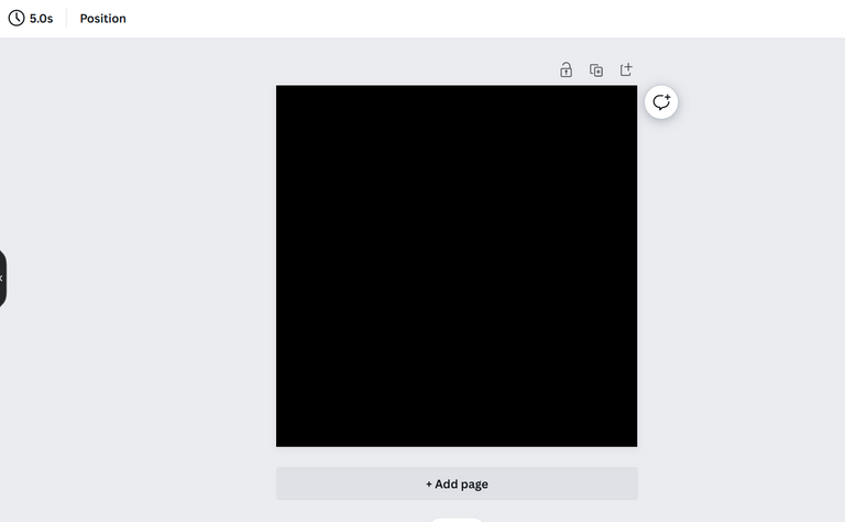
After the canvas opened up, I chose the background color as Black so that the elements I use gets more visibility and pops out!
Step 3
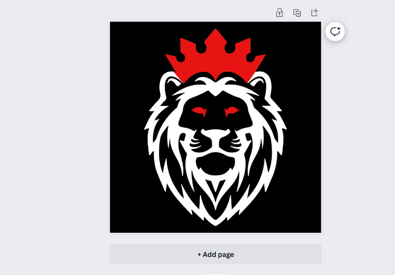
I searched within the canva for a elemental or basic line draw type lion picture as a base of my project. After some searches with different keywords, i finally found this png picture above and chose it for my art.
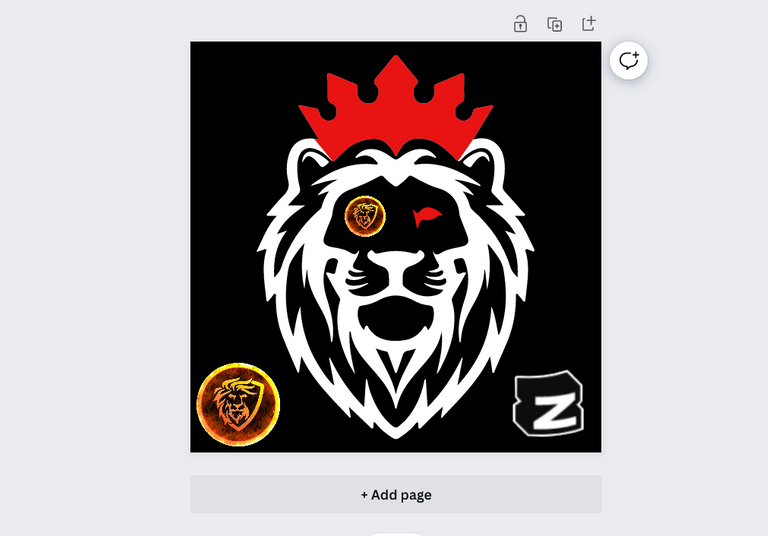
Step 4
I tried to replace is boring eyes with the 2 logos so that the logos get some attention here and also make the picture eye catchy!
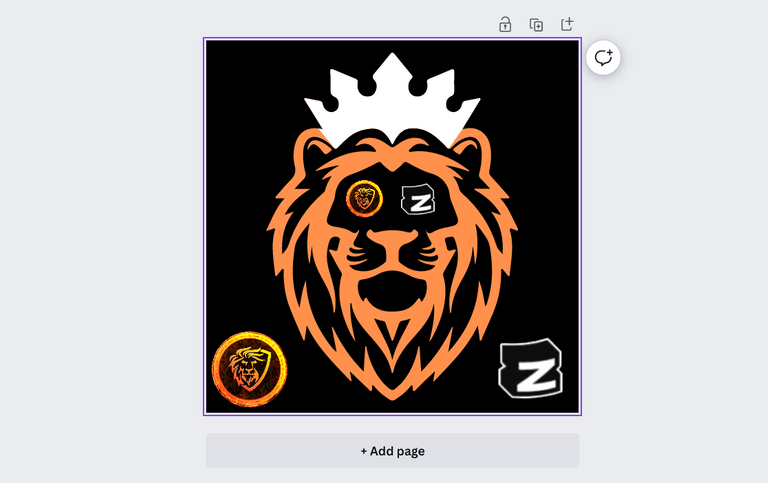
Step 5
After a little replacements and resizes, I finally got what I wanted and also pkaced those 2 logos at the base corners.
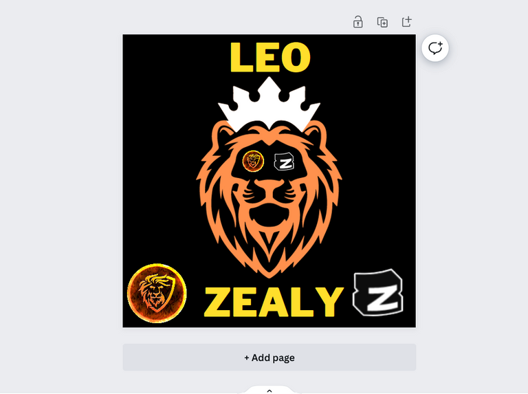
Step 6
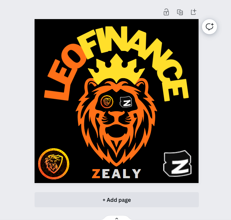
Next, I tried to place the name of both projects and places 'Leo' and 'Zealy' at the top of bottom of the image.
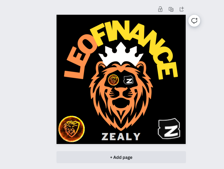
Step 7
I changed the Leo word to leofinance and curved it over the top of the lion. I colored it similar to their font style and this one is looking cooler!
Step 8
As for next, I played with the color grading to give it a more pop and color burst look and came out with a better version.
Step 9
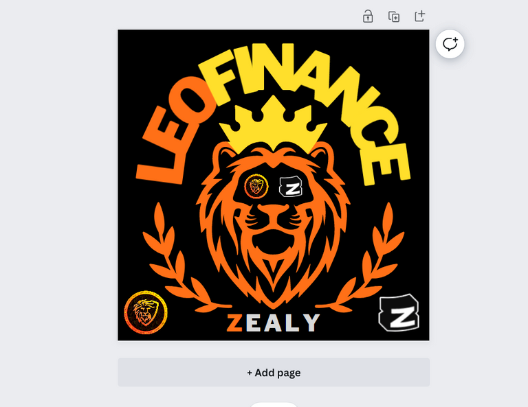
To enrich the image even more, I tried to add some leaves style at the below part that will make the unfinished circular theme a complete look. After some time, I found a good png of a olive leaves and then it took a little time to place them well, but now it is suddenly looking an awesome poster look!
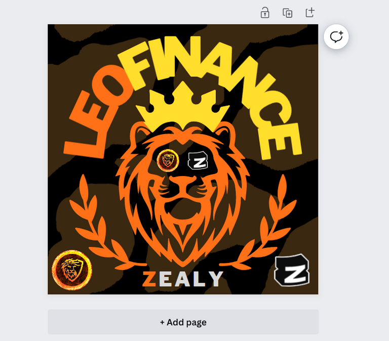
Step 10
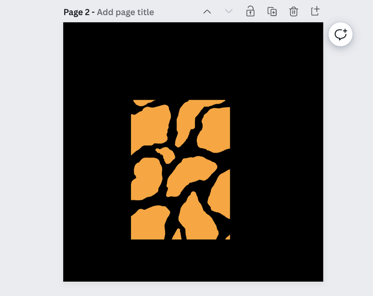
Then I tried to add an animal type texture at the solid back background to see how it is looking on the core image. I did some research and come out with this one but later at final stage, I chose to exclude it.
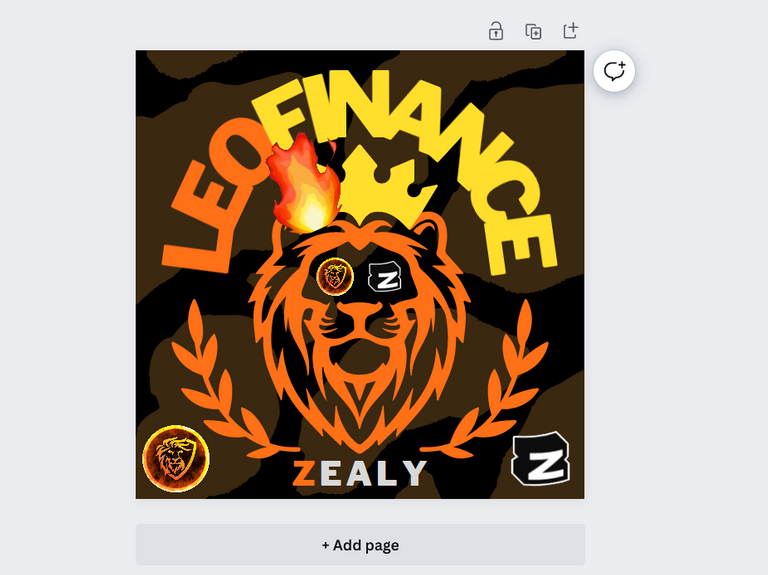
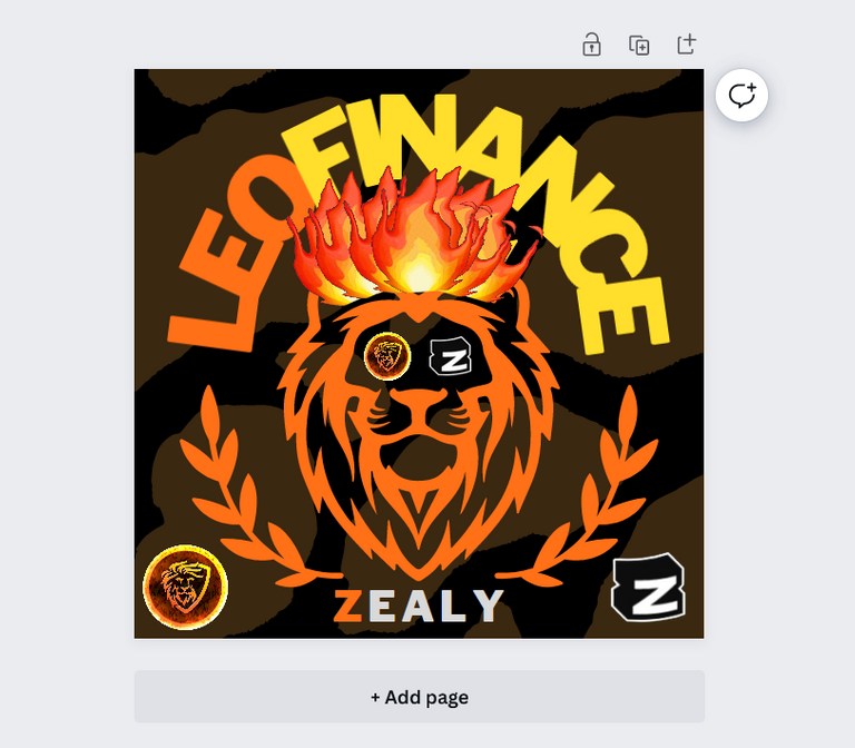
Step 11
Now to add some secret juice that helps it to get stand out among the crowd, i decided to make a Crown made of flames for my badass lion. I find out one good gif animation of flame at google and used it multiple times and adjusted them well to get the worthy crown I was wishing for.
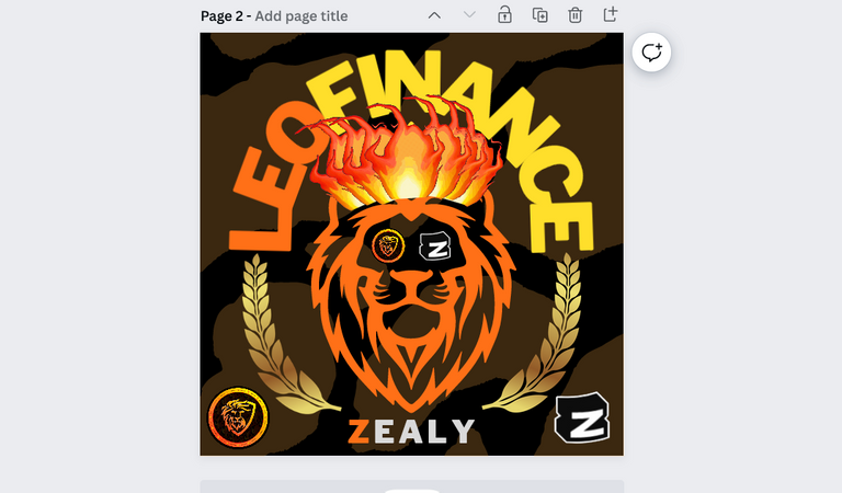
Step 12
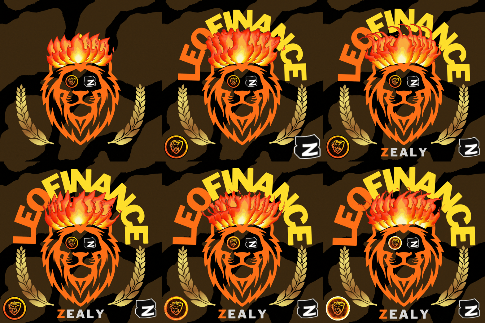
After a final touch of resizing and relocating, replacing the old olive leaves with a golden one and toggling them with basic animations, I finally come out with this cool looking gif poster on the theme I was given, however this is not the final piece, as I decided to remove the stripes from behind and to keep a solid background gave me an even better looking art piece, Look below!
The Final ART
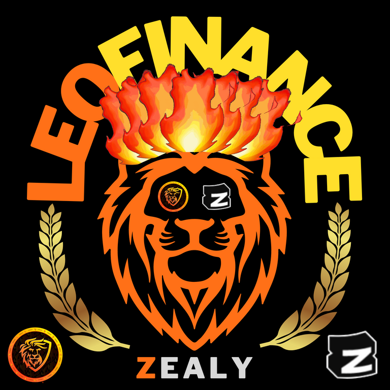
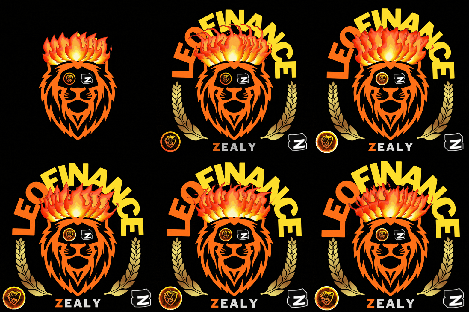
Here is the full image and animation gif of my ART that I made following the steps above. Give it some time to reload the gifs and if you are watching it as too large, try clicking on it while viewing from www.peakd.com front end. Hope you liked my work effort after this art, if you find it beautiful, please let me know in the comment below! I will be seeing you all in my next post!
https://leofinance.io/threads/mango-juice/re-mango-juice-2rdltpnd2
The rewards earned on this comment will go directly to the people ( mango-juice ) sharing the post on LeoThreads,LikeTu,dBuzz.
It was great, I liked it.
Really felt great that you liked it man! ❤️