 HARKLAW.
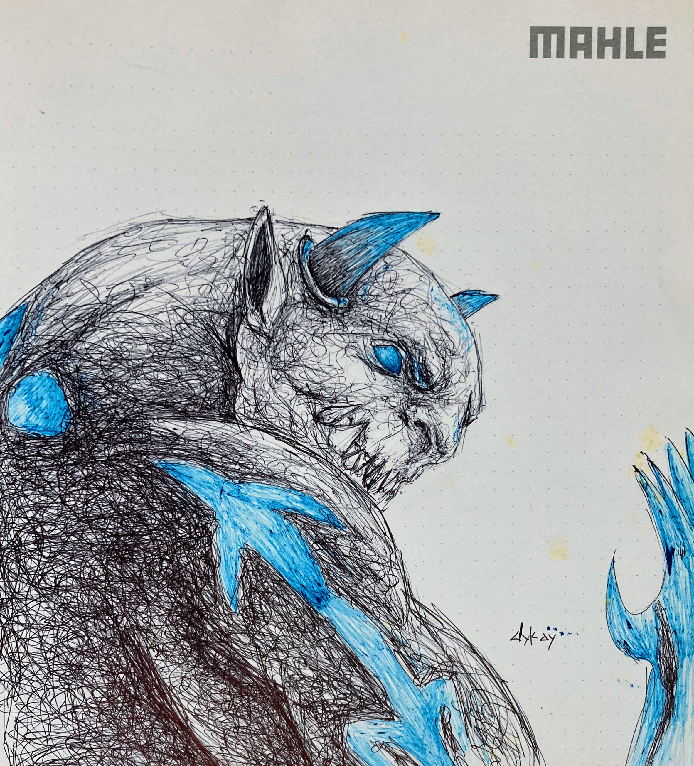
Firstly, I want to apologize for not sharing any of my work with you these few weeks. There's been a lot of development and honestly I had to take time out to sort them out. These trying times can be overwhelming if you don't have solace and that is why I am glad I do. Amidst this drowning I was able to recall the joy I feel when I draw and make entries into the #splinterlands contest. The sheer fun and thought process I put into these works often draw me from my life's situations. When I remembered this, I took my pen and started hunting for cards. I then stumbled on the Harklaw which I must confess is badass (if I may use the word). So below are the steps I took befor I accomplished this feet.

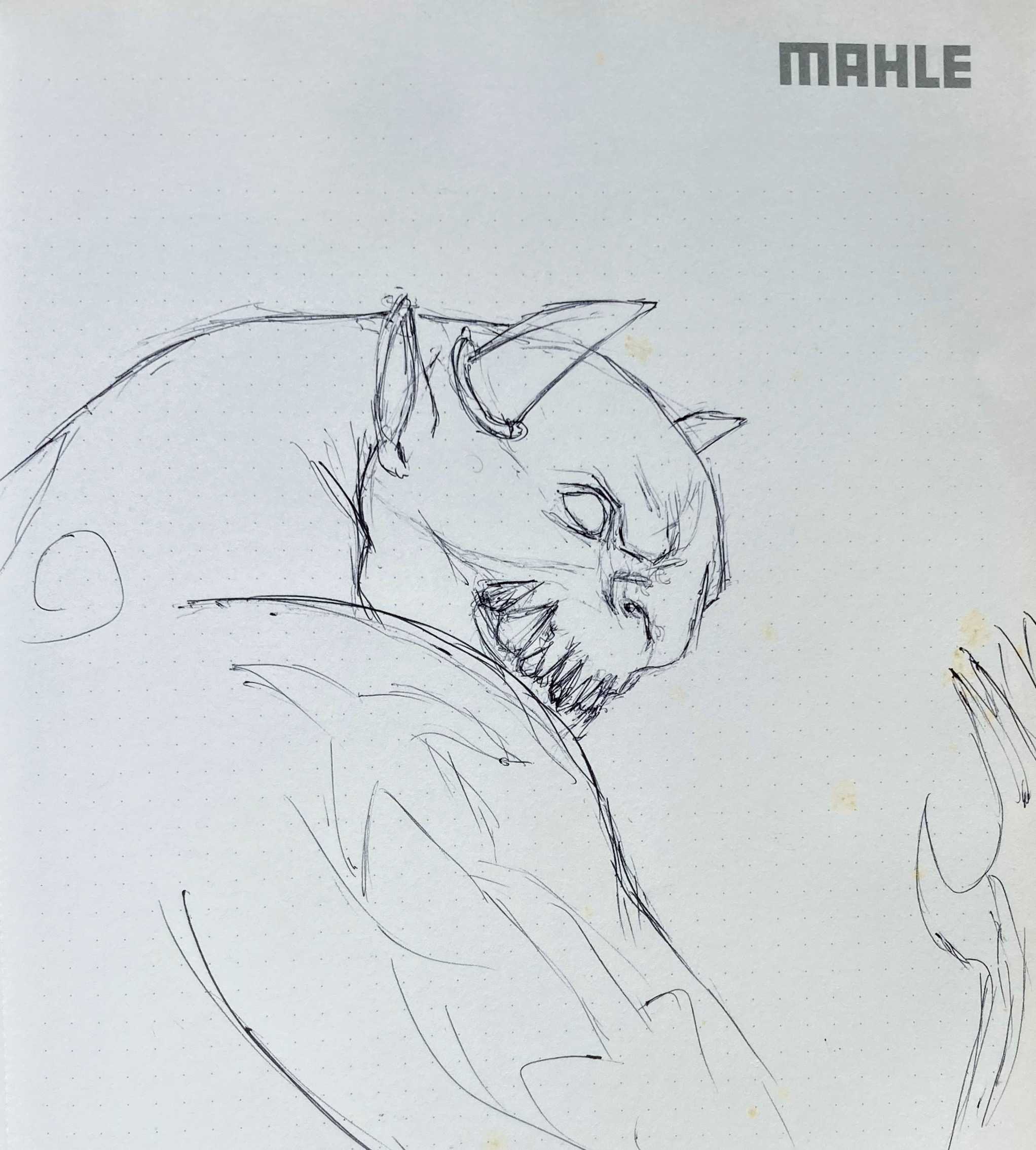
The first degree was a light work. Just as I have done these past months, I didn't use my blue pen for the first layout as the body of the Harklaw only has that color as flourescence. I used my black pen and didn't assume a whole. I took the process through the eye of my reference and adopted it to what the Harklaw possesses.
After this was done, I made the little distinctions of color and depth on his face, horn and body using both pens.

I continued with the obvious and made it firm. During this process I applied depths to some necessary areas but soon noticed as I was doing this that the pen was faulty so I stopped.
The first coating of black was the next move and it was a good one. Just as I always do, I used it to map out important spots and areas so that when the shading begins (regardless of the technique, everything will fall in place)
Following the previous step led to this and the next...
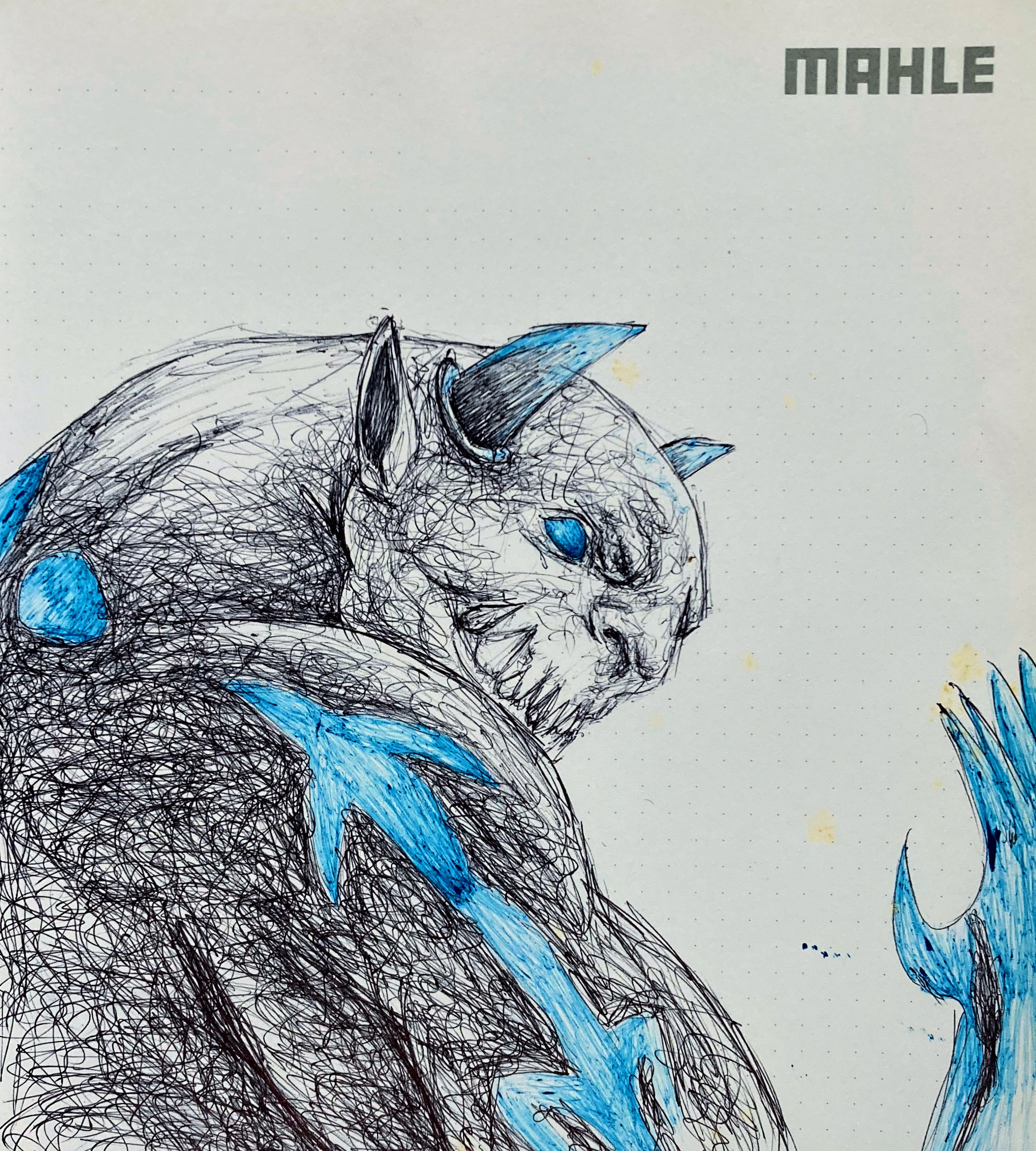
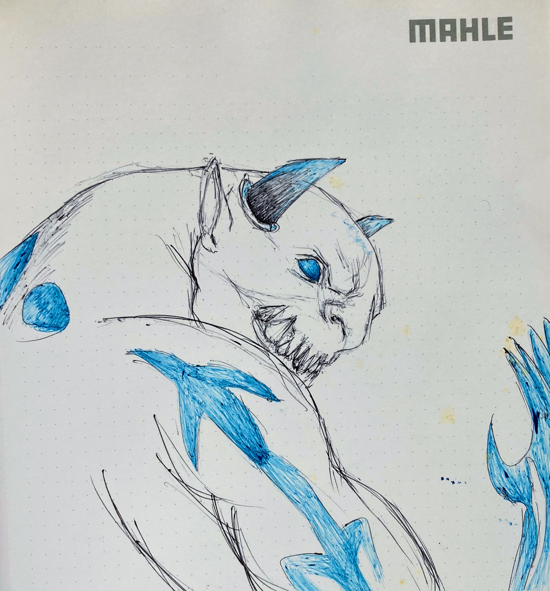
Since this is a two color piece and the blue is something of an ornament, I decided to add some depths to the areas that surrounded this highlight so as to make them pop out more and stand out.

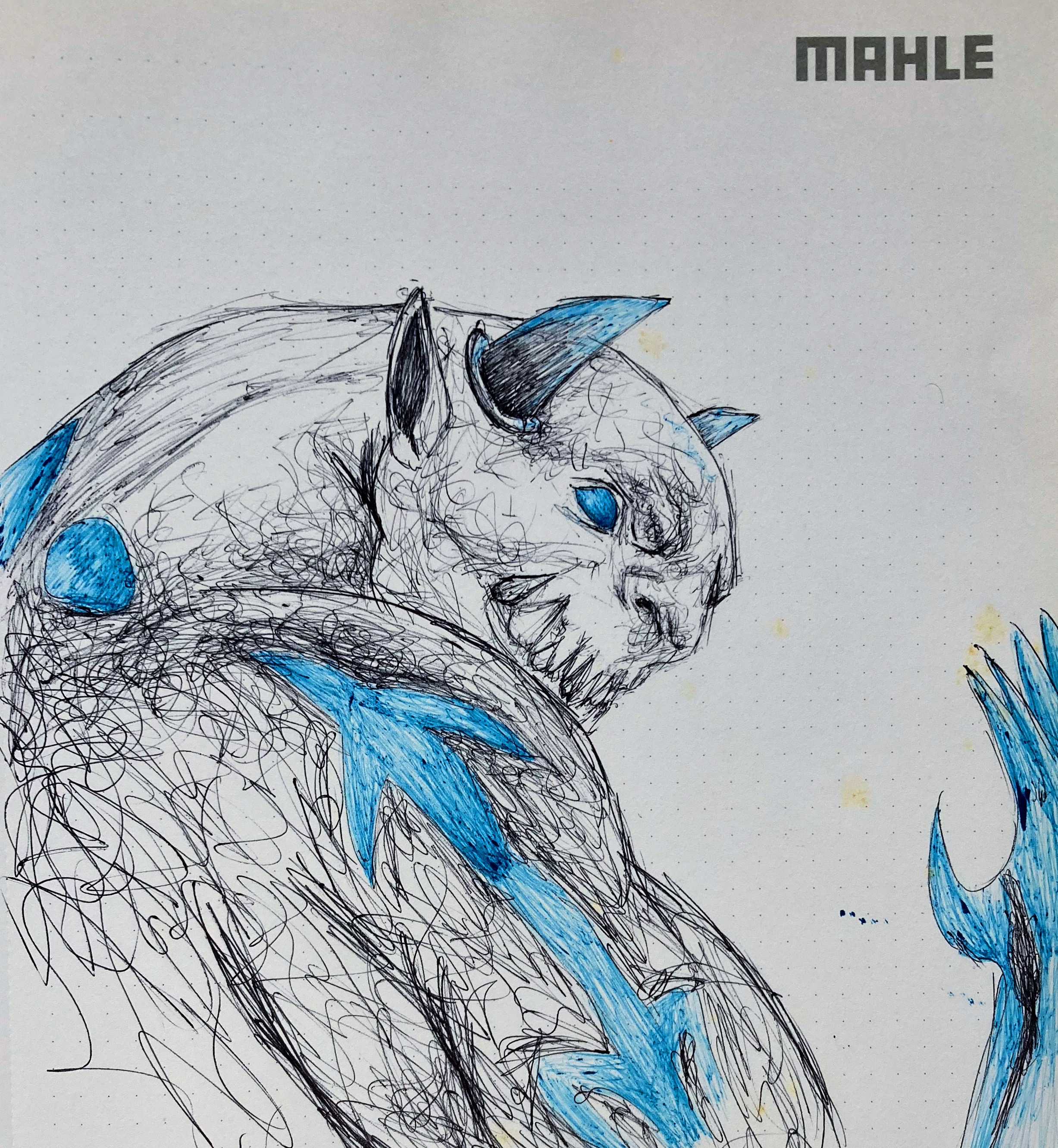
This was the final touch and I made efforts to blend the body. I would've made efforts towards a greater depth degree but I feared I might arm the paper and the contrast I have for some time been building.
Lest I forget, I also pronounced the highlights of the blue.
The materials I used while making this sketch are Blue and Black pens.
Increíble trabajo 👏. Realmente tiene mucha textura visual. 🤗
Incredible work 👏. It really has a lot of visual texture. 🤗
I took my time on this and I guess it paid off.
Thanks
Congratulations @dykay! You have completed the following achievement on the Hive blockchain And have been rewarded with New badge(s)
Your next target is to reach 3750 upvotes.
You can view your badges on your board and compare yourself to others in the Ranking
If you no longer want to receive notifications, reply to this comment with the word
STOPCheck out our last posts:
Glad to see you back to drawing again. You shared such a beautiful drawing with us, we love it and can’t wait to see more of your drawings in the future, well done.
selected by @ibbtammy
Thank you 🙏