Hey Hive!
We're back again with another Art Attack! If you're new to the series, this is where I share my drawings and the process behind them. A behind-the-scenes look at my artwork, if you will. This is not to say that I'm very good at art, or that I'm a professional in any way. In fact this is the opposite, and serves as a reminder to how I first started, and lets me track my progress too!
We're back with another series of Twitch emotes! I've shared about my streaming journey on Twitch in multiple posts and the art I've done both for my Twitch channel and for my viewers. Earlier this year, Twitch announced that Affiliates (such as myself) would get access to many more emotes slots so I was scrambling to draw new ones to fill them for the first half of this year.
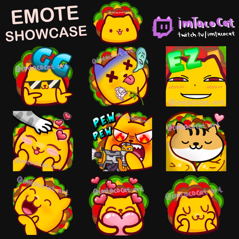
Here are some of the more recent ones I've done:
I previously wrote about a cute blankies emote I did for one of my streamer friends that looked like this:
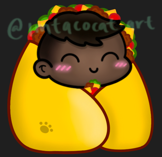
It's still one of my favourite "commissions" or art redeems I've done to this day since it looks pretty nice and clean, and I'm grateful he attributed it to me as well. Since then I had the idea of doing my own blankies emote that looks pretty much the same but with a cat head of course, that looks like this:
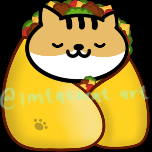
I thought it looked pretty good, but then realised it's not that easy to see at 56px or less in chat, so I wanted to do a zoomed in version essentially. I found a really cute reference for it too:
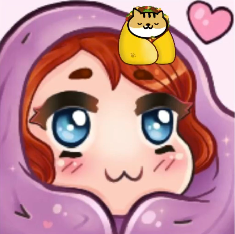
So I was essentially going to do the same overall shape just with my cat in a taco blanket. Here's the sketch:
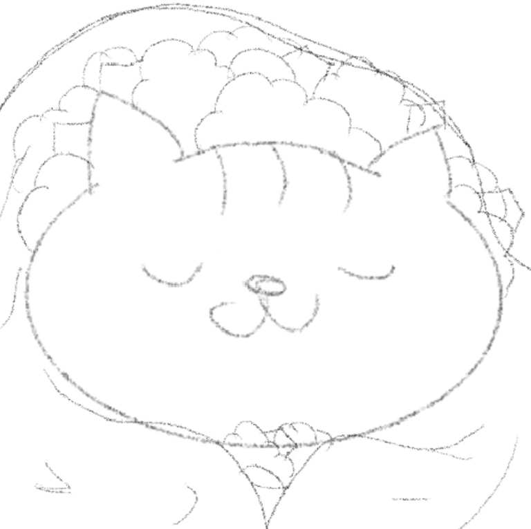
Unfortunately I had to do a full outline and recolour again since the scale and dimension was off and it was easier to just redraw the taco fillings again. Finally we get this, which I thought looked perfect.

It's not as smooth as the other one but I thought it was fine since it gave the blanket some natural folds. Although I'm not sure how accurate the taco blanket looks now, it does look more comfy and cozy this way which is exactly the vibe I was going for anyway.
I also shared about a heart emote I did long ago, but tbh I wasn't too happy about that one since It looked too basic, and I was still quite new to digital art at the time.
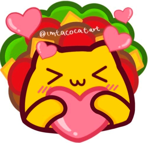
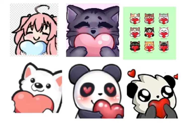
I have had more experience doing emotes since then so I wanted to remake my heart one into something better. This time I found more references and I knew I wanted the heart to be a lot bigger since emotes tend to be quite small in the chat.
These were some of the references I found:
I also wanted the heart to look more round and bouncy like a plushie, with a more comfy-looking facial expression.
This was my initial sketch:
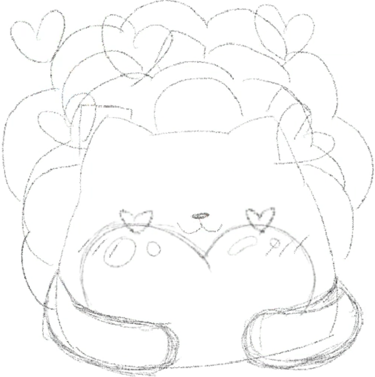
Then I decided to change the facial expression since it looked like too many hearts in the same place.
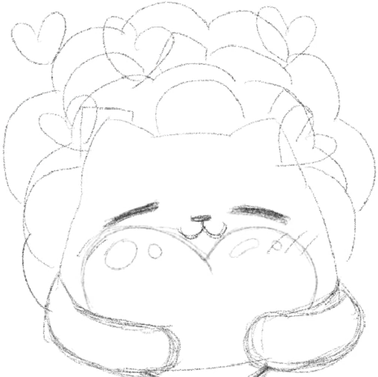
The eyes ended up looking a little too flat though and not visible at 56px so I had to exaggerate them a little bit, and we eventually get this:
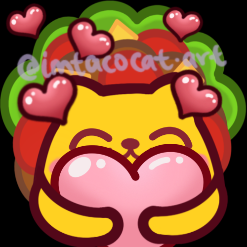
At the time I thought this looked pretty good. I didn't want all the hearts to be the same colour either, and it didn't help that I had a hard time drawing the line nicely. The arms looked a little weird to me but I didn't know how to change it at the time so I settled with this. Now looking at it I think I would want a different pose though.
Overall though, I thought these emotes looked really good. I especially like the blankies one a lot and have been using it a bunch since I uploaded it. I think my chat likes it too though which is great.
Here's the timelapse for these two emotes:
Thanks so much for reading!
To find out more about me, check out my intro post here!

Muy creativo
muchas gracias!