Hey Hive!
We're back again with another Art Attack! If you're new to the series, this is where I share my drawings and the process behind them. A behind-the-scenes look at my artwork, if you will. This is not to say that I'm very good at art, or that I'm a professional in any way. In fact this is the opposite, and serves as a reminder to how I first started, and lets me track my progress too!
I've shared about my streaming journey on Twitch in multiple posts and the art I've done both for my channel and for my viewers, including emotes, redeems, and even art presents I've gifted to my moderators and subscribers!
Here are some of my favourites:
The lurk and unlurk emotes from this showcase:

a redeem I did for one of my mods who wanted to include the mod team in a meme:
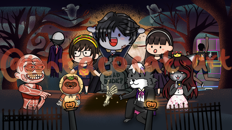
a birthday piece I did for one of my mods who also contributed quite a bit to the community:
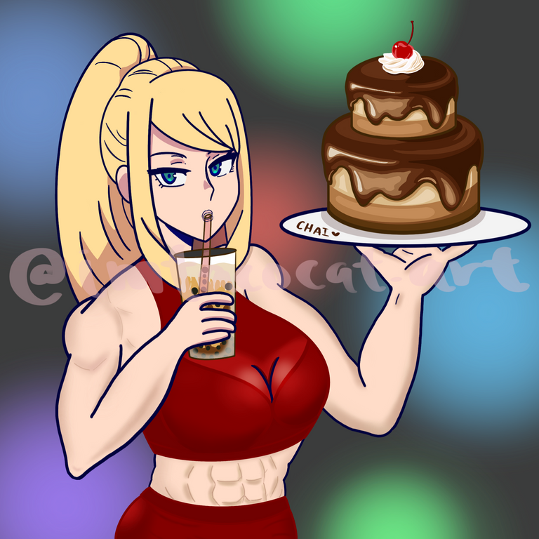
But there's actually a lot of other art that I did for my channel, and back in 2021 I wanted to make a custom overlay for my streams. When I first started I was still figuring everything out and I just used a generic overlay I found online for free:
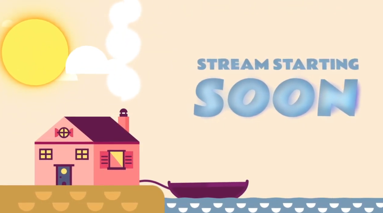
It's animated but unfortunately I don't have the gif version anymore since I have deleted it since then. Anyway, once we reached 500 followers I wanted to change it up and do a custom one so it'll be special. I also wanted to make space for my on-screen widgets like having the chat box even while we're on this scene.
I saw a lot of generic ones online but I couldn't really find one that I liked, so I tried to make my own. An early idea I had was to show my entire room, or at least try to replicate it as best I could but I couldn't get the lines right and it just looked so weird.
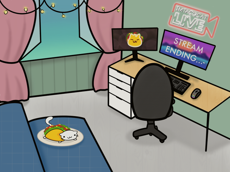
After that I realised I had to zoom in more on the desk itself since there was going to words there. Here's one of the references I used:
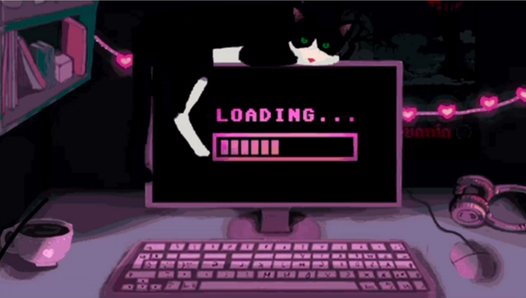
There were a few elements I wanted to incorporate like having the background look like my actual desk with 2 monitors, a keyboard and a mouse. I also wanted it to have a LIVE sign that would flash along with some fairy lights. I thought it was a pretty simple concept until I actually started working on it.
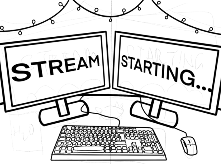
In order to maximise the space I thought of having my monitors at an angle so they would be symmetrical. I also wanted my keyboard to light up since I have an RGB keyboard that looks pretty cool. I also wanted to include some of my Tacocats like the one I've been using as my Twitch profile picture this whole time.
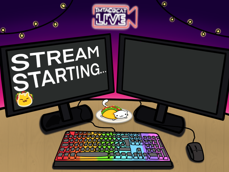
But it was only after I went to import it into my streaming software that I realise there's no way I could make the chat box tilt that way to match the monitor. I'm sure there was probably some special way to do it but it didn't look good and honestly the perspective was off anyway so I didn't like it.
My dimensions were also off on the original one I worked on so I had to choice but to redraw it again. After that I was thinking if I should just make both the monitors straight but since this was accurate to my actual setup I thought it was fine.
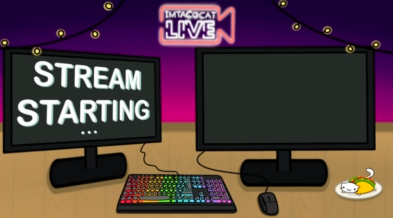
For the animation, the main aspects of the animation were the cat's tail, the flashing lights and the keyboard. I was also thinking about putting a rolling Tacocat slime on the screen which I thought would be weird but it turned out pretty well I think.
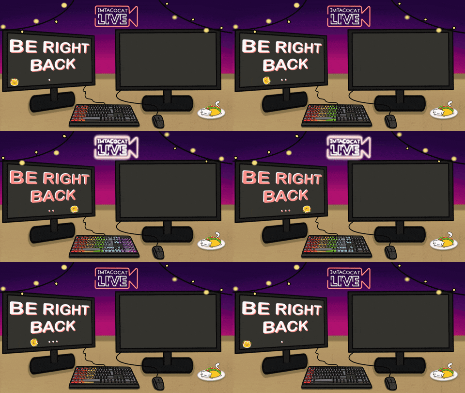
This is what it ended up looking like and I thought it was fine at the time, but now that I look back it looks so basic and I'm glad I changed it shortly after once the channel really took off. But unfortunately we did have to stay with this overlay for a few months, which my chat was very supportive about and really liked despite what I thought about it.
Here's the timelapse for this. The only difference in versions is the words and their colours but the rest is pretty much the same.
Even now when I look back at my present overlay which is more detailed and a lot nicer I always see things I want to change. I guess it's the curse of being an artist; nothing is ever truly done since art is constantly evolving. At the very least it just means that I am indeed improving in both my skills and my tastes.
I'll definitely be sharing the later versions of this because there have been 2 more iterations since then and many other behind-the-scenes pieces I don't share on my instagram.
Thanks so much for reading!
To find out more about me, check out my intro post here!
