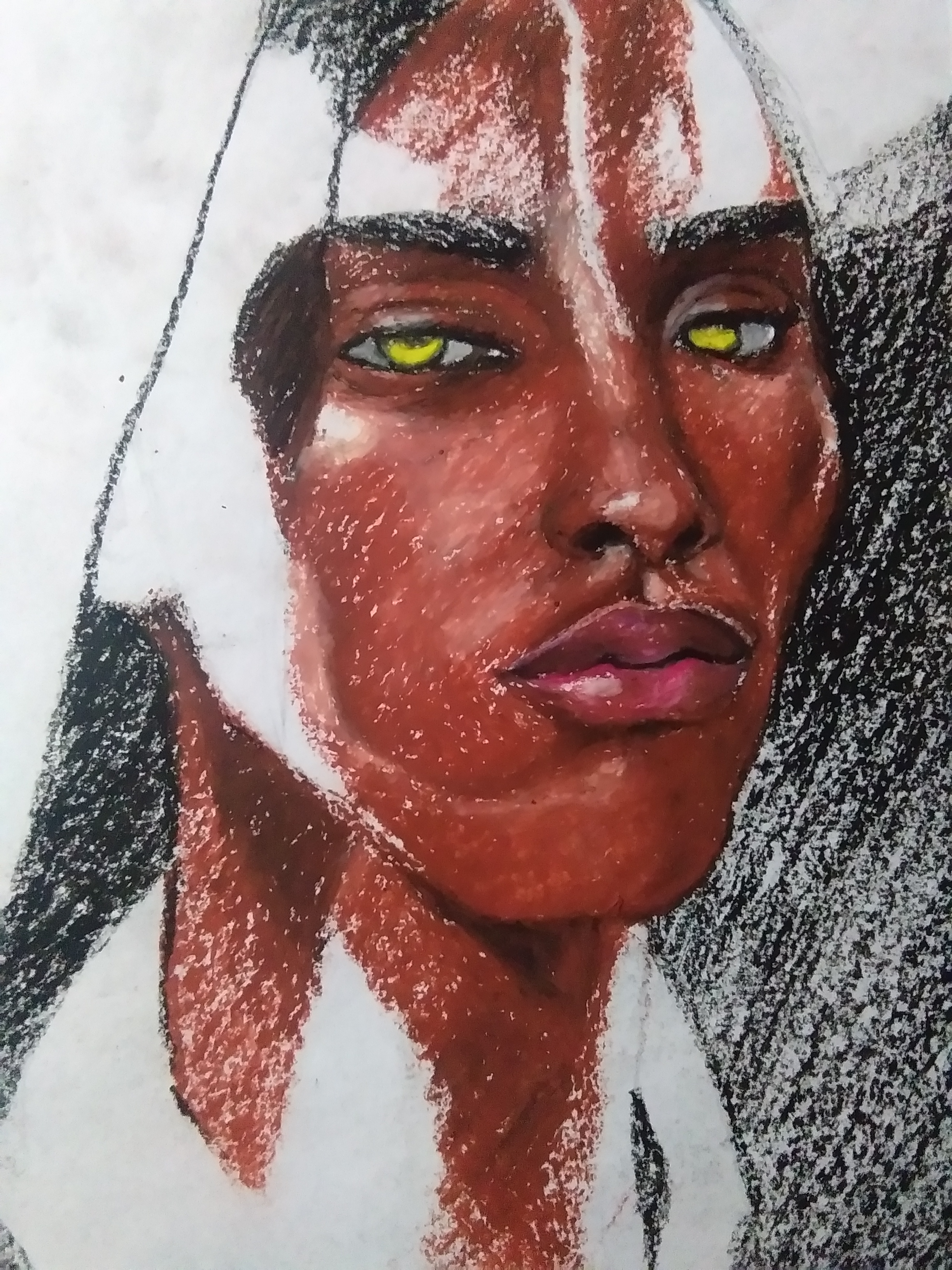
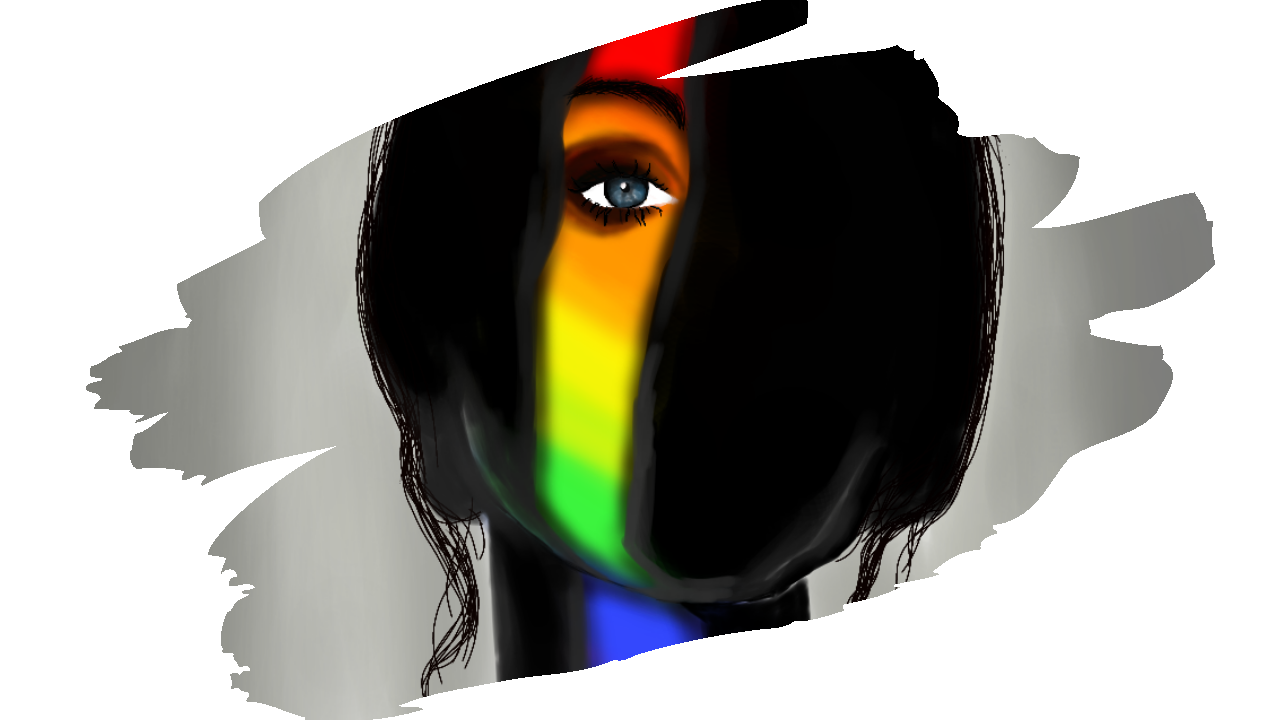
Hello hivers! It's me again! For today's post, it will be the part 1 of my oil pastel portrait. I also did a digital version of this before and if you have time you can check it out. It took me so long to start drawing this because I really find it difficult. I keep on overthinking like "what if it's not the same as my digital painting?!" and "what am I gonna do?!". Those kind of questions has been haunting me for a while now but when I am already the halfway through I was impress. I am happy how it turned out even though it's not yet done. So, without a further a do, dive in and I'll show you.


Oslo Paper
It is a rough 9′ x 12′ piece of thick white paper, commonly used by elementary students for arts and crafts. It is the usual choice for art project because of its sturdiness and thickness – perfect for water-based paint and felt-tip markers.
Cray-pas Junior Artist Student Quality Oil Pastels
Easy to use, fun and safe, these student-quality oil pastels help to build basic art skills in classrooms worldwide. Children can achieve oil painting effects without the mess of paint.
Junior Artist Oil Pastels produce bright, intense colors. They contain pigments that blend easily and last without fading. Ideal for texture rubbing, blending, scratch art, almost any coloring project.
Individual pastels are round, measuring 2-3/8" × 5/16" (60 mm × 8 mm), and have paper sleeves. Non-toxic, they conform to ASTM D 4236.
COLORS
#19 Red
#07 Pale Orange
#12 Brown
#49 Black
#-- Violet
#-- Yellow

Title: "Sentiments of Judged Soul"
Dimension: 9x12'
Medium: Oil Pastel
Year Created: 2020

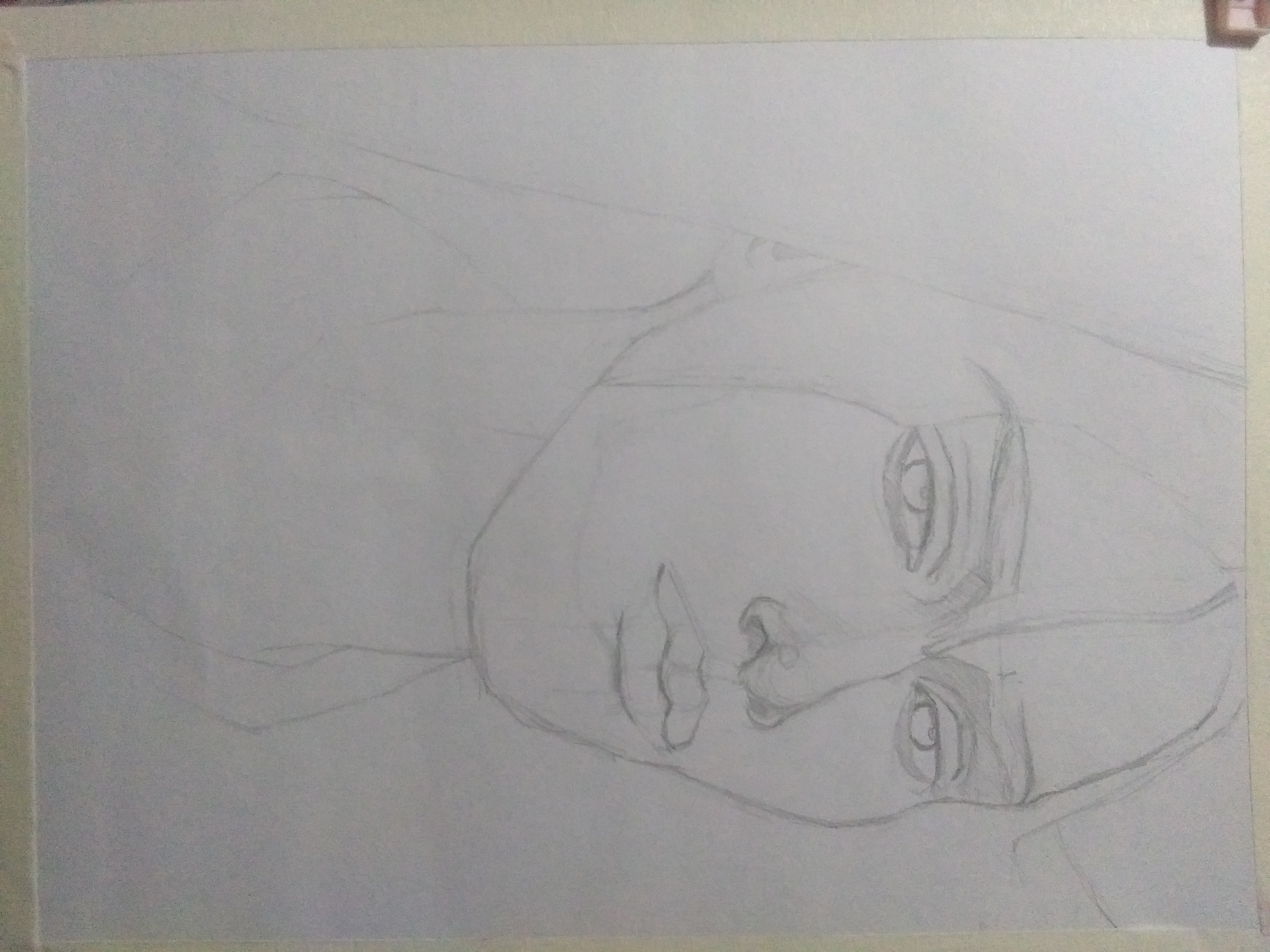
First, I made an outline using my Mongol 2 pencil. At this time I was a bit worried about its resemblance to my digital paint. I feel like its kinda difficult drawing it in a paper or maybe this time I just got used to digital painting and I just recently explored oil pastel in terms of portraits.
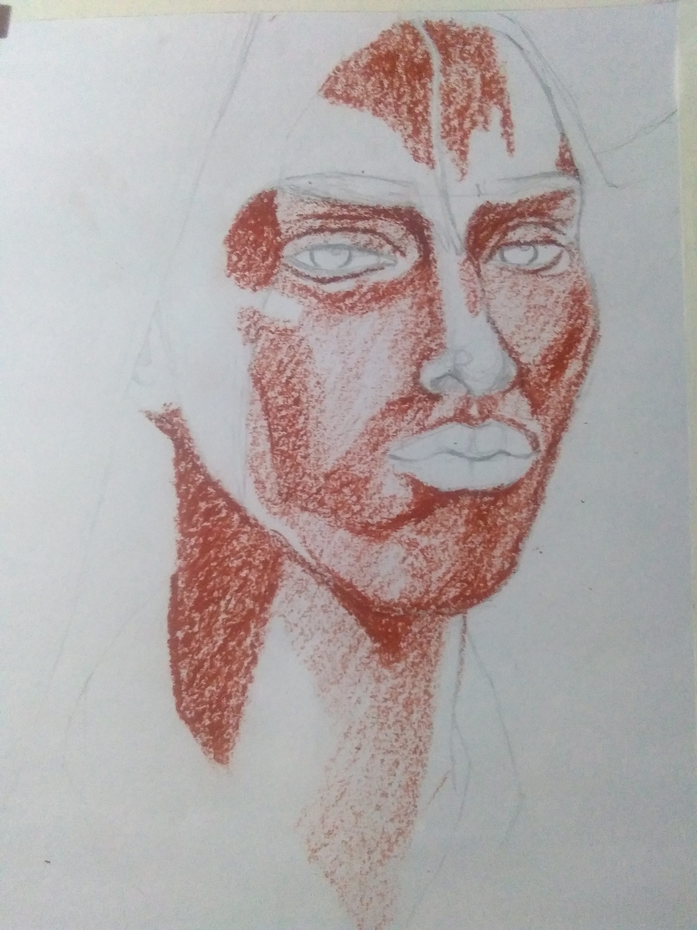
Then, I tried to color some areas like the under eye, forehead, side of his neck and chin with #12 brown. In this part, I made sure that I color it in one direction (diagonally).
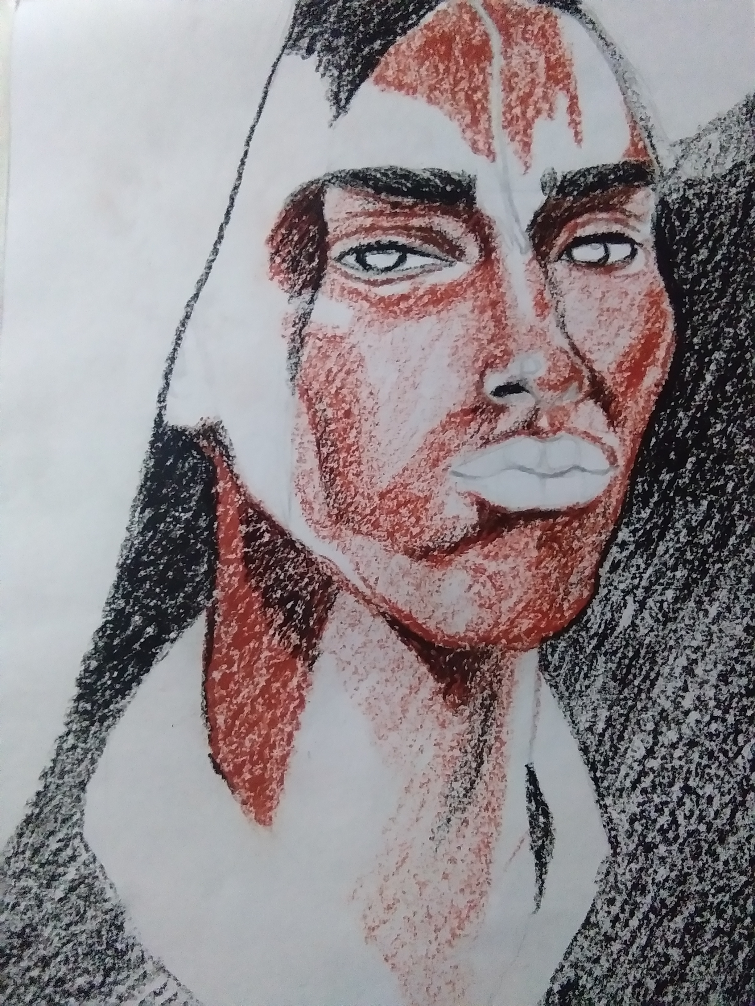
After which, I used #49 black on his eyebrow and some of his face to emphasize shadow and depth. I am really hesitant to add other color because I might mess this up. But to know if something works then you have to experiment and explore with it.
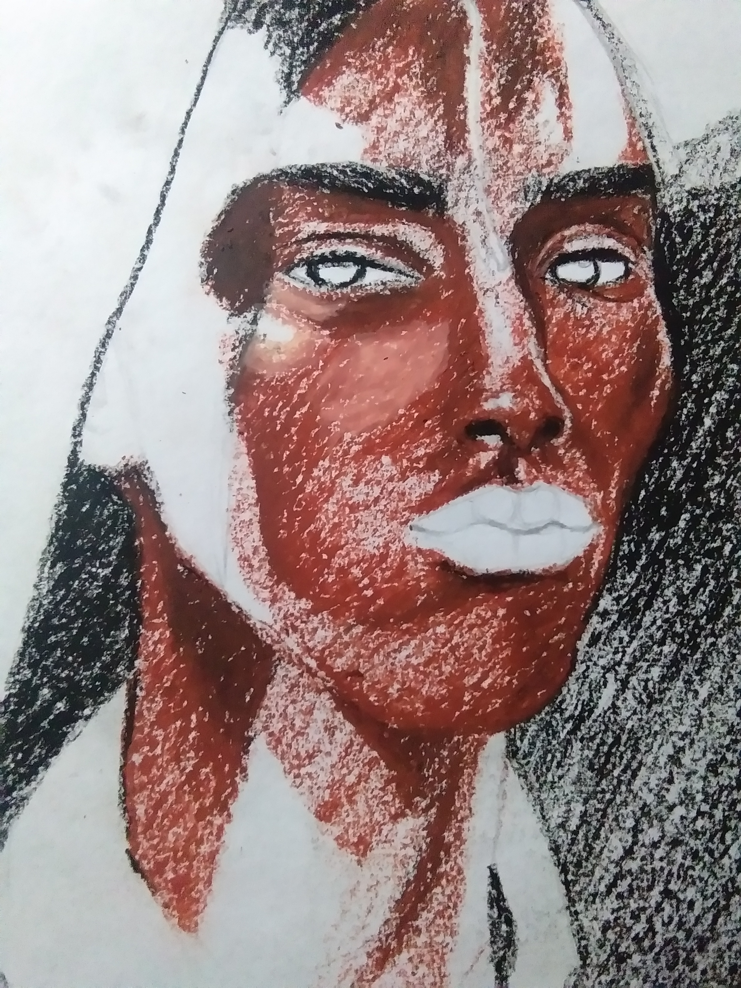
I also made sure to outline his eyes and proceed to adding #07 pale orange to blend his under eye.

His lips is the most time consuming area that I worked on. I used 5 colors namely black, violet, red, brown and pale orange just to achieve how it looks like and also picked yellow as his eyes' base color for now. Viola, we are half way through! Hope you enjoy! See yah in part 2!

Note: Don't compare your works to the works of others. Compare your work of today from your work of yesterday.

MILLION THANKS FOR REACHING THIS FAR! 

 Hello once again! Heads up hivers! Jenny Mauring here who lives in the Philippines, 20 years old which means that I am no longer a teenager! I am a self taught artist, if you consider me as one. I am a friend to some and strangers to many. I am a lady with light in her eyes, love in her bones and a sucker of artsy and creatives. Come and visit my blog @jmauring to check out my content. You can also connect with me through my Instagram account, that's @jmauring, Jenny Mauring in Facebook and YouTube Channel as well. Stay happy, healthy and crazy.


Congratulations @jmauring! You have completed the following achievement on the Hive blockchain and have been rewarded with new badge(s) :
You can view your badges on your board and compare yourself to others in the Ranking
If you no longer want to receive notifications, reply to this comment with the word
STOP