
The OUCH logo was designed by me for a client who wants to open a school for people who are mentally and emotionally sick or stressed.
The logo is a visual story that captures the essence of pain, support, and healing.
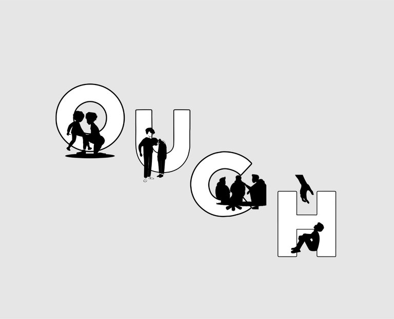
Each letter carries its own meaning showing through the characters within it:
O – A child being cared for by a mother figure.
This represents the first encounter with pain or injury, often when someone is vulnerable and in need of help. The act of care inside the “O” shows compassion at the very beginning of hurt.

U – Two person standing side by side, one offering support to the other. This illustrates empathy and encouragement, reminding us that no one should go through pain alone. The “U” becomes a symbol of upliftment one another with unity.

C – It illustrates 3 persons having a conversation. This represents sharing, counseling, and community support. Pain often lessens when it’s spoken about, and the “C” emphasizes care through connection and communication.

H – It illustrates someone seated tired of everything (Depressed) seated and a hand is reaching down to help.This portrays recovery, restoration, and rescue we get when other people help us out when we are in need of help

Nice work! The "O" with the mother figure is a really powerful image. 👍
Thank you so much! 🙏 I’m glad you noticed that detail.
You did a great job 👍
The logo alone says it all, honestly, mentally stressed people need support so opening such school is a good Idea.
Exactly you're right
This post is really interesting 🤔, you will teach me how to construct those things.
No problem😊I got you
Congratulations @emmyblaze! You have completed the following achievement on the Hive blockchain And have been rewarded with New badge(s)
Your next target is to reach 200 replies.
You can view your badges on your board and compare yourself to others in the Ranking
If you no longer want to receive notifications, reply to this comment with the word
STOP