I remembered back during my English exams in school, my relative proficiency from watching far too many Anglophone cartoons meant that I almost always finish first, or at least much faster than a lot of other students. I'm willingly and openly boasting about that, since English is often the only bright spot in my scoresheet, but I digress. I frequently had more than half an hour to spare, out of a two-hour allocation. I'd spend my time gazing out the window, or fiddling about with my pencil and eraser, turning the desk into a makeshift football field.
If I'm feeling productive, I'd flip through my exam papers over and over again, making sure I hadn't made a single mistake, and that I would perfect every little thing, including my chicken-scratch handwriting. Then, we get to the essay-writing section, where I'd erase huge bits and swapping or adding more lines and text on top of it. I had the time after all, so I may as well try and make it Pulitzer-worthy, right? Wrong, as the more I change, and the more I add onto the original piece of fairly descent spontaneity, I kept making it worse.
Less, Is More.
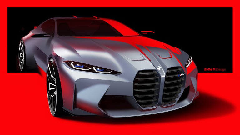
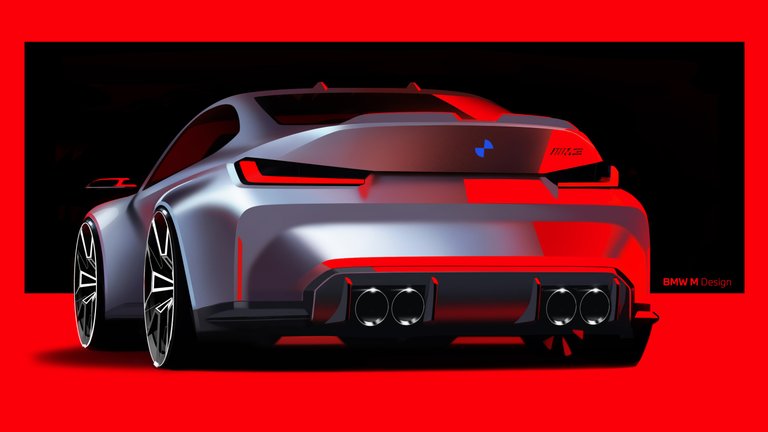
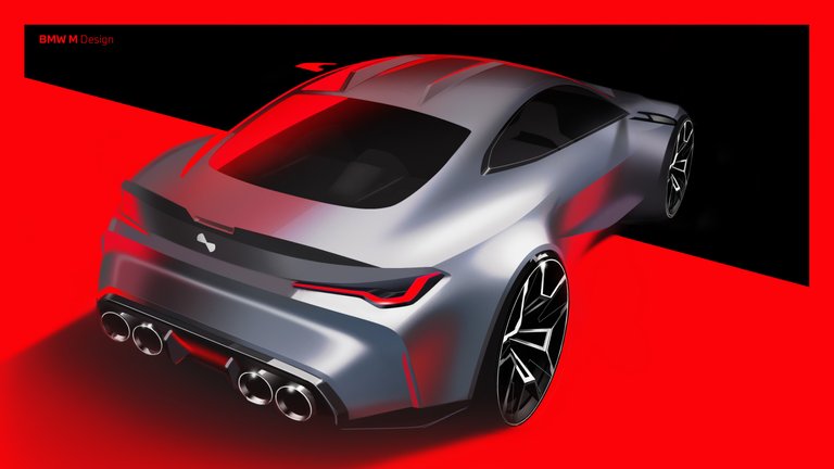
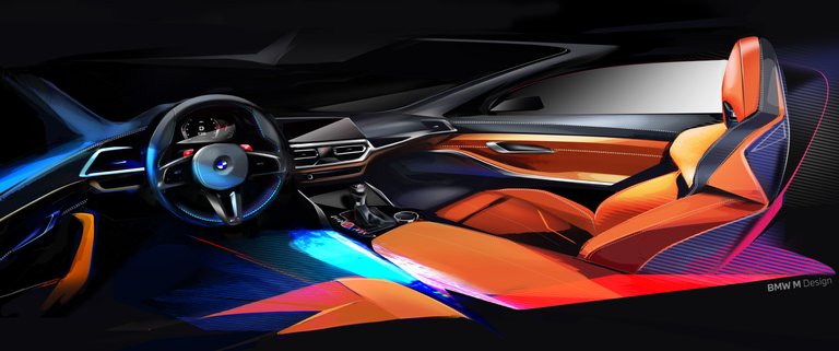
Credits to: BMW
Every minute adjustment made it catastrophically bad, and reading it back, I genuinely am surprised I ever got an A at all. The lesson I've learnt, is that sometimes things are best left as is, or as it was intended. "Less is more", or "Simplicity is the ultimate sophistication", and all that. This, I think, is a lesson BMW needs to be learning right now. That's especially true since Bavaria's finest have just lifted the veil on their new, and supposedly exciting BMW M3, and M4. Well, I'm certainly feeling excited, but not in a good way.
I sense that the part of my soul that had always secretly lusted over a Bimmer is very quickly receding away now. For the most part, this new generation is better than what came before. They're faster, more powerful, and far more technically capable that its predecessors, with an abundance of computers and ponies that you don't feasibly need for a daily commute. But when you've found that quiet, twisty, challenging bit of tarmac, you can very comfortably let loose and pin your foot on the throttle.
All the while, a big ear-to-ear grin appears on your face, as that turbocharged inline-6 smoothly rides a wave of torque to kick the tail out, burning rubber and swigging gasoline along the apex. It's exactly what everyone wants from an M car, and I'm sure it'll be just as fun to drive as it has always been. But just as they've taken 10 steps forward, I'd argue that they've taken just as many steps back. The engineering team at BMW ought to be pretty pleased with themselves, with many pats on the back.
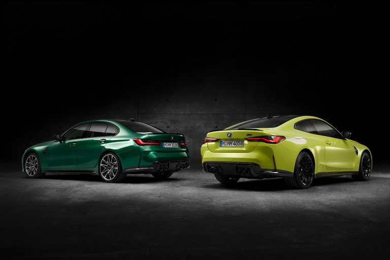
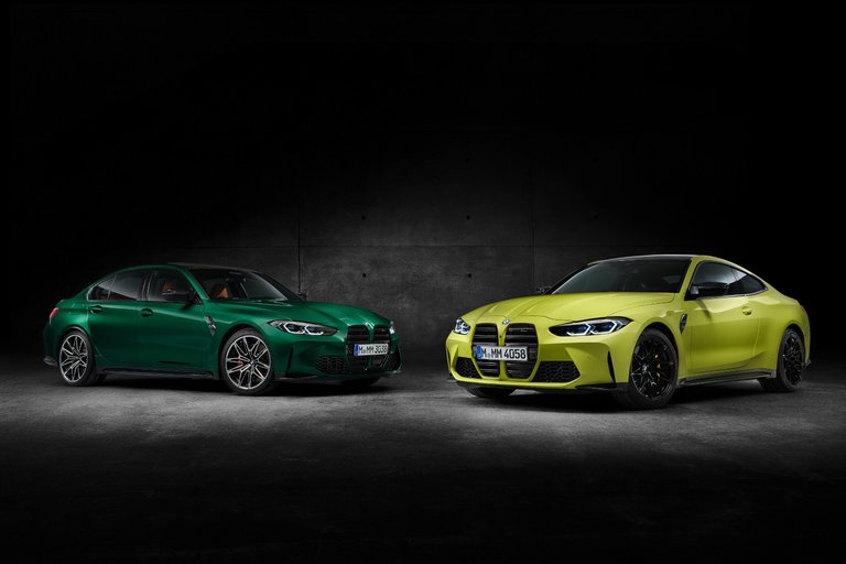
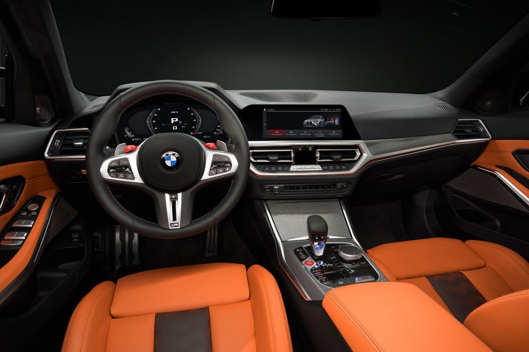
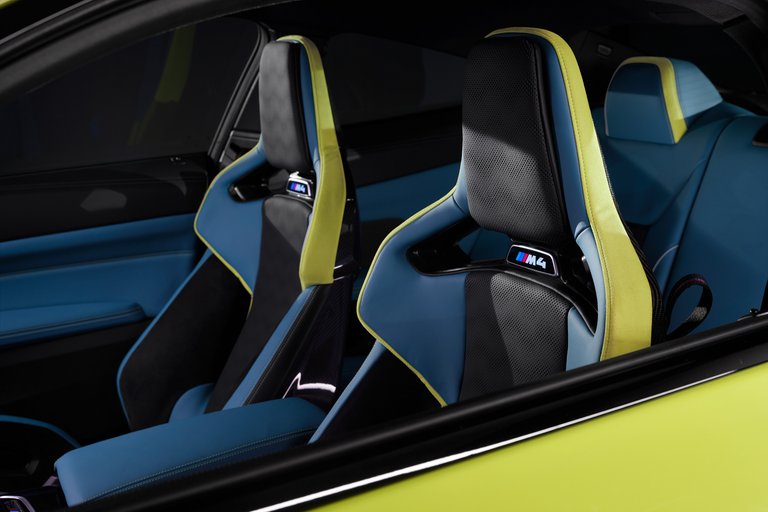
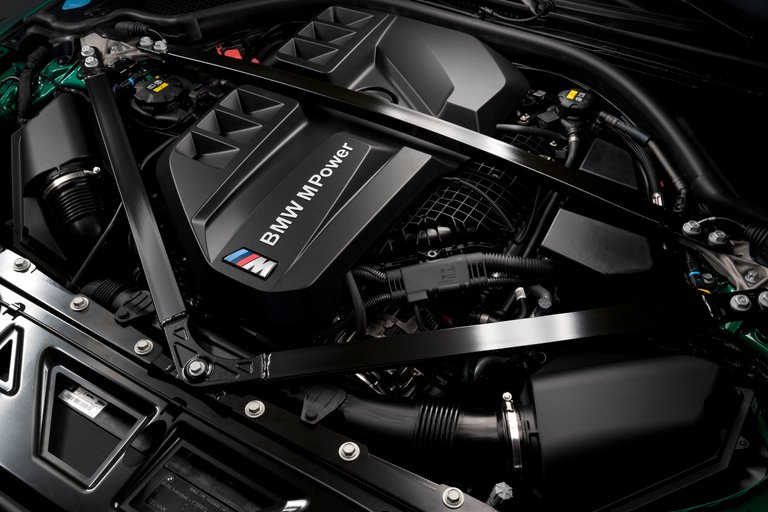
Credits to: BMW
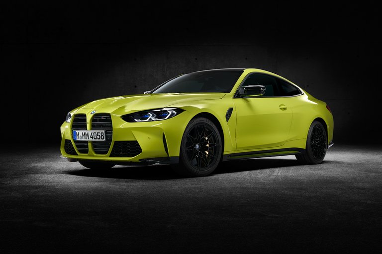
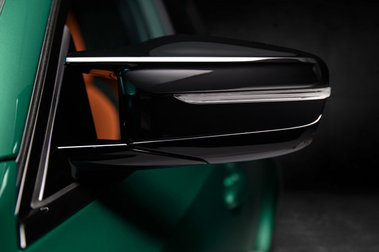
However, I'm not so sure if I'd levy the same hurrah to the design studio, and for good reason. There's no better way to say this, but the new BMWs are fairly hideous things to look at; genuinely unpleasant to the eyes. It appears rather good from the rear three-quarter, with its creased up bodylines, muscular bulges, and sharpish lights. Especially on the lower, wider, and tauter 4er, I do adore the direction that they're going for. The interior looks pretty fab too, though I really wish BMW had thrown the overly girthy steering-wheels into the bin.
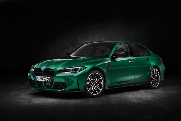
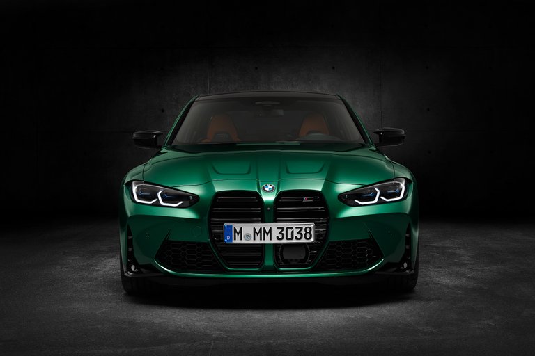
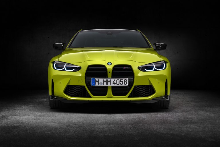
So far, it's not bad. That is, until we get to the front-end. There's been so many jokes, memes, and hatred thrown at this new grille design, and I didn't really see the need to pile on even more onto the already heated discussions. Yet, even after having forced myself to gaze into that bucktooth grille over all these months, since we first saw it on the i4 concept, I still can't live with it. BMW's grilles have progressively gotten larger, and ever more disproportionate since the X7, and its trickled down all the way to the smallest of 2-series'es. Similarly, it's unnecessarily.
Plus, this isn't even the first time that a radical redesign from BMW has courted controversy, as evident by the Chris Bangle-era during the turn of the new millennium. Millions upon millions of hardcore and passionate fans called for his removal, and to an effect, he did eventually retire. Nonetheless, whether it's the 'Bangle Butt' 7-, or the 'Eagle Eye' 5-series, a lot of us can agree that we've not only come to terms with it, but have actually loved it as it's aged well over the years.
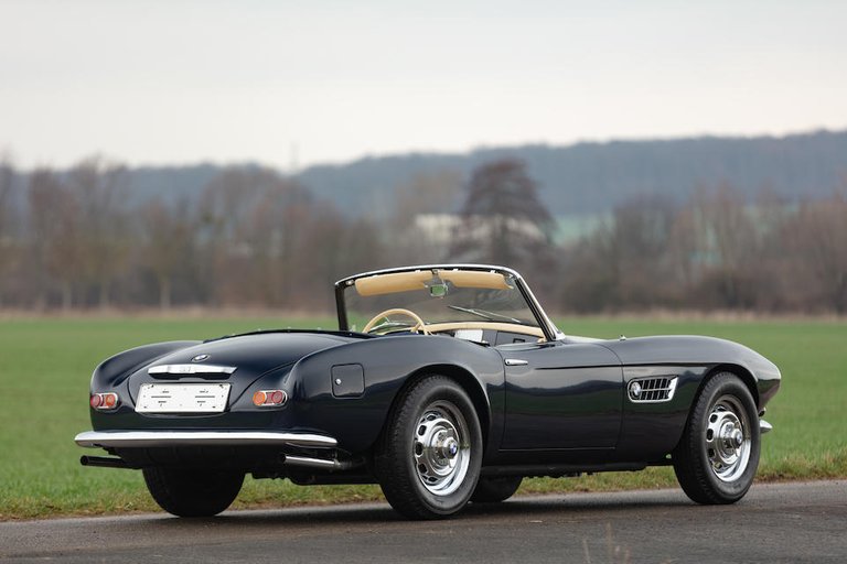
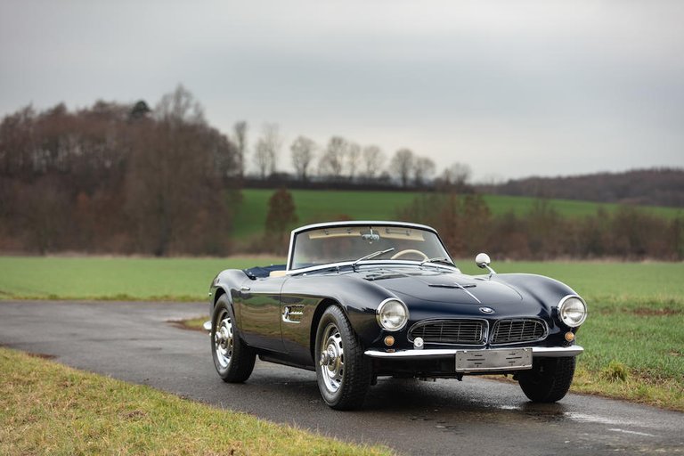
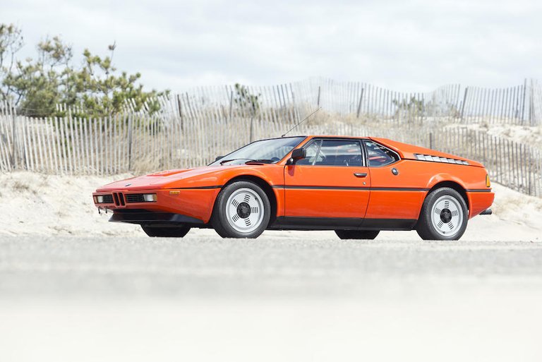
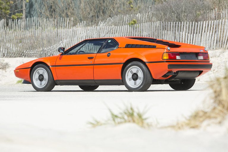
Credits to: Bonhams - BMW 507, Bonhams - BMW M1, and CarPixels - BMW M4 CS
I'm not sure if I can sat the same of this one, however. The interesting thing is, most of that added real-estate isn't even functional, from what I can see. The old kidney-grilles are more than enough to carry all the air needed for the engine, so there's no precedent for such a large opening, and one so dreadfully interrupted by a license-plate. Legendary designer, Frank Stephenson, summarised the 4-series well by saying that, "it looked as though the car was designed by two different people". The curvature of the headlights meet the roughness of the grille just as well as putting LEGOs and DUPLOs in the same box.
It has a face that only its mother could love, and we'll unfortunately be seeing more of it coming along. It's made even more painful knowing that BMW has designed handfuls of jaw-droppingly marvellous cars over its long, storied history. The old 507 is a masterpiece of classical Teutonic styling, while performance-y cars like the M1 showed how Bauhaus could so wonderfully be translated into an automobile. Even as recently as the preceding 3-, and 4-series are some of favourite designs; clean and simple.
Maybe its much more complex than I think, or perhaps there's something that I don't yet understand. I also know that looks are subjective, and I will certainly get that BMW's new clothes might appeal to quite a few people. But even looking aside my own tastes, I can't help but notice how excessive it is, just like my English essays. It felt as though the designers just kept on going, and going. But if you thought that the 'regular' M3 and M4 are overdesigned, complicated, and unbalanced works of modern art, then look away now.
A Grim Future.
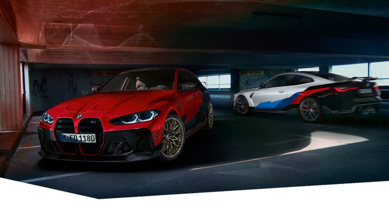
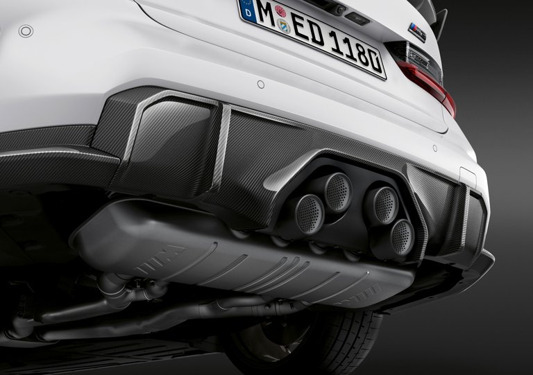
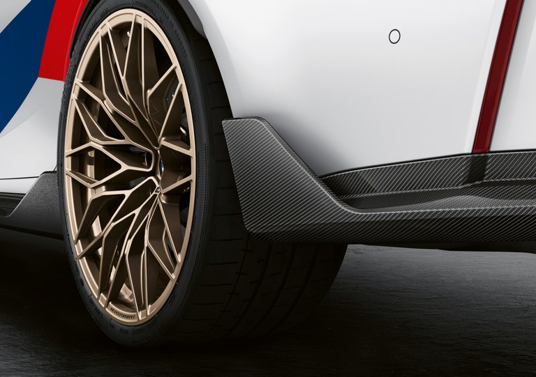
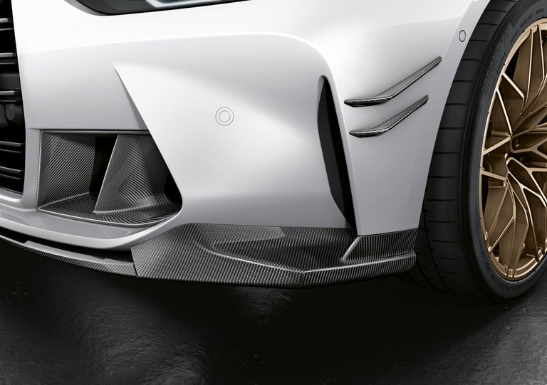
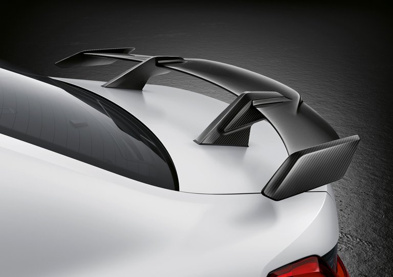

Credits to: BMW M Performance Parts, and Gizmodo
BMW also sells 'M Performance Parts', which are basically factory-approved - thus are warranty-friendly - bodykits and modifications for your own Bimmer. Now, this is akin to me rewriting my English essay, but completely drunk on single-malt whisky, while simultaneously high on magic mushrooms. The gold lightweight-forged wheels, sports-suspension, and Art Car-esque livery are rather nice touches, but just look at everything else. How many different wings, splitters, spoilers, ducts, and dive planes do you need in a car?
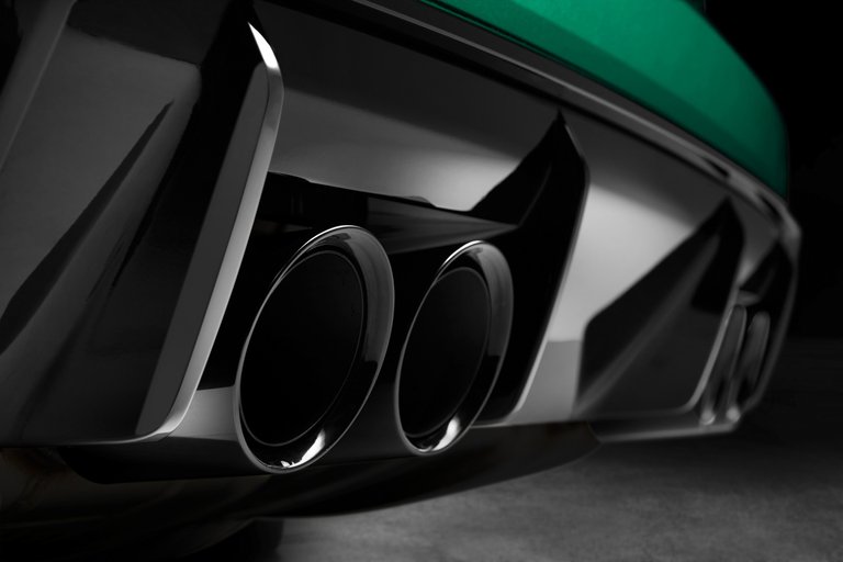
How much more of your house are you willing to mortgage just to get some tacked-on carbon-fibre that'll eventually get smashed on a curb? Also, remember how people complain of getting Trypophobia - the intense fear of a repetitive pattern of holes - when Apple reorganised the camera cluster on the new iPhones? Well, if you're terrified of that, the behold the new exhaust system. In its most basic form, all these additions aren't bad, but it's in such a way that it presents an ugly car to be even uglier.
Putting that kit on it makes this a face that even its mother would deny ever giving birth. If you happen to actually like the look of it, then good for you. But for me, it signals a rather terrifying shift in their ethos. It worries me that I'm more attracted to their new motorcycle, the M 1000 RR, than their cars. Maybe, just maybe, I'll get used to it. Honestly, I'm already hating it slightly less than I did before. Will BMW intentionally make their cars unsympathetically bold and expressive? Who knows, but I'll let that judgement fall onto you, the person who might be more inclined to buy something Bavarian, than I am.
They look angry... Probably at their designers.
Haha, quite true! It looks very disappointed, and definitely out to seek revenge one day. It still boggles the mind at why it needs to look like this, but c'est la vie... 🙃
Yep not a fan too of the front, especially the grill...
But the 507 🙏 :
It's really, very annoying that BMW went from making handsome cars, to this unforgivingly expressive grille. It's hideously unnecessary, especially if we see how BMW has made loads of wonderful cars in the past, like the 507 or 328 🙃. Now that is how you're supposed to do vertical grilles!
!discovery 30
Grazie mille for the support, @phage93 and @discovery-it ^_^
Congratulations @zacknorman97! You received a personal badge!
You can view your badges on your board and compare yourself to others in the Ranking
Do not miss the last post from @hivebuzz:
This post was shared and voted inside the discord by the curators team of discovery-it
Join our community! hive-193212
Discovery-it is also a Witness, vote for us here
Delegate to us for passive income. Check our 80% fee-back Program
Indeed, that front part looks a bit odd. It doesn't attract me at all.
It seems that I was lucky in that regard because as soon as I was done with the test... I could go outside and play! Thus, losing any possibility to screw up what I had already done! 🤣
Lol, I only wish that was possible. The schools here can be strict, seeing how every teacher carries a large, nasty cane around... So, even if you're done very early, they'll just ask you to go to sleep, and they'll wake you up five minutes before the exam ends 😂. Hence why I keep making an already decent essay even worse!
It's an interesting one, we, one of the few who actually quite like it, there also a couple of BMW purists we know that it appeals to, too. I've always been a fan of big kidney grilles, however i do think the plate should be to the right or left like some Alfa Romeo models, also even if you don't like, we're sure some designer will create a kit or new front end. We'd like buy purely based on the fact they stand out and will be a rare sight.
People today want unlimited levels of modification, be it rear wings, rims, colour options, trim - just look at the Sweptail, hardly a Phantom, yet it is or maybe even a large model BMW.
Cheers for dropping the fascinating comment. I'm very sure the design will appeal to a lot of people too, as I've learned on Twitter, though I have to wonder how many potential buyers they're possibly alienating with this. It's all questions at this point, and I do agree 100%, the license plate should've been put aside.
I think it would look nicer without it interrupting the lines like that. I also think there could be a business based around simply selling, and kitting out Bimmers with that old kidney-grille design, since most of it doesn't even appear functional. Modification is definitely a great thing, but the way it's been done, I think they've made it more... Bold XD
Congratulations @zacknorman97! You have completed the following achievement on the Hive blockchain and have been rewarded with new badge(s) :
You can view your badges on your board and compare yourself to others in the Ranking
If you no longer want to receive notifications, reply to this comment with the word
STOPDo not miss the last post from @hivebuzz:
Cheers, @poshbot! The automatic Twitter embed is pretty convenient :-D