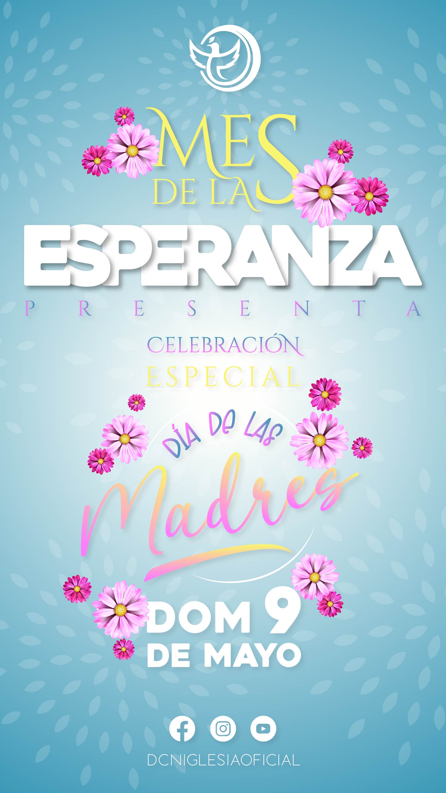
Hello friends, in this post I will show you an advertising poster that I made for an event of the church God with Us, which this campaign is titled month of Hope, celebrated throughout the month of May, where the main entrance was the celebration of Mother's Day.
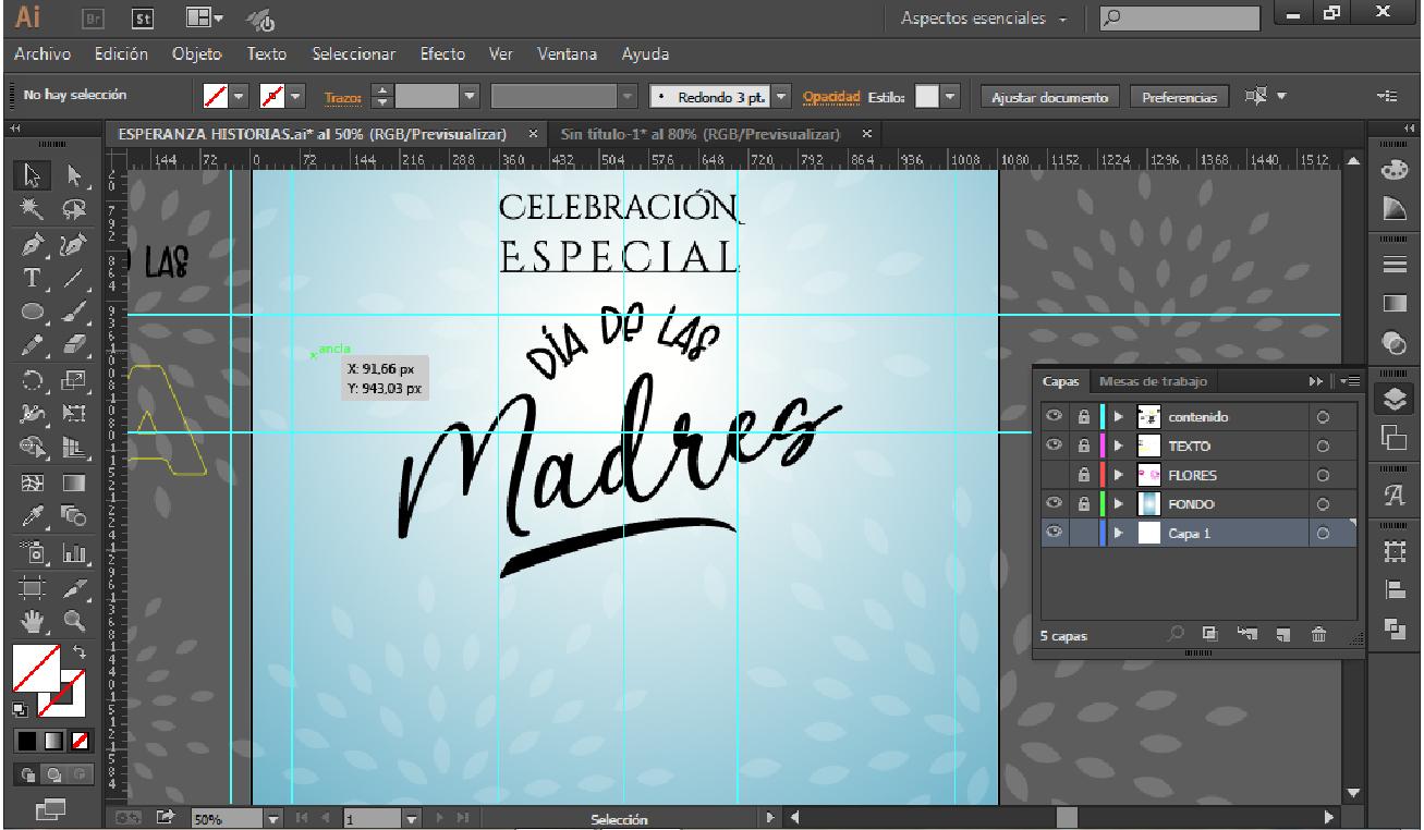
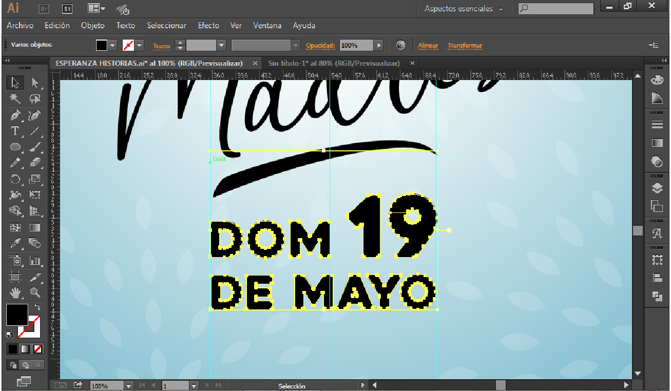
Dicho trabajo no tiene ningún fin monetario, ya que el objetivo principal es promover la esperanza para nuestro país Venezuela, por medio del mensaje de la palabra de Dios. Es por ello que decidí crear una pequeña linea gráfica para el evento. Aquí les mostraré imágenes que forman parte del proceso de diseño, elaborado en adobe illustrator.
This work does not have any monetary purpose, since the main objective is to promote hope for our country Venezuela, through the message of the word of God. That is why I decided to create a small graphic line for the event.
Here I will show you images that are part of the design process, elaborated in adobe illustrator.
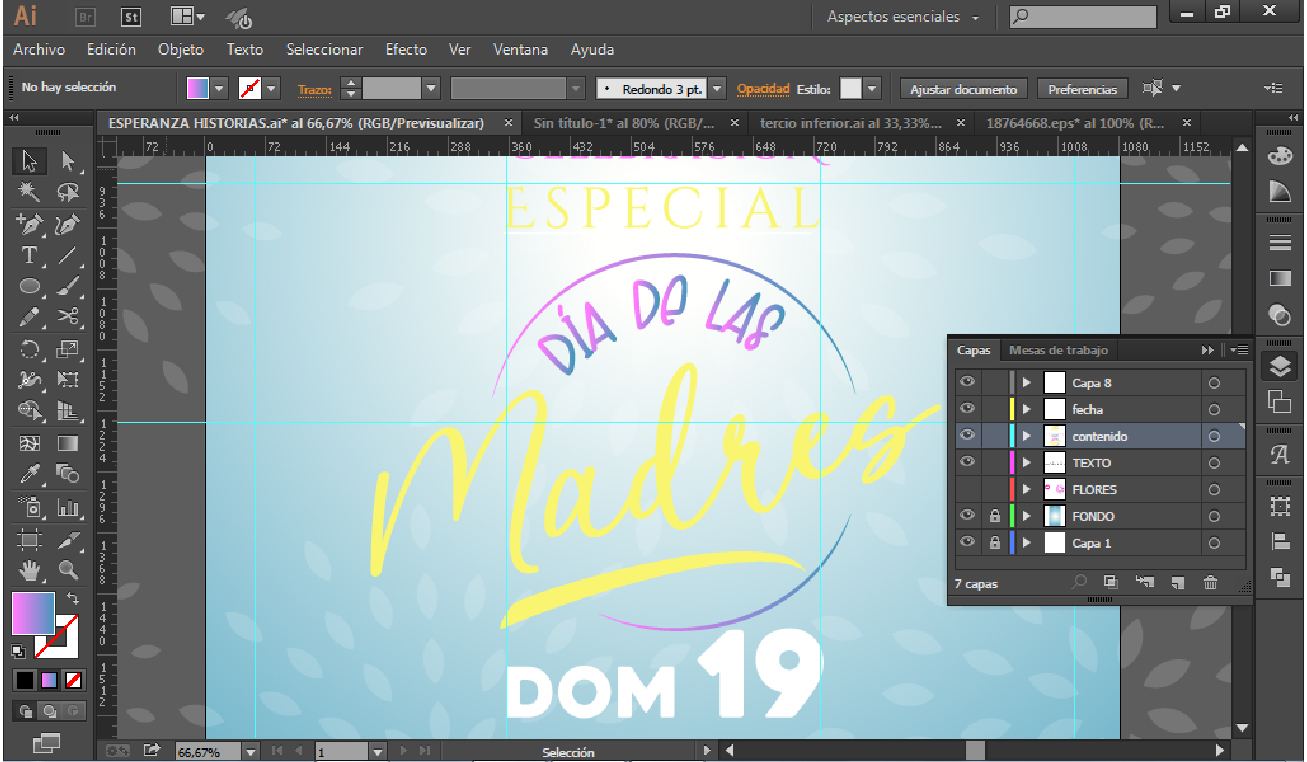
Éste lo realicé con un estilo lettering (es el arte de dibujar letras bonitas mediante diferentes técnicas, según el método de escritura que utilicemos); puesto que es uno de mis estilos favoritos en diseño, ya que en creatividad me ayuda a sacar el mejor potencial. Ahora bien, en este estilo lettering mi intención fue desde un principio que el contenido diagramado formara una cruz, que tiene un significado alusivo; para esto usé cuatro tipografías distintas las cuales son: Heavitas, Cinzel, Loves y Goodest, que varían de contraste en formas y grosores. Y para finalizar coloqué el logo coorporativo de la iglesia
I did this one with a lettering style (the art of drawing beautiful letters using different techniques, depending on the writing method we use); since it is one of my favorite styles in design, because in creativity it helps me to get the best potential. Now, in this lettering style my intention was from the beginning that the diagrammed content would form a cross, which has an allusive meaning; for this I used four different typefaces which are: Heavitas, Cinzel, Loves and Goodest which vary in contrast in shapes and thicknesses. And finally I placed the corporate logo of the church.
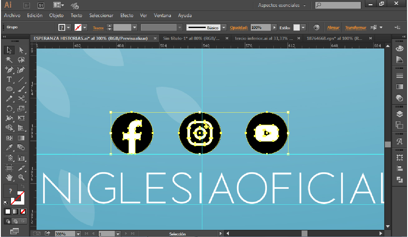
Usé recursos gráficos de una pagina web llamada freepik, de dicha pagina usé el background, las flores y los iconos de las redes sociales. También tomé en cuenta que se va a compartir como post en las redes sociales (Instagram y Facebook) aquí les muestro como quedaron los post sacados del mismo cartel.
I used graphic resources from a website called freepik, from this website I used the background, the flowers and the icons of the social networks. I also took into account that it will be shared as a post on social networks (Instagram and Facebook) here I show you how the posts were taken from the same poster.
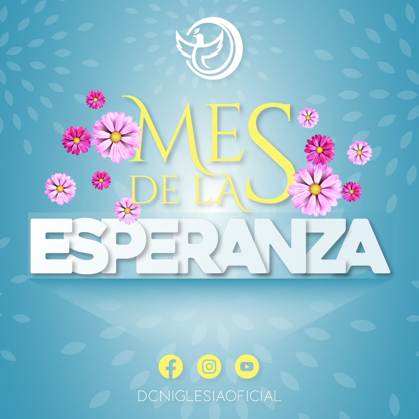
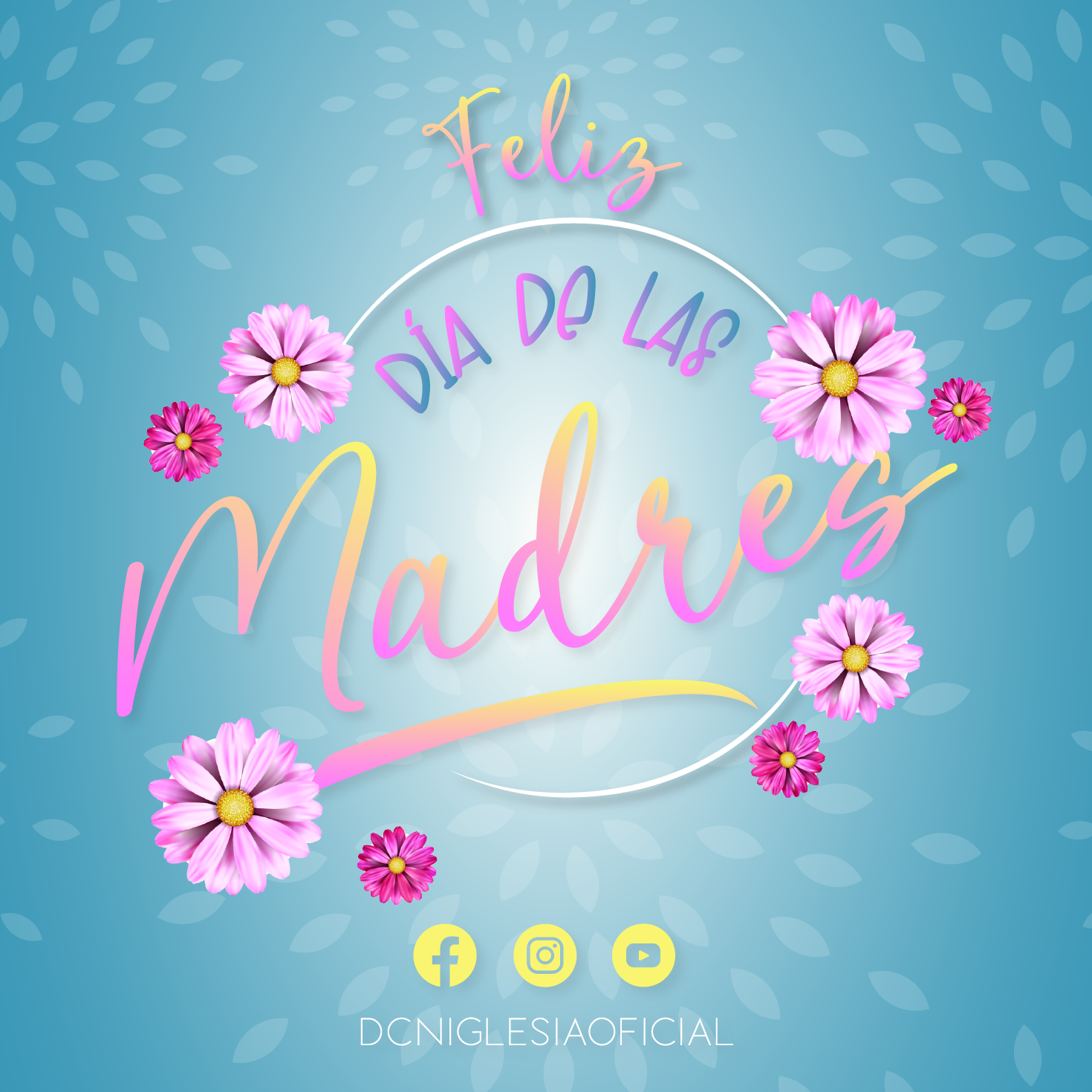
En cuanto a la psicología de los colores me centré en colocar colores alusivos a la esperanza como lo son: amarillo, azul claro, rosado y blanco.
Espero les haya gustado este proceso de diseño que estoy dirigiendo!! Les invito puedan visitar la pagina de esta iglesia @Dcniglesiaoficial.
As for the psychology of colors I focused on placing colors allusive to hope such as: yellow, light blue, pink and white.
I hope you liked this design process that I'm directing! I invite you to visit this church's website @Dcniglesiaoficial.