¡Hola a todos! el día de hoy les mostraré este proyecto que me pareció muy interesante y divertido de hacer, se trató de experimentar con las formas y los colores para la creación de letras y diseños que las acompañaran.
Hello everyone! today I will show you this project that I found very interesting and fun to do, it was about experimenting with shapes and colors for the creation of letters and designs that go with them.
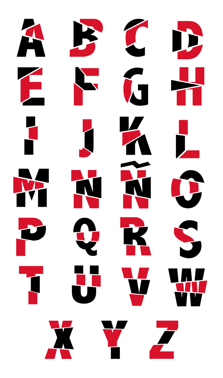
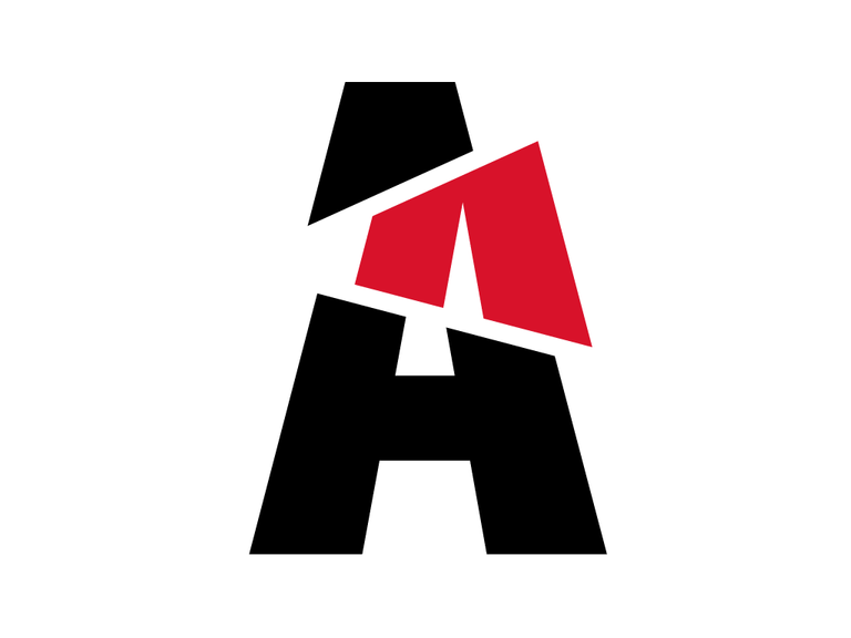
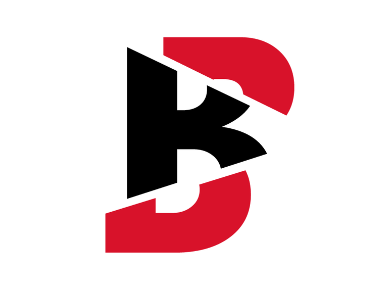
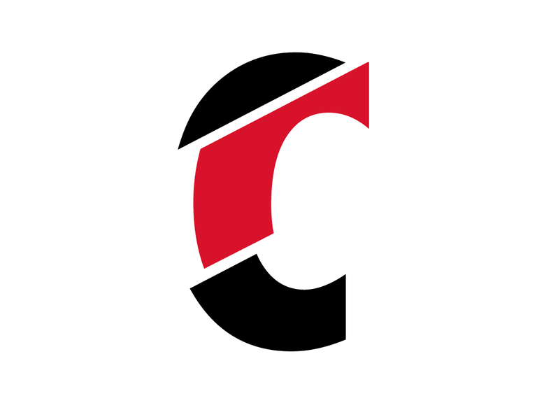
Los colores que escogí fueron el rojo, el negro y el blanco, es una combinación llena de contraste, incorporé estos colores en la creación de letras que se separan en su cuerpo, es decir que crea la ilusión de que cada letra estuviera des-construyéndose y, sin embargo, no pierden su esencia.
The colors I chose were red, black and white, it is a combination full of contrast, I incorporated these colors in the creation of letters that are separated in their body, that is to say that it creates the illusion that each letter was deconstructing and, however, they do not lose their essence.
Además de eso, usé formas geométricas simples, como cuadrados, rectángulos y círculos y jugué con la combinación de los mismos, de tal manera que se fusionaran entre sí.
Besides that, I used simple geometric shapes, such as squares, rectangles and circles and played with the combination of them, so that they merge with each other.
Aquí el resultado de la tipografía desfragmentada 😊
Here is the result of the defragmented typography. 😊
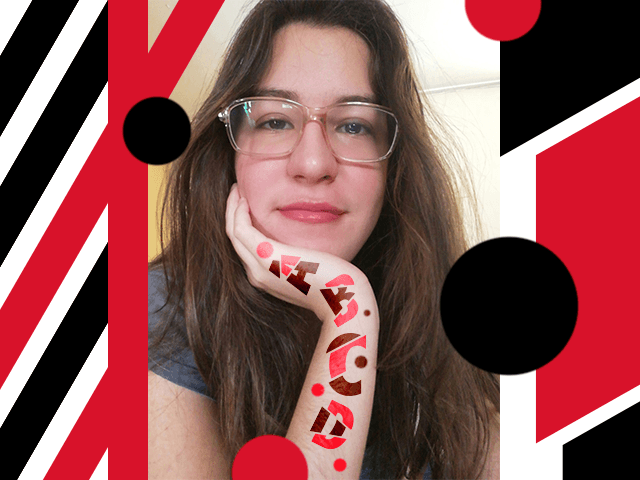
Y por aquí les muestro los diseños con formas geométricas básicas 😊
And here I show you the designs with basic geometric shapes. 😊
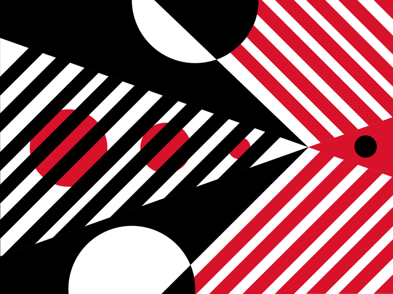
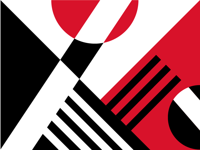
Como pueden ver hay un alto contraste de formas y colores, pero no pierden la simpleza, muchas veces la respuesta más simple, es la correcta. Menos es más amigos.
As you can see there is a high contrast of shapes and colors, but do not lose the simplicity, often the simplest answer is the right one. Less is more my friends.
Espero les haya gustado este proyecto tanto como a mí me encantó hacerlo, los animo a que también lo intenten, los resultados seguro que los sorprenderán.
I hope you liked this project as much as I loved doing it, I encourage you to try it too, the results will surely surprise you.
¡Nos leemos pronto! 😆
We will read us soon! 😆