Good day everyone😊🥰, today i'll be sharing my experience creating my brand's display picture and what the design portrays. I'm into graphics design so it would be based on that.
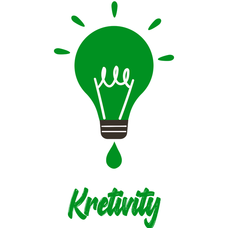
THE FIRST ONE
Now the idea behind this particular design is that the bulb signifies ideas or intelligent mind. This is to show potential customers that we have the ability to think and generate ideas for their business or brand. The drip sign at the bottom of the bulb indicates that it's not a dry vessel thus emphasizing the fact that we won't run out of ideas for their business or brand. Kretivity is the name of the brand so i included it in.
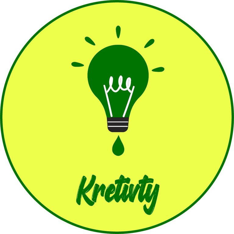
THE SECOND ONE
So i felt that the design needed a background and i came up with this. A yellow background with green border lines, wasn't satisfied still so i kept thinking.
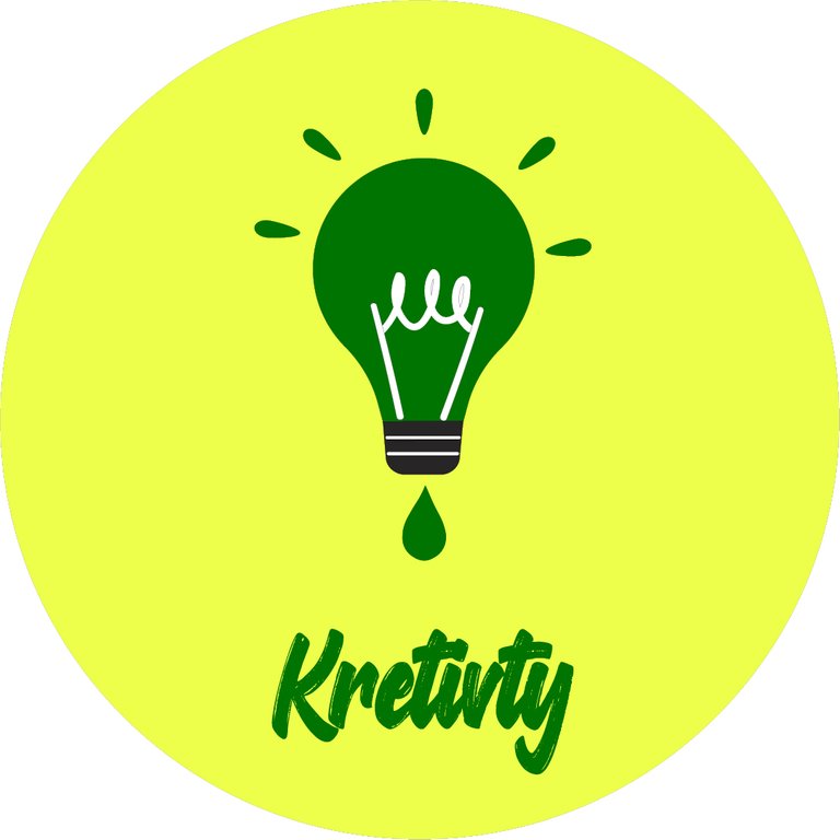
THE THIRD ONE
I noticed that the border line gave it an off look. It looked more like a company badge or something of sort so i had to remove the border lines. Interesting right?
THE FOURTH ONE
What does this design need? Eureka! Simplicity. Since its just a logo to be used basically as my social media display pictures i don't have to put the brand name alongside so i removed it. I posted it but the design wasn't eye catching because of the design so something obviously had to be done.

THE FIFTH AND FINAL ONE (FOR NOW😁)
So i inverted the colours, making the logo white where it was green before and vice-versa. I also picked another shade of green which wasn't too sharp but it was eye-catching.

What are your thoughts concerning this? I would love to engage you in the comment section below.
I design artworks, flyers, banners, amotion graphics e.t.c. Feel free to chat me up so i can help bring that beautiful scenery on your mind to a realization.