I have just completed going over data from the Center for Disease Control’s website. If you would like to check the numbers, here is the link:
https://gis.cdc.gov/grasp/fluview/mortality.html
The graph on the page is called “Percentage of all deaths due to pneumonia and influenza, National Summary”. To get the data for all deaths (which they need to figure out the percentage) do these steps: (1) Click on the “Download” button. (2) In popup window, select “Custom Data”; “Surveillance Area” = “National”; “Season” check box “Select All”; “Age Group” check box “Select All”. (3) Format is in CSV for “Comma Separated Value”. This will open in any spreadsheet program. A free one you can use is called LibreOffice
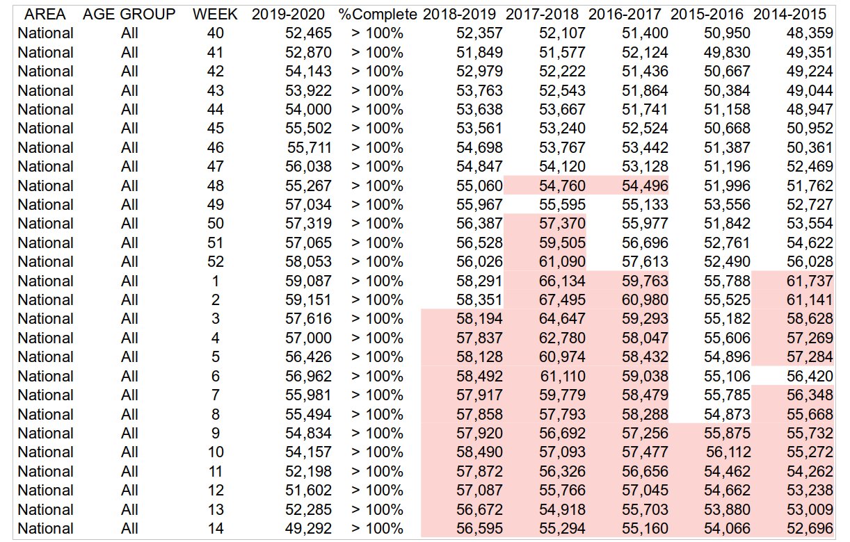
Here are the results after some cutting and pasting to show how many total deaths there were in the USA by week versus flu season time period. The data in red shows when there were less total deaths than the current season (2019-2020).

Source: CDC
Remarks: The total population of the USA has increased every year in years past. We would expect an increasing trend in the number of people who die each year on any given week. This pattern is followed at the end of last year. Since the beginning of the year, however, less people are dying every week than normal. If constant media exposure is making you believe more people are dying this year, then you have a wrong understanding of the data supplied by the CDC. 2020-04-21 http://kimbriggs.com/. Check the data and send me corrections.