¡Un saludo a todos! En esta oportunidad les vengo a mostrar una nueva edición en Photoshop. Esta vez les enseñare como pueden editar y mejorar una fotografía de manera fácil, rápida e intuitiva en Adobe Camara raw (un complemento de Photoshop). Así que sin más preámbulos ¡comencemos!
Greetings to all! In this opportunity I come to show you a new editing in Photoshop. This time I will show you how you can edit and enhance a photograph in an easy, fast and intuitive way in Adobe Camara raw (a Photoshop plug-in). So without further ado, let's get started!
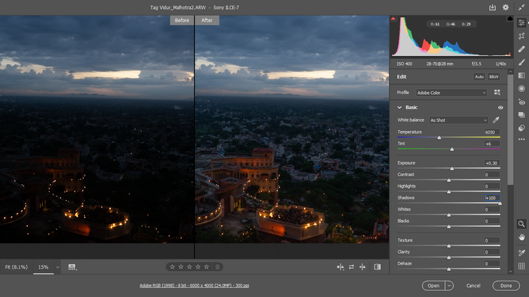
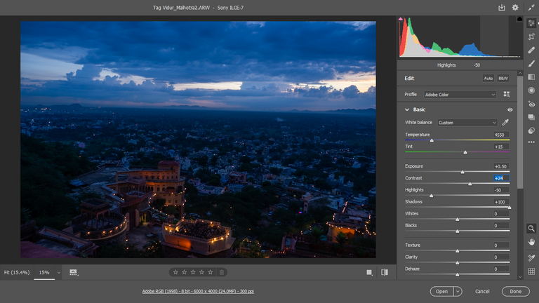
En lo primero que debemos fijarnos es en el histograma, ya que este nos dirá como esta nuestra luminosidad.
En este caso el histograma me dice que tengo muchas partes oscuras en la fotografía. ¿Como lo sé? pues el histograma se divide en 3. Cuando se tiene mucha información del lado izquierdo, quiere decir que la fotografía tiene muchas partes oscuras, cuando se tiene mucha información del lado derecho, quiere decir que la foto tiene partes muy iluminadas y cuando se tiene mucha información en la parte central, quiere decir que la fotografía presenta muchos grises, es decir, poco contraste. Por lo tanto, si se quiere hacer una buena edición el histograma debe verse más balanceado, es decir, repartir la información buscando la parte central y derecha (en este caso que la imagen es muy oscura).
The first thing to look at is the histogram, since it will tell us how our luminosity is.
In this case the histogram tells me that I have a lot of dark parts in the photograph. How do I know? Well, the histogram is divided into 3 parts. When there is a lot of information on the left side, it means that the photograph has a lot of dark parts, when there is a lot of information on the right side, it means that the photograph has very bright parts and when there is a lot of information in the central part, it means that the photograph has a lot of grays, that is to say, little contrast. Therefore, if you want to make a good edition, the histogram must look more balanced, that is to say, distribute the information looking for the central and right side (in this case the image is very dark).
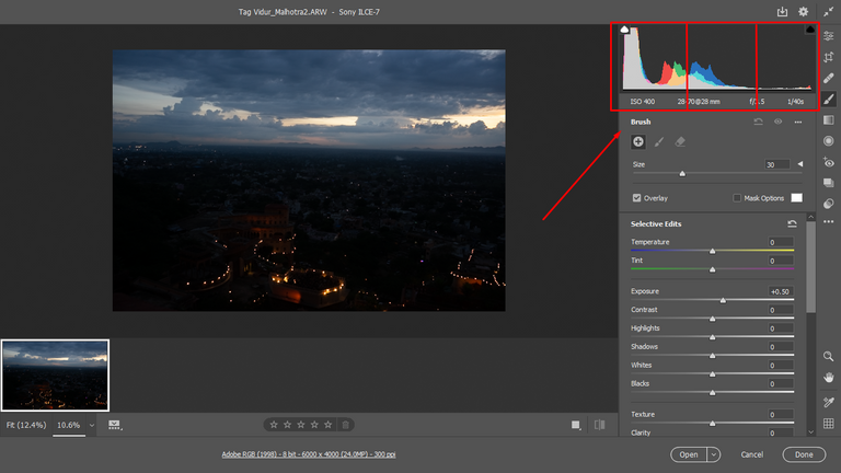
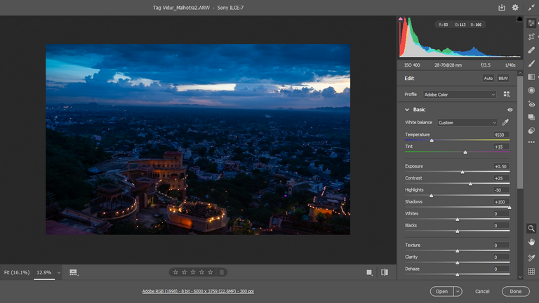
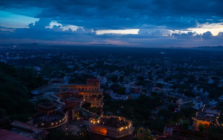
Como la fotografía está muy oscura, lo primero que edite fue el área de las sombras, y si logran notarlo, el histograma ya empieza a correrse un poco a la derecha.
As the picture is very dark, the first thing I edited was the shadow area, and if you can notice, the histogram is already starting to shift a bit to the right.
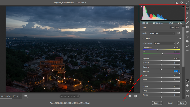
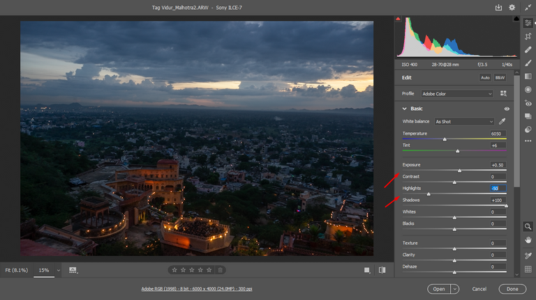
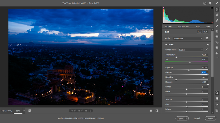
Luego, edite un poco la exposición, pero solo un poco para obtener un poquito más de luces. No lo puedo aumentar demasiado, ya que esta fotografía fue sacada en un ambiente nocturno y de hacerlo, la fotografía se iluminaría demasiado e incluso tornaría la apariencia de ser una foto tomada en el de día y este no es el caso.
Then, I edited the exposure a little bit, but just a little bit to get a little bit more highlights. I can't increase it too much, since this picture was taken in a night environment and if I did, the picture would be too bright and it would even look like it was taken in the daytime and this is not the case.
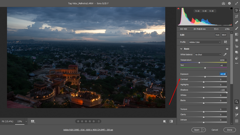
Después, baje un poco las iluminaciones y subí un poco la exposición para que el cielo se viera un poco más agradable.
Then, I lowered the highlights a bit and raised the exposure a bit to make the sky look a little nicer.
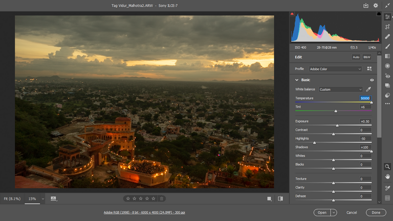
En esta parte trabaje con la temperatura de la imagen. En este caso me pareció mucho más apropiado irme por una temperatura fría, inclinada hacia los azules por el ambiente nocturno de la misma
In this part I worked with the temperature of the image. In this case it seemed much more appropriate to go for a cold temperature, leaning towards the blues because of the night environment of the image.
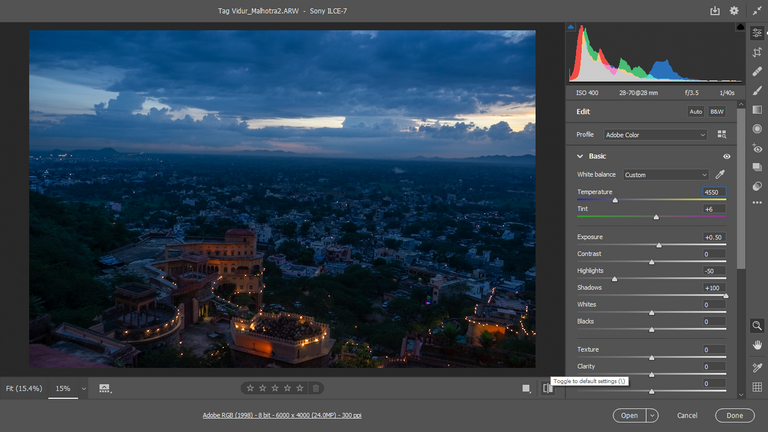
Aquí ajusté un poco los matices, inclinándome a una tonalidad un poco más purpura.
Here I adjust the shades a bit, leaning towards a slightly more purple hue.
Luego aumente un poco el contraste, pero no demasiado, porque de hacerlo oscurecería mucho la imagen y no estaría haciendo nada. Sería como tener la imagen original pero entintada de azul. Algunas imágenes les queda perfecto el exagerar la cantidad de contraste, pero depende de la luminosidad y de los colores que tenga. Como en el ejemplo siguiente:
Then I increased the contrast a little bit, but not too much, because if I did that it would darken the image too much and I would not be doing anything. It would be like having the original image but inked blue. Some images are perfect to exaggerate the amount of contrast, but it depends on the brightness and the colors you have. As in the following example:
Una de las cosas que me gusta hacer, es darles más presencia a los cielos. Y para aplicar efectos solamente a los cielos, podemos utilizar la herramienta de filtro graduado. En este caso reducí la temperatura. Incline el matiz hacia los verdes, ya que me parecio que de esta forma se notaba mucho más la nitidez, y para generar un poco más de contraste, aumente las luces y reducí las sombras.
One of the things I like to do, is to give more presence to the skies. And to apply effects only to the skies, we can use the graduated filter tool. In this case I reduced the temperature. I tilted the hue towards the greens, as it seemed to me that this way the sharpness was much more noticeable, and to generate a little more contrast, I increased the highlights and reduced the shadows.
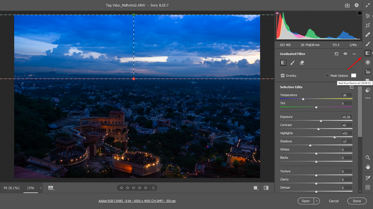
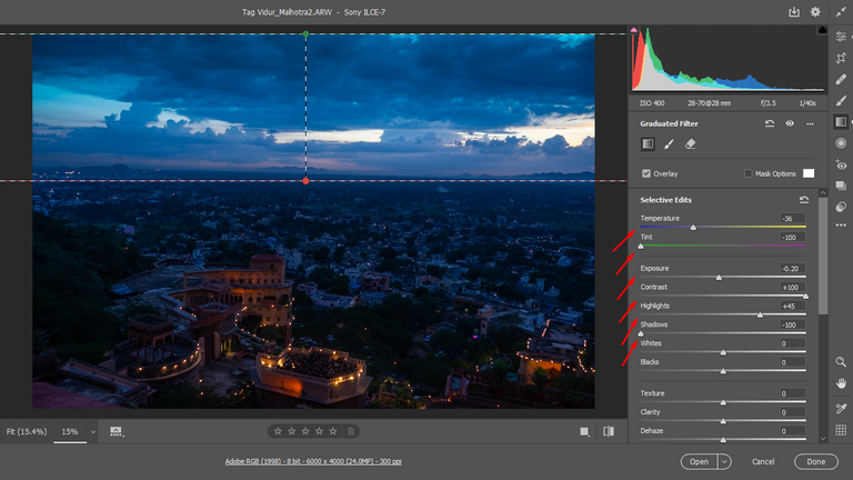
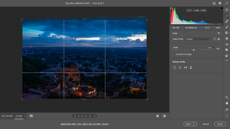
Por último, recorte un poco la fotografía, ya que había elementos en el cielo que a mi consideración eran innecesarios y de eliminarlos, el cielo se vería más limpio.
Finally, I cropped the photo a bit, as there were elements in the sky that I thought were unnecessary and if I removed them, the sky would look cleaner.
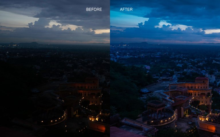
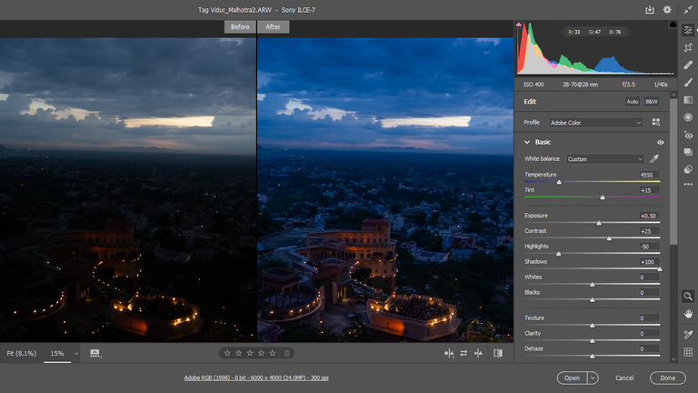
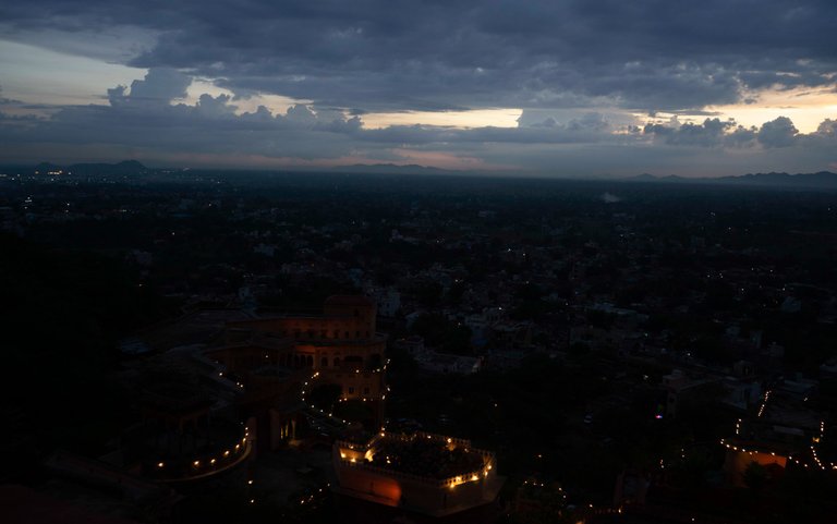
And that's it! Here's the before and after of this photo edition
Thanks for watching, I hope you liked my post. A hug and see you next time.😊
Hermoso e interesante amigo @johstingmzk gracias
Congratulations @johstingmzk! You have completed the following achievement on the Hive blockchain and have been rewarded with new badge(s):
Your next target is to reach 3750 upvotes.
You can view your badges on your board and compare yourself to others in the Ranking
If you no longer want to receive notifications, reply to this comment with the word
STOPCheck out the last post from @hivebuzz:
Excelente, saludos.¡Hola @Johstingmzk! Me parece excelente que brindes esta información a quienes quizá la necesiten y desconozcan. En lo particular realizo arte digital (normalmente lo incluyo en mis posts) y no sé me complica a la hora de publicar, pero sé de muchas personas con maravillosos textos que no tienen ni la menor idea de cómo aumentar la calidad de sus fotografías por ejemplo al hacerles un retoque.
Muchas gracias por tu comentario. Lo aprecio mucho y si, definitivamente esa es la idea, brindar la información a quienes quizás no sepan y además enseñar como conseguir estos resultados. Un saludo de vuelta 😊
esta genial la información @johstingmzk me gusta usar mucho la herramienta de photoshop y para las fotos oscuras lo que explicaste es perfecto, gracias por compartir. Saludos!!
Gracias! me alegro que te haya gustado. Un saludo para ti tambien 😊
Me gustó mucho este post. Es lo que necesitaba para mejorar mis fotografías. Usualmente uso Lightroom en el tlf y tengo Photoshop pero aún no lo sé utilizar muy bien. No conocía este complemento, trataré de buscarlo y poner en práctica está información. Muchas gracias por compartir!
Me alegra que te haya gustado y servido. Pronto subiré mas contenido como este 😊
Te quedó muy bien y el tutorial está claramente explicado. Gracias por compartir.
Gracias a usted por el apoyo
esta edición te quedó genial.
Saludos, bendiciones y éxitos.
Me alegra que te haya gustado! muchas gracias e igualmente 😊